

What Is ICC Profile: what is icc profile and How It Impacts DTF Color
Ever had that sinking feeling when the vibrant design on your screen comes out of the printer looking dull, muddy, or just... wrong? You're not alone. The culprit is almost always a color translation problem, and the solution is something called an ICC profile. For any professional print shop, this little digital file isn't just a nice-to-have; it's the key to getting the color you see to be the color you get.
What Is an ICC Profile and Why It Matters
Think of an ICC profile as a translator for all your gear. Every single device in your shop—from your monitor to your DTF printer—sees and reproduces color differently. They each speak their own unique color "language."
Without a translator, a brilliant, fire-engine red on your screen might be interpreted by your printer as a muted, rusty orange. An ICC (International Color Consortium) profile acts as that translator. It’s a small data file that describes exactly how a specific device creates color, defining its unique color gamut based on the exact ink, film, and printer settings you're using.
The Color Mismatch Dilemma
When you operate without a profile, you're essentially flying blind and hoping for the best. Your monitor creates colors by adding light (an RGB model), while your printer creates them by subtracting light with ink on a substrate (a CMYK model). These two systems are fundamentally different worlds.
An ICC profile bridges that gap. It creates a standardized, device-independent color space that acts as a middleman, ensuring the RGB values from your design file are accurately converted into the precise CMYK ink combinations needed for a perfect print.
This translation is what separates amateur results from professional, repeatable quality. It stops the frustrating and expensive cycle of reprinting jobs over and over again to chase the right color.
To put it simply, an ICC profile gives your color workflow a rulebook to follow. Let's break down the core ideas.
ICC Profile Key Concepts at a Glance
| Concept | Simple Explanation | Why It Matters for DTF |
|---|---|---|
| Device Characterization | The profile is a "fingerprint" of your printer, ink, and film combination. | It accounts for the unique properties of your specific DTF setup, not some generic standard. |
| Color Space Conversion | It acts as a translator between your monitor's RGB language and your printer's CMYK language. | This ensures the colors you design on screen are the ones that actually get printed. |
| Gamut Mapping | It intelligently handles colors that your printer can't reproduce (out-of-gamut colors). | Prevents ugly color shifts by finding the closest printable match for those super-vibrant screen colors. |
| Standardization | It creates a consistent reference point for color across your entire workflow. | Every print, from the first to the thousandth, looks the same. Consistency is king. |
Having this framework in place moves your printing from guesswork to a predictable, scientific process.
The Real-World Benefits for Your Shop
For any print business, but especially for DTF, nailing color is how you build a reputation. The benefits of using a proper profile are immediate and tangible.
- Predictable, Accurate Color: You can finally print with confidence, knowing the final shirt will match the digital proof the client signed off on. No more surprises.
- Rock-Solid Consistency: This is huge for repeat orders or jobs for brands with strict color guidelines. Every reprint will be a perfect match to the original.
- Drastically Reduced Waste: Getting colors right the first time saves a ton of money. Think of all the ink, film, powder, and time you won't waste on reprints.
Ultimately, taking the time to understand what an ICC profile is and how to use it properly is one of the most impactful things you can do to elevate the quality and profitability of your work.
How ICC Profiles Master Color Accuracy in Printing
Let’s break down exactly what an ICC profile is. Think of it as a custom recipe, a secret sauce made just for your specific printing setup. It’s the difference between telling your printer "make this red" and giving it the precise formula—the exact parts of cyan, magenta, yellow, and black ink—to hit a perfect Coca-Cola Red or Tiffany Blue.
Without that recipe, your printer is essentially winging it. It might throw in a little too much magenta trying to create a vibrant red, and you end up with something that looks vaguely purple. An ICC profile takes all that guesswork out of the equation. It's a detailed instruction manual for color.
Understanding Your Printer's Color Gamut
This custom recipe is based on a concept called a color gamut, which is simply the full range of colors a device can produce. Your computer monitor, which creates color with light (RGB), has a huge gamut filled with bright, glowing shades. Your DTF printer, on the other hand, uses physical DTF printer ink (CMYK) and has a different, often smaller, range of colors it can physically create.
A huge part of an ICC profile's job is to act as a translator between these two different color worlds. When your design includes a color that's "out of gamut"—meaning your printer literally can't mix the inks to make it—the profile steps in. It intelligently finds the closest possible color your printer can produce. This is what stops that brilliant neon green on your screen from turning into a sad, muddy green on the finished t-shirt.
This map shows how an ICC profile is the central hub, translating color from what you see on screen, to what your printer understands, and finally to what comes out on the garment.
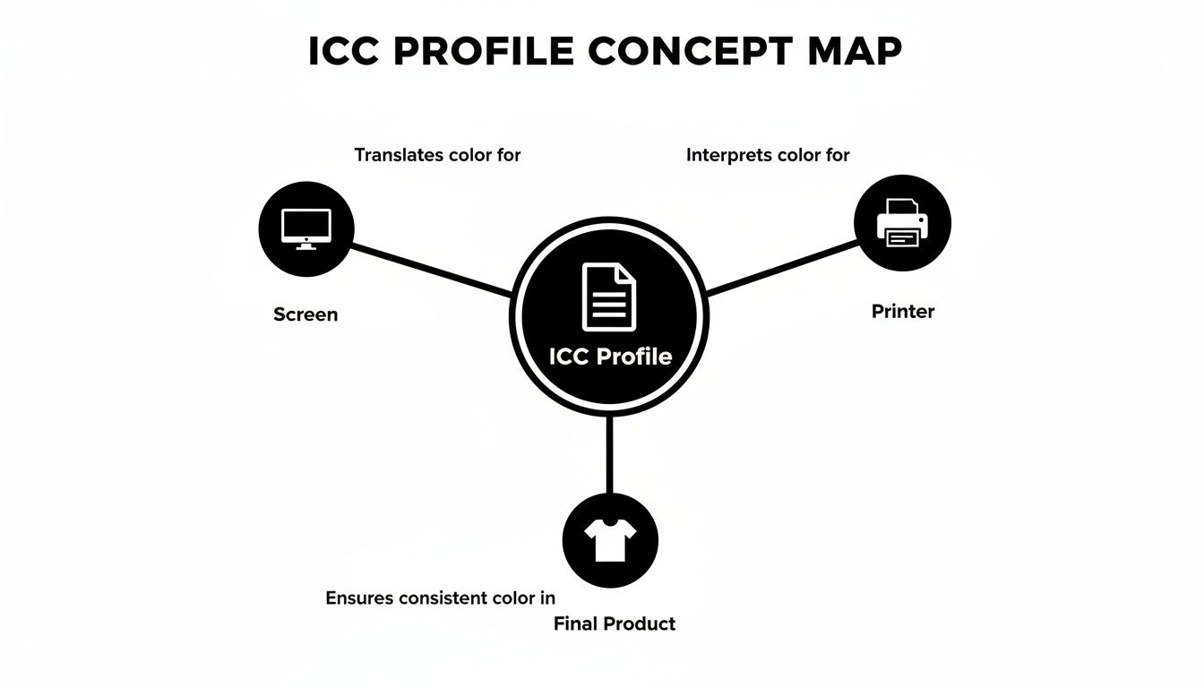
As you can see, the profile is the critical piece that makes sure the language of color is spoken fluently at every step.
The Three Pillars of Color Management
By expertly managing this translation, an ICC profile gives you control over the three pillars of professional color management. For any print shop that's serious about quality, these are non-negotiable.
- Accuracy: This is all about making sure the printed color matches what was in the digital file. It’s the difference between printing a generic, dull orange and hitting the specific, vibrant tangerine your client needs for their logo.
- Gamut: The profile helps you get the most out of your equipment. It maximizes the full spectrum of colors your unique printer and ink combination can achieve, ensuring you get the richest, most vibrant prints possible from your setup.
- Consistency: This is the key to repeatability. It guarantees that the 100th print looks absolutely identical to the first. When you’re dealing with repeat orders or clients with strict brand guidelines, this kind of reliability is everything.
By controlling these three elements, an ICC profile moves your printing process from a game of chance to a predictable science. It provides the control needed to deliver professional, repeatable results that build customer trust and reduce costly waste.
A Step-by-Step Guide to Installing and Using ICC Profiles
Alright, so you understand what an ICC profile is. Now for the fun part: putting it to work. This is where the magic happens, moving from theory to perfectly colored prints. Properly installing and applying a profile is the key to creating a consistent, reliable workflow from your screen to your DTF printer.
Getting the profile onto your computer is basically a simple copy-and-paste job. The trick is knowing exactly where to put the file so your software can find it. The location is a little different depending on whether you're using a Windows PC or a Mac.
Installing Profiles on Your Operating System
First things first, you need to get the profile file itself—it will usually end in .icc or .icm—into the right system folder.
-
For Windows: The easiest way is to just right-click the ICC profile file and hit "Install Profile." If you prefer to do it manually, you can copy the file to
C:\Windows\System32\spool\drivers\color. -
For macOS: You'll want to copy the file to either
/Library/ColorSync/Profiles(which makes it available for everyone using the computer) or~/Library/ColorSync/Profiles(for just your user account).
Once the file is in place, it's always a good idea to restart your design programs, like Adobe Photoshop, to make sure they see the new profile.
Applying Profiles in Adobe Photoshop
With the profile installed on your system, you can now tell your design software how to use it. In Photoshop, this lets you do something called soft proofing—essentially, getting an accurate preview on your monitor of how the colors will actually look when they come out of your printer.
This step alone can save you a mountain of frustration, not to mention wasted ink and film, by letting you spot color problems before you print.
-
Assign Profile: First, go to
Edit > Assign Profile. This step tells Photoshop how to interpret the colors already in your design. Most of the time, your working space will be sRGB or Adobe RGB. -
Enable Soft Proofing: Next, head to
View > Proof Setup > Custom. This is the most important part of the process. - Configure Proof Conditions: A dialog box will pop up. From the "Device to Simulate" dropdown menu, find and select the printer profile you just installed. A key step here is to make sure "Preserve RGB Numbers" is unchecked to see a true color translation.
What you're doing here is telling Photoshop, "Hey, show me exactly what this design is going to look like when it's printed using my specific DTF printer, ink, and film."
Configuring Your RIP Software
While Photoshop is your creative sandbox, the final command center for any serious DTF operation is your RIP (Raster Image Processor) software. This is the program that takes your finalized design and sends the color-corrected data to the printer. Setting up your ICC profile correctly here is non-negotiable for professional results.
To dive deeper into your options, check out our guide on the best DTF printing software.
Crucial Tip: Color management should only happen in one place. If your RIP software is handling the ICC profile, you absolutely must turn off color management in the printer driver itself. If you don't, you'll end up "double profiling," which will give you wildly oversaturated and incorrect colors. It's a classic mistake, but an easy one to avoid.
Why Generic Profiles Undermine Professional Results
So, you've unboxed your new printer or installed your RIP software, and it comes loaded with a bunch of "generic" or "canned" ICC profiles. It feels like you're ready to hit the ground running, right? Well, not so fast.
Relying on these pre-made profiles for serious DTF work is a bit like using a map of Chicago to navigate New York City. You'll head in the general direction, but you’re definitely not going to land on the right doorstep.
The Real-World Variables
A generic profile is born in a perfectly controlled, almost sterile lab environment. It’s based on a perfect storm of printer, ink, and media that just doesn't reflect the reality of a working print shop. Your shop has its own personality, its own climate, and that has a huge impact on your color.
Think about all the little things that make your setup unique. Even tiny differences can throw your colors way off course.
- Ambient Conditions: The temperature and humidity in your room change how ink behaves on the DTF film. A profile built in a lab with 40% humidity isn't going to hold up in a workshop that's sitting at 70% humidity on a summer day.
- Ink Batch Variations: Even the best inks have tiny, microscopic differences from one batch to the next. A custom profile is tuned to the specific ink you have in your printer right now.
- DTF Film and Powder: Not all consumables are created equal. Different brands—and even different rolls from the same brand—of film and powder have unique properties that affect how they take ink.
A generic profile just steamrolls over all these crucial details. It’s a one-size-fits-all solution for a process that demands a tailored fit.
Custom Profiles: The Professional Standard
This is exactly why a custom ICC profile is the only way to go if you're serious about your results. A custom profile is built for your specific printer, in your shop, with your ink and your film. It's a color recipe made just for your kitchen.
By mapping the true color behavior of your unique DTF workflow, a custom profile ensures that the fiery red on your monitor actually prints as that same fiery red on any of the best shirts for DTF—not some dull, disappointing maroon. It's how you finally achieve true "what you see is what you get" (WYSIWYG) printing.
For any shop that depends on repeat business and has to nail specific brand colors, this kind of precision isn't just a nice-to-have; it's a must-have. A generic profile might be fine for a hobbyist, but it will consistently let you down when professional clients are on the line. Investing in a custom profile turns your color process from a guessing game into a predictable science, saving you a ton of time, wasted materials, and headaches.
Troubleshooting Common Color and Profile Issues
Even with what seems like a perfect setup, color problems can—and do—happen. It’s one of the biggest frustrations in printing, leading to a lot of wasted time and materials. When that final print doesn’t match what you saw on screen, the culprit is almost always hiding somewhere in your color management workflow.
The good news is that most issues are just a simple mismatch between your software, your profile, and your printer. Think of it as a game of telephone; if one person whispers the wrong message, the end result is garbled. By checking each step of the process, you can find the source of the problem and get back to business. Having a structured approach, like when creating an effective troubleshooting guide, makes this much easier.
Common Print Problems and Their Profile Solutions
When your prints go sideways, it’s easy to feel lost. But most color issues leave behind specific clues. This table is a quick reference to help you play detective, connecting the symptom you see on the print to its likely cause and, most importantly, its solution.
| Symptom | Potential Cause | How to Fix It |
|---|---|---|
| Colors look washed out or faded | The wrong ICC profile is selected (e.g., for a different film or ink). | Double-check that you've chosen the exact profile for your ink, film, and powder combination. |
| Reds print as orange or magenta | The profile isn't mapping reds accurately. This is common with generic or poorly made profiles. | Use the lab-provided profile from Cobra DTF. If it persists, a custom profile may be needed for your specific setup. |
| Prints are too dark or too saturated | Color management is being applied twice (e.g., in both Photoshop and the RIP). | This is called "double profiling." Turn off color management in your printer driver or design app and let the RIP software handle it. |
| Grays and blacks have a color cast | The profile isn’t correctly defining the neutral axis, causing a shift toward blue, green, or magenta. | Ensure you are using the correct profile. A high-quality custom profile is the ultimate fix for perfect neutrals. |
Think of this table as your first stop for diagnostics. Most of the time, the fix is as simple as clicking the right setting or choosing the right file.
The Double Profiling Trap
If there’s one mistake that catches everyone—from beginners to seasoned pros—it’s double profiling. It's the number one cause of overly dark, muddy, and oversaturated prints.
Imagine you're adding salt to a recipe. If you add the correct amount, it tastes great. But if someone else comes along, not knowing you already seasoned it, and adds the same amount of salt again, the dish is ruined. That's exactly what double profiling does to your colors.
The cardinal rule of color management is simple: Let only one program handle the color conversion.
This happens when color correction is applied once by your design software (like Photoshop) and again by your RIP software or printer driver.
To avoid this trap, you need a clear and consistent workflow. Your RIP software should always be the final authority on color. Go into your printer driver settings, find the color management options (often labeled "ICM" or "ColorSync"), and set them to Off or No Color Adjustment. This step is crucial. It clears the way for your RIP software and its ICC profile to do their job properly, giving you the accurate, vibrant color you've been working toward.
Best Practices for Flawless Color Management
Getting consistently great color isn’t a happy accident. It’s the result of a deliberate, well-managed workflow. Following a few key practices will turn your printing from a guessing game into a predictable science, making sure every DTF transfer you produce is vibrant, accurate, and professional.
It all starts in your design software. Always begin your projects in a standard, well-defined color space like sRGB or Adobe RGB. Think of these as a reliable starting point, a known standard for your colors before you even get close to the printer. Nailing this first step saves you from a world of color headaches down the line.
From Design to Print: A Reliable Workflow
Once your design is good to go, the next critical step is in your RIP (Raster Image Processor) software. This is where you absolutely must select the custom ICC profile that matches your exact combination of printer, ink, and film. Don't ever just leave this on a default setting. A profile made specifically for your setup is the only way to guarantee the colors on your screen translate accurately to the final print.
Industry reports love to talk about the growth of digital printing, but they often skim over the technical details that actually drive quality. For successful print shops, understanding what an ICC profile is and applying the right one is a major differentiator. Flawless color management, however, goes beyond just installing a profile; it touches every part of your process, including how you optimize export settings in editing software like Lightroom to keep your colors intact for different uses.
Verifying Accuracy with Print Targets
So, how can you be totally sure your entire system is dialed in perfectly? The ultimate proof is to print a "print target"—a standardized test chart. This is simply a file filled with a wide range of specific color swatches, smooth gradients, and neutral grays.
By printing this standardized chart and visually comparing it to the digital file on a calibrated monitor, you can spot any color shifts immediately. If the printed chart is a dead ringer for the digital version, your color management is spot on.
This final check is your quality control stamp of approval. It confirms that your design space, ICC profile, and printer settings are all playing nicely together, giving you the confidence to produce stunning, accurate prints that will keep your customers coming back for more.
Your Top Questions About ICC Profiles Answered
Even after you get the hang of ICC profiles, some practical questions always pop up. Let's tackle some of the most common ones we hear from print shop owners every day.
Do I Need a New Profile for Every T-Shirt Color?
Nope, you don't. Think of the ICC profile as the translator between your computer screen and the printer. Its job is to get the colors right on the DTF film itself, long before that film ever meets a t-shirt.
That said, you definitely want to see how your design will look on the final shirt. A great pro tip is to add a new layer in your design software (Photoshop, for example), fill it with the shirt color, and place it behind your artwork. This gives you a fantastic on-screen preview of the final product.
What’s the Difference Between an ICC and ICM File?
This is a simple one: there’s no difference at all in what they do. They are the exact same type of file, just with different naming conventions.
- ICC is short for the International Color Consortium, the group that sets the standards.
- ICM stands for Image Color Matching, which is what Microsoft decided to call the file extension in Windows.
You can use a file ending in .icc or .icm interchangeably on almost any system without a problem.
How Often Should I Get a New Custom Profile Made?
If you keep your setup consistent, a well-made profile can last you a very long time. You really only need to think about getting a new one when you change one of the key ingredients in your printing recipe.
A new profile is a smart move if you switch your ink brand, change the type of DTF film you use, or buy a completely new printer. These are the core variables your profile is built on, so changing one means you need a new color "map."
Can an ICC Profile Fix a Bad Design File?
An ICC profile is a powerful tool for accuracy, but it can't perform magic. It's designed to faithfully reproduce the colors from your design file onto the film—not to fix a flawed design.
The old saying "garbage in, garbage out" is 100% true here. A profile can't make a blurry, low-resolution image sharp. It won't correct clashing colors chosen by the designer, and it can't add details that were never there to begin with.
For predictable, vibrant results every time, trust Cobra DTF for all your Direct-to-Film needs. Our USA-made supplies provide the consistency required for perfect color management. Explore our full range of DTF products to lock in your quality.