
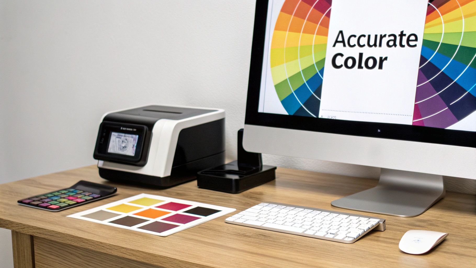
What is an icc profile? A Quick Guide to DTF Color Consistency
An ICC profile is a small data file that essentially acts as a translator, making sure the colors you see on your screen are the same colors that come out of your printer. Think of it as the secret ingredient to preventing those frustrating color shifts that can ruin a perfectly good t-shirt design.
The Secret Language of Accurate Color
Have you ever spent hours perfecting a design with a specific shade of navy blue, only to have it print out as a dull, almost-black mess? This is a classic color management problem. It’s not your printer's fault, and it’s not your monitor's fault—it's a communication problem between them.
Your monitor creates color by mixing Red, Green, and Blue light (RGB), while your DTF printer uses Cyan, Magenta, Yellow, and Black ink (CMYK) to create color on a physical surface. They are speaking completely different "color languages." An ICC profile is the interpreter that steps in and ensures both devices understand each other perfectly.
Why This Matters for Your Business
For any custom apparel business, nailing color is everything. It’s not just a nice-to-have; it's a critical part of your workflow that directly impacts your profit margin. Flying blind without color management means every print is a gamble, leading to wasted ink, film, and time.
An ICC profile is a standardized data file that describes how a specific device—like your monitor or DTF printer—reproduces color. For professional print shops, implementing solid color management with the right profiles can cut material waste by 10–30%. That's money that goes straight back into your business.
Using a specific ICC profile, particularly one created for your Cobra DTF setup, lays the groundwork for repeatable, professional results. This little file is the key to unlocking:
- Consistency: Hitting those exact brand colors every single time, from the first print to the hundredth.
- Efficiency: Saying goodbye to costly reprints and cutting down on wasted ink and film.
- Customer Satisfaction: Delivering a final product that looks exactly like the proof your customer approved.
To help break this down, here’s a quick look at the core ideas behind ICC profiles.
ICC Profile Key Concepts at a Glance
| Concept | Simple Analogy | Why It Matters for Your Business |
|---|---|---|
| Color Gamut | A painter's palette | Each device (monitor, printer) has a limited range of colors it can produce. The profile tells you exactly what those colors are. |
| Color Space | A language | This is the specific "dialect" of color a file uses, like sRGB or Adobe RGB. The profile ensures the right dialect is spoken. |
| Rendering Intent | A translation style | This tells the software how to handle colors that are "out of gamut" (unprintable). For example, does it shift all colors slightly or just clip the outliers? |
| Device Characterization | A device's fingerprint | The process of creating a profile by measuring how a specific printer, ink, and film combination actually produces color. |
Ultimately, this isn't just a technical detail—it's a business fundamental. Getting color right is just as important in your printing process as it is in your apparel product photography, where what customers see online absolutely has to match what they get in their hands. An ICC profile is what turns guesswork into predictable, professional quality.
It’s one of the most frustrating moments in the custom apparel world. You spend hours getting a design just right, the colors pop on your screen, but when the final DTF transfer comes off the printer, it looks… off. That vibrant red is now a dull crimson.
What went wrong? This isn't a mistake or a faulty printer. It’s the unavoidable reality of how screens and printers speak two completely different languages when it comes to color.
Your computer monitor, phone, and tablet all create color by adding light. They start with a black screen and project beams of Red, Green, and Blue light (RGB). When you mix all three at full blast, you get pure white light. This is additive color, and it’s why screen colors can look so bright and almost glow.
Printers do the exact opposite. They work with subtractive color, starting with a white surface (your DTF film) and subtracting light by adding layers of Cyan, Magenta, Yellow, and Black ink (CMYK). Think about mixing paint as a kid—the more colors you added, the darker and murkier it got. That’s the world your printer lives in.
The Light vs. Ink Problem
Here's a simple way to think about it: creating color on a screen is like being a lighting designer in a dark theater, mixing colored spotlights. Creating color on a print is like being a painter with a palette of inks.
The range of colors you can make with light (the RGB gamut) is way bigger and brighter than what you can achieve with ink (the CMYK gamut). A huge number of those brilliant, electric colors you see on a monitor simply can't be recreated with physical ink on film.
Here’s a look at the RGB color model, which uses light to create its spectrum.
The challenge is that your DTF printer has to take the instructions from this light-based world and somehow translate them into the physical world of ink, which has a much smaller color palette.
Bridging the Gap with an ICC Profile
This is exactly where an ICC profile saves the day. It acts as a professional interpreter between these two completely different color languages.
An ICC profile is a small data file that contains a precise map for your specific setup—your Cobra DTF printer, your exact inks, and the film you're using. It tells your computer how to convert the screen's RGB colors into the right CMYK ink combinations to get the most accurate match possible.
Without a profile, your software is just guessing. It makes a generic, one-size-fits-all conversion from RGB to CMYK. An ICC profile replaces that blind guess with a precise, data-driven translation, ensuring the color you see is the color you get.
It’s especially smart about handling those "out-of-gamut" colors—the super-bright RGB shades that CMYK ink can't physically reproduce. Instead of letting them turn into a muddy mess, the profile intelligently shifts them to the closest printable color. This gives you predictable, repeatable results every single time.
For anyone who relies on visual accuracy, this level of control is critical. Just as professional product photo editing services ensure color consistency for online stores, an ICC profile gives you that same power over your physical prints. It's not just a nice-to-have; it's an essential tool for getting professional-grade results.
How an ICC Profile Actually Works in Your DTF Workflow
Alright, so we know what an ICC profile is. But how does it fit into your day-to-day work? Let's trace a design's path from a file on your computer to a finished, pressed transfer to see where this little data file does its heavy lifting.
Think of your workflow as a chain of communication. Your monitor speaks one language (RGB), and your printer speaks another (CMYK). An ICC profile is the expert translator that sits between them, making sure nothing gets lost in translation. It ensures the color decisions you make on screen are the ones that actually get printed.
The Three Profiles You'll Encounter
To get color you can count on, you need to manage every device that touches your artwork. This is done with three main types of ICC profiles, and each has a very specific job:
- Input Profiles: These deal with devices that capture color, like a scanner or a digital camera. For most DTF work where designs are created digitally, you won't touch these much.
- Display Profiles: This one is for your monitor. It tells your computer how your specific screen shows color, which is absolutely vital for making good edits. If your monitor profile is wrong, you're flying blind.
- Output Profiles: This is the big one for DTF. It’s the profile that describes the unique color behavior of your printer, your specific set of inks, and the film you're using. A custom profile for a Cobra DTF printer is a perfect example of an output profile.
This diagram breaks down how a profile translates what you see into what you get.
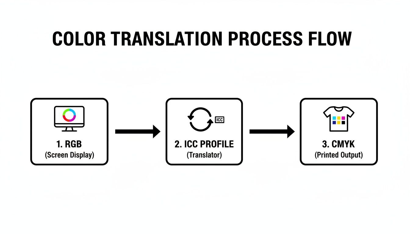
As you can see, the ICC profile is the critical bridge. It takes the vibrant RGB language of your digital design and converts it into the precise CMYK ink instructions your printer needs to recreate it.
From Your Screen to the Heat Press
So where do you actually use these profiles? It all happens inside your design software (like Adobe Photoshop or Affinity Designer) and, most importantly, in your RIP (Raster Image Processor) software.
Your design program uses the display profile to show you an accurate preview of your colors. But the real work happens in the RIP. The RIP is the brain of the operation, preparing your file for the printer.
When you send your artwork to the RIP, you'll select the specific output profile built for your Cobra DTF inks and film. The RIP software then uses that profile's data to handle the final color conversion with incredible precision. It calculates the exact mix of CMYK ink droplets needed to hit the colors you chose back on your monitor. To get a better feel for this, you can check out our guide on the best DTF printing software and see how different RIPs manage color.
Fun fact: By the early 2000s, ICC-based color management became the global standard for professional graphics. This is a huge deal. It means a small print shop in the USA using the right profiles can perfectly match the brand colors for a client on the other side of the world, every single time.
This isn't just a "nice to have" process; it's essential for professional, repeatable results. Printing with a generic profile is like throwing a dart in a dark room. Using a custom output profile that matches your exact setup is how you hit the bullseye, print after print.
Putting ICC Profiles to Work with Your Cobra DTF System
Alright, you've got the theory down. Now for the fun part: putting that knowledge into practice. This is where we bridge the gap between abstract color concepts and the real-world results you get from your Cobra DTF printer.
Mastering your color workflow isn't just a technical skill; it’s smart business. A dialed-in process cuts down on wasted film and ink, builds trust with your customers, and makes every single print predictable and professional. Let’s walk through the three essential steps to get it right every time: soft-proofing, applying, and embedding your profiles.
Preview Your Prints with Soft-Proofing
Before you commit a single drop of ink, you can see an incredibly accurate preview of the final print right on your computer screen. This is a game-changing feature called soft-proofing. It uses your printer’s specific ICC profile to simulate exactly how your design will look once it's printed with your Cobra DTF inks on film.
Think of it as a free digital test print. It stops you from wasting expensive materials on a design whose colors simply won't translate from a bright RGB monitor to the physical CMYK world. Most professional design programs, like Adobe Photoshop and Affinity Designer, have a dedicated soft-proofing mode.
When you flip it on and select your Cobra DTF profile, you'll see your screen’s colors shift to show you what’s actually achievable. Those super-vibrant electric greens or deep royal blues might look a little less punchy. That's not a mistake! That's the profile giving you an honest preview, allowing you to make crucial adjustments before you hit print.
By making soft-proofing a regular part of your process, you can catch color problems early, manage client expectations, and dramatically reduce material waste. It's one of the simplest ways to make your workflow more profitable.
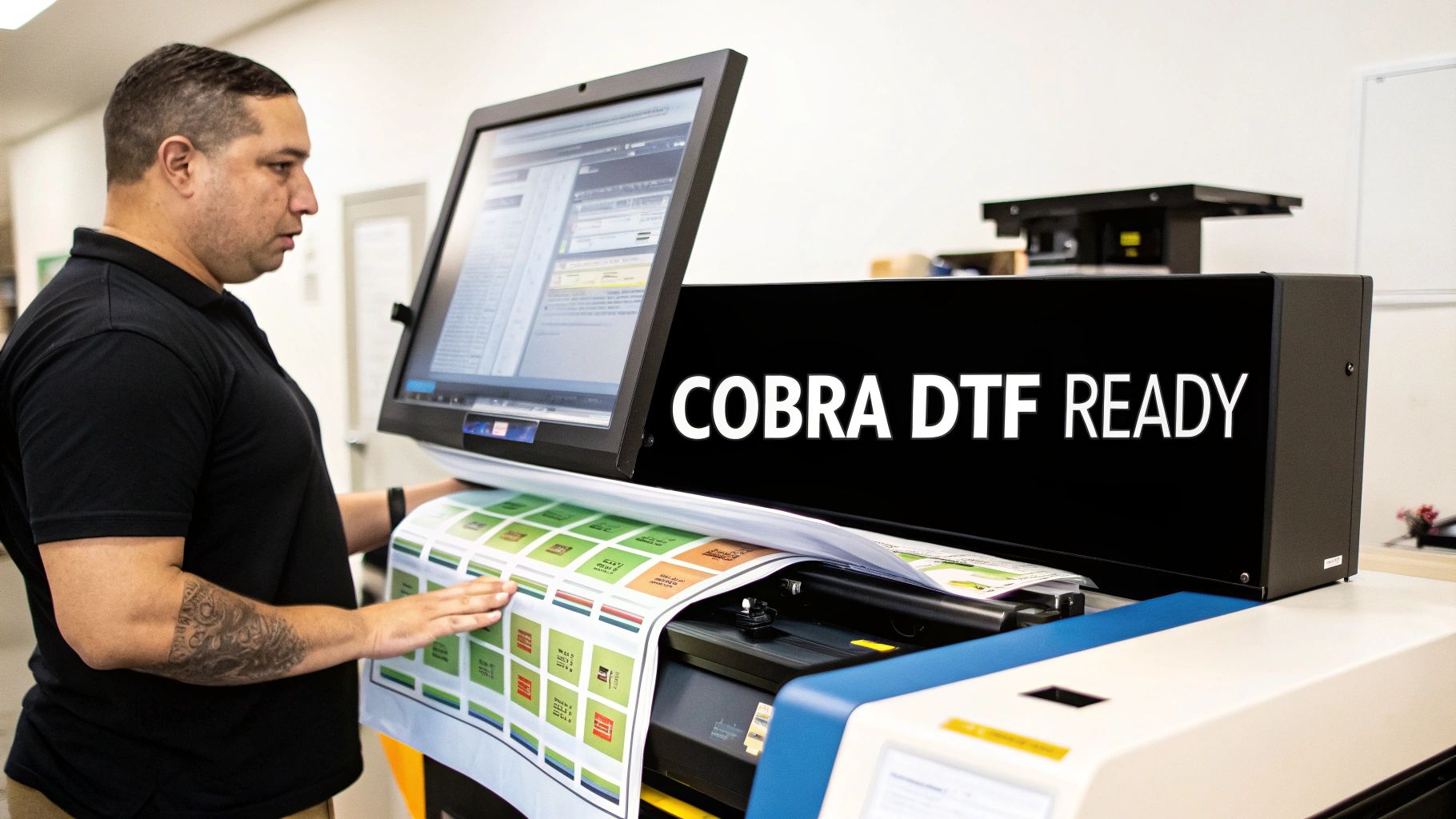
Apply the Correct Profile in Your RIP Software
This is the make-or-break moment. Applying the correct output profile in your RIP (Raster Image Processor) software is what translates your design into a language the printer understands. It tells the printer exactly how to mix its CMYK inks to reproduce the colors you see on screen.
When you load your artwork into your RIP, you have to select the specific ICC profile built for your Cobra DTF printer, ink, and film combination. Using a generic profile—or even worse, no profile at all—is like asking a chef to bake a cake without a recipe. You might get something, but it won't be what you wanted.
Here’s how simple the process is:
- Load Your Design: Open your print-ready file in your RIP software.
- Find the Color Settings: Look for a tab or menu labeled "Color Management" or "Printer Settings."
- Select the Output Profile: From the dropdown menu, choose the specific Cobra DTF ICC profile for your setup.
- Confirm and Print: Double-check that other settings align with the profile's recommendations, then send the job to the printer.
Getting this step right is non-negotiable for achieving professional quality. If you want to learn more about how different inks behave and why a matched profile is so critical, check out our guide to DTF printer ink.
Embed Profiles to Preserve Your Color Intent
So, what happens when you need to save a file or send it to a client for approval? You need to make sure your color "recipe" travels with the design file. The way to do that is to embed the ICC profile.
When you save your artwork in formats like TIFF, PSD, or PDF, look for a checkbox that says something like "Embed Color Profile." Always check this box. Embedding the profile is like attaching a detailed instruction manual for the colors in your file. It tells any other computer or software exactly how your colors are supposed to look.
If you don't embed the profile, other systems will have to guess, and that almost always leads to unexpected—and disappointing—color shifts.
Here’s a quick-reference table for embedding profiles in some of the most popular design tools.
ICC Profile Settings in Common Design Software
| Software | Export Format | Where to Find the 'Embed Profile' Setting |
|---|---|---|
| Adobe Photoshop | TIFF, PSD, JPG, PDF | Found in the "Save As" or "Export As" dialog box. Look for a checkbox labeled "Embed Color Profile." |
| Adobe Illustrator | PDF, AI, EPS | In the "Save As" dialog for PDF, it's under the "Output" section. Check "Include All Profiles." |
| Affinity Designer | PDF, TIFF, PSD | In the "Export" dialog, click "More..." and ensure "Embed ICC profile" is checked under the "Color" options. |
| CorelDRAW | PDF, JPG | When exporting to PDF, go to the "Color" tab in the settings window and select "Embed color profiles." |
Always embedding the profile ensures that whether you're printing today or opening the file a year from now, the colors will remain consistent and true to your original vision.
Troubleshooting Common DTF Color Issues
Even when you follow all the steps, color problems can still pop up. There’s nothing more frustrating—or costly—than pulling a freshly pressed shirt off the heat press only to see that the colors are all wrong. This section is your field guide for figuring out what went wrong and how to fix it.
Think of it like being a detective. Every color shift is a clue, and your job is to trace it back to the source. More often than not, the culprit isn't a broken printer; it's a tiny misstep somewhere in your color management workflow. Let's dig into the usual suspects.
Why Are My Reds Printing Orange or Pink?
This is easily one of the most common headaches in the print world. You’ve designed something with a beautiful, rich crimson, but the final transfer looks like a weak, orangey-red or even a faded pink. This is a classic sign that your color data is getting lost in translation.
When your reds look weak, it usually means the printer isn't getting the right command to lay down the proper amount of magenta and yellow ink. A few things could be causing this communication breakdown.
Here’s a quick checklist to run through:
- Incorrect Profile Selected: Are you 100% positive you chose the correct ICC profile for your specific Cobra DTF ink and film inside your RIP software? Grabbing a generic profile, or one meant for a different material, will throw your colors way off.
- Missing Embedded Profile: Take a look at the original design file you sent to the RIP (your TIFF, PDF, etc.). Does it have an RGB color profile, like sRGB or Adobe RGB, embedded in it? If that information is missing, your RIP software is forced to guess what the colors are supposed to be, and it's not a very good guesser.
- Soft Proofing Mismatch: Did you use the soft-proofing feature before hitting print? This is exactly what it’s for. Soft proofing would have flagged this color shift on your screen, letting you know that the specific red you chose was "out of gamut." That’s just a technical way of saying your printer’s inks physically can't reproduce that particular vibrant shade.
Why Do My Blacks Look Gray and Muted?
Right behind bad reds is the disappointing gray-black. Your design has a deep, solid black, but the print comes out looking flat, washed out, and just plain unprofessional. Getting a truly deep black isn’t just about using black ink; it requires a precise mix of all the CMYK colors.
A "rich black" is a print industry term for black ink that’s fortified with other colors (like cyan or magenta) to create a much deeper, more saturated tone. An incorrect ICC profile often fails to build this mix, leaving you with a one-dimensional, weak gray.
If your blacks are looking faded, here’s what to check:
- Profile Rendering Intent: Dive into your RIP software's settings and find "Rendering Intent." For designs with photos and smooth gradients, Perceptual is usually your best bet. If you're printing solid logos or brand colors, Relative Colorimetric might give you a better result. The wrong setting here can seriously weaken your blacks.
- Ink Levels and Nozzle Check: I know, it sounds too simple, but it happens all the time. A partially clogged nozzle on your cyan or magenta printhead can stop a rich black from ever being formed. Before you do anything else, run a quick nozzle check to make sure every color is firing perfectly. For more on this, check out our guide on how to improve print quality for some handy maintenance tips.
- Source File Black Value: Check the black in your original design file. If it’s just 100% K (black ink), you aren't giving the printer much to work with. A properly calibrated ICC profile should handle a standard RGB black just fine, but sometimes defining a rich black in your design software (by adding a bit of C, M, and Y) can help.
By working through these points one by one, you can track down the source of most common color frustrations. Soon, you’ll be back to producing the kind of vibrant, accurate prints that keep customers coming back.
Got Questions? Let's Talk ICC Profiles
Even after you've got the basics down, you're bound to have some questions. It's totally normal. Here are some of the most common things we hear from DTF shop owners, with straightforward answers to help you get back to printing.
Do I Really Need to Use an ICC Profile for Every Single Job?
Honestly, for consistently great results, yes. Using an ICC profile every time is the only way you can be certain your colors will be predictable and repeatable. This is a game-changer when you're printing a client's brand logo or any artwork where getting the color just right is non-negotiable.
Think of it as a crucial quality check. It's a small step in your process that prevents the massive headaches of reprints, wasted film and ink, and frustrated customers. It removes the guesswork.
Where Can I Find the Right ICC Profile for My DTF Printer?
The absolute best profile is one that’s custom-made for your exact setup. I'm talking about your specific printer, your brand of ink, the DTF film you use, and even the powder. A generic profile that came with your printer is better than nothing, but it just can't account for all those little variables that make your shop unique.
Good suppliers, like Cobra DTF, often provide custom profiles made to work perfectly with their products. That should always be your first stop. A profile built for your specific materials will outperform a generic one every single time—it's the key to truly accurate color.
Your ICC profile isn't just some file you download. It's the digital fingerprint of your entire printing process. Using one made for your specific inks and film is the single biggest move you can make to master your color output.
What's the Difference Between "Assigning" and "Converting" a Profile?
This is a great question, and it really gets to the core of how your design software and your RIP software talk to each other. They sound similar, but they do completely different jobs.
- Assigning a Profile: This is like putting a label on your image. It tells the software, "Hey, the color numbers in this file should be interpreted using the sRGB color language." It doesn't actually change any of the color values in your design.
- Converting a Profile: This is where the magic happens. It physically changes the color data in your file to match how it will look in a different color space. Your RIP software does this when it takes your design's RGB data and translates it into the specific CMYK+W instructions your printer needs, using your output profile as its guide.
Simply put, you assign a profile in your design software, and your RIP converts those colors for the printer.
Can I Still Use an ICC Profile if My Monitor Isn't Calibrated?
You can, and you absolutely should. A professionally calibrated monitor gives you the best on-screen preview (the most accurate soft proof), but the ICC profile is what controls the actual printed color. That's what really matters.
Without a calibrated screen, what you see might not be a perfect match for the final shirt, but the print itself will be consistent and repeatable every time you run that job. And for your business, that consistency is gold. The printer profile guarantees reliable output; monitor calibration just makes sure your screen matches it.
Ready to stop guessing and start printing with confidence? The team at Cobra DTF provides premium, USA-made transfers and the expertise to help you master your color workflow. Explore our products and see the difference that quality and consistency can make for your business.