
A DTF Guide on How to Improve Print Quality
When it comes to getting better DTF prints, you need to think about four key areas that all work together: your environment, software settings, materials, and machine maintenance. Nailing a flawless Direct-to-Film (DTF) transfer isn't about finding one magic setting; it’s about a holistic approach to managing these pillars for consistent, professional results.
Why Your DTF Prints Aren't Perfect
Let's be honest—achieving that perfect DTF print can feel like you're chasing a moving target. If you've ever pulled a transfer with faded colors, fuzzy text, or a design that just doesn't pop, you’re not alone. The good news is that getting professional-grade results is entirely within reach once you understand how a few critical areas connect.
This isn't about hunting down a single, elusive setting. It's about systematically controlling the variables in your workflow. Think of it as having a roadmap to diagnose issues and make targeted tweaks that lead to reliable, high-quality prints every single time.
The Four Pillars of Print Quality
To truly master your DTF process, you have to focus on four foundational pillars. Each one directly influences the final look, feel, and durability of your prints. If you let even one of them slide, you’ll end up with frustrating inconsistencies and a pile of wasted materials.
Getting these elements right is what separates hobbyist results from professional production. I've broken down the entire DTF process into what I call the "Four Pillars." Master these, and you'll master your prints.
Four Pillars of High-Quality DTF Printing
| Pillar | Key Factors | Impact on Quality |
|---|---|---|
| Print Environment | Temperature, humidity, dust, and airflow. | Affects ink flow, film static, powder application, and curing consistency. |
| Software & Settings | RIP software configuration, color profiles (ICCs), ink density, and resolution. | Controls color accuracy, vibrancy, print sharpness, and overall detail. |
| Materials & Handling | Quality of ink, film, and powder; proper storage and usage. | Determines the transfer's feel, stretch, washability, and color fidelity. |
| Printer Maintenance | Regular cleaning, nozzle checks, and component upkeep. | Prevents common defects like banding, ink starvation, and clogged printheads. |
Each pillar is a piece of the quality puzzle. You can have the best materials in the world, but if your maintenance is lacking, your prints will suffer. Likewise, perfect settings won't save you if your workshop's humidity is all over the place.
This relentless pursuit of quality is what’s pushing the whole industry forward. In fact, the global digital printing market was valued at USD 38.07 billion in 2023 and is expected to hit USD 57.03 billion by 2030, a jump driven largely by innovations that improve print fidelity. You can learn more about the industry's growth in digital printing technology.
My Two Cents: Stop troubleshooting in silos. The most effective way to level up your print quality is to take a holistic view that addresses your environment, settings, materials, and maintenance routine all at once.
Throughout this guide, we'll dive deep into each of these pillars. I'll show you exactly how every piece of the puzzle affects your final product, setting you up for repeatable success and prints you can be genuinely proud of.
Fine-Tuning Your RIP Software and Printer Settings

If you really want to level up your DTF prints, you have to get comfortable with your Raster Image Processor (RIP) software. It's the brain of your whole operation. Moving beyond the default settings is probably the single biggest thing you can do to improve your quality, because this is where a digital design gets translated into a physical, high-quality set of instructions for your printer.
Think of the RIP as a translator. It takes your design file—like a PNG—and turns it into a language the printer can actually use: precise dots of ink. How good that translation is will directly affect the vibrancy, sharpness, and accuracy of the final print.
Default settings are a decent starting point, sure, but they're made to be a catch-all. They aren’t optimized for your specific design or materials. To get those truly professional results, you've got to roll up your sleeves and tweak things yourself.
Mastering Your White Ink Underbase
The secret to getting colors to pop on dark or colored shirts? It all comes down to a perfectly calibrated white ink underbase. This layer is like the primer on a canvas; it stops the garment's color from muddying your design. I see a lot of lackluster prints, and a weak underbase is almost always the culprit.
If you use too little white ink, you'll get a washed-out, almost translucent look where the shirt color peeks through. But go too heavy, and the final transfer feels thick and rubbery, and you might even run into problems with curing.
Finding the sweet spot depends entirely on your design and the garment.
- Photorealistic Designs on Black Shirts: For a complex, full-color image going on a dark tee, you'll need a stronger foundation. I usually start with a white ink percentage between 65-80%. This gives every color a solid white base to sit on, making them as vibrant as possible.
- Simple Text or Logos: If you're just printing a basic logo on a mid-tone shirt, you can back off the white ink. Something in the 50-60% range is often plenty to provide opacity without adding needless bulk.
Pro Tip: Never skip a test print. When you're using a new design or garment, run a small test with a few different underbase settings. What looks great on your monitor can feel and look completely different once it's pressed. A quick test will save you a ton of time and wasted materials down the line.
The Non-Negotiable Role of ICC Profiles
If the underbase is your foundation, then your ICC profile is the blueprint for color accuracy. An ICC profile is basically a data file that tells your system how your specific printer, ink, and film combination reproduces color. It bridges the gap between your screen and the final print.
Without the right ICC profile, your printer is just guessing. You might send it a beautiful, vibrant red from your design software, only for it to print a dull, orangey version. The profile corrects for these discrepancies, ensuring what you see is what you get.
It is absolutely crucial to use a profile built specifically for your setup, like your Cobra DTF ink and film. Generic profiles just can't account for the unique properties of your materials, which leads to frustrating color shifts and endless reprints. Making sure you've chosen the right DTF printing software is a great first step to managing these profiles.
Dialing in Resolution and Dot Size for Detail
Resolution, measured in Dots Per Inch (DPI), has a direct impact on the sharpness of your prints. It's tempting to just crank this setting to the max, but it’s really about finding the right balance for the job at hand.
- High-Detail Graphics: For designs with really fine lines or smooth gradients, a higher resolution like 1440x720 dpi is your best bet. It uses smaller ink droplets placed closer together, creating a much smoother, more detailed image.
- Blocky Designs: For simpler, bolder designs without tiny details, you can often get away with 720x720 dpi. It's more than enough for the job and will speed up your print times.
Beyond just the DPI, most RIPs also let you control the dot size (usually labeled as small, medium, or large). Smaller dots are fantastic for photorealistic details and smooth gradients. Larger dots are more efficient for laying down solid blocks of color.
And remember, great output starts with great input. It's worth understanding 300 DPI resolution for printing to make sure your art files are print-ready before they even touch the RIP.
Advanced Adjustments Choke and Ink Channels
Once you're comfortable with the basics, you can start digging into the more advanced settings for that extra bit of polish. Choke is a perfect example—it's a critical tool for getting perfectly crisp edges. All it does is slightly shrink the white underbase layer so it sits just inside the color layer on top.
This small adjustment prevents any white ink from peeking out around the edges of your design, which can create a fuzzy, unprofessional-looking outline. I typically start with a choke setting of 1 to 3 pixels, but you might need to tweak this depending on your print head alignment.
You can also get incredibly precise by fine-tuning individual ink channel levels. If you notice your reds are running a little hot or your blues seem weak, you can simply go in and decrease the Magenta or bump up the Cyan. This kind of granular control is how you achieve perfect color balance, dialed in for your specific machine.
Dialing in Your Materials and Print Environment
Getting your software settings perfect is a huge step, but it's only half the story. Your physical workspace and the materials you use are just as important for getting that perfect print. I've seen beautifully calibrated RIP profiles completely undone by humid film or ink that wasn't mixed properly. Let's get into the tangible things you can control to build a solid foundation for every single print job.
Think of your print room as a critical part of the machine. If your temperature and humidity are all over the place, you're going to be chasing your tail trying to get consistent results. Nail this down first, and everything else gets easier.
Creating a Stable Print Workspace
Your shop's climate is probably the most overlooked variable in DTF printing. It's also one of the most critical. Ink, film, and powder are all incredibly sensitive to the environment, and an unstable room can trigger a whole chain of frustrating problems.
The sweet spot for humidity in a DTF workshop is right between 40% and 60%. If your room is too dry (below 40%), you'll constantly be fighting static. That means powder flying everywhere and clinging to your film in all the wrong places. But too much humidity (above 60%) is even worse. It can make the film's coating go soft, causing your ink to bleed and spread. It also makes the adhesive powder clump up, leaving you with a splotchy, uneven mess.
A stable temperature is just as crucial. You want to keep the room somewhere between 68-78°F (20-26°C). Big temperature swings can mess with your ink's viscosity, which leads to inconsistent jetting from the printhead and can even cause clogs. It also makes the film itself expand and contract, which can cause the edges to curl and risk a dreaded head strike.
A Quick Tip from Experience: Grab a cheap digital hygrometer/thermometer and stick it on the wall in your print room. It’s a small investment that gives you a constant read on your environment. A quick glance tells you if you need to fire up a dehumidifier or a small space heater before you even think about printing for the day.
While this advice is specific to DTF, the core principles of maintaining a stable workspace are universal. For a deeper dive, it's worth understanding indoor environmental quality standards to see the bigger picture.
Best Practices for Ink and Film Handling
Your consumables are the lifeblood of your business. How you store and prepare them has a direct, immediate impact on your final product. These aren't just suggestions; think of them as non-negotiable steps for getting those vibrant, long-lasting prints you're after.
Ink Management is Crucial
Those heavy pigments in DTF ink love to settle, especially the titanium dioxide that makes your white ink opaque. When that pigment sinks to the bottom of the bottle, you get weak, watery-looking white layers and your colors won't pop.
- Shake Your White Ink Daily: This is a must. Before you print anything, grab that white ink bottle and shake it hard for at least 60 seconds. You need to get that pigment re-suspended to ensure you’re laying down a thick, consistent base.
- Gently Agitate Colors: Your color inks don't separate nearly as much, but it's still good practice to give them a gentle swirl or a roll a few times a week to keep everything nicely mixed.
Proper Film and Powder Storage
Moisture is the enemy of your DTF film and powder. Leaving them out in an open, humid room is basically asking for trouble.
- Keep It Sealed: When you're not using them, always store your film rolls and adhesive powder in airtight containers or their original sealed packaging. I like to toss a few silica gel packets in there just to soak up any sneaky ambient moisture.
- Spotting Quality Film: Good film should feel smooth with a perfectly even coating. If you run your hand over it and notice blemishes, greasy spots, or any inconsistencies, that’s a red flag. Those defects can seriously mess with how the ink adheres.
Paying attention to these details means you're starting with a transfer that's ready to perform. Of course, even a perfect transfer needs the right canvas. To make your work truly shine, make sure you're using the best shirts for DTF that can really showcase your quality.
Mastering the Curing Process
Curing the adhesive powder is the final step before you head to the heat press. This is where you lock in the transfer's durability and give it that soft-hand feel. The goal isn't to just melt the powder into a flat, plastic sheet; it's a bit more nuanced than that.
As you heat the powdered transfer, watch it like a hawk. You're looking for that magic moment when the fine, sugary-looking powder transforms into a glossy, slightly bumpy surface. The perfect texture looks a lot like the peel of an orange.
That "orange peel" texture is your visual confirmation of a perfect cure. If you over-cure it, the adhesive can become brittle and crack. If you under-cure it, the transfer won't stick properly and will probably peel off after the first wash. Getting that texture just right means the adhesive has melted perfectly to bond with the ink, creating a strong yet flexible layer that's ready for pressing.
Keeping Your DTF Printer Running Like a Dream: A Practical Maintenance Routine
If there's one secret to consistently great DTF prints, it's proactive care, not reactive repairs. An unmaintained printer is the fastest way to get clogged nozzles, ugly banding, and a pile of wasted film and ink.
Think of it like changing the oil in your car. It might feel like a chore, but skipping it is a surefire way to face much bigger, more expensive headaches down the road. Committing to a simple routine is honestly the best thing you can do for your print quality and the longevity of your machine.
Daily Habits for Flawless Prints
These quick checks take less than five minutes at the start of your day but will save you hours of frustration. They’re all about making sure your printer is ready to go from the very first print.
- Always Run a Nozzle Check: This is non-negotiable. Before a single print job, run a nozzle check. A perfect pattern tells you every nozzle is firing cleanly. If you see any gaps or broken lines, you've caught a minor clog early. Just run a head cleaning cycle to fix it before it becomes a real blockage.
- Wipe the Capping Station: Your printhead rests on the capping station, and it collects ink gunk over time. Take a foam swab and some cleaning solution and gently wipe the rubber seal. This ensures a perfect seal, which stops air from drying out your precious printhead nozzles.
- Shake That White Ink! White ink is notorious for pigment separation, a leading cause of clogs. Make it a daily habit to give your white ink bottle or cartridge a good, hard shake for 30-60 seconds. This gets that heavy titanium dioxide pigment back into suspension where it belongs. You can dive deeper into ink management in our complete guide to DTF printer ink.
These three little steps are your best defense against the most common print quality killers.
I learned this the hard way: skipping a single day of shaking the white ink led to a week of frustrating clogs and inconsistent prints. Now, it’s the first thing I do when I walk into my shop. Treat it as an essential part of your startup procedure.
Weekly Upkeep for Long-Term Reliability
Set aside 15-20 minutes once a week for a slightly deeper clean. These tasks tackle the parts that slowly build up with dust and ink residue—the kind of grime that can degrade your print quality so gradually you might not even notice it's happening.
A tiny bit of gunk in the wrong place can cause chaos. A single speck of dust on your encoder strip, for example, can throw off the printhead's positioning and cause vertical banding that ruins an entire transfer.
Keeping your printer in top shape is all about consistent, small actions. This simple checklist covers the essential daily, weekly, and monthly tasks that prevent the vast majority of print quality issues before they can even start.
DTF Printer Maintenance Schedule
| Frequency | Task | Reason |
|---|---|---|
| Daily | Nozzle Check | Catches clogs before they become serious blockages. A perfect pattern means you're ready to print. |
| Daily | Wipe Capping Station | Ensures a tight seal to prevent the printhead nozzles from drying out overnight. |
| Daily | Shake White Ink | Prevents pigment separation, which is a primary cause of white ink clogs and starvation. |
| Weekly | Clean Encoder Strip | Dust or ink on this strip can cause vertical banding, misaligned prints, or printer errors. |
| Weekly | Clean Wiper Blade | A dirty blade just smears old ink across the printhead, leading to streaks and poor nozzle cleaning. |
| Weekly | Inspect Ink Lines | Look for air bubbles that can cause "ink starvation" and gaps in your prints. |
| Monthly | Lubricate Carriage Rail | Ensures the printhead moves smoothly and reduces wear on the motor and belt. |
| Monthly | Perform a Wet Cap | Soaking the printhead on the capping station with cleaning fluid can dissolve stubborn internal gunk. |
Sticking to a schedule like this turns maintenance from a stressful reaction into a simple, effective routine. You'll spend far less time troubleshooting and much more time printing amazing products.
Essential Monthly Deep Cleans
Once a month, it's time for a more thorough cleaning to reset your machine and knock out any long-term buildup. This is your defense against that slow, creeping decline in quality that can sneak up on you.
Think of it as hitting the reset button to keep your printer operating like it just came out of the box.
Here are a couple of key monthly tasks:
- Lubricate the Rail: The metal rail the printhead carriage travels on needs to be slick. Apply a few drops of the manufacturer-recommended oil to keep its movement smooth and precise, which reduces wear on the motors.
- Perform a Wet Cap or Ink Flush: Depending on your printer, you may want to perform an ink flush to clear sediment from the lines and dampers. A simpler alternative is a "wet cap," where you place a small amount of cleaning solution in the capping station and park the head on it overnight to dissolve stubborn clogs.
- Clean Around the Printhead: Carefully clean any ink overspray or dust from the areas around the printhead carriage. You don't want that debris falling onto your film in the middle of a print.
By breaking maintenance into these simple daily, weekly, and monthly chunks, the whole process becomes easy to manage. You’ll spend less time fighting with your printer and more time creating products you’re proud to sell.
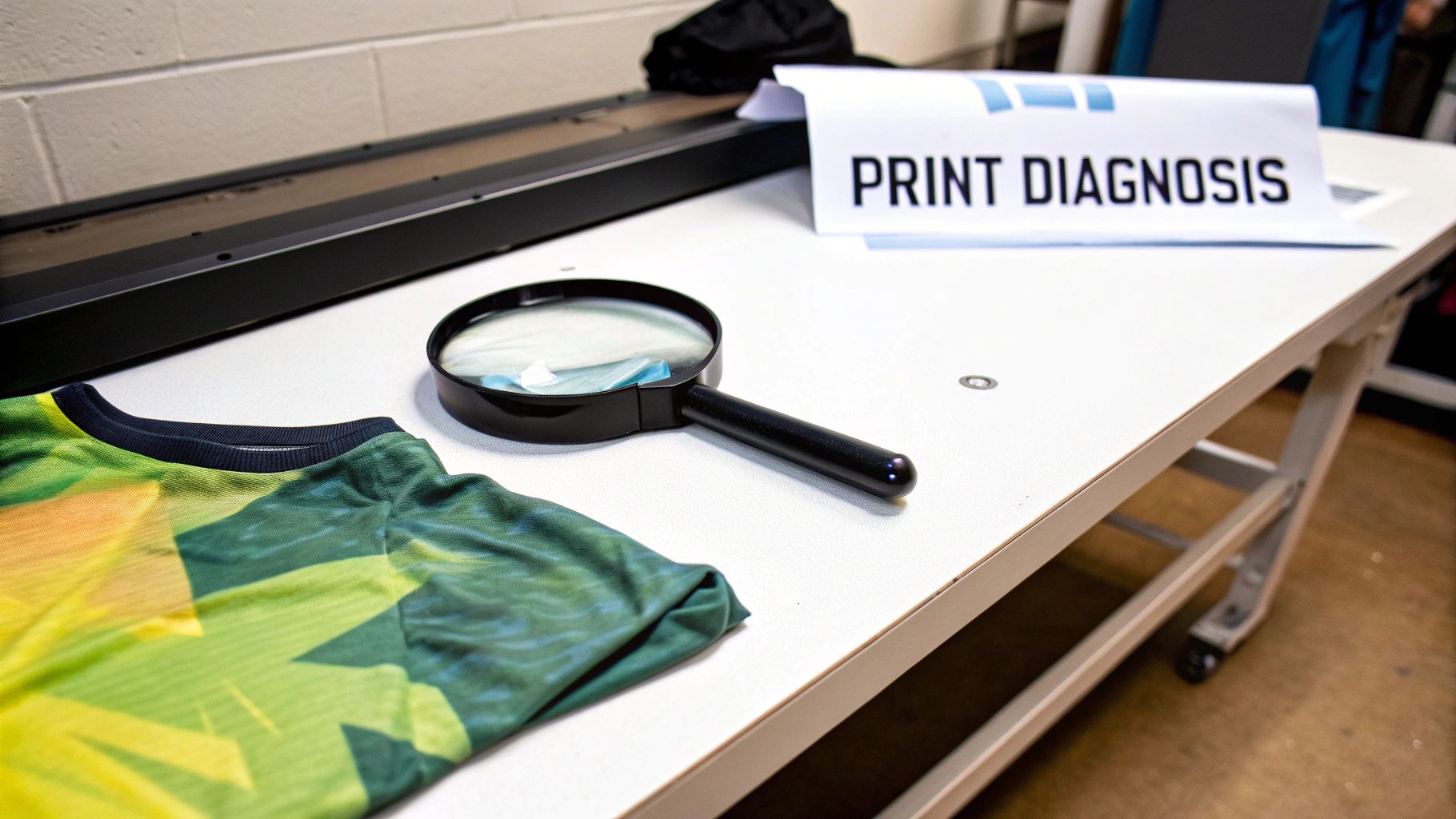
A Visual Guide to Troubleshooting Print Defects
Even when you've dialed in your settings and are using the best materials, print defects are just part of the game. The real skill is learning how to diagnose the problem quickly instead of burning through time, ink, and film with guesswork. This is your problem-solving toolkit—a visual guide to spotting common DTF issues and taking clear, immediate steps to fix them.
Think of it as your troubleshooting roadmap. When a print comes out looking funky, you can come here, match the defect to a description, understand the likely culprits, and follow a simple checklist to get your production back on track. This approach turns frustrating mistakes into valuable learning experiences that ultimately make your prints better.
Identifying and Fixing Banding Issues
Banding is probably the most common headache you'll run into. It shows up as distinct, ugly horizontal lines running across your print, completely ruining the smooth look of colors and gradients.
What It Looks Like
You’ll see faint or obvious lines, sometimes evenly spaced, sometimes random, that slice through solid areas of your design. It can range from a subtle texture to a glaring flaw that makes the print unusable.
Most Likely Causes
Nine times out of ten, the root cause is an interruption in ink flow from the printhead. This usually boils down to one of these culprits:
- A partially clogged nozzle in the printhead.
- A misaligned printhead (bidirectional alignment is off).
- Low-quality or poorly agitated ink.
- Pesky air bubbles trapped in your ink lines or dampers.
How to Fix It
Always start with the easiest fix first and work your way up.
- Run a Nozzle Check: This is your first line of defense. If that test pattern shows any missing lines or gaps, run a head cleaning cycle and print it again. You may need to repeat this two or three times.
- Perform a Head Alignment: If your nozzle check looks perfect but you still see banding, your bidirectional alignment is likely the problem. Run the alignment calibration from your printer’s utility menu. This ensures the printhead is laying down ink accurately on both its left-to-right and right-to-left passes.
- Check Your Ink: Give your inks a good shake, especially the white. Old, separated, or poorly formulated ink is a common cause of inconsistent flow.
Correcting Inaccurate or Muddy Colors
Nothing is more frustrating than seeing the vibrant red on your monitor print as a dull, brick-like color on the transfer. It’s a classic sign of a color management breakdown and can make even the best designs look flat and amateur.
This handy flowchart gives you a visual guide to the maintenance routine that serves as your best defense against most print quality problems.
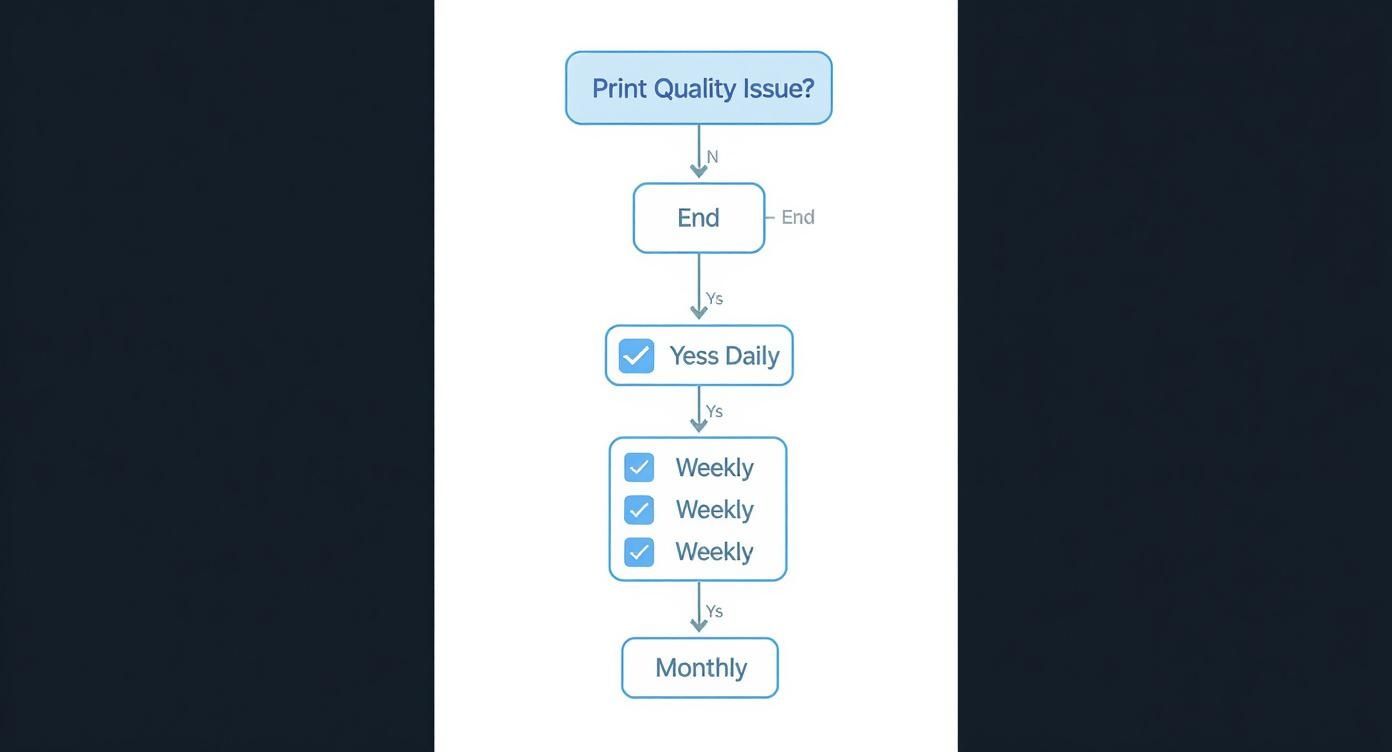
As the chart shows, consistent daily, weekly, and monthly checks are the bedrock of good printing, preventing issues before they ever have a chance to start.
What It Looks Like
The colors on your finished print just don't match your source file. They might look faded, washed out, have a weird color cast (like a yellow or blue tint), or be completely different shades altogether.
Most Likely Causes
This is almost always a software or data problem, not a mechanical one. The usual suspects are:
- The wrong ICC profile is selected in your RIP software.
- Your source file is in the wrong color mode (e.g., RGB vs. CMYK).
- Your monitor isn't calibrated, giving you a false sense of your colors.
- You have a clogged nozzle in a specific color channel (for example, a clogged magenta nozzle will make your reds look orange).
A Quick Insight: Your ICC profile is basically a translator. It converts the RGB colors your screen understands into the precise CMYK+W recipe your specific printer, ink, and film combo needs to hit that color. Using a generic profile is like using a bad translator—the original meaning gets lost.
Sharpening Blurry Edges and Ink Bleeding
Crisp, sharp lines are the signature of a professional-quality print. If your designs have fuzzy edges or look like the ink is spreading, it instantly cheapens the final product and destroys any fine detail.
What It Looks Like
The edges of your design aren't clean and well-defined. Text might be tough to read, and you may see a "halo" of color bleeding beyond the intended border of the graphic.
Most Likely Causes
This defect usually points to an issue with your environment, materials, or settings.
- High Humidity: If your print room's humidity creeps above 60%, the DTF film's coating can absorb that moisture, causing the ink droplets to spread out before they have a chance to dry.
- Over-Inking: You might be putting down too much ink. Check the ink density or saturation settings in your RIP software; if they're too high, the film simply can't handle the volume.
- Poor Quality Film: Not all films are created equal. A low-grade film might have an inconsistent coating that actively encourages the ink to bleed.
The professional printing world is increasingly turning to automated inspection to catch these flaws. In fact, the global print quality inspection market was valued at USD 675.2 million in 2024, as more businesses invest in systems that use cameras and AI to spot defects instantly. You can read more about how technology is advancing print quality. Even though you're likely inspecting by eye, the principle remains the same: catching errors early saves money and protects your reputation.
Your Top DTF Print Quality Questions, Answered
Even when you think you've got everything dialed in, little issues can pop up. That's just part of the DTF learning curve. Here are some of the most common questions we hear from folks trying to perfect their prints, along with some practical, no-nonsense answers.
How Often Should I Really Run a Nozzle Check?
Honestly? Before your first print of the day, every single day. Make it a habit. It's the simplest, quickest thing you can do to avoid wasting a ton of film and ink on a print that was doomed from the start.
If you're in the middle of a long production run, it's also a good idea to run a quick check every four to five hours. Think of it as a two-minute insurance policy. It can catch a tiny clog before it turns into a major headache and ruins an entire batch.
Can I Mix and Match Different Brands of Ink and Film?
Look, you can, but it's one of the fastest ways to introduce chaos into your workflow. If you want consistent, repeatable results, stick with a complete system—ink, film, and powder—from one supplier you trust.
Key Takeaway: All those components are engineered to work together. When you use a matched set, especially with the right ICC profile, you eliminate so many variables. It’s the clearest path to getting the color and adhesion you expect, every single time.
My Shirt Colors Don't Match My Screen. What's Going On?
Ah, the classic color matching puzzle. The first thing to remember is that your monitor is probably lying to you unless it's been professionally calibrated. What you see on screen is just a bright, backlit approximation.
The real fix happens in your RIP software. You absolutely have to be using the correct ICC profile for your specific printer, ink, and film combo. An ICC profile is basically a translator—it tells your printer exactly how to mix its CMYK and white inks to accurately reproduce the colors from your design file. Using the default profile is a shot in the dark.
Why Do the Edges of My Design Look Blurry or Jagged?
Fuzzy edges usually point to one of three culprits.
- Your Artwork: First, check your source file. Is it at least 300 DPI at the size you intend to print? If you're starting with a low-resolution image, you'll always get a fuzzy result. Garbage in, garbage out.
- Your RIP Settings: Dive into your RIP software and look for the "choke" or "ink spread" settings. If the white underbase is bleeding out from under the color layer, it creates that blurry halo effect. You might need to dial that choke in a bit.
- Your Printer Alignment: Sometimes, it's a simple mechanical issue. Running a bidirectional print head alignment through your printer's maintenance menu can often tighten everything up and give you those crisp, sharp edges back.
Ready to eliminate the guesswork and achieve consistently vibrant prints? At Cobra DTF, we provide a complete, USA-made system of inks, films, and powders designed to work together perfectly. Explore our premium materials and simplify your workflow at https://cobradtf.com.