

CMYK for Navy Blue: A Guide to Perfect Prints
The standard CMYK for navy blue is C:100, M:100, Y:0, K:50. However, that's rarely the final value you'll use on apparel, because substrate, ink behavior, white underbase, and curing all shift the way navy reads in the finished transfer.
If you're here, you've probably had the same experience most print shops run into sooner or later. The artwork looks clean on screen, the file is built carefully, and the printed navy comes out too purple, too dead, or too close to black. On DTF, that problem gets even more expensive because the film can look one way before pressing and another way after cure and transfer.
Navy is one of those colors that punishes shortcuts. It sits in a narrow zone where small changes in magenta balance, black depth, underbase strength, or fabric interaction show up fast. A bright blue can drift and still look intentional. Navy usually just looks wrong.
What works is a process, not a guess. Start with the standard formula, understand why it works, then adjust for the actual garment, film, RIP settings, and press conditions in front of you.
Why Your Perfect Navy Blue Looks Wrong on Fabric
A common job goes like this. The customer approves a navy logo on a monitor. The art file leaves the design station looking sharp and controlled. The transfer prints, gets cured, pressed onto a shirt, and suddenly the color reads as aubergine, charcoal, or a dull dark blue with no authority.
That isn't one problem. It's several stacked together.
Screen color is built from light. Print color is built from ink. Fabric adds another layer because the shirt surface, transfer adhesive, and white underbase all change how the eye reads the final blue. On apparel, navy is especially unforgiving because it has to stay cool, dark, and clean at the same time.
Where fabric changes the result
A navy transfer that looks respectable on one garment can fall apart on another. Cotton and polyester don't always present the same surface, and blends can push the same transfer in a different direction. If you print across multiple apparel types, it helps to compare how cotton and polyester behave in decoration workflows before you lock a navy formula for production.
Three failure patterns show up constantly:
- Purple shift: The magenta influence reads too strongly once the print is cured and pressed.
- Muddy navy: Black dominates and the color loses its blue identity.
- Washed-out dark blue: The transfer doesn't hold enough depth after application.
Navy usually fails by a small margin, not a dramatic one. That's why shops miss the cause and keep reprinting the same bad formula.
Why DTF makes this trickier
DTF adds variables that generic print advice doesn't address well. You're not just converting artwork from RGB to CMYK. You're also laying color over a white underbase, curing film, adding adhesive, then pressing onto a fabric surface under heat and pressure. Each stage can move navy a little. Those little moves add up.
The fix isn't to chase random numbers. The fix is to understand the base formula, then test it where the job lives: on the transfer, after cure, after press, on the intended garment.
The Foundation of Navy Blue in CMYK
A navy that looks right on screen can still print too purple, too flat, or too black once it runs through a DTF workflow. The starting build matters because every correction after that depends on whether the original CMYK recipe was sound.
For standard process navy blue, the common baseline is C:100, M:100, Y:0, K:50. That build is commonly associated with hex #000080, as noted earlier from Canva's navy blue reference. In practice, this formula gives shops a controlled place to start, not a guarantee of a perfect garment result. DTF still adds white underbase influence, film behavior, adhesive powder, and heat during application.
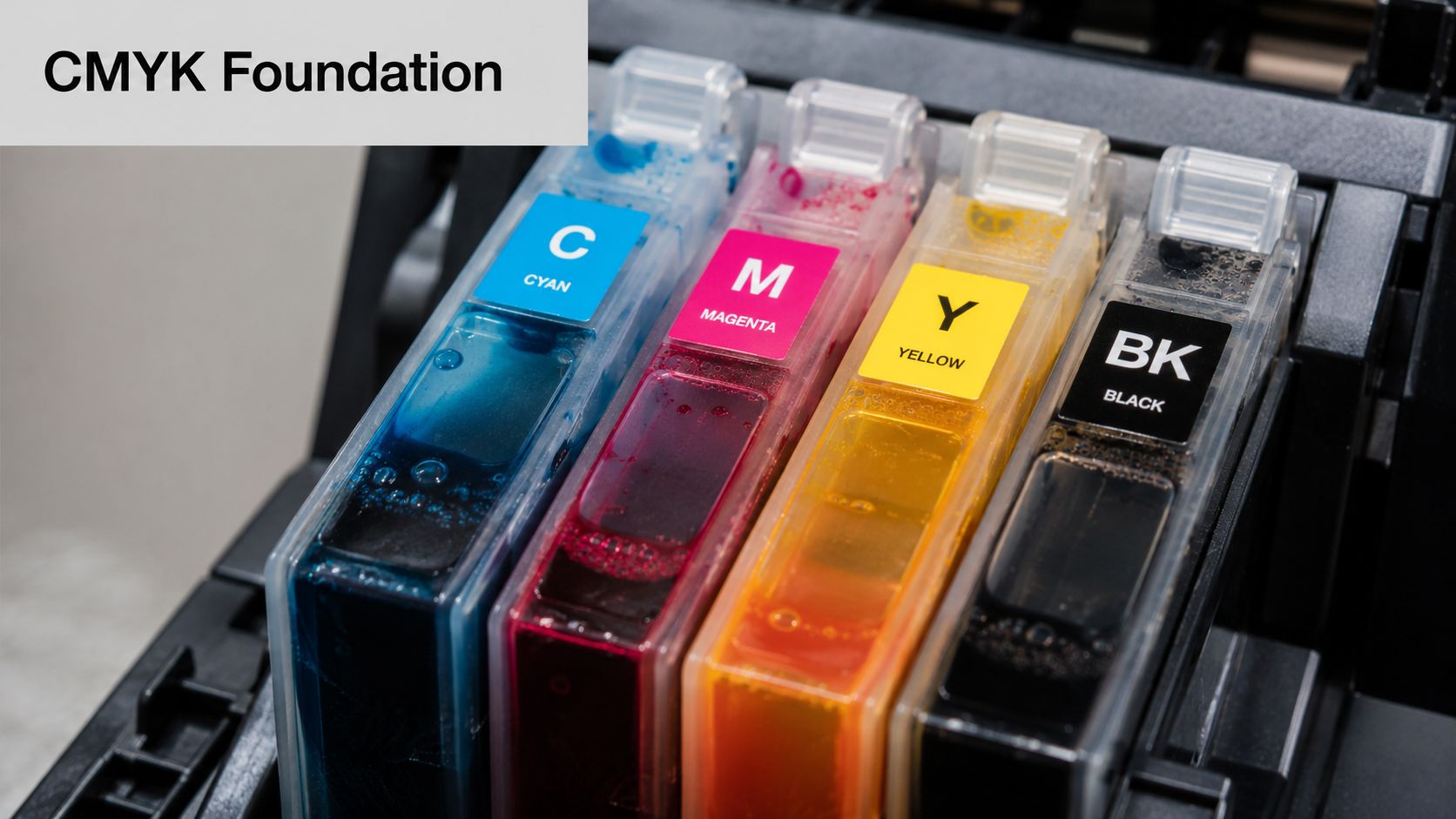
What each ink is doing
Each channel has a specific job in navy, and small changes are expensive when you are reprinting transfers.
- Cyan sets the blue direction: It keeps the color cool and prevents the mix from reading dull or warm.
- Magenta gives navy its depth in the blue-violet range: Without enough magenta, the color can drift toward a colder, less recognizable dark blue.
- Yellow stays at zero: Even a small yellow addition can dirty the mix and push navy away from the clean, formal look clients usually expect.
- Black controls depth and density: K does more than darken the file. It affects how heavy and serious the final color reads after transfer.
Why the 1:1 cyan and magenta ratio matters
The equal cyan and magenta build is what keeps standard navy centered. Once that balance shifts, the print usually tells on you fast. Extra magenta pushes the job toward purple. Reduced magenta can make the color feel cold and less full, especially after pressing onto a bright white underbase.
This matters more on DTF than it does in generic paper print discussions. The underbase increases perceived contrast, so weak channel balance becomes easier to see on finished apparel. A navy that looked acceptable in the artwork window can turn noticeably off once it is transferred onto a hoodie or performance tee.
The safest approach is simple. Change one channel at a time and keep notes from actual press samples, not screen previews.
Why K is not just darkening ink
Black is what moves the build from dark blue into navy. At around K:50, the color gains the lower-value, more restrained look that works for uniforms, corporate marks, and left-chest graphics.
Too much black creates a different problem. The blue identity starts to collapse, and the print can look muddy after cure, especially if the ink film is already heavy. On DTF jobs, that often shows up on dark garments where the white underbase is strong but the top color layer is overbuilt.
That is why printer behavior matters as much as file values. Ink density, profile limits, and channel response all affect whether C:100, M:100, Y:0, K:50 prints as navy or as a near-black blue. If you are diagnosing whether the problem starts with the ink set rather than the artwork, review how DTF printer ink affects transfer output before rebuilding every navy swatch in your library.
A Spectrum of Navies CMYK Values and Pantone Equivalents
“Navy blue” sounds singular, but in production it's a family of colors. Some brands want a classic process navy. Others want a darker executive tone, or a more muted navy that sits closer to a Pantone target than a generic CMYK build.
The most useful way to approach this is to treat navy as a controlled range rather than one sacred formula.
Common navy formulations worth keeping on hand
| Navy Variant | CMYK Values | HEX Code | Closest Pantone (Coated) |
|---|---|---|---|
| Standard Navy | C:100, M:100, Y:0, K:50 | #000080 | Not specified in the verified data |
| Pantone-style Navy variation | C:94, M:73, Y:5, K:69 | #202A44 | Pantone 533 C |
| Deep Navy | Higher K variant such as K:68 or K:79 with high Cyan maintained | Not specified in the verified data | Not specified in the verified data |
| Dark Navy example | C:100, M:92, Y:0, K:79 | Not specified in the verified data | Not specified in the verified data |
Only one of these is the standard generic navy. Another is a specific variant tied to Pantone 533 C, which uses C:94, M:73, Y:5, K:69 and hex #202A44, as documented in ColorCodes.io's navy blue color reference.
What changes between these navies
The standard navy build is cleaner and more direct. It carries the classic deep-blue identity typically expected when asking for navy without a brand spec.
Pantone 533 C is different. It uses less cyan and magenta than the standard build, introduces 5% yellow, and drives black up to 69%. In practice, that pushes the result darker and more muted. It's useful when the client's reference color feels less vivid and more restrained.
Here's the trade-off in plain shop language:
- Standard Navy: Better when you want a recognizable, traditional navy that still reads blue.
- Pantone 533 C style navy: Better when the job needs a darker, quieter navy with less brightness.
- Deep navy formulas: Better when the print environment tends to wash dark blues out.
Pantone references are useful for expectation-setting. They are not magic. A Pantone-like target still has to survive your printer, film, adhesive, white underbase, and garment.
How to choose the right navy for the job
Start with the visual target, not the swatch name.
If the customer gives you a web hex or a screenshot, don't assume they want standard process navy. If they're matching a uniform program, branded packaging, or a prior printed item, the safer move is to compare your sample to both a standard navy build and a more muted navy like the Pantone 533 C style range.
A good working habit is to keep a physical sample ring of your repeat navy formulas. Label them by actual print result, not just by file value. “Looks right on black polyester” is more useful in a production room than “Dark Navy V3.”
What not to do
Don't flatten every navy request into one shop default. That creates avoidable reprints.
Also don't promise a Pantone-perfect match from a process workflow without testing the exact production path. Process CMYK and branded spot expectations live in different worlds, even when they land close visually.
The Critical Role of Color Profiles and Proofing
A lot of navy problems get blamed on the file when the actual issue is translation. The artwork may be fine. The system interpreting that artwork may not be.
That's what a color profile does. It acts like a translator between design intent and printer behavior. Without the right translation, the same CMYK values can print differently across machines, media, and workflows.
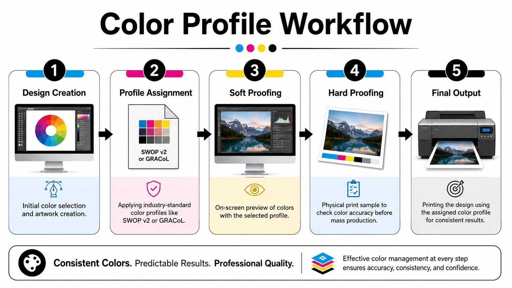
Why one navy formula can produce different prints
If you've ever loaded the same file on two systems and gotten two different navies, that's color management at work, or not working.
Typical failure points include:
- Monitor drift: The screen encourages edits toward a color that won't hold in print.
- Incorrect document profile: The art is built in one assumption, then output through another.
- RIP interpretation: The printer software remaps the CMYK build in a way the designer never saw.
- Media mismatch: The profile isn't tuned to the actual transfer film or production condition.
A navy formula is just a set of instructions. The profile decides how the device reads those instructions.
Soft proof first, hard proof always
Soft proofing is useful because it helps catch obvious issues before anything hits film. In Adobe Illustrator or Photoshop, that means previewing how the color is likely to translate under the intended output condition.
Hard proofing matters more.
Print the sample. Cure it. Press it to the actual garment if possible. Judge the navy in the state the customer will receive, not in the state the RIP preview shows. That small step saves far more pain than endless on-screen tweaking.
A navy that looks slightly too bright on film can settle nicely after transfer. A navy that already looks muddy on film rarely improves by surprise.
If your workflow needs a refresher on profile handling, this ICC profiles guide gives a practical primer for managing output consistency.
What to ask before approving production
Before a larger apparel run, lock down these questions:
- Which output profile is active? Make sure the production device is using the profile you expect.
- Was the art soft-proofed in that condition? If not, screen approval has limited value.
- Was a physical proof reviewed after transfer? This is the approval that matters.
- Was the proof made on the intended garment type? Navy can change character between fabrics.
That last point gets overlooked constantly. The transfer isn't the finished product. The shirt is.
Achieving Accurate Navy Blue on DTF Transfers
DTF is its own environment. If you treat it like paper printing with a heat press at the end, navy will keep disappointing you.
The reason is simple. On DTF, the visible color isn't just the CMYK build. It's the combination of printed color, white underbase, adhesive layer, cure, transfer pressure, garment surface, and post-press appearance. Navy sits right in the zone where each of those variables matters.
The white underbase is helping and hurting
You need the white underbase for opacity and pop, especially on darker garments. But that same bright foundation can make a navy feel cleaner and lighter than expected if the top color layer doesn't carry enough depth.
That's why some navy formulas that look acceptable in a general CMYK chart feel weak on a DTF transfer. The underbase lifts them.
For darker navy variants, the formulation often shifts upward in black. Color-Name's deep navy reference notes that darker versions such as deep navy raise K to 68% or 79%, including an example of C:100, M:92, Y:0, K:79, and describes that increase in black as a way to reduce brightness and prevent the print from appearing washed out or gray on high-absorbency substrates like DTF films or textiles.
Why richer navy often wins on apparel
This is one place where production reality beats textbook purity. On DTF, a slightly richer navy often survives the whole chain better than a mathematically neat but visually fragile one.
A practical approach looks like this:
- Start from the standard navy intent: Use the classic build as your visual benchmark.
- Increase depth when the transfer loses authority: A higher-K navy can hold better after cure and press.
- Watch magenta while deepening: Darker shouldn't mean more purple.
- Test over the actual underbase behavior: White laydown changes the apparent result.
Fabric and heat both move the color
Cotton, polyester, and blends don't all read the transfer the same way. Even when the transfer itself is identical, the finished navy can feel sharper, flatter, or more muted depending on how the surface reflects light.
Then the press adds another shift. Heat and pressure can slightly alter the final appearance, especially in dark tones where the eye notices small changes quickly. That doesn't mean DTF is unreliable. It means navy needs to be judged after the full production cycle.
On DTF, the approved color should be the pressed color. Film-only approval invites trouble.
A practical DTF workflow for navy
When a job calls for navy logos, team uniforms, or chest prints, the safest production routine is this:
- Build two candidate navies. One standard-leaning. One deeper, with more black influence.
- Print both on the same film run. Keep every other variable fixed.
- Cure them identically. Don't compare samples produced under different conditions.
- Press onto the intended garment. If the order spans fabrics, test each fabric family.
- Judge in normal lighting. Don't approve dark blues only under a monitor glow or a single overhead fixture.
That process sounds slower, but it's cheaper than remaking a full batch because the navy looked acceptable at the artwork stage and wrong at delivery.
Troubleshooting Common Navy Blue Print Problems
Most navy failures can be diagnosed quickly once you identify the exact production fault. On DTF jobs, that matters because the same “wrong navy” complaint can come from artwork, profile choice, white underbase behavior, or press settings, and each one needs a different fix.
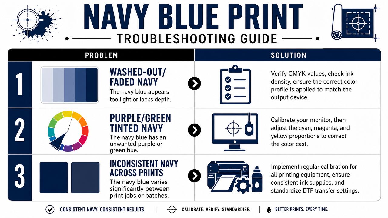
A common shop scenario looks like this. The film sample seems acceptable, the first shirt comes off the press, and the navy is suddenly purple, dead, or weak. At that point, random color edits waste time. Check the failure pattern first.
Problem one when navy looks purple
Cause
Purple-leaning navy usually comes from excess magenta, a profile mismatch, or monitor drift that pushed the operator toward a bad correction. I also see it when a shop tries to deepen navy by eye and keeps adding magenta instead of controlling black and total balance.
Solution
- Reset to a neutral navy build: Compare the file against a known-good navy instead of adjusting on screen from memory.
- Check the viewing setup: A warm or uncalibrated monitor can make a balanced navy look too green, which leads to overcorrection.
- Run a pressed comparison sample: On DTF, review the transferred result beside the target navy. Film alone is not enough for this diagnosis.
Problem two when navy looks muddy or almost black
Cause
This failure usually points to too much black, dark-tone compression in the output profile, or excessive ink weight in the transfer. On apparel, the white underbase can make that heaviness more obvious, especially if the top color is already built too dark.
Solution
| Problem | Likely Cause | Best Fix |
|---|---|---|
| Muddy navy | Too much black influence | Reduce black and compare against a cleaner navy build |
| Nearly black navy | Profile or output condition is closing shadow detail | Reproof under the actual production profile and judge the pressed sample |
| Flat dark patch | Underbase and top color are both laying down too heavily | Retest with controlled ink limits, curing, and press settings |
Problem three when navy looks faded
Cause
A faded navy usually means the chosen build does not hold enough depth through the full DTF cycle. It can also mean the transfer was under-cured, the press settings were inconsistent, or the navy was acceptable on film but too light once applied to the garment.
Solution
- Test a deeper version of the color: A navy with more black can survive transfer better, but only up to the point where it starts losing detail.
- Inspect curing before editing color: If powder melt or ink cure is inconsistent, color corrections will not solve the underlying problem.
- Approve against the garment, not the artwork file: Apparel decoration is judged on the shirt, not in the RIP preview.
Stable production conditions solve a large share of navy complaints. Once curing, pressing, and underbase behavior are controlled, color adjustments become smaller and more predictable.
Problem four when navy changes across runs
Cause
Run-to-run drift almost always traces back to an uncontrolled variable. The usual culprits are a different garment, a changed profile, a substituted film, altered curing, or a press that is no longer delivering the same heat and dwell.
Solution
Build a reference set for repeat navy jobs. Keep the approved file, RIP settings, film sample, and pressed garment sample together. For DTF work, I also recommend logging the garment type, underbase approach, cure routine, and press settings used on the approved run. That record prevents well-meaning operators from making unnecessary tweaks that push the next batch off target.
If navy blue has been costing you time in reprints, sample rounds, and color approvals, Cobra DTF is worth a look. Their USA-made DTF transfers are built for shops that need dependable color, fast turnaround, and a production partner that understands how apparel printing behaves in actual printing environments.