
What Is ICC Profiles A Guide to Perfect Color in DTF Printing
An ICC profile is really just a small file, but think of it as a universal translator for color. Its entire job is to make sure the vibrant red on your screen looks like that same vibrant red on the finished t-shirt, saving you from the all-too-common disappointment of a major color shift.
Decoding the Language of Color
Ever designed a graphic with a stunning, electric blue, only for it to come out of the printer as a dull, lifeless navy? That's one of the most common frustrations in printing, and it happens because every single device in your setup—your monitor, your design software, your DTF printer—speaks its own unique "color language."
Your monitor uses combinations of Red, Green, and Blue light (RGB) to show you color. Your printer, on the other hand, uses Cyan, Magenta, Yellow, and Black ink (CMYK) to create it. They're starting from completely different places, so they interpret color values in fundamentally different ways.
An ICC profile is the bridge between these different languages. It's like a detailed instruction manual for one specific device. It tells your software precisely how your printer sees and reproduces every possible color, outlining its strengths and, just as importantly, its limitations. Without this translator, you’re essentially guessing, and that leads to inconsistent results that waste time, materials, and your customers' trust.
The Foundation of Consistent Color
This system didn't just appear out of nowhere. It was a solution to a massive problem. Back in 1993, a group of industry giants—including Apple, Kodak, and Adobe—got together to form the International Color Consortium (ICC). Their goal was to create a standardized framework to stop the color chaos. Before they did, sending a file from a scanner to a monitor and then to a printer was a complete game of chance.
Today, their work is the industry standard. Over 90% of professional imaging software supports ICC profiles, and a properly calibrated workflow can cut color errors by up to 70%. You can learn more about the early days of color management and the ICC's mission on their website.
An ICC profile doesn't actually change the colors in your design file. What it does is provide the crucial data your software and printer need to accurately translate those colors for a specific output. It’s all about making sure what you see is truly what you get.
This whole process is absolutely essential for professional printing, especially in a field like direct-to-film printing, where bright, accurate colors are a huge selling point. If your business depends on hitting specific brand colors or reproducing high-quality photos on apparel, you simply can't afford to ignore ICC profiles.
To really get a handle on this, it helps to break down the core ideas that make it all work. These are the building blocks of any color-managed workflow.
Key Color Management Concepts at a Glance
| Concept | What It Does | Why It Matters for DTF |
|---|---|---|
| Color Space | Defines the total range of colors a device can produce or display (its gamut). | Your monitor's RGB color space is much larger than your DTF printer's CMYK space. The profile helps manage this mismatch. |
| Rendering Intent | A set of rules that tells the system how to handle out-of-gamut colors. | It decides whether to prioritize exact color matches (Absolute) or pleasing visual relationships (Perceptual) for the best print. |
| Profile Connection Space (PCS) | A device-independent reference color space (like CIELAB or CIEXYZ). | The PCS acts as a neutral go-between, ensuring accurate translation from your monitor's profile to your printer's profile. |
| White Point | Defines what is considered "pure white" for a device or lighting condition. | This is critical for DTF, as it ensures your whites are neutral and not tinted, which affects the entire color balance of the print. |
Understanding these terms isn't just academic—it's practical. They are the controls you'll use to fine-tune your prints and solve color problems when they inevitably pop up.
Why It Matters for Your DTF Business
Putting in the effort to create a color-managed workflow isn't just about pretty colors; it directly impacts your efficiency and reputation. It transforms your production process from a frustrating guessing game into a predictable, repeatable science.
Here’s what that actually looks like:
- Predictable Results: No more wasting expensive ink and film on endless test prints. A solid profile means the colors you approve on your screen are the same ones that roll out of the printer.
- Happier Customers: When you deliver on your promise of vibrant, accurate colors every single time, you build trust. That trust is what turns one-time buyers into repeat customers.
- Better Efficiency: Think of all the time you'll save not having to constantly tweak files and reprint jobs. You can spend that time taking on more orders instead.
- A More Professional Shop: In a crowded market, superior color fidelity makes you stand out. It's a clear signal to customers that you're a high-quality, professional operation.
How ICC Profiles Translate Color From Screen to Shirt
So, we know an ICC profile is a translator. But what's actually happening under the hood? Getting a color from your design software to a finished DTF transfer is a clever, multi-step journey that prevents some seriously expensive guesswork between your devices. It all starts by converting your design into a universal language.
Think about it like this: your monitor speaks English (RGB), and your printer speaks Spanish (CMYK). If they try to talk to each other directly, meanings get twisted and lost. The solution is to use a neutral, intermediary language—let's call it Latin—that both can translate to and from perfectly. This is exactly what the Profile Connection Space (PCS) does.
The Role of the Profile Connection Space
The PCS is a device-independent color space. That’s just a technical way of saying it isn't tied to the unique quirks of any single piece of hardware. When you hit "print," a two-part translation kicks off:
- From Device to PCS: Your monitor’s ICC profile takes its specific RGB values and translates them into the universal PCS language.
- From PCS to Device: Your printer’s ICC profile then grabs that universal PCS data and translates it into the precise CMYK ink recipe needed to replicate the color on your DTF film.
This two-step handshake is the secret sauce that makes ICC profiles so effective. By using that neutral reference point, it guarantees the original intent of your color is preserved all the way through the workflow. No more digital "lost in translation" moments.
The diagram below really brings this to life, showing how your color data travels from the screen, through the ICC profile's translation engine, and onto the final shirt.
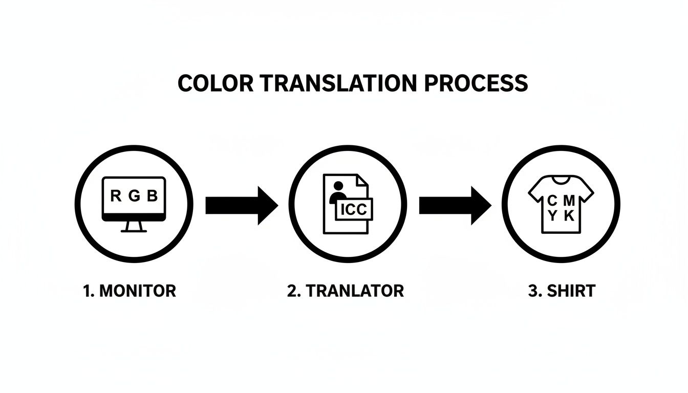
This flow shows the ICC profile acting as the crucial bridge, converting the language of light (RGB) into the language of ink (CMYK) by way of the Profile Connection Space. Without that bridge, your colors would be all over the place.
Understanding the Concept of Color Gamut
Of course, a translation can only be perfect if one language actually has the words to express an idea from another. This leads us to a make-or-break concept in color management: the color gamut. A device's gamut is simply the full range of colors it can see or create.
I like to think of it as a box of crayons. Your fancy design monitor might have a huge, 120-crayon box with every shade you can dream of. But your DTF printer, because of the physical limits of mixing CMYK inks, might only have a 64-crayon box. It can still create millions of gorgeous colors, but its total range—its gamut—is just plain smaller than your monitor's.
The monitor's RGB gamut (additive color made from light) is almost always larger than a printer's CMYK gamut (subtractive color made from ink). This means your screen can show off vibrant, glowing colors that are physically impossible to mix with ink on a shirt.
This gamut mismatch is probably the number one cause of frustration for printers. You create a design with a stunning, electric green on screen, but when it prints, it looks dull and flat. Why? Because that specific color was "out-of-gamut"—it simply didn't exist in the printer's box of crayons.
This is where your ICC profile proves its worth. It doesn't just translate the colors that are within the printer's gamut; it also has smart strategies for handling the ones that aren't. The profile maps that out-of-gamut color to the closest possible match the printer can actually produce. This intelligent conversion is what separates professional, predictable results from a whole lot of wasted ink and film.
Choosing Your Translation Style with Rendering Intents
So, we've established that your monitor can show colors your DTF printer simply can't produce. This is the classic "gamut mismatch" problem. What happens when your design includes one of those impossible colors? The ICC profile doesn't just throw up its hands; it uses a specific strategy to translate that color into the closest printable equivalent.
These strategies are called rendering intents.
Think of it like translating an idiom from another language. A word-for-word translation might make no sense. Instead, you have to choose: do you find the closest literal phrase, or do you find a different phrase in the new language that captures the feeling and meaning of the original? Rendering intents are your four choices for how to handle that color translation.
Picking the right one is a huge part of getting the print you envisioned. Each of the four main intents tackles out-of-gamut colors with a different philosophy, and the best one for the job really depends on the artwork itself.
Perceptual Rendering
The Perceptual intent is almost always the best choice for photos. Its main job is to preserve the overall look and feel of an image by maintaining the relationship between all the colors. It makes sure the final print looks pleasing and natural to the human eye.
When a Perceptual profile finds out-of-gamut colors, it doesn't just clip them. Instead, it carefully squishes the entire color range of the image to fit inside the printer's smaller gamut. This means every color shifts just a tiny bit. While individual colors might not be a perfect match, the gradients, transitions, and overall vibe of the photo remain intact.
- Best for DTF: This is your go-to for complex photographs, especially those with smooth gradients and skin tones. If the overall aesthetic of the image is more important than nailing one specific Pantone color, Perceptual will give you the most beautiful result on a t-shirt.
Relative Colorimetric Rendering
The Relative Colorimetric intent is much more direct. It looks at your design and says, "Any color I can print, I'll print perfectly." All the in-gamut colors are mapped one-to-one with extreme accuracy. It only changes the colors that are outside the printer's range, clipping them to the nearest reproducible hue.
The key here is that it also adjusts the white point of your design to match the white of the DTF film and powder. This is a huge deal, as it prevents weird color casts and ensures your colors look correct on the physical media.
- Best for DTF: This is the workhorse for logos, vector graphics, and any design where brand color accuracy is critical. If your artwork is full of solid colors that need to be spot-on, Relative Colorimetric is the one you want.
The adoption of ICC profiles revolutionized printing by dramatically improving consistency. In fact, their use has been shown to cut color inconsistency errors by over 50% in high-volume production environments. This is vital for custom shirt makers, where firms using ICC profiles reported 40% fewer customer rejections compared to non-users. You can find more details in this ultimate guide to understanding ICC profiles.
Absolute Colorimetric Rendering
On the surface, Absolute Colorimetric seems just like Relative. It maps in-gamut colors perfectly and clips the ones that are out-of-gamut. But there’s a critical difference: it does not adjust the white point.
This intent tries to simulate the entirety of the source device, including the white of the "paper" (or in our case, the white of your monitor). For DTF, this can be a problem. It might try to print a yellowish or bluish tint on your bright white film to mimic your screen's white point, leading to some very strange results. Its real job is for proofing—simulating what one printer will look like on a different printer.
- Best for DTF: Honestly, you'll probably never use this. It’s a specialized tool for proofing, not final production. For day-to-day DTF work, just stick with Perceptual or Relative.
Saturation Rendering
Last up is the Saturation intent, which has one simple mission: make colors punchy. It throws accuracy out the window in favor of creating the most vivid, vibrant print possible.
This intent takes the colors in your design and pushes them to the most intense, saturated versions the printer can handle. It's fantastic for business charts, graphs, and graphics where you need maximum visual impact. The trade-off is that you lose all subtlety and true-to-life color fidelity.
- Best for DTF: Pull this one out for bold, cartoonish graphics or any design where you just want the colors to scream. Avoid it like the plague for photos or brand logos, because you'll get a super-vibrant but completely inaccurate print.
Putting ICC Profiles to Work in Your DTF Workflow
Alright, enough with the theory. Let's talk about where the rubber meets the road—actually using these ICC profiles in your day-to-day DTF printing. This is where you’ll see the payoff. Getting it right means your colors will look predictable and consistent, from the moment you design them on screen to the final press on a t-shirt.
Don't worry, it's not complicated. It's really a two-step dance: first, you introduce the profile to your computer, and second, you tell your software to use it. Once you've got this down, it becomes a simple, repeatable part of every single print job, saving you from endless frustrating reprints.
Getting Profiles Installed on Your System
Before any of your fancy software can use a profile, your operating system needs to know it exists. The profile file itself will have a .icc or .icm extension. Installing it is as simple as dropping a file into the right folder so your programs can find it.
For Windows Users:
- Find the
.iccor.icmfile you downloaded. - Just right-click on it.
- Choose "Install Profile" from the menu. That's it. Windows handles the rest, putting it exactly where it needs to go.
For macOS Users:
- Grab the profile file you need to install.
- Copy it.
- You'll need to paste it into one of two spots:
/Library/ColorSync/Profiles(this makes it available for everyone who uses the computer) or~/Library/ColorSync/Profiles(this one's just for your user account).
Quick tip: sometimes a profile seems to vanish, especially on a Mac after an update. If you can't find your profile in your software, a quick reinstall of your printer's driver usually jogs the system's memory and makes it reappear.
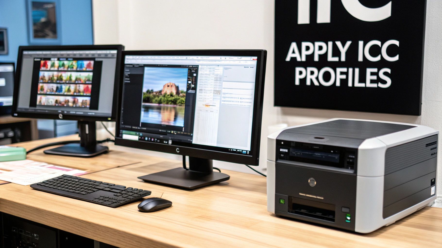
Setting Up Your Design and RIP Software
Installing the profile is just step one. The real magic happens when you tell your software how to use it. This is how you ensure that the colors you see on your monitor are a faithful preview of the final print and that your printer gets the right instructions.
Your Raster Image Processor (RIP) software is the heart of this operation. Think of it as the mission control for your printer; it manages everything from ink levels to how colors are translated. When you're setting up a new roll of film or a new set of inks, you'll assign the matching ICC profile right inside the RIP. This is where the heavy lifting of color conversion is done. To truly dial things in, you have to get comfortable with your specific DTF printing software, because that's your command center for the entire color process.
Just as important is getting your design software on the same page. In programs like Adobe Photoshop or Illustrator, you need to set up your color spaces correctly so you're not designing in a color vacuum.
This screenshot shows Photoshop’s "Color Settings" panel. This is where you tell the program how to handle colors—what profiles to use for new RGB or CMYK files and what to do when it opens a file with a profile that doesn't match your setup.
Pro Tip: A solid, professional workflow is to design in a standard RGB working space like sRGB or Adobe RGB (1998). Then, let your RIP software do the final, precise conversion to your printer's CMYK profile. This keeps your original design files versatile while letting the RIP do what it does best: translate colors perfectly for your specific printer, ink, and film.
Getting your software configured is a foundational skill. For example, when preparing and uploading your artwork for custom banners, a solid understanding of ICC profiles means the final product will match the design you approved. The same exact principle applies to DTF printing, where getting the color right is non-negotiable for keeping clients happy. By building a fully color-managed workflow from start to finish, you take the guesswork out of the equation and deliver consistent, beautiful prints every single time.
Taking Control: Why Custom ICC Profiles Are the Ultimate Upgrade
Generic, off-the-shelf ICC profiles are a great place to start, but they're basically an educated guess. They’re built for an ideal setup: a specific printer model, a particular brand of ink and film, all working under perfect environmental conditions. But what happens when your reality is different? Maybe you use a different film, your ink batch varies slightly, or the humidity in your shop is high this week. That's when you start seeing those subtle, frustrating color shifts.
When "close enough" isn't good enough and every single print needs to be spot-on, it's time to create your own color map. That's exactly what a custom ICC profile is. It's a profile built from the ground up, exclusively for your printer, your inks, and your film, capturing its unique color personality. This is how you achieve true color mastery.
This leap in precision takes you from just managing color to truly mastering it. It’s the kind of detail that separates your shop from competitors who are still settling for "good enough."
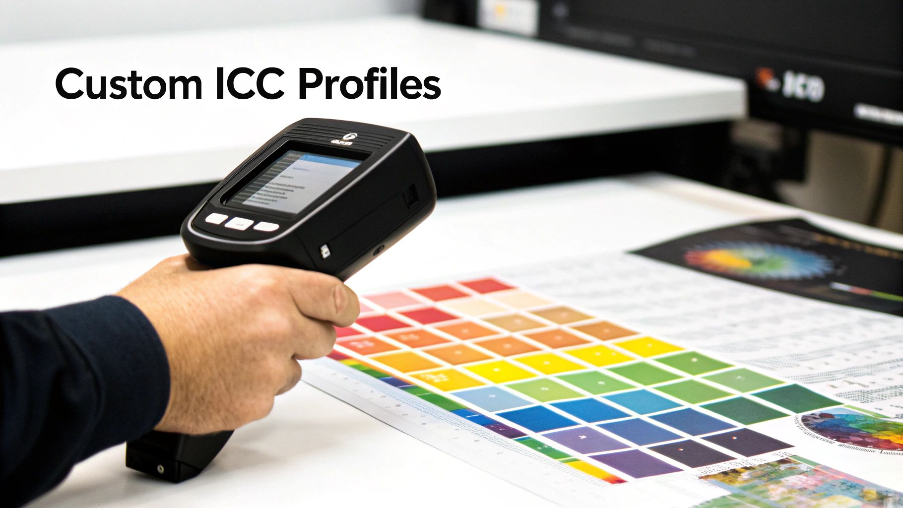
Meet Your New Best Friend: The Spectrophotometer
To build a custom profile, you need a tool that can measure color with cold, hard objectivity. Enter the spectrophotometer. This isn't about eyeballing it; this device sees color on a scientific level that humans simply can't, measuring the exact spectral data of light bouncing off a printed surface.
Think of it as a hyper-accurate color scanner. It doesn’t see a picture; it just sees pure color. You place it over a printed color swatch, and it analyzes the light to record its precise chromaticity values—its true color fingerprint. That raw data becomes the bedrock of your custom profile, giving you the ground truth of how your system behaves.
A spectrophotometer is the bridge between the physical print in your hand and the digital file on your screen. It eliminates all the guesswork and subjectivity, building a color correction map based on pure data. This is the secret weapon professional print shops use to get dead-on-accurate color every single time.
The Custom Profile Workflow
While the tech behind it is pretty complex, the actual process of creating a custom profile is surprisingly straightforward. It boils down to printing a specific chart of colors and then using the spectrophotometer to measure how your printer actually reproduced them.
Here’s a look at the typical steps:
- Print a Color Target: Your profiling software will generate a special chart filled with hundreds—sometimes thousands—of specific color patches. The most critical part of this step is printing the target with all color management turned off. You need to see your printer's raw, unedited output.
- Measure the Patches: After the print has completely dried and cured (don't rush this!), you'll use the spectrophotometer to scan each patch one by one. The device reads the printed color and compares it to the original digital value it was supposed to be.
- Generate the Profile: This is where the magic happens. The profiling software crunches all that measurement data, identifies every single deviation, and builds an incredibly precise correction table. This table is saved as your new, custom ICC profile—a perfect color translator built just for your gear.
Investing in this process gives you a color workflow that isn't just accurate, it's repeatable. Every job you run from that point on benefits from this initial investment, delivering the kind of consistency and quality that keeps customers coming back.
Troubleshooting Common ICC Profile and Color Problems
Even with a perfect workflow on paper, color issues can and do pop up. This is where truly understanding ICC profiles pays off, moving from abstract theory to hands-on problem-solving. Let's tackle the most common headaches DTF printers run into and give you the real-world fixes to solve them for good.
Why Do My Prints Look Dull Compared to My Screen?
This is, without a doubt, the number one frustration we hear about. You spend hours creating a design with stunning, vibrant colors, only for the final t-shirt to look disappointingly flat and lifeless. The culprit is almost always a gamut mismatch.
Think of it this way: your monitor creates color with light (RGB) and can display a massive range of brilliant, glowing shades. Your printer has to physically mix inks (CMYK) to reproduce those colors, and its palette just isn't as expansive. It's like trying to paint a sunset with a box of eight crayons—you just can't hit all the notes.
How to Fix It:
- Calibrate Your Monitor: Before you blame the printer, make sure your screen is telling you the truth. A hardware calibrator is the only way to do this accurately, creating a custom ICC profile that tunes your display to a neutral, correct standard.
- Embrace Soft Proofing: This is your crystal ball. In tools like Adobe Photoshop or Illustrator, the "Soft Proof" feature uses your printer's ICC profile to simulate the final output right on your screen. It gives you a realistic preview, letting you tweak colors before you ever hit "print."
- Pick the Right Rendering Intent: Remember those rendering intents we talked about? For photographic images, Perceptual often gives the most visually pleasing result by gently compressing all the colors to fit within the printer’s more limited gamut. For logos or graphics with critical brand colors, Relative Colorimetric is usually the better choice.
The goal of color management isn't to force your printer to match the impossible glow of a monitor. The real goal is to build a predictable, consistent system where the final print perfectly matches the realistic preview on your (calibrated) screen.
What Does a "Profile Mismatch" Warning Mean?
Ever open an image in Photoshop and get a pop-up warning you about a "profile mismatch"? Don't panic. All this means is that the ICC profile embedded in the image file (say, sRGB) is different from the default working color space you have set up in Photoshop (like Adobe RGB 1998).
It's not a disaster, but it is a fork in the road. You have to tell the software how to handle it.
What to Do:
- Use the Embedded Profile: This is your safest bet 99% of the time. It tells Photoshop to respect the file's original color "recipe."
- Convert to Working Space: This option translates the image's colors into your preferred editing space. It’s useful if you're combining this image with several other elements into a single, larger design.
- Discard the Embedded Profile: Just don't. This strips away all the color information and forces your software to guess, which almost always ends badly.
My Colors Are Shifting or Banding in Gradients
Seeing strange color shifts or chunky, uneven banding in what should be a smooth gradient? This issue often points to either a low-quality profile or a problem with your RIP software settings.
A poorly made ICC profile might not have enough data points to accurately map out those subtle transitions, causing it to stumble.
Beyond the profile, your RIP software's settings dictate how much ink goes down on the film. If those settings aren't dialed in for your specific ink, film, and powder, you can get oversaturation, which turns smooth gradients into a muddy mess. Learning how to improve print quality means getting comfortable in your RIP and fine-tuning things like ink limits and resolution. A high-quality profile paired with properly configured software is the key to achieving those buttery-smooth prints your customers will love.
Common Questions (and Straightforward Answers) About ICC Profiles
Even after you get the hang of ICC profiles, some questions always seem to come up. Let's tackle the most common ones you'll run into in your DTF shop, so you can get back to printing.
Do I Need a Different ICC Profile for Every T-Shirt Color?
Nope, you don't. Think of your ICC profile as being tuned for your specific printing recipe: the printer, ink, film, and powder you're using. It’s all about getting the color right as it's laid down on the white ink base, long before it ever touches a t-shirt.
Now, will a design look different on a black shirt versus a white one? Of course. The final garment color absolutely changes how we perceive the printed color. But that's a challenge solved by design experience and techniques like a solid underbase, not by swapping out your profile.
Can I Use an ICC Profile from a Different Printer Model?
That’s a hard no. Grabbing a profile from another printer model, even if it's from the same brand, is a guaranteed way to get wonky colors. Each printer model has its own unique quirks in how it lays down ink, and the profile is a super-specific map of that exact behavior.
It's like trying to use a map of New York City to find your way around Los Angeles. They're both cities, sure, but the streets are completely different. The map would be worse than useless. An ICC profile is a precise map for one device and one device only.
Why Can’t I Find a Specific ICC Profile for My Paper or Film?
This can be frustrating. Sometimes a manufacturer just doesn't provide a profile for a less popular film or paper. Other times, the profile might just be playing hide-and-seek, especially on a Mac after a system update. It could be tucked away in a system folder where your design software can't see it.
If a profile has gone missing:
- Reinstall the Printer Driver: This is the go-to first step. It often re-establishes all the default settings and makes the profiles visible again.
- Check the Manufacturer's Website: Head over to the support section for your printer, ink, or film brand. They usually have a library of profiles you can download directly.
- Go Custom: If you rely on a specific film that just doesn't have a good stock profile, investing in a custom-made one is the only way to guarantee professional-grade color every time.
Does My Monitor Really Need to Be Calibrated?
Yes. 100% yes. An uncalibrated monitor is basically lying to your eyes. It might show colors as brighter, more saturated, or with a slight color cast you don't even notice. If you're editing based on what that screen is showing you, you're flying blind.
When you calibrate your monitor with a tool like a spectrophotometer, you're creating a profile for your display. This ensures it shows you a neutral, accurate version of your design file. It’s the foundational first step for any color workflow you can actually trust.
Ready to stop guessing and start printing with confidence? At Cobra DTF, we provide premium, American-made DTF transfers that deliver the vibrant, accurate colors your business depends on. Experience the difference that quality makes by exploring our products.