

Blank T Shirt Designs: Top Trends for 2026
A customer has approved the blank garment, but the design direction is still open. One concept looks polished in a mockup, another photographs better on a person, and a third may be easier to produce but wrong for the buyer. The strongest blank t shirt designs don't begin with visual novelty. They begin with the shirt's job, the audience, the placement, the production method, and the setting where someone will wear it.
That decision matters in a large commercial category. The global blank apparel market was estimated at USD 15.23 billion in 2024 and is projected to reach USD 24.04 billion by 2033, with T-shirts and tanks representing 48.39% of 2024 sales and B2B channels accounting for 96.51% of the market in that year, according to Grand View Research's blank apparel market analysis. For customizers, blank tees are a volume foundation for wholesale, merchandise, events, and personalization.
This roundup organizes ten design directions by real workflow performance, from line art and typography to photorealistic portraits, oversized graphics, character systems, niche merchandise, and interactive concepts. Cobra DTF is one production option for turning prepared artwork into garment-ready transfers, while the design choice still determines how well the finished product sells. If your concept draws on body-art references, this guide to tattoo styles for clothing themes can also help you develop a visual starting point.
1. Minimalist Line Art Designs
Minimalist line art gives a blank tee a refined identity without covering the garment in ink. A single continuous outline can suggest an animal, face, mountain range, botanical stem, or architectural form. The restraint is useful for premium merchandise, gallery-inspired apparel, boutique brands, and customers who want something expressive but easy to wear.
Good subjects include geometric animal outlines, abstract faces, single-line logos, small scenes, and botanical illustrations. A folded white shirt photographed on a wood surface can make a delicate black floral design feel considered and tactile, especially when the garment texture remains visible around the transfer.
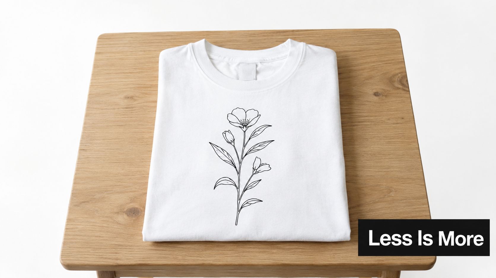
Make restraint look intentional
Line art often fails because the artwork is too thin, the print is too small, or the mockup uses a garment color with weak contrast. Work at the final print size, inspect the thinnest strokes at actual scale, and test the transfer on the intended blank rather than relying only on a digital preview.
- Keep the palette narrow: One or two colors usually communicate the minimalist approach more clearly than a crowded multicolor treatment.
- Use placement strategically: A left-chest mark, centered small graphic, or upper-back design can create impact without excessive coverage.
- Build adaptable templates: Test the same illustration on light, dark, and muted blanks, adjusting the underbase and contrast where necessary.
- Photograph the negative space: Use flat-lays with generous breathing room and worn photos where the design can be seen without folds crossing the key lines.
Production rule: If a line disappears in the mockup at thumbnail size, assume the customer may miss it in the product listing too.
Market the result as an artistic, premium basic rather than as “just a small print.” The value comes from editing, proportion, and wearability.
2. Full-Color Photorealistic Designs
A customer ordering a pet portrait or family photo expects the shirt to preserve the image, not merely display a graphic. Full-color photorealistic designs suit pet portraits, loved ones, sports action, album-inspired artwork, scenes, and layered digital illustrations. The image leads the purchase decision, so every production choice should protect detail from upload through delivery.
Start with the intended garment and print size. A black tee with a golden retriever needs a close crop that reveals fur and facial detail, paired with a worn or draped view that shows how the artwork follows the fabric.
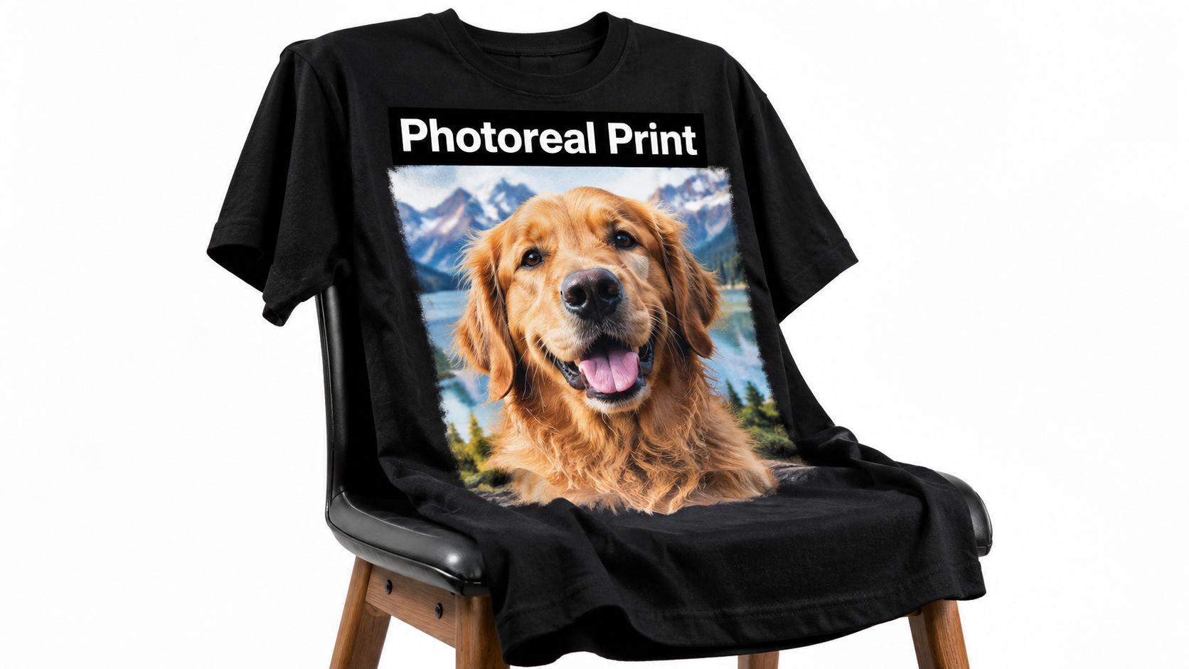
Build the file around the final transfer
Use a high-resolution source at the finished dimensions. Compressed screenshots, soft phone crops, and busy backgrounds limit the result even when the printer can reproduce rich color. Remove distractions, inspect skin, fur, and gradient transitions, then preview the artwork with color-management tools. Layered digital illustrations benefit from understanding how artists create digital renders before files are prepared for print.
For a repeatable application sequence, this guide to transferring a photo to a shirt covers the garment-transfer stage.
Choose the blank according to contrast and customer use. Dark garments can make saturated colors stand out, while their underbase requires closer checking. Produce a sample on the actual shirt before listing it, and inspect gradients, tiny details, and color shifts under normal lighting. Photograph both the full garment and a detail crop, since the close view proves quality while the worn image helps customers judge scale and drape.
Confirm that submitted photos are authorized for use. Album, sports, and entertainment artwork may require separate permission. The sale includes image preparation, proofing, and personalization, so those steps should be reflected in the offer and its pricing.
3. Retro and Vintage-Inspired Designs
A retro graphic earns its place when the blank, artwork, and product photo tell the same story. A 1970s floral composition, 1980s geometric layout, or 1990s grunge treatment can signal a mood, memory, or community immediately. Choose one reference system for each collection, then keep its colors, type, texture, and composition consistent.
A distressed orange-and-brown sun on a beige tee shows how that decision works in practice. The muted garment supports the worn graphic instead of competing with it.
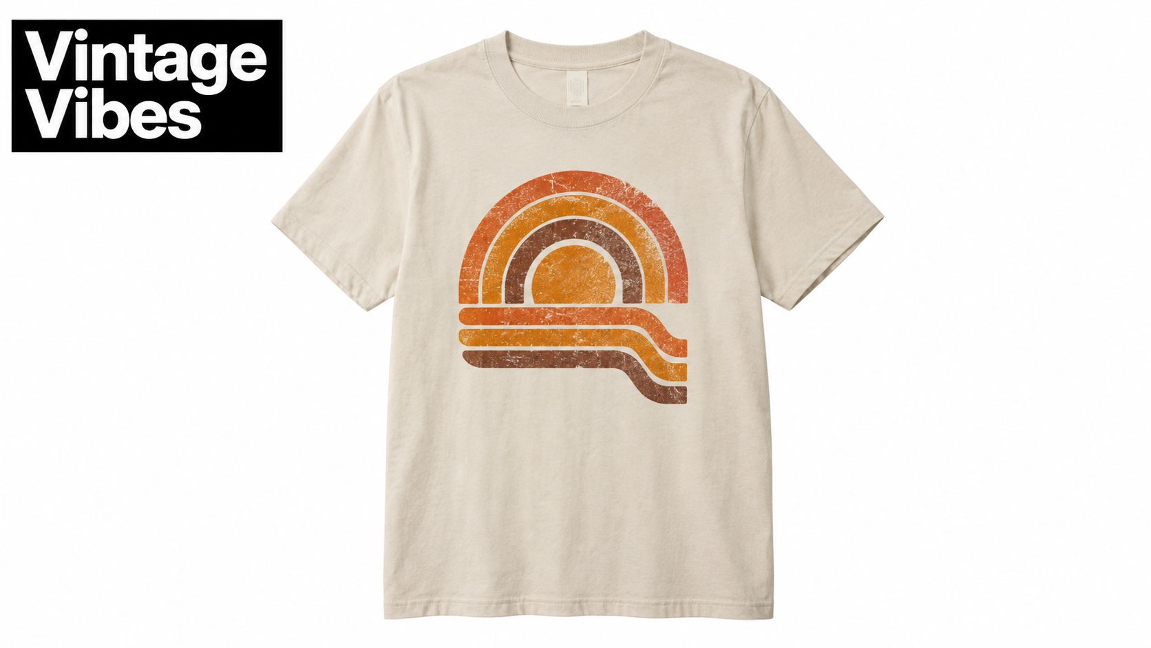
Retro concepts fit travel merchandise, record shops, breweries, outdoor brands, music communities, and event collections. A unisex casual everyday t-shirt works well for lifestyle presentation, provided its color and silhouette support the chosen era.
Build the collection around these production decisions:
- Choose one decade per collection: A focused palette and type system looks more authentic than a mix of neon, serif, and distressed elements.
- Distress with control: Remove selected portions of the artwork, while preserving enough letter detail for clear reading.
- Photograph the garment in context: A record store, roadside, workshop, or outdoor setting can reinforce the product's story. Include a flat or close detail view so customers can inspect texture and print placement.
- Keep an evergreen option: Pair trend-led graphics with a simpler logo or emblem, giving unsold inventory continued use.
DTF supports layered colors and distressed artwork without requiring a separate complex screen setup for every variation. Extensive coverage can still affect the hand feel. Prepare a production-size file, test it on the exact blank, and inspect the cured transfer before listing the design.
4. Custom Typography and Text-Based Designs
Typography-led tees work when the message reads instantly and feels specific to its audience. A witty phrase can support an impulse purchase, a name and date can mark an event, while a professional tagline can turn a blank shirt into brand merchandise. Set a clear reading order so customers understand the main message, supporting detail, and reason it belongs on a garment.
Text layouts also make customization efficient. One proven composition can accommodate names, locations, years, roles, or short phrases without rebuilding the artwork. That flexibility suits family events, team apparel, creator merchandise, company uniforms, and gifts.
Build the layout around the selling image
Start with the product photo rather than the design editor. Show one straight-on mockup with enough garment area to judge the full composition, then add a worn image that reveals how the wording follows the body. For social video, check readability while the shirt moves and folds. A design that works only as a flat file will create avoidable customer questions.
Use these checks before opening personalization:
- License the typeface: Choose fonts from reputable sources and retain the licensing record for commercial work.
- Protect the hierarchy: Give the main phrase clear dominance. Keep supporting text only when it adds useful context.
- Create deliberate contrast: Dark type on a black blank and pale type on a white blank can both lose clarity. Prepare color-specific versions when needed.
- Proof every field: Check names, dates, punctuation, and spelling manually before production.
- Leave breathing room: Space around the wording improves scanning and keeps the print from feeling crowded.
For DTF, prepare the artwork at production size with clean edges, separated color versions, and a layout that avoids unnecessary coverage. Test the transfer on the exact blank, then inspect it worn and flat before listing. Keep the editable master organized so a customer's replacement phrase does not require rebuilding the entire design.
5. Embellished and Multi-Textured Designs
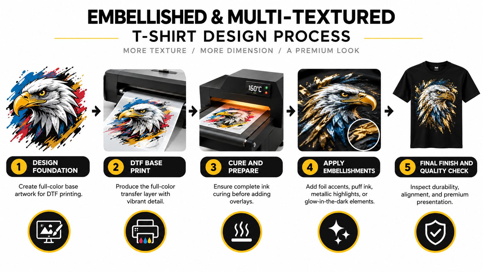
A DTF graphic gives tactile decoration a strong color base. Foil, metallic highlights, puff effects, specialty inks, and glow elements suit limited-edition merchandise, luxury streetwear, premium event apparel, and collectible drops. The appeal comes from the combination of a detailed image and a finish customers can see and feel.
For an eagle graphic with a metallic accent, use a close product photograph with directional light. Diffuse lighting can flatten reflective details, while an angled view reveals raised areas and surface changes. Show a straight-on mockup for overall composition, then add a close crop for texture and a worn image to demonstrate how the finish behaves on the body.
Build the decoration around production
Hybrid decoration requires a repeatable workflow. Cure the DTF layer correctly before applying another process, and keep the operation order consistent. Record press settings, curing sequence, alignment method, and inspection points so each garment receives the same treatment.
Use a sample-first workflow:
- Test the combination: Foil, puff, metallic, and glow finishes can behave differently on cotton, blends, and garment-dyed blanks.
- Limit specialty coverage: Concentrate the effect on lettering, borders, highlights, or one focal element instead of covering every detail.
- Check the final garment: Inspect the transfer flat and worn, especially where folds or seams can distort raised decoration.
- Photograph the upgrade clearly: Use side lighting and close crops so customers understand the difference from the base version.
- Set the right offer: Present the embellished garment as a premium or limited run, with a standard DTF option for broader use.
For dimensional effects, use this guide to puff DTF transfers as a production reference. Prepare the artwork at final size, separate color versions where needed, and keep coverage controlled to reduce handling and testing. Specialty finishing can raise perceived value, but it also adds alignment, inspection, and quality-control work. A documented sample process protects consistency before the design reaches a larger order.
6. Eco-Friendly and Sustainable Design Messaging
A sustainability graphic earns trust when the shirt, product page, and fulfillment process support the same claim. Native plants, local wildlife, conservation work, repair culture, and zero-waste themes can all fit blank t-shirt designs. Match the wording to evidence you can provide, rather than using leaves, earth icons, or green type as decoration alone.
For mockups, show the artwork on a natural-color blank with enough fabric texture to make the garment feel tangible. Photograph the front print in even light, then add a close crop of the blank, label, or packaging when those details support the story. This presentation helps customers judge both the visual style and the product behind it.
Cobra DTF describes USA-made production, USA-sourced inks and films, and eco-conscious practices. If those details are part of your offer, state them accurately and add your own documented choices, including blank sourcing, packaging, and fulfillment. Review sustainable printing practices for production considerations, then test the complete sample before photographing it or accepting a larger order.
Make the message defensible
Avoid “zero impact” or “completely sustainable” unless your documentation supports those statements. Buyers may ask about the garment, packaging, artwork, or production method. Specific language is easier to maintain across product pages, customer questions, and repeat orders.
- Choose grounded subjects: Local ecosystems and conservation actions give the graphic a clear audience and purpose.
- Keep records ready: Save supplier details, packaging information, and relevant certifications.
- Align the product page: The mockup, garment description, and sustainability copy should describe one consistent offer.
- Prepare the DTF file cleanly: Use readable shapes and controlled coverage so the message remains clear on the selected blank.
- Explain the price: Responsible materials and documented production can require additional work. Show customers what the price supports.
Sustainable messaging works when it describes a real process, not just an attractive graphic.
7. Character and Mascot-Based Designs
A café launches a mascot tee, then needs matching stickers, hoodies, event signage, and social graphics. An original character can connect those products, whether the customer is a coffee shop, sports team, school, gaming community, children's program, or local business. Licensed characters serve established entertainment properties, but the necessary rights must be secured before production.
Treat the mascot as a reusable design system. Define its silhouette, colors, facial features, proportions, outline treatment, and approved poses before creating variations. This keeps commissioned artists and AI-assisted artwork consistent. Build a few distinct expressions or roles for future releases, then test each version at left-chest size and as a large front or back graphic. Fine details that read on a poster may disappear in DTF printing at a smaller scale.
Design for the workflow, not one shirt
Start with the layout your customer will wear. A compact character suits a left-chest placement and leaves room for a larger back graphic. A full-body pose needs more print area, while a bold head or silhouette can remain recognizable on smaller blanks. Use strong contrast against the chosen garment color, and prepare simplified and detailed files rather than forcing one artwork version across every size.
For DTF production, keep edges clean, separate important color areas clearly, and export transparent artwork at the intended print dimensions. Print a sample on the actual blank before approving mockups or accepting a larger order. Check facial details, outline thickness, white underbase coverage, and how the design looks after washing.
Product photography should show recognition and scale. Use a straight-on image for the character's face, then add a worn photograph that shows placement and proportions. Present collection variations together so customers can see the logic behind seasonal outfits, expressions, locations, or event editions. Protect intellectual property by licensing or registering the artwork and retaining commission records.
8. Niche and Subculture-Specific Designs
A gaming tee, metal shirt, skate graphic, or tabletop design succeeds when insiders recognize the reference immediately. Hiking, programming, fitness, vinyl collecting, and audiophile communities each have their own visual language. A broad “outdoors” graphic may attract attention, while a trail habit, instrument detail, game mechanic, or community joke creates stronger relevance.
Authenticity determines whether the design earns repeat wear. Subculture customers notice copied symbols and inaccurate references. Build from conversations, community observation, collaborations, and real use cases. A tabletop shirt may need room for a campaign name. A gym design should read clearly from behind during training. A record-store tee can pair a restrained front mark with a detailed, catalog-style back layout.
Build around the buyer's actual setting
Start by defining the insider: hobby, role, experience level, and scene. Then choose the blank and print placement for that person's use. Performance blanks fit outdoor and gym customers, while heavyweight or relaxed blanks may suit lifestyle communities.
Invite potential buyers to review early sketches. They can identify inaccurate references, improve wording, and suggest merchandise formats that feel natural. Keep the collection focused so each design has a clear audience and purpose.
Mockups should match the sales setting. Use action-oriented photography for tournaments, shows, and training gear. Use styled lifestyle images for convention merchandise, pop-ups, and online drops. Show front and back views when the design depends on a campaign title, detailed illustration, or catalog layout.
DTF works well for niche artwork that combines exact lettering, detailed illustration, and multiple colors. Prepare transparent files at the intended print dimensions, separate important color areas, and simplify tiny references before production. Print a sample on the actual blank, then inspect lettering, outline clarity, white underbase coverage, and wash performance. The audience should identify the main idea at a glance, even when the design includes insider detail.
9. Oversized and Graphic-Heavy Statement Designs
A full-back print can dominate a product photo, but the same artwork may lose clarity once the shirt is worn, folded, or sized up. Oversized graphics turn the blank tee into a moving poster through large front illustrations, wraparound side compositions, expansive logos, and band-style artwork. They suit streetwear, music merchandise, art projects, sports collections, and brands built for strong social photography.
Build the layout around the blank's usable area. Check the neckline, sleeve seams, side seams, and the wearer's proportions before finalizing the canvas. Large typography can cross folds, while a face, emblem, or logo may distort near seams. Test more than one garment size when the collection covers a broad range.
The mockup should show the intended scale clearly. Use separate front and back views when the statement sits on one side, then add a worn image to reveal how movement affects the composition. Negative space inside the artwork keeps a large print from becoming a dense block. A complex image usually reads better on a neutral blank, while a saturated garment may require a simpler palette.
Choose the blank to support the graphic's physical demands. Large color areas require inspection for saturation, curing, and hand feel before listing. Align placement deliberately for every size instead of copying one measurement across the range.
For DTF production, prepare transparent artwork at the final print dimensions, check fine details at full scale, and confirm that the printer can handle the coverage. Print a sample on the actual blank, inspect color and edge clarity, then test application and washing. Broad coverage uses more material and demands more careful pressing, so pair a statement back with a smaller front mark when customers need a more wearable option.
10. Interactive and AR-Enhanced Design Concepts
A customer scans the shirt at an event and reaches a private video, team content, an event page, a digital reward, a game, an educational resource, or an afterparty experience. That physical-to-digital link gives a blank shirt a second use, provided the destination remains useful after purchase. AR can create a richer effect, but it also adds setup and testing requirements.
Start with the scan point, then build the artwork around it. Keep a QR code on a relatively flat area, away from the neckline, sleeve seams, and side seams. Give it strong contrast and enough quiet space for phone cameras to read it. A short instruction should explain the result, such as access to exclusive content or event information, rather than leaving the customer to guess.
For mockups, show the code at its actual scale on the blank and include a worn photograph with a phone nearby. Keep the phone from covering the garment, and use a separate close-up if the code is small. The shirt must still work as apparel when nobody interacts with it, so the graphic needs a clear visual purpose beyond the scan.
Test the interaction on the finished garment
A screen preview proves very little. Print the design on the actual blank and test indoor and outdoor lighting, folds, movement, and different phone cameras. Check the complete path from scan to destination before listing the product.
- Protect a clear quiet zone: Keep nearby artwork away from the code so scanning remains reliable.
- Give customers a reason to scan: Exclusive content, useful information, event access, or a meaningful reward is stronger than a vague promise.
- Explain the steps: A brief instruction reduces confusion at the point of use.
- Maintain the destination: Update content, check links, and retire expired experiences instead of sending customers to a dead page.
- Prepare the DTF file correctly: Export transparent artwork at final print dimensions, inspect the code at full scale, and print a sample before production.
Use a trackable destination only after its redirects and reporting are configured. For larger coverage, inspect hand feel and pressing carefully. The interactive element should strengthen a wearable design, not replace one.
10-Style Blank T-Shirt Design Comparison
| Design Style | 🔄 Implementation Complexity | ⚡ Resource Requirements & Speed | ⭐ Expected Outcome Quality | 📊 Ideal Use Cases | 💡 Key Advantages / Tips |
|---|---|---|---|---|---|
| Minimalist Line Art Designs | Medium, precise vector work and printer calibration | Low ink usage; fast production and curing | ⭐⭐⭐⭐ Crisp, timeless aesthetic with high resale appeal | E‑commerce, bulk orders, modern minimalist brands | 💡 Low material cost; test line weights and printer settings |
| Full-Color Photorealistic Designs | High, requires high-res files and color management | High ink consumption; longer print/curing times | ⭐⭐⭐⭐⭐ Photo-like detail; premium perceived value | Premium merch, portrait/custom work, artist collabs | 💡 Use 300 DPI images, calibrate printers, offer as premium service |
| Retro and Vintage-Inspired Designs | Medium, needs era-accurate palettes and distressed effects | Moderate ink; standard production time with texture tests | ⭐⭐⭐⭐ Strong nostalgic engagement and emotional appeal | Limited drops, streetwear, nostalgia-driven marketing | 💡 Research decade palettes and typography; replicate authentic distress |
| Custom Typography and Text-Based Designs | Low, layout and font selection are primary tasks | Low ink; very fast turnaround and easy customization | ⭐⭐⭐⭐ Clear, readable, scalable across sizes | Personalized orders, corporate apparel, quick-turn projects | 💡 Use licensed high-quality fonts and ensure contrast/readability |
| Embellished and Multi-Textured Designs | Very high, multi-step processes and specialty equipment | High material and labor needs; slow multi-step production | ⭐⭐⭐⭐⭐ Distinctive, luxury look; high perceived value | Luxury drops, limited editions, high-margin collaborations | 💡 Cure DTF fully before overlays; prototype combos and document process |
| Eco-Friendly & Sustainable Design Messaging | Medium, requires supply-chain transparency and sourcing | Variable, may need certified blanks and eco inks; moderate speed | ⭐⭐⭐⭐ Builds trust with conscious consumers; brand differentiation | Sustainable brands, non-profits, Millennial/Gen Z markets | 💡 Be transparent about sourcing, use certified materials and packaging |
| Character & Mascot-Based Designs | High, original art or licensing and consistent style guides | Moderate–high ink; requires consistent reproduction quality | ⭐⭐⭐⭐⭐ Drives brand recognition and repeat purchases | Brand mascots, kids' merch, entertainment and sports franchises | 💡 Secure IP/licensing; create style guides and multiple poses/expressions |
| Niche & Subculture-Specific Designs | Medium–High, needs deep community knowledge and authenticity | Moderate resources; small batches often preferred | ⭐⭐⭐⭐ High engagement and loyalty within target communities | Gaming, music subcultures, outdoor/fitness niches | 💡 Collaborate with community members and attend events for credibility |
| Oversized & Graphic-Heavy Statement Designs | Medium, large layouts and precise color management | High ink coverage; longer curing and quality checks | ⭐⭐⭐⭐ Bold visual impact; strong brand visibility | Event merch, streetwear, promotional and team apparel | 💡 Test saturation/placement on samples; allow extra curing time |
| Interactive & AR-Enhanced Design Concepts | Very high, requires AR/tech development and digital assets | Moderate material needs but high development/time costs | ⭐⭐⭐⭐ Highly engaging with measurable digital ROI | Tech-forward brands, events, gaming, experiential campaigns | 💡 Ensure QR/AR markers are scannable, provide clear CTAs and test across devices |
Turn One Concept Into a Sellable Collection
A strong design idea becomes a sellable collection through controlled decisions, not by adding more decoration. Begin with the audience and use case. A pet portrait has a different buyer expectation from a metal band tee, a family reunion shirt, or a boutique line-art garment. Define whether the customer needs a gift, event uniform, daily basic, premium collectible, team item, or branded product before choosing the visual style.
Next, match the style to the blank and intended print area. Minimal line art may need a smooth surface and high contrast. A distressed retro graphic may benefit from a muted garment that supports the aged effect. A performance customer may prioritize the blank's function over a heavyweight fashion silhouette. An oversized back print needs careful placement around seams and body movement, while typography needs enough contrast and spacing to remain readable in both thumbnails and worn photos.
Prepare the artwork for its final application rather than designing only for a screen. Build the canvas at the intended print dimensions, check transparent areas, inspect small details at actual size, and confirm that all text is spelled correctly. Separate artwork versions when necessary. A small chest mark may need simplified detail, while a large back version can carry more texture. Keep files organized by garment color, print size, placement, and customer personalization fields.
Test before publishing
Press the design onto the actual blank garment. A digital mockup can't reliably show how the transfer interacts with fabric texture, seams, color, folds, or the garment's fit. Inspect edges, gradients, fine lines, coverage, alignment, curing, and hand feel. Wash testing is also useful when the product will be sold as a repeat-wear item, even though the sample can't replace the production instructions for the chosen transfer.
Create both flat-lay and worn product photography. The flat-lay should show the complete layout and garment color clearly. The worn image should demonstrate scale, placement, drape, and audience context. For photorealistic work, add a detail crop. For embellished work, use angled light. For interactive designs, show the scanning action without hiding the print.
Compare the mockup against the physical sample before publishing. If they differ, update the listing rather than hoping customers won't notice. A dependable workflow also matches the production method to coverage, detail, and finish. Simple artwork may need only a straightforward transfer, while large, textured, personalized, or specialty-finish designs require additional sampling and documentation.
Customization also has economic value. One academic study found that self-designed T-shirts produced a 113% increase in willingness to pay, with mean willingness to pay rising from €6.0 to €12.8, as reported in this academic study of customized T-shirts. That doesn't mean every personalized shirt can command the same premium. It does show why a well-built customization workflow can support a stronger offer than a generic graphic alone.
Cobra DTF can be considered when you need USA-made DTF products, vibrant and fade-resistant colors, quick turnaround, same-day shipping for qualifying orders placed by 1 PM CST, and delivery within 1-3 days. Visit Cobra DTF for current product and shipping details.
Cobra DTF provides USA-made DTF transfers for customizers working with detailed portraits, typography, oversized graphics, and personalized blank t shirt designs. Visit Cobra DTF to review current transfer options and choose a production path for your next tested collection.