

Ultimate Guide to Pms Colours to Cmyk: Perfect Prints
A client sends over a logo file, circles a brand blue, and says, “This has to match.” The mockup looks right on screen. The transfer looks acceptable under shop lights. Then it lands on a shirt, gets pressed, and suddenly the blue is flatter, darker, or just wrong enough that everyone notices.
That's the moment most shops realize PMS colours to CMYK isn't a simple button click. It's a translation problem. And in apparel, especially DTF, that problem gets harder because you're not just dealing with ink on paper. You're dealing with film, adhesive powder, white underbase behavior, fabric color, heat press variables, and viewing conditions.
The good news is that color matching doesn't have to stay a guessing game. A disciplined workflow gets you much closer, and it helps you catch bad conversions before they become wasted transfers and awkward client calls.
The Color Matching Dilemma in Custom Apparel
A lot of color disputes start the same way. The client approves a digital proof. The art file includes a Pantone reference. Everyone assumes the print will follow. Then the final garment shows a visible shift, and the shop gets blamed for “changing the color.”
The issue usually happened much earlier. Pantone is a spot color system. Most digital apparel workflows, including DTF, run through CMYK-based output. If nobody manages that translation carefully, the shop ends up printing the closest automatic guess instead of the closest practical match.
Where apparel jobs go sideways
In custom apparel, color tolerance is tighter than many buyers realize. A fashion print can survive a little drift. A branded uniform order usually can't. The client compares the shirt to packaging, signage, or previous runs and sees a mismatch immediately.
That's why beginners benefit from learning broader production discipline, not just software tricks. If someone on your team is still building fundamentals, this practical guide to screen printing advice for novices is useful because it reinforces a habit that matters here too: control the process before the press exposes the mistake.
A bad color match rarely starts at the printer. It usually starts with a weak approval process.
Why DTF raises the stakes
DTF makes short runs, full-color graphics, and fast turnarounds easier. It also makes it easy to trust the RIP preview too much. That preview can look convincing while still hiding a poor Pantone conversion.
On apparel, you also have another layer of perception. The same transferred graphic can feel different on black cotton, a blended fleece, or a lighter fashion tee because the surrounding material changes how people read the printed color. The transfer may be technically consistent, while the viewer still sees inconsistency.
Shops that handle this well don't promise impossible exactness. They explain the trade-off, build a repeatable conversion workflow, and approve against real output whenever color matters. That's how you protect margin, reduce reruns, and keep branded apparel jobs from turning into color arguments.
Why PMS and CMYK Are Different Color Languages
The cleanest way to understand this is to stop treating Pantone and CMYK as interchangeable. They aren't. They describe color through different systems, and they behave differently in production.
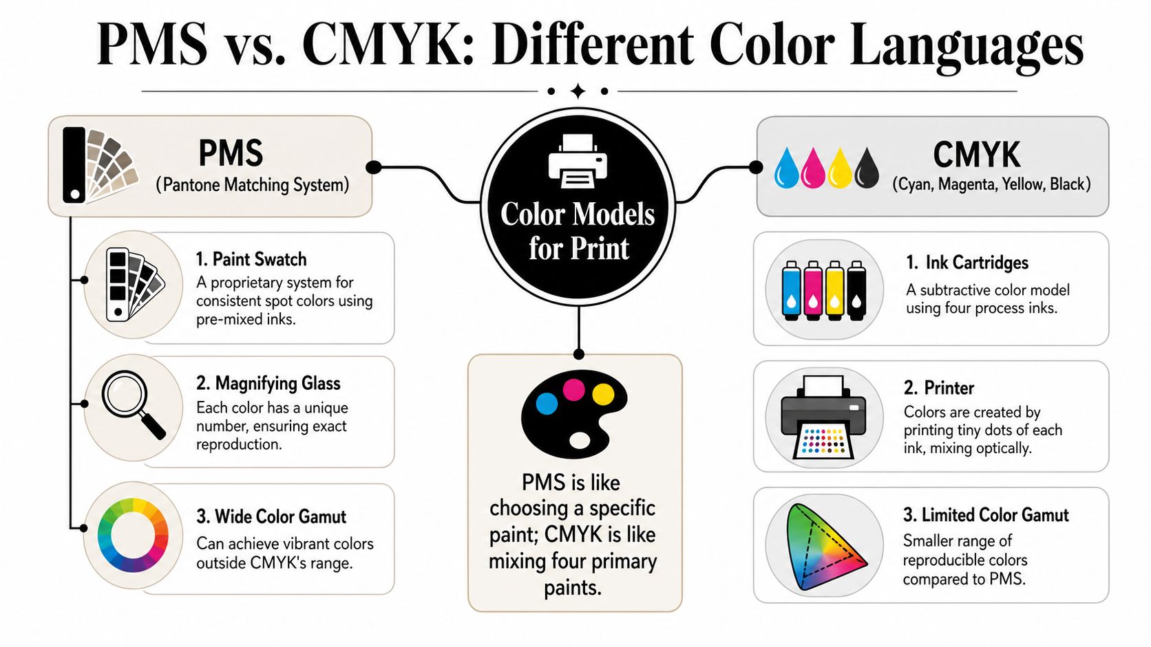
PMS is selected color and CMYK is built color
Pantone Matching System (PMS) works like choosing a specific paint formula from a swatch book. Each Pantone color represents a defined target. In print terms, that usually means a pre-mixed spot color.
CMYK works differently. It builds color from four process inks: Cyan, Magenta, Yellow, and Black. Instead of using one dedicated ink formula for each target shade, the printer combines percentages of those four inks to simulate the result.
That difference matters because simulation has limits. According to PSPrint's explanation of Pantone to CMYK matching, approximately 60% of Pantone colors can be reproduced by CMYK presses when correct conversion methods are used, while the remaining 40% fall outside the CMYK gamut entirely. That same source also notes that the conversion is an approximation because PMS uses precise pigment formulations and CMYK is a subtractive process mix.
Why gamut decides what's possible
When printers talk about gamut, they mean the range of colors a system can reproduce. Pantone's range includes colors that standard CMYK can't hit cleanly, especially some vivid reds, deep blues, and metallic effects.
That's why a Pantone swatch can look alive while the CMYK version looks muted or shifted. The file may be correct. The process just can't physically produce the same result.
A simple analogy helps:
- PMS is like ordering a custom-mixed house paint from a formula card.
- CMYK is like trying to recreate that same paint using only four base cans.
- LAB is the reference language that helps software compare both targets in a more universal way.
Why LAB matters in conversion
Professional conversion tools typically use LAB values as the intermediate reference point. LAB doesn't solve every problem, but it gives software a better starting target than a rough visual guess. That's one reason modern conversion workflows are more dependable than old shortcut methods.
If your team also handles client photography or mockups, it helps to understand how display color spaces distort expectations before files ever reach print. This overview of optimizing image color for client galleries is relevant because many color disputes begin with screen assumptions, not print reality.
The monitor shows an interpretation. The press prints a limitation.
The Digital Workflow for Accurate PMS Conversion
The shop-safe workflow starts before you export anything. If the PMS reference is wrong, the coated or uncoated book is wrong, or the spot color gets flattened carelessly, the file is already drifting before the RIP sees it.
Start with the correct Pantone reference
Pantone colors aren't one-size-fits-all. A coated reference and an uncoated reference can lead you in different directions. If the end product is apparel, the practical takeaway is simple: choose the swatch book that best aligns with the way you're evaluating your target, and don't let a random on-screen swatch stand in for a physical decision.
Physical books still matter because screens don't show print color reliably. If the client gives only a screenshot or website hex value, treat that as a starting conversation, not a production target.
Use Adobe tools the right way
In Illustrator, the standard command path for conversion is Edit > Edit Colors > Convert to CMYK. In InDesign, the reliable route for PDF export includes the Ink Manager settings All Spots to Process and Use Standard Lab Values for Spots. Those workflow details are documented in this PrintPlanet discussion on Pantone's updated Lab values and CMYK conversion behavior.
That same reference is important for another reason. Pantone updated its Lab values, and those changes affected CMYK recipe results in professional software. So if someone says, “This used to convert differently,” they may be remembering an older reference basis, not spotting a software bug.
Don't stop at Convert to CMYK
The menu command only changes the color definition. It doesn't guarantee the file is ready for your printer, film, and substrate combination.
A stronger workflow looks like this:
- Identify the exact PMS swatch from a physical book when color accuracy matters.
- Confirm whether coated or uncoated is the better reference for the job's approval context.
- Convert through the Adobe application using the proper spot handling settings.
- Keep Standard Lab Values for Spots enabled when the workflow supports it.
- Export with consistency so the RIP receives the same intent you approved upstream.
Practical rule: If you can't name the Pantone swatch source, the paper reference, and the output profile path, you're still guessing.
Match the file prep to the production environment
Time loss frequently occurs in many small shops. The design team finishes the artwork in one set of assumptions, while production prints under another. A file that was converted loosely in Illustrator often gets “fixed” later inside the RIP, and each extra intervention opens the door to drift.
That's why it helps to standardize your software stack and document it. If your shop is still settling on a workflow, Cobra's guide to choosing your DTF printing software is worth reading because software decisions affect color handling long before the transfer is printed.
What works and what doesn't
A few habits consistently produce better results:
-
What works
- Physical swatch selection: It anchors the conversation in something real.
- Lab-based conversion: It gives software a stronger reference path.
- Controlled export settings: They reduce accidental spot-to-process surprises.
- Proof-first approvals: They catch problems while fixes are cheap.
-
What doesn't
- Approving from phone screens: Too variable.
- Trusting a Pantone bridge value blindly: It may not reflect your actual output condition.
- Letting every operator convert differently: Inconsistency compounds fast.
- Treating the RIP as a rescue tool: By then, you're already correcting a weak upstream process.
Verifying and Refining Your CMYK Match
Conversion gets you into range. Verification tells you whether the result is acceptable. That's the difference between a shop that hopes and a shop that knows.
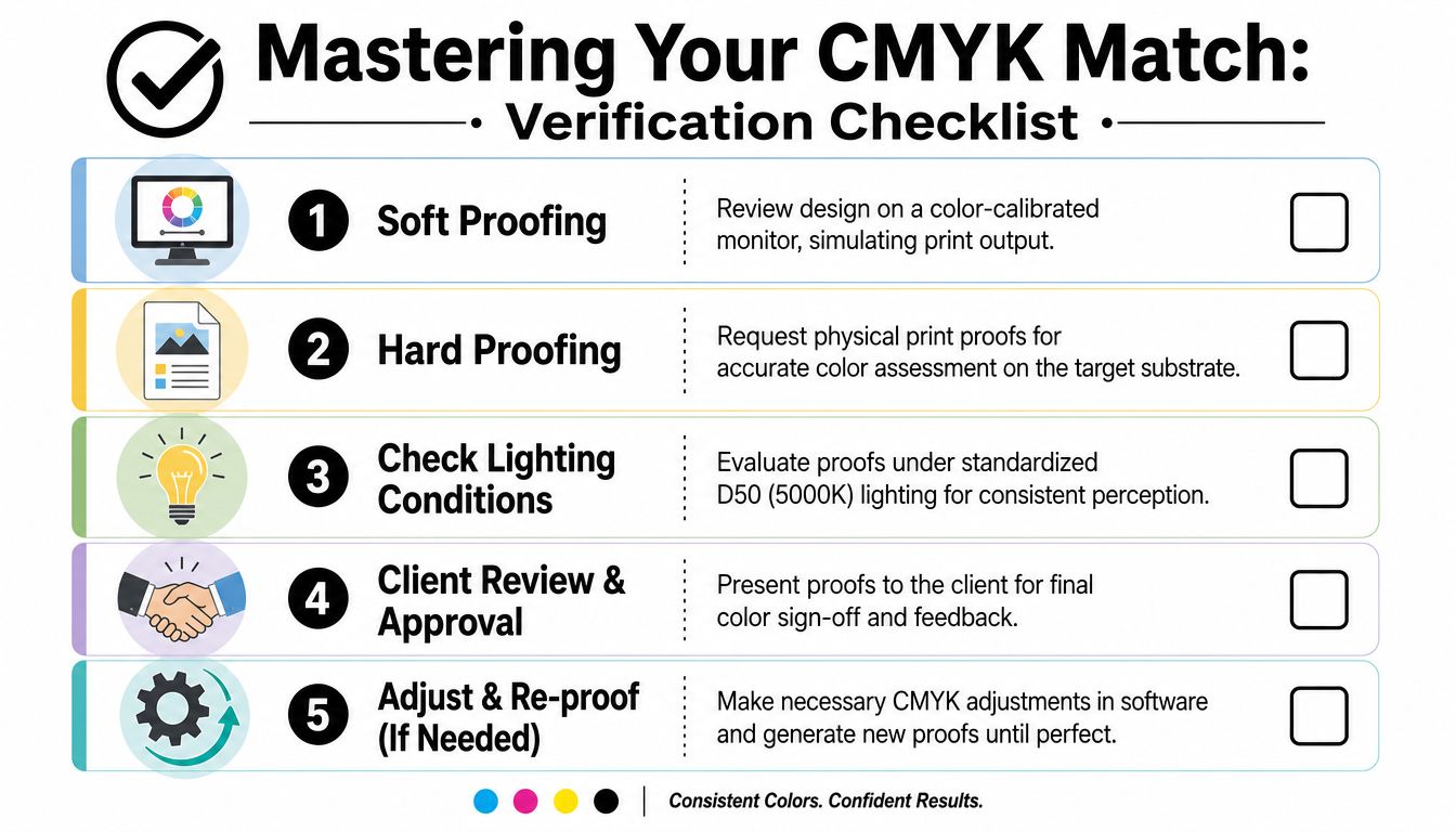
Soft proof before you print anything
Soft proofing is where you preview how the converted color is likely to behave under a specific output profile. It won't replace a physical proof, but it helps you spot trouble early.
The colors most likely to cause trouble are the intense ones. As noted in this video explanation of Pantone to CMYK conversion practice, approximately 15 to 20% of vibrant PMS colors, especially deep reds, bright oranges, and electric blues, fall outside the CMYK reproducible range. The same source describes the most reliable workflow as converting the PMS color to Lab in Adobe software, applying a pre-calibrated CMYK ICC profile, and requesting a physical proof against the original swatch.
Read gamut warnings like a production signal
If soft proofing shows a gamut warning, the software is telling you the target color can't be reproduced exactly in the chosen output space. That's not a reason to panic. It's a reason to decide what matters most.
Sometimes the right adjustment is to preserve brightness. Sometimes it's to preserve brand character, even if the print becomes slightly duller. Sometimes the honest answer is that a full CMYK workflow won't satisfy the job and the client needs that conversation early.
A practical review sequence looks like this:
- Check the converted build visually: Don't judge by numbers first.
- Toggle proof colors on and off: Watch where the shift happens.
- Look at nearby neutrals and surrounding colors: Context changes perception.
- Print a controlled sample: Screen confidence isn't enough.
Make targeted refinements instead of random tweaks
Manual adjustment works best when it's deliberate. If the converted color reads too muddy, reducing black may help. If it feels weak, slight shifts in magenta or yellow can move the print closer to the original intent. The key is to change one variable at a time and compare against the Pantone swatch and proof, not against memory.
The goal isn't mathematical perfection. The goal is a stable visual match under realistic production conditions.
| PMS Color | Automated CMYK Value | Optimized CMYK Value (with Soft Proofing) | Notes |
|---|---|---|---|
| Pantone 100 | C:100, M:56, Y:0, K:23 | Adjusted after proofing for the target substrate and ICC profile | Documented CMYK conversion example appears in the earlier conversion source. Final production values still need proofing. |
| Pantone Silver 877 | C:0, M:0, Y:0, K:100 | Adjusted only as a visual approximation where metallic behavior cannot be reproduced | Metallic spot colors won't translate exactly in CMYK. |
| Vibrant out-of-gamut PMS color | Automated software conversion | Refined through proof-based visual adjustment | Deep reds, bright oranges, and electric blues often need compromise decisions. |
ICC profiles are not optional
A shop that ignores ICC profiles is making color decisions blind. The profile connects the file to an expected print condition. Without it, the same CMYK numbers can behave differently from one workflow to another.
If you want a cleaner explanation of why profiles matter in day-to-day production, Cobra's article on what ICC profiles are in print workflows is a solid reference.
The best-looking CMYK build on screen can still be the wrong build for your actual print condition.
Mastering Color on DTF with Cobra DTF
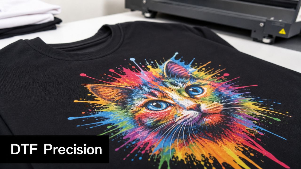
DTF changes the color conversation because the print doesn't land directly on the garment the way many traditional print buyers imagine. The image is built on film, supported by white, cured with powder, then transferred under heat and pressure. Every one of those stages affects how a PMS target finally reads on fabric.
Generic conversion breaks down fast in DTF
A generic PMS-to-CMYK conversion might be acceptable for a paper proof. It often isn't enough for DTF production. The film, ink laydown, white underbase behavior, curing, and press application all influence saturation and perceived hue.
That's why experienced DTF operators separate two questions:
- What is the closest process-color conversion of the Pantone target?
- What CMYK build reproduces best on this DTF setup?
Those are not always the same answer.
The printer profile must match the real setup
DTF rewards shops that build around a controlled stack: printer, RIP, ink set, film, powder, and press routine. If one variable changes, color can move. That's why a profile tuned for one configuration shouldn't be treated as universal.
The easiest mistake is importing a client file with a decent CMYK conversion, then assuming the RIP and printer will preserve that intent automatically. In practice, output quality depends on whether the production environment has been characterized for the actual materials in use.
That includes the ink system. If you're troubleshooting saturation, adhesion-stage appearance, or print consistency, it helps to understand how the ink itself fits into the workflow. Cobra's guide to DTF printer ink is useful here because ink behavior is part of color behavior.
What DTF does well for color
DTF can produce punchy, high-impact graphics that apparel buyers love. It handles multicolor artwork efficiently. It also gives shops a practical route for small branded orders that would be cumbersome in other processes.
Where DTF shines, though, is not the same as saying it reproduces every Pantone target perfectly. Strong results come from using the process for what it does best and managing client expectations where spot-color exactness is unrealistic.
A disciplined DTF color workflow usually includes:
- A controlled RIP setup that isn't changed casually between jobs.
- Consistent film and consumables so proof behavior matches production behavior.
- Repeatable press conditions because heat and dwell affect final appearance.
- Garment-aware approvals since a transfer can read differently depending on the fabric and shirt color.
Handle metamerism before the client does
One of the most frustrating issues in apparel color is metamerism, where two colors appear to match under one light source and drift apart under another. This matters in DTF because a transfer approved inside the shop may look different in daylight, retail lighting, or warehouse lighting.
You can't eliminate metamerism entirely, but you can reduce surprises:
- Review proofs under more than one lighting condition.
- Compare against the Pantone swatch and the garment together, not separately.
- Avoid overconfidence with difficult blue, orange, and red targets.
- Get client sign-off on a physical sample when the job is brand-sensitive.
Shops lose trust when they approve color under one light and deliver under another.
The practical trade-off
For DTF, the smartest position is not “we can match any Pantone exactly.” It's “we can build the closest reliable match for this production method, then verify it on the actual transfer and garment.” That sounds less flashy, but it's the language of shops that stay profitable.
When the setup is dialed in, DTF can deliver very convincing brand color for a large range of jobs. But the winning habit is process discipline, not blind faith in software conversion tables. Shops that understand that tend to waste less film, reprint less often, and argue with clients less.
From Approximation to Perfection in Every Print
Good color matching is a system. It starts with understanding that PMS and CMYK are speaking different languages. It gets stronger when you convert from a proper Pantone reference, use Lab-aware workflows, and keep your Adobe settings under control. It becomes dependable when you soft proof, profile the output condition, and verify against physical samples instead of trusting a monitor.
For apparel decorators, DTF adds another layer. The transfer process, white base, film, ink behavior, and garment itself all shape the final look. That's why solid shops don't chase mythical exactness. They build repeatable conditions and make informed compromises where the process has limits.
This shift is mental. Stop treating PMS colours to CMYK as a one-click technical task. Treat it as production planning. Once you do that, color stops feeling mysterious and starts becoming manageable.
That's how you cut down on expensive reruns. That's how you set realistic expectations before a client sees the first finished shirt. And that's how a shop earns a reputation for reliable output, especially on branded apparel where small color mistakes get noticed fast.
If you want DTF transfers built for consistent, vibrant output, Cobra DTF is worth a look. They focus on USA-made DTF products with quick turnaround, which makes it easier for print shops and apparel businesses to keep production moving while chasing tighter color control.