

Ladies T Shirt Styles
You're standing in front of a rack of women's blanks that all look close enough to pass, until you start thinking about where a logo will land, how the side seams pull, and whether the print will still sit clean after the first wash. That's the real problem with ladies T shirt styles for a custom shop, they're not just fashion labels, they're production variables that change placement, hand-feel, and the way a DTF transfer settles on the garment.
The good news is that this is learnable. Once you connect silhouette, neckline, length, and fabric to the print zone, you stop guessing, and you start choosing blanks that behave the way your order needs them to behave. The women's T-shirt market is also large enough to reward that kind of precision, with one major estimate valuing it at USD 106.62 billion in 2021 and projecting USD 161.69 billion by 2028 in a 6.1% CAGR forecast, while another puts it at USD 114.26 billion in 2022 rising to USD 155.67 billion by 2028 (Printful's history overview).
Why Ladies T-Shirt Styles Matter for Custom Shops
A shop owner can waste time and money by treating every women's tee like a smaller men's blank. That approach ignores shoulder slope, bust shape, torso length, and the way softer drape shifts the safe decoration area. The result is predictable, a print that lands too high, hugs a seam, or looks off-center once the shirt is worn.
For a new shop, style literacy is a margin tool. It helps you reduce misprints, field fewer return requests, and avoid the common complaint that the shirt “looks different than the mockup.” It also makes your catalog easier to organize, because you stop thinking in vague terms like “women's tee” and start sorting by fit family, neckline, and print window.
Start with print behavior, not just appearance
A customer may ask for a “cute women's shirt,” but the production question is different. Does the design need a flat center chest, a small left-chest mark, or a larger artwork panel that sits lower to avoid a bust curve? That choice changes everything from art size to platen setup.
Practical rule: if the shirt changes the body shape, assume the print zone changes too.
That's why sizing guidance matters operationally. One apparel chart maps a women's M to a 35–37 inch body chest, while a unisex M maps to a 38–40 inch body chest, which shows that the same label doesn't mean the same cut or the same decoration risk (women's T-shirt size chart).
If you want a useful planning resource for shop visibility and product pages, SEO tips for fashion brands is a practical reference for organizing style-related content around buyer intent.
What to look at first on a blank
Use this order every time, because it keeps your decisions tied to decoration outcomes:
- Fit shape first, because it tells you where the chest sits on the body.
- Neckline second, because it controls how close you can place artwork to the collar.
- Length third, because it affects whether a front print reads balanced or bottom-heavy.
- Fabric last, because it affects print hand, press settings, and wash behavior.
The market data backs up why shops need this level of control. Style variation is now a major driver, with oversized and relaxed-fit designs accounting for 34% of new style launches between 2023 and 2024, and polyester holding a 51.7% revenue share in 2021 while cellulosic materials were the fastest-growing segment (market report). For a production team, that means the “right” blank is the one that fits the print plan, not just the hanger.
The Main Fit Families and How They Behave
The five fit families that dominate ladies tees each create a different print surface. Oversized and relaxed silhouettes give you more breathing room, fitted styles demand cleaner alignment, cropped tees shorten the vertical canvas, and baby tees compress everything into a tighter visual field. That's why the same artwork can look bold on one blank and awkward on another.
Oversized and relaxed fits
Oversized tees push the print lower and often a little wider, because the body falls away from the chest instead of hugging it. That makes them strong candidates for bold center-chest graphics, but the artwork still needs enough open space so it doesn't drift into side-seam tension or look swallowed by all that fabric. Relaxed fits behave similarly, just with a softer drape and less volume.
A big shirt doesn't mean a big print should sit anywhere you want. It means the design needs a clear anchor point.
Oversized and relaxed options usually work best when the graphic has some width and a little negative space. Tiny art often looks lost on these blanks, while art that's too tall can fight the natural drape.
Fitted, cropped, and baby tee shapes
Fitted tees bring the print closer to the bust and waistline, so placement has to be more exact. A design that's even slightly crooked stands out faster on a fitted blank because the garment itself reads as more shaped and form-fitting.
Cropped tees compress the vertical zone, so a left-chest placement can start to feel too low and too central unless you shift it upward. Baby tees are the most restrictive. They usually reward minimalist art, wordmarks, small icons, or a simple chest hit that doesn't fight the narrow surface.
| Fit Family | Print Placement Zone | Max Design Width | Common Pitfall |
|---|---|---|---|
| Oversized | Lower center chest, slightly outward | Large | Artwork feels too small |
| Relaxed | Mid chest with room to breathe | Medium to large | Print sits too high |
| Fitted | Center chest or left chest | Small to medium | Skewed placement shows fast |
| Cropped | Upper chest, compact vertical zone | Small | Design drops too low |
| Baby Tee | High chest, minimal coverage | Very small | Artwork overwhelms the shirt |
If you want the design to feel intentional, keep the art scale tied to the silhouette instead of copying the same file onto every blank. That one habit solves a lot of mockup disappointment.
Necklines and Lengths That Change the Look
Neckline and hem length are the second layer of control, and they matter because they change what the eye sees before it ever reaches the graphic. A crew neck gives you a stable frame, a V-neck pulls the eye downward, a scoop neck opens the upper chest, and a mock neck closes off the top zone almost completely. That's a decoration decision, not just a style detail.
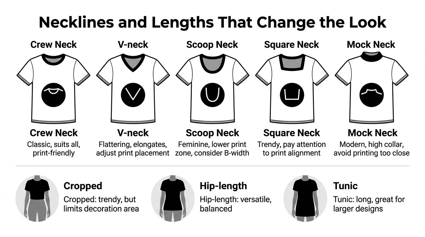
Necklines that protect or expose the print zone
Crew necks are the easiest to manage because they leave a familiar left-chest space and don't crowd the upper print zone. V-necks can look flattering, but they require careful placement because the point of the V creates a diagonal visual pull. Scoop and square necks expose more upper chest, which gives you room to work but also makes poor alignment easier to spot. Mock necks push artwork lower or force you into a very small placement, because there's little room near the collar.
A useful rule is simple. The more open the neckline, the more attention your artwork gets near the top of the chest. The higher the neck, the more you should keep the print away from the collar line.
For a deeper styling reference, the internal guide on shirt neckline styles is useful when you're comparing collar shapes against artwork placement.
Length changes the whole balance
Standard lengths give you the most flexibility, because the front panel can support a balanced chest print without looking cut off. Longline tees can carry larger artwork or a lower front graphic because there's more vertical field. Curved hems usually want the print centered a bit higher so the design doesn't fight the arc at the bottom. Cropped tees compress everything and can make a full-front design feel crowded unless the artwork is shortened too.
That's where DTF film size starts to matter. A 22 cm film is often enough for smaller placements like left chest or tight center graphics, while a 30 cm sheet gives you more room when the garment needs a bigger visual block or when you want to avoid seam overlap on wider fronts. Choose the film to match the panel, not the other way around.
Fabric Choices for Comfort and Decoration
Fabric choice changes how the shirt feels, how it hangs, and how the transfer settles into the surface. For ladies tees, the main decision is usually between 100% combed cotton, ringspun cotton, cotton-poly blends, and tri-blends. Each one gives you a different trade-off between crispness, softness, durability, and ease of pressing.
Side-by-side fabric differences
| Fabric | Hand-feel | Drape | DTF Compatibility | Shrink Risk | Best Use |
|---|---|---|---|---|---|
| 100% combed cotton | Clean, crisp, structured | Moderate | Very strong | Higher than blends | Retail tees, crisp graphics |
| Ringspun cotton | Softer, smoother | Moderate to soft | Strong | Moderate | Premium comfort-focused orders |
| Cotton-poly blend | Balanced, easywear | Stable, light drape | Strong with the right setup | Lower than cotton | Volume orders, active everyday use |
| Tri-blend | Very soft, vintage feel | Fluid, drapey | Good with careful settings | Lower visual shrink, but more sensitive to heat | Fashion-forward and lived-in looks |
How each fabric changes the press
Combed cotton takes a DTF transfer cleanly because the knit surface is fairly straightforward, but it can feel a little firmer against the skin. Ringspun cotton is usually the safer choice when a customer expects a softer hand, especially on a boutique-style blank.
Cotton-poly blends are often the easiest production choice for high-volume work. They're stable, they usually handle repeat wear well, and they don't ask for the same shrink management you'd plan around with pure cotton. Tri-blends are the most style-driven option, but they need more respect at the press because heat and dwell time can make them feel too stiff or too glossy.
Shop-floor rule: the softer the fashion fabric, the more careful you need to be with temperature and pressure.
You also have to think about the ink and adhesive side. Cotton usually pairs well with standard DTF setups. Poly-rich blends call for lower-temperature awareness, and tri-blends usually benefit from softer-hand films so the print doesn't fight the drape. That fabric-to-film pairing matters more than the name on the hanger.
For a broader comparison of fiber behavior, the guide on cotton vs polyester is a useful companion when you're deciding what to stock for different customer tiers.
Printing Considerations for Each Style
The same design file can behave very differently depending on where it lands on the shirt. A fitted tee compresses the art, an oversized tee gives you more lateral room, and a scoop or V-neck changes the safe zone near the collar. Once you connect those shape changes to the fabric, the printing decision gets much easier.
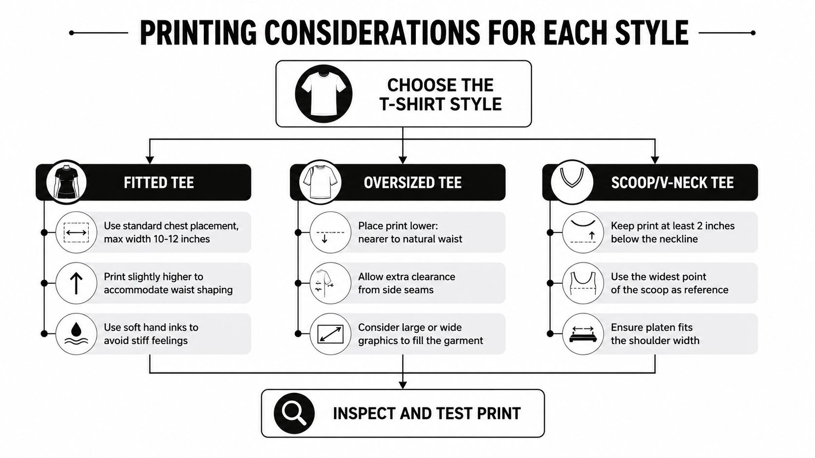
Placement rules by silhouette
Fitted tees need cleaner alignment because the shirt follows the body more closely. A slightly high chest placement usually reads better than dropping the design too low, since the waist shaping can make a low print look pulled. Oversized tees give you the opposite problem, the print can sink visually if you don't place it with enough structure, so a lower center-chest hit often looks more natural.
Scoop and V-necks need extra space below the neckline. If the design sits too close to the collar, the eye gets crowded by the opening and the art loses balance. On these shapes, the widest part of the neckline should guide placement, not the top seam alone.
For technique details, the printing reference on t-shirt printing techniques is helpful when you're deciding how far to push a transfer on a given fabric.
Pre-press habits that prevent avoidable problems
Trim visible seam clutter on baby tees so the print doesn't compete with tiny armhole or neck details. Pre-shrink 100% cotton blanks before you commit to a production run, because post-wash movement can change the relationship between art and garment. On fleece-backed or brushed fabrics, a cover sheet can protect the transfer surface and help keep the finish consistent.
- Standard cotton: use a normal DTF setup and keep placement centered against the actual body shape.
- Poly blends: watch for dye migration and choose a lower-temp adhesive approach when needed.
- Tri-blends: use a softer-hand film and avoid pressing hotter than necessary.
- Baby tees: keep the art small and inspect edge spacing before you press.
The compatibility flag is simple, really. If the garment is structured, you have more room to press aggressively. If the garment is soft, stretchy, or fashion-driven, you need to protect the drape first and the decoration second.
Matching Styles to Real Customer Segments
A useful style system is built around buyers, not just blanks. The same women's tee can make sense for one audience and fail for another, because the customer isn't buying a shirt in isolation, they're buying an image of how they'll wear it. That's why the most profitable shops match silhouette, neckline, and fabric to a clear customer segment.
Four buyer profiles that actually help production
The streetwear buyer wants an oversized tee in heavyweight cotton with a bold center-chest print. That order usually supports a more visible graphic, and the customer is often comfortable with a shirt that feels intentionally loose.
The boutique customer usually prefers a fitted or semi-fitted ringspun tee with a scoop or crew neck and a small chest mark. That order is often about polish, so the print has to feel subtle, placed with care, and aligned to the garment's shape.
The athleisure enthusiast tends to choose a relaxed poly-blend crew with a small logo placed high on the chest. That buyer cares about easy wear and repeat use, so the decoration should stay clean and uncomplicated.
The boho or sustainable shopper often responds to a tri-blend relaxed fit with a vintage-style placement graphic. This customer likes softness and drape, so the print should feel like part of the shirt instead of sitting on top of it.
If you're trying to define the right buyer before you order blanks, boost your marketing success with EmailScout is a useful reference for thinking through audience fit and segmentation.
What to plan for each order type
- Streetwear orders: usually tolerate larger art and may justify a broader size run if you're testing demand.
- Boutique orders: often favor smaller runs with a higher attention to detail.
- Athleisure orders: work well when you keep the decoration simple and repeatable.
- Boho or sustainable orders: benefit from softer visuals and fabrics that already feel lived-in.
The market trend toward relaxed and oversized shapes, plus the continued split between comfort-led and fashion-forward cuts, supports this buyer-based approach rather than a one-style-fits-all buying plan (trend coverage). If you can map the person to the blank before you print, your art choices become much easier to defend.
Quick Checklist Before You Press Print
The last quality check should happen before the garment ever reaches the heat press. Confirm that the blank matches the intended fit family, that the fabric works with your DTF film and adhesive setup, and that the placement zone still makes sense after you measure the neckline and hem. A shirt can look fine on a hanger and still fail once the print sits on a body.
A fast pre-production pass
- Verify the silhouette: make sure the style name and cut match the customer segment you planned for.
- Check the fabric behavior: cotton, poly blend, and tri-blend all need different attention.
- Measure the print window: compare the chest zone against the neckline, shoulder width, and body length.
- Run a small test press: a short test area helps you check adhesion, stretch, and recovery before full production.
Common mistakes that cost reprints
Skipping pre-shrink on 100% cotton causes placement shifts after wash. Ignoring dye migration on poly-blend heathers can ruin the clean look of light transfers. Pressing too hot on rayon or modal can flatten the hand and make the shirt feel harsher than it should. On scoop and square necks, center-chest art can drift visually if you don't account for the wider opening at the top.
Label your blanks by fit family, not just by size. That habit keeps reorders consistent when batches arrive from different suppliers.
Finish with cure checks, wash testing, and a simple record of which print setup worked on which style. That one habit saves time later, especially when customers reorder the same shirt and expect the same result.
Cobra DTF can help you keep these style decisions profitable by giving you DTF transfers that are built for clean placement, strong color, and reliable turnaround. If you're stocking ladies tees for a shop, a launch, or a custom order run, visit Cobra DTF to see how their USA-made transfers fit into a production workflow that values speed, consistency, and fewer print surprises.