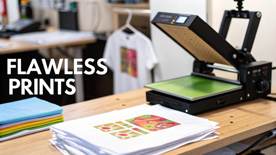
How to Use Transfer Paper for Flawless Prints
Using transfer paper is pretty simple at its core: you print your design onto the special paper, position it on your garment, and then apply heat and pressure. The magic, however, is in the details. Your success hinges on picking the right paper for your printer and fabric, getting a clean press, and knowing exactly when and how to peel the backing away.
Gathering Your Essential Transfer Paper Toolkit
Before you even think about printing, getting your workspace and materials in order is the single most important step for a pro-level finish. Think of it as your pre-flight checklist. Skipping a step here often leads to frustration and wasted materials down the road. The right gear doesn't just make things easier; it directly affects how good your final design looks and how long it lasts.
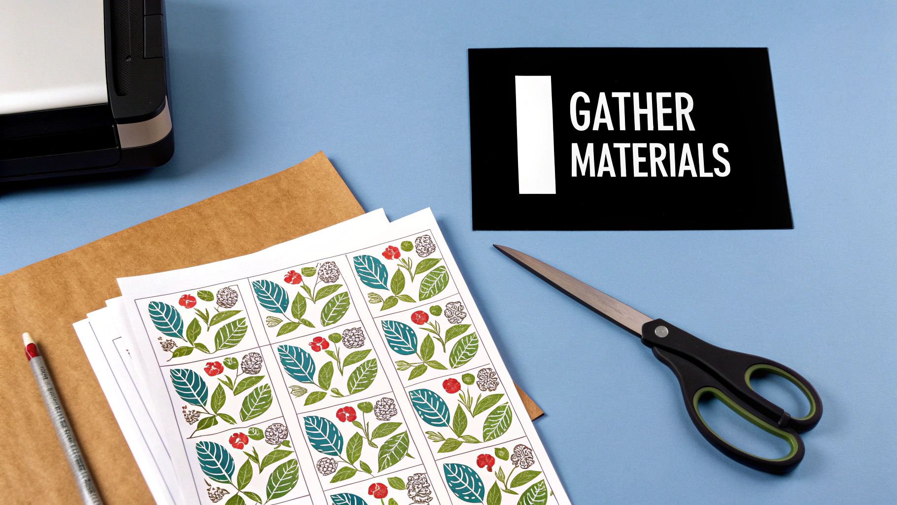
Choosing Your Core Materials
Any great transfer project is built on three pillars: the paper, the printer, and the fabric. These pieces have to work together. A mismatch can cause everything from dull, faded colors to a melted, sticky mess.
First up is your printer—is it inkjet or laser? This is a critical fork in the road. Inkjet transfer paper and laser transfer paper are not interchangeable. They're formulated completely differently to bond with either liquid ink or powdered toner. Grabbing the wrong one will give you a poor-quality transfer that won't survive the first wash.
Next, let’s talk fabric. You can always experiment, but if you want consistent, vibrant results, stick with these tried-and-true options:
- 100% Cotton: This is the gold standard. It’s a natural, breathable canvas that takes transfers beautifully, resulting in a bright, durable print.
- Cotton/Polyester Blends (50/50): A fantastic middle ground. You get the printability of cotton combined with the durability and wrinkle resistance of polyester.
- 100% Polyester: This is trickier territory. You’ll need a special low-temperature paper designed specifically for synthetics to avoid scorching or melting the fabric.
The demand for custom apparel is fueling some serious market growth. The global heat transfer paper and vinyl market, valued at USD 1.6 billion in 2025, is expected to hit USD 2.27 billion by 2034. It just goes to show how popular these creative tools have become for hobbyists and businesses alike.
Before you jump in, here’s a quick-reference table to make sure you have everything you need on hand.
Your Project Essentials Checklist
| Item | Type | Key Consideration |
|---|---|---|
| Transfer Paper | Inkjet or Laser | Must match your printer type. Choose "light" or "dark" based on fabric color. |
| Printer | Inkjet or Laser | Ensure it's in good working order with sufficient ink or toner. |
| Garment | Cotton, Poly/Cotton Blend, or Polyester | Pre-wash the item without fabric softener to remove any sizing or chemicals. |
| Heat Source | Heat Press or Household Iron | A heat press is strongly recommended for even, consistent pressure and temperature. |
| Protective Sheet | Teflon or Parchment Paper | Prevents ink from transferring to your heat press platen. A must-have! |
| Cutting Tool | Scissors, Craft Knife, or Cutting Machine | A cutting machine (like Cricut) is best for intricate designs. |
Having these items ready will set you up for a smooth and successful project from the get-go.
Essential Tools for a Flawless Application
Beyond the basics, a few non-negotiable tools are what separate amateur results from professional-grade work. If you're serious about this, a quality heat press is the most important investment you can make. A household iron just can't deliver the consistent temperature and even pressure required for the transfer's adhesive to properly bond with the fabric.
You'll also need a protective Teflon sheet or parchment paper. You place this between your transfer and the heat source to stop any ink from sticking to the hot metal platen—a crucial step for keeping your equipment clean.
Finally, don't overlook your cutting tools. Sure, scissors work for simple circles and squares, but a craft knife or a cutting machine like a Cricut or Silhouette is what you need for clean, intricate edges. This is especially true when creating detailed custom iron-on shirt decals that truly elevate the final look.
Getting Your Design Ready to Print
This is where the magic really starts—and also where things can go wrong if you're not careful. A killer design on your screen doesn't automatically mean a perfect print. Taking a few extra minutes to prep your file and dial in your printer settings is the single best thing you can do to make sure your final shirt looks professional.
Think of it this way: what you do now determines whether you get a crisp, vibrant transfer or a blurry, backward-looking mistake. Let's walk through it.
Tweaking the Digital File
Before you even touch the printer, open up your design file. The most common pitfall I see is people using a low-resolution image. For a transfer to look sharp and clean, your artwork needs to be at least 300 DPI (dots per inch). If you pull a 72 DPI image off a website, it might look fine on your monitor, but it will print out looking pixelated and fuzzy. It’s a dead giveaway of an amateur job.
Another crucial step, especially for light-colored fabrics, is mirroring your image. You have to flip it horizontally in your design software before you print. Why? Because you'll be placing the transfer face-down onto the shirt. If you don't mirror it, all your text and logos will be backward. It's a simple checkbox in most print settings, but forgetting it is a classic (and very frustrating) mistake.
Heads Up: This usually changes for dark fabric transfers. Most of the time, you do not mirror the image for darks because they're applied face-up. But don't take my word for it—always, always read the instructions that came with your specific paper. It can save you a lot of wasted ink and materials.
Dialing in Your Printer Settings
Okay, your design file is perfect. Now, let's get your printer ready. Don't just hit "Print" and hope for the best. You need to jump into the printer's properties or preferences menu to make a few quick changes. This is what gives your colors that vibrant, saturated look.
Here's what I always adjust:
- Paper Type: Look for a setting like "photo quality," "glossy paper," or "premium matte." Even though you're using transfer paper, this setting tells the printer to use more ink, which is exactly what you want for deep, rich colors.
- Print Quality: Crank it up to the highest setting possible. It might be called "Best," "High," or "Photo." Sure, it'll print a little slower, but the detail and color accuracy you get in return are well worth the wait.
- Color Management: Unless you're a pro with a fully calibrated setup and custom ICC profiles, just let the printer manage the colors. It's the most reliable option for getting predictable and consistent results.
These little adjustments make a massive difference. Seriously, try printing the same design on a "plain paper" setting and then again on a "photo quality" setting. The first one will look washed-out and dull, while the second will look bold and ready to press. That pop of color is what makes a custom shirt look like it came from a store.
Bringing Your Design to Life with the Heat Press
You've got your printed transfer, and now it's time for the magic. This is the moment where all your prep work pays off, turning a digital design into a wearable piece of art. The secret to a professional, long-lasting print isn't just about having a good design; it's about mastering the delicate balance of time, temperature, and pressure. Get this right, and you'll have a vibrant, durable garment. Get it wrong, and you're looking at a cracked, peeling disaster.
Before you even think about placing your transfer, you need to pre-press your garment. Lay the shirt flat on your heat press and give it a quick press for about 5-10 seconds. This seems like a small step, but it's non-negotiable. It evaporates any lingering moisture and irons out wrinkles, giving you a perfectly smooth and dry surface for the transfer to bond to. Skipping this is a common rookie mistake that leads to bad adhesion and a hazy look.
With your shirt prepped, it's time to get your alignment just right. A well-placed design is the hallmark of a professional job.
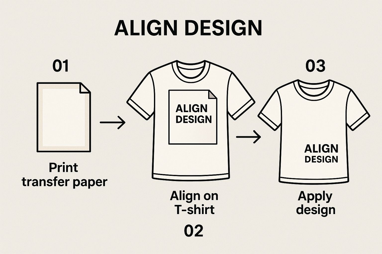
As you can see, taking a moment to ensure the transfer is perfectly centered and straight makes all the difference before you bring the heat.
Getting Your Settings Just Right
Carefully position your printed DTF transfer onto the shirt. Cover it with a Teflon sheet or a piece of parchment paper—this is your insurance policy against scorching your garment or getting ink on your heat press platen.
Now, lock it down. You're looking for firm, even pressure across the entire design. This is something a standard home iron simply can't achieve, and it's essential for a quality finish that feels like part of the fabric, not a sticker sitting on top.
The right time and temperature settings are totally dependent on your specific transfer paper and the fabric you're using. These aren't just suggestions; they're crucial for a successful press.
For instance, a 100% cotton shirt can handle higher heat, usually in the ballpark of 350-375°F (177-190°C). But if you're working with a sensitive polyester blend, you'll need to drop that temperature to around 300-320°F (149-160°C) to prevent the synthetic fibers from melting or scorching.
Always, always, always check the manufacturer's instructions that came with your transfers. They've tested their products extensively and know what works best. The demand for custom apparel is exploding—the global textile transfer paper market was valued at an incredible USD 871.6 billion in 2025 and is projected to hit USD 1,546.3 billion by 2035. This growth is fueling innovation, with new types of specialized papers hitting the market all the time, each with its own unique requirements.
For a quick reference, here's a handy guide to get you started with some common fabric and paper combinations.
Heat Press Settings Guide for Common Fabrics
| Fabric Type | Paper Type | Temperature Range (°F/°C) | Press Time (Seconds) | Peel Type |
|---|---|---|---|---|
| 100% Cotton | Hot Peel DTF | 350-375°F / 177-190°C | 15-20 | Hot |
| Cotton/Poly Blend | Standard DTF | 320-340°F / 160-171°C | 12-15 | Cold |
| 100% Polyester | Low-Temp DTF | 280-300°F / 138-149°C | 10-12 | Cold |
| Tri-Blends | Versatile DTF | 300-320°F / 149-160°C | 10-15 | Warm/Cold |
Remember, this table is a starting point. Always do a test press on a scrap piece of fabric if you're unsure.
The Make-or-Break Moment: Hot Peel vs. Cold Peel
Once that timer beeps, you've hit the most critical part of the whole process: the peel. This is where you find out if you nailed it. The terms "hot peel" and "cold peel" are everything here, and confusing them will ruin your shirt in an instant.
A hot peel means you rip that backing film off the second the press opens, while it's still smoking hot. A cold peel, on the other hand, demands patience. You have to wait for the garment and transfer to cool down completely before you even think about touching the film.
There is no "warm peel" unless the instructions specifically say so. Peeling a cold-peel transfer while it's still warm will almost certainly cause parts of the design to lift, leaving you with a patchy mess. Trying to peel a hot-peel transfer after it has cooled will make the film incredibly difficult to remove and can leave a tacky residue on the design.
This isn't just a preference; it's based on the chemistry of the adhesive. Following the right peeling method ensures the ink releases cleanly and bonds permanently with the fabric fibers. If you want to learn more about the nuances of different application techniques, our complete guide on heat transfer shirt printing is a great place to start. Nailing this final step is what gives you that soft-hand feel and professional quality you're after.
Light vs. Dark Fabric Paper: What's the Real Difference?
Picking the right transfer paper is probably the single most important decision you'll make in this whole process. It’s not just a small detail—it dictates your entire workflow and seriously impacts how your final shirt looks. Getting this right from the start is the key to avoiding a lot of wasted time, ink, and frustration.
The core difference boils down to one simple concept: transparency vs. opacity.
The Deal with Light Fabric Paper
Transfer paper for light fabrics is basically a clear film. When you heat press the design, only the printed ink makes its way onto the shirt. Any part of the paper you didn't print on remains clear, letting the color of the fabric show right through. Think of it like a stained-glass window—the light-colored fabric behind the design is a crucial part of the final image.
Because you apply this paper face-down, you absolutely must mirror your image before printing. If you skip this step, every single word and number will show up backward on your shirt. Trust me, it’s a rookie mistake you only make once.
Why Dark Fabric Paper Is a Different Beast
On the other hand, transfer paper for dark fabrics has a solid, opaque white base layer. This white background essentially acts as a primer, making sure your colors pop, even on a black or deep navy shirt. Without it, the dark fabric would just swallow the ink, leaving your design looking dull, muddy, or almost invisible.
This opaque layer completely changes the game. You apply the transfer face-up, which means you typically do not mirror the image. It also means that any unprinted area around your design will end up as a solid white patch on the final garment.
The need for these specialized papers is what drives so much of the custom apparel industry. The global autographic transfer paper market, which includes these very sheets, was already worth $1.2 billion in 2023 and is expected to hit $2.1 billion by 2032. That growth is all about giving creators like us the right tools for the job. You can dig deeper into these market trends over on DataIntelo.com.
How This Choice Changes Your Prep Work
The paper you choose directly affects how you have to prepare your artwork.
Let's say you're printing a design on a white shirt using light paper. You can get away with a pretty loose trim around the image because the unprinted film is virtually invisible once pressed.
Try that same lazy trim with dark fabric paper, and you'll have a disaster on your hands. You'll be left with a clunky white box or a noticeable halo around your artwork. For darks, you have to trim as precisely as possible right along the edge of your design.
Here’s a quick breakdown to keep on hand:
| Feature | Light Fabric Paper | Dark Fabric Paper |
|---|---|---|
| Base | Transparent Film | Opaque White Layer |
| Best For | White, pastels, and very light-colored fabrics. | Black, navy, forest green, and all dark colors. |
| Image Prep | Must mirror the design before printing. | Do not mirror the design (usually). |
| Trimming | Can be trimmed loosely; unprinted areas are clear. | Must be trimmed precisely to the design's edge. |
| Final Feel | Softer, more integrated into the fabric. | Slightly thicker feel due to the opaque base. |
At the end of the day, making the wrong choice will ruin your project. If you use light paper on a dark shirt, your design will completely disappear. If you use dark paper on a light shirt, the design might feel unnecessarily thick and plasticky. Always, always match the paper to your fabric for a professional result.
Troubleshooting Common Transfer Paper Issues
Even when you do everything by the book, sometimes a project just doesn't turn out right. Don't sweat it. When you hit a snag with transfer paper, it's usually a simple fix and a great learning moment for your next custom piece. Let's walk through some of the most common hiccups and how to get things back on track.

From annoying cracks to colors that look flat, almost every problem boils down to an issue with time, temperature, or pressure. Getting that trio right is the secret sauce.
Why Is My Design Cracking or Peeling?
This is the big one. It's incredibly frustrating to pull a beautiful shirt out of the wash only to find the design is a shattered, peeling mess. This almost always points to one thing: the transfer's adhesive didn't properly bond with the fabric fibers.
So, what causes this weak bond? It's usually one of these culprits:
- Not Enough Pressure: Your heat press needs to apply some serious, even force to actually push the ink into the fabric's weave. If your pressure is too light, the transfer is just sitting on the surface, waiting for the first chance to flake off.
- Wrong Temperature: If your press isn't hot enough, the adhesive won't fully activate. On the flip side, too much heat can scorch both the fabric and the transfer, making the design brittle and prone to cracking.
- Pressing Time Was Too Short: Cutting the press time short, even by a few seconds, means you're stopping the curing process before it's finished. The result is a weak application that just can't stand up to a wash cycle.
Pro Tip: Always pre-press your garment for 5-10 seconds. This simple step steams out any hidden moisture and gets rid of wrinkles, giving you a perfectly flat surface. It makes a huge difference in how well the transfer sticks and helps prevent peeling later on.
Fixing Dull or Faded Colors
Ever have a design that looks amazing on your computer but disappointingly dull on the final shirt? This problem usually starts before you even fire up the heat press.
First, double-check your printer settings. If you're printing on a "plain paper" setting, you're not getting enough ink on the page, which leads to that washed-out look. You need to tell your printer to lay down a thick, rich layer of ink by selecting a high-quality setting like "photo paper" or "premium matte."
The other common cause is using the wrong type of paper for your shirt color. If you put a transfer meant for light fabrics onto a dark shirt, the shirt's color will bleed through and make your design look muddy. For bold, vibrant colors on dark garments, you absolutely need to use an opaque paper specifically designed for that job.
For a closer look at application techniques that really make colors pop, check out our guide on using custom DTF transfers ready to press.
Got Questions About Transfer Paper? We've Got Answers.
Even the best guides can leave you with a few questions. That's just part of the process when you're dialing in a new technique. Let's walk through some of the most common issues people run into with transfer paper, so you can get past the learning curve and start making great-looking apparel.
Can I Just Use My Home Iron Instead of a Heat Press?
Look, I get the temptation. But while you technically can use an iron, you really shouldn't if you want your design to last. The problem with a standard iron is that its heat is all over the place—hot spots here, cooler spots there. It simply can't provide the consistent, even pressure needed for the transfer adhesive to properly melt and bond into the fabric fibers.
What does that mean for your shirt? It means cracking, peeling, and fading, often after just the first or second wash. A heat press is designed to deliver perfectly uniform heat and pressure across the entire design, every single time. That's the real secret to a durable, professional finish. If you're serious about your projects, a heat press isn't a luxury; it's essential.
Why Did My Design Crack After I Washed It?
There’s nothing more frustrating than pulling a shirt out of the laundry only to see your beautiful design cracked and ruined. The good news is, this is almost always an application issue, and it's easy to fix.
Nine times out of ten, cracking comes down to one of these culprits during the heat press stage:
- Not enough heat: The press wasn't hot enough, so the adhesive never fully cured into the fabric.
- Not enough pressure: You need firm pressure to physically push the ink into the garment's weave. If it's too light, the design just sits on the surface, ready to flake off.
- Not enough time: The adhesive needs that specific dwell time under heat and pressure to form a permanent bond. Cutting it short is a recipe for failure.
Always, always double-check the recommended settings for the specific paper you're using. A little tip for extending the life of your finished shirts: wash them inside out with cold water and tumble dry on the absolute lowest heat setting.
Do I Really Have to Mirror My Image Before Printing?
This is a big one, and getting it wrong is a painful mistake. The answer depends completely on the type of transfer paper you're working with.
For most transfer papers made for light-colored fabrics, the answer is a definite yes. You apply these face-down onto the shirt, so if you don't mirror the image first, all your text will be backward.
However, opaque transfer papers for dark fabrics work differently. You typically apply these face-up, so you do not mirror the image. When in doubt, your paper's instruction sheet is your best friend.
Here's a simple way to remember it: Mirror for lights, no mirror for darks. But seriously, always read the instructions that came with your paper to avoid a classic, and totally preventable, mistake.
What’s the Difference Between a Hot Peel and a Cold Peel?
This isn't about personal preference—it's about chemistry. The term tells you when to remove the backing paper after pressing, and doing it at the wrong time will completely ruin your transfer.
A "hot peel" paper requires you to rip off the backing immediately after the heat press opens, while the shirt is still piping hot. This process usually leaves the design with a softer, more matte finish that feels like it's part of the fabric.
A "cold peel" paper is the exact opposite. You have to wait for the garment and the transfer to cool all the way down to room temperature before touching that backing. If you get impatient and peel it while it's still warm, you'll pull the design right off. Cold peel transfers often have a slightly smoother, sometimes glossier, finish. Your instructions will always tell you which type you have.
Ready to create vibrant, long-lasting custom apparel without the hassle? At Cobra DTF, we provide premium, American-made DTF transfers that are ready to press. Get professional quality with a quick turnaround by visiting us at https://cobradtf.com today.