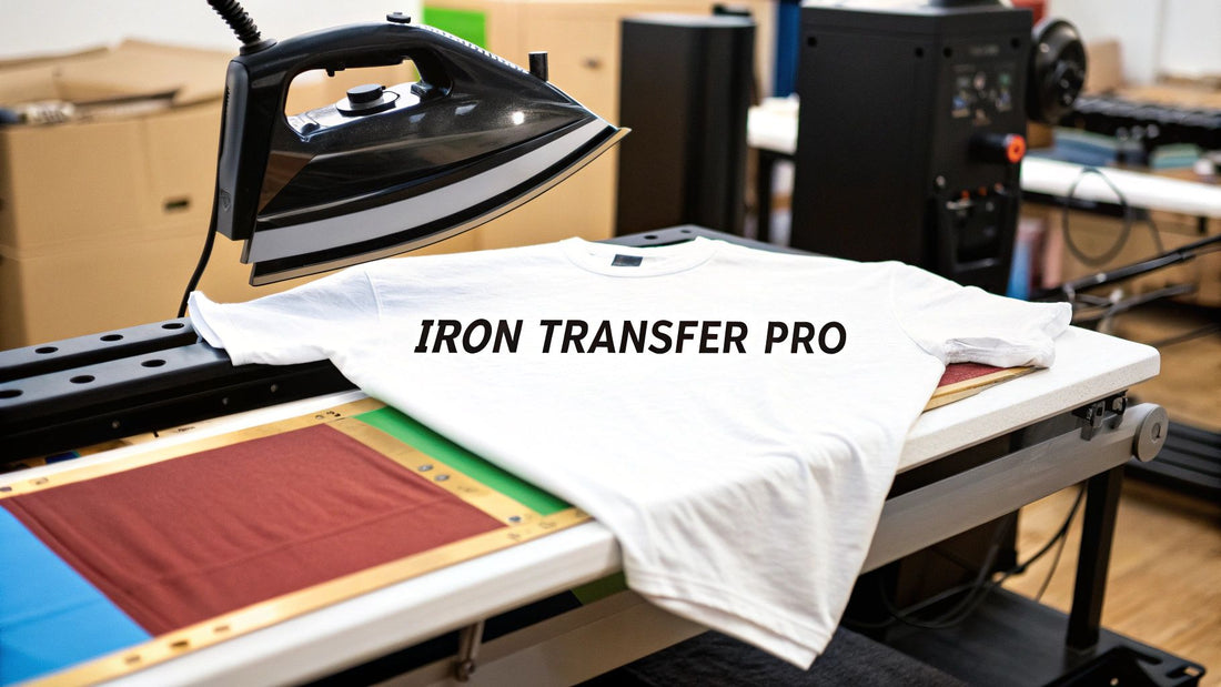
How to Use Iron Transfer Paper Like a Pro
Using iron transfer paper is surprisingly straightforward. At its core, you just print a design onto the special paper, position it on your fabric, and then use a hot iron to transfer the image. It's a fantastic way to turn a digital graphic into something you can wear, all from the comfort of your home.
Your Guide to Flawless Iron On Transfers
Ready to transform a plain t-shirt into your next favorite piece of clothing? I'm here to walk you through it. This guide goes beyond the basic instructions on the package, sharing the little secrets I've learned for getting a durable, professional-looking finish every time.
We'll cover how to avoid those all-too-common frustrations—like designs cracking, peeling, or fading after the first wash. Think of this as your inside scoop, from picking the perfect paper to making sure your creation lasts.
Let's dive in.
Getting Started: Light vs. Dark Fabric Paper
The very first decision you need to make is choosing the right paper, and it all comes down to the color of your fabric. This choice is critical because the papers for light and dark fabrics work in completely different ways.
A lot of beginners get tripped up here, so let's break it down to make sure you grab the right one for your project.
Iron Transfer Paper At a Glance
This table gives you a quick side-by-side comparison.
| Paper Type | Best For | Printing Requirement | Application Feel |
|---|---|---|---|
| Light Transfer Paper | White, pastel, and light-colored fabrics | Must be mirrored (flipped horizontally) | The design bonds into the fabric fibers, feeling softer. |
| Dark Transfer Paper | Black, navy, red, and any dark or vibrant fabrics | Print as-is (do not mirror) | The design sits on top of the fabric, like a thin vinyl layer. |
Knowing these key differences from the start will save you a lot of time and potential mistakes.
So, what does this mean in practice?
-
With light transfer paper, the transfer film is transparent. Any white in your design will simply be clear, letting the color of your shirt show through. Because you place it face-down to iron, you must print a mirrored version of your image.
-
On the other hand, dark transfer paper has an opaque white background. This is what makes your colors show up brilliantly on a dark shirt. You print the design normally (no mirroring!) and then peel it off the backing to place it face-up on the shirt. This also means you have to trim very carefully around your design if you don't want a white border.
Nailing this first step is the foundation for a perfect transfer.
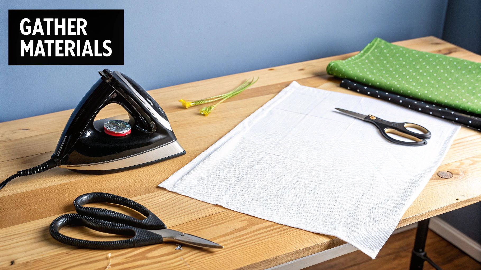
Getting Your Gear Together: Tools and Materials
Before you even think about printing, let's get your workspace set up. Honestly, having everything you need within arm's reach is half the battle. It turns a potentially frustrating project into a smooth, creative session. Think of it as your mise en place for crafting.
First up, the star of the show: the iron transfer paper. You'll need to decide if you're working with a light-colored shirt or a dark one, as this determines which type of paper you buy. This isn't a small detail—it changes the entire application process.
You'll also need an inkjet printer. The vast majority of transfer papers you'll find at a craft store are designed specifically for the liquid ink that inkjet printers use. That ink bonds perfectly with the paper's special coating. A laser printer just won't work here; it uses heat and powdered toner, which requires a totally different (and less common) type of paper.
Prepping Your Fabric and Ironing Station
The fabric you choose is just as critical as the paper. For the best results, you want something with a high cotton content, as the transfer film loves to grab onto natural fibers.
- 100% Cotton: This is your best bet. Transfers on pure cotton come out looking vibrant and tend to last longer.
- Cotton/Polyester Blends (50/50): These are also a great option. The final print might look a little more "vintage" or faded compared to 100% cotton, but they absolutely work. If you want to dive deeper, we have a whole guide comparing cotton and polyester fabrics.
- Synthetics to Avoid: Steer clear of fabrics like nylon, rayon, or anything with a lot of stretch. The intense heat from the iron can easily scorch or even melt them.
Finally, where you do the ironing matters. A lot. Your wobbly old ironing board isn’t going to cut it for this. It’s too padded and doesn't provide the solid, even pressure you need.
My Go-To Trick: I always use a sturdy kitchen counter or a solid table. I just lay down a clean pillowcase to protect the surface, and this gives me a firm foundation. It lets me lean in and use my body weight to get that consistent pressure that makes or breaks a good transfer.
This whole idea of making custom shirts at home really took off in the 90s when home printers became a thing everyone had. Suddenly, you could print anything you wanted and stick it on a t-shirt, which was a huge deal for personal expression and DIY fashion.
So, to recap, your toolkit is simple: the right transfer paper, an inkjet printer, a cotton-rich garment, and a hard, heat-safe surface. Once you've got these items gathered, you're ready to move on to the fun part.
Getting Your Design Ready for a Flawless Transfer
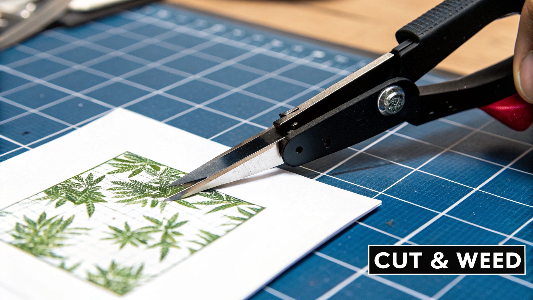
A fantastic-looking custom shirt starts on your computer, well before you even think about plugging in the iron. This is the stage where you can head off most of the common frustrations and make sure your final piece looks sharp and professional, not like a blurry, backward mistake.
The absolute first thing you have to do—and this is especially true for transfers on light-colored fabrics—is mirror your image. Think about it: you'll be placing the paper design-side-down onto the fabric. If you don't flip the design horizontally in your software first, all your text and logos will come out looking like they would in a mirror. It's a classic rookie mistake, but thankfully, it's an easy one to avoid.
Why Image Quality is Everything
The quality of your digital file dictates the quality of your finished shirt. It's that simple. A low-resolution image that looks decent on your small phone screen will turn into a pixelated, fuzzy mess when it’s printed and pressed onto a t-shirt. You have to start with the best possible file you can get your hands on.
As a solid rule of thumb, make sure your image is at least 300 DPI (dots per inch) at the final size you want to print. This is the secret to getting those crisp, clean lines instead of jagged, blurry edges.
Seriously, don't skip this. You can't magically add detail that isn't there to begin with. Starting with a high-quality file is fundamental to understanding how transfer paper works to give you an accurate copy of your design. If you're designing from scratch, checking out some unique drawing ideas can get the creative juices flowing for a truly custom piece.
Tweaking Your Design Before You Print
Colors on your bright computer screen rarely look the exact same when they come out of a printer. Screens use an RGB (Red, Green, Blue) light model, but printers use CMYK (Cyan, Magenta, Yellow, Black) ink, which can sometimes make vibrant colors appear a bit muted.
Here’s how to get ahead of that:
- Give the Saturation a Little Nudge: In your design program, whether it’s Canva or Photoshop, try bumping up the color saturation by about 5-10%. This small tweak often helps compensate for the slight dulling effect of the printing process.
- Always Print a Test Copy: Before you use up a precious sheet of transfer paper, print your final, mirrored design on a plain piece of paper. This five-second check is a lifesaver for catching color problems or realizing you forgot to flip the image.
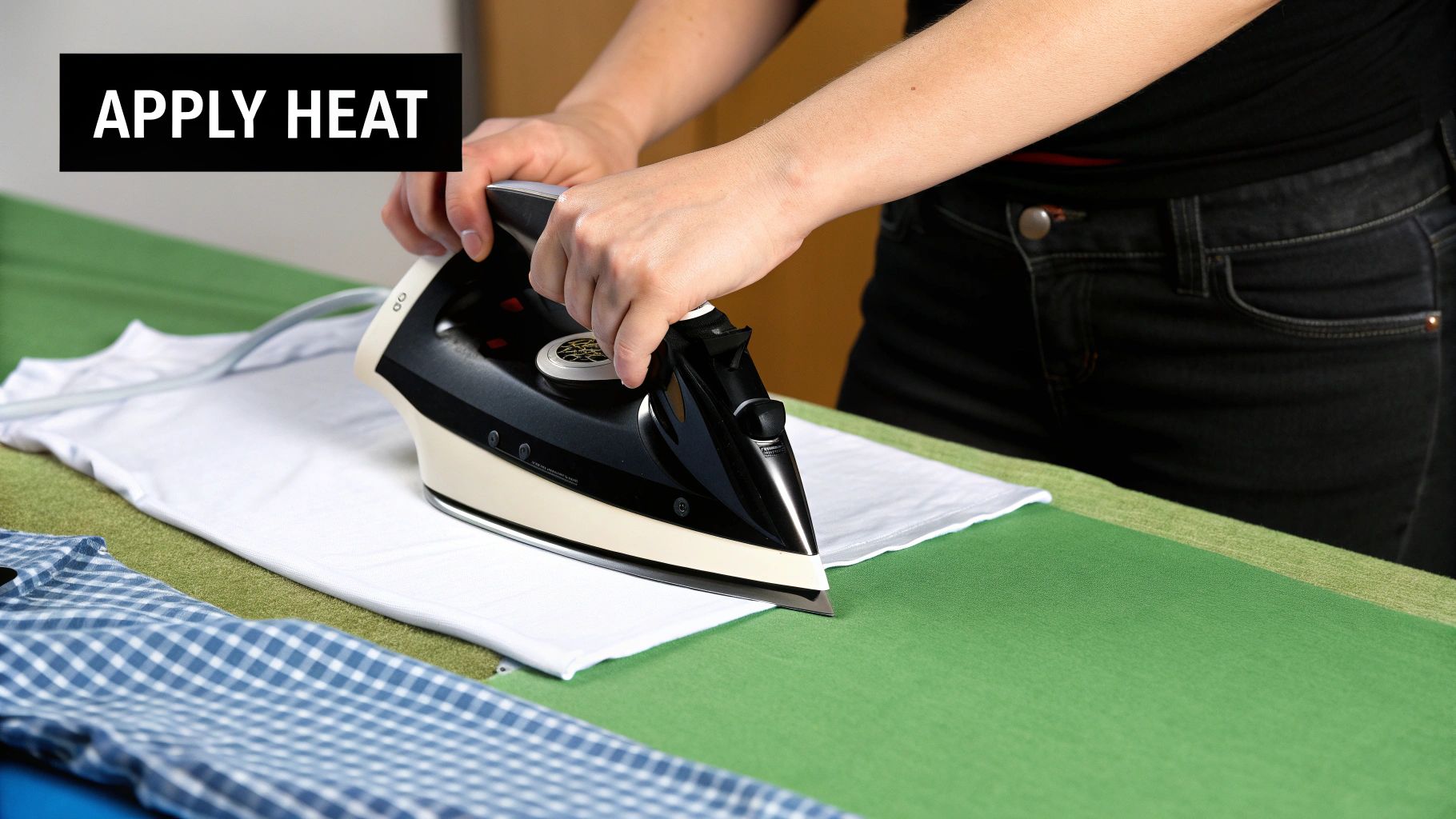
Getting the Ironing and Application Just Right
This is where your design truly comes to life. A successful transfer isn’t about just running a hot iron over the paper; it’s a careful balance of heat, pressure, and timing. Nailing this part is what makes the difference between a shirt that looks homemade and one that looks like a professional, long-lasting custom print.
First, let's get your iron set up. Crank it up to its highest temperature—usually the setting for cotton or linen. And this is critical: make sure the steam function is completely off. Steam is the arch-nemesis of a good transfer. It adds moisture, which can ruin the adhesive and cause your design to peel.
Applying Heat and Serious Pressure
Before you even think about placing your transfer, give the garment a quick press for about 10-15 seconds. This little prep step does two things: it smooths out any last-minute wrinkles and, more importantly, it zaps any residual moisture hiding in the fabric. You want a perfectly flat, dry canvas for your artwork.
Okay, now place your transfer paper on the fabric, with the design facing down. The secret to a transfer that lasts wash after wash is firm, consistent pressure. Don't just slide the iron around casually. You need to put some muscle into it. Press down hard, using your body weight, and move the iron slowly across the entire design.
I recommend spending about 15-30 seconds on each area, overlapping your passes slightly. Pay extra attention to the edges and corners, as they're often the first places to lift if they don't get enough heat and pressure.
This visual guide really breaks down the key steps for a perfect application.
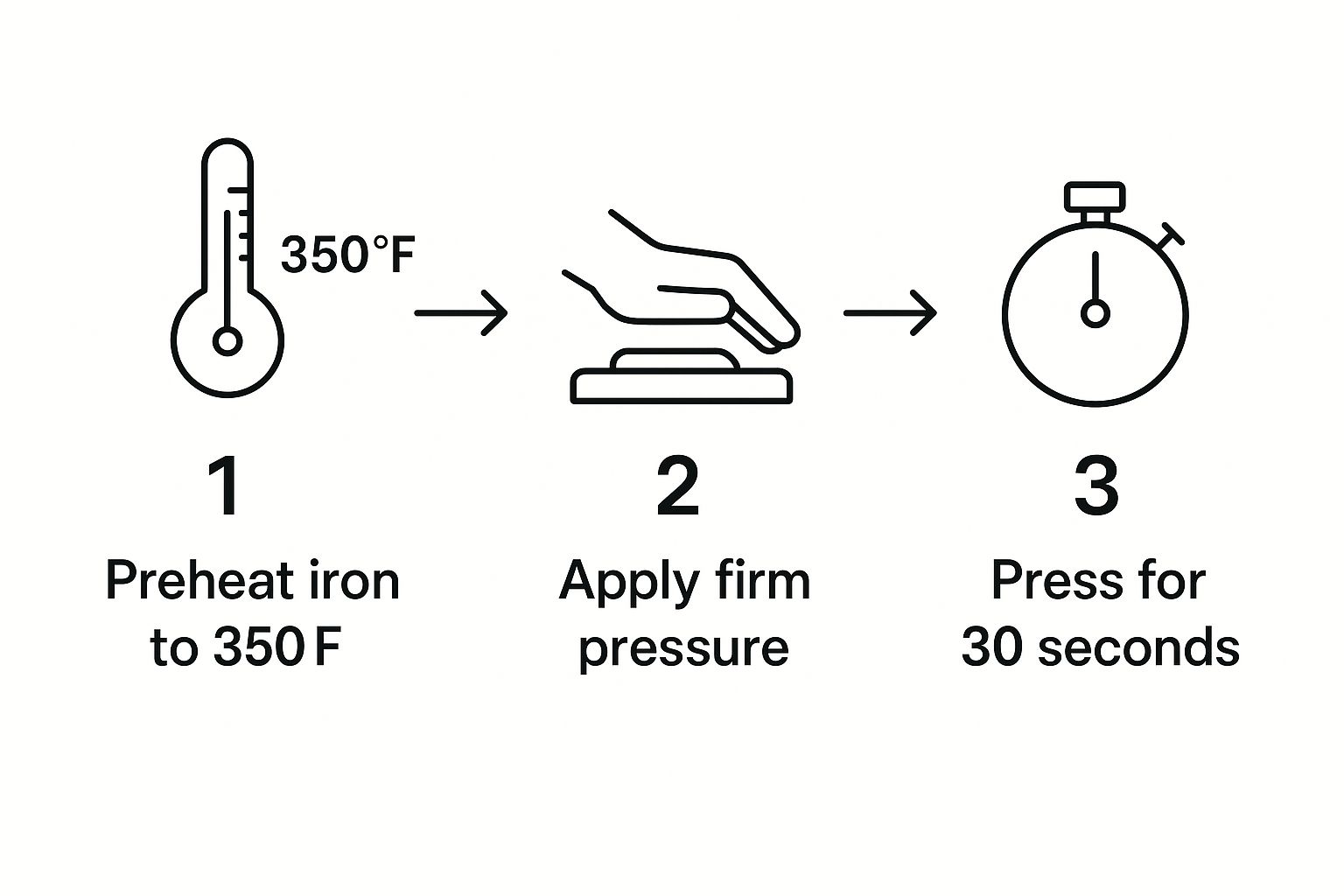
As you can see, it's all about combining high heat with steady pressure for the right amount of time. It’s no surprise that 70-80% of people get fantastic results simply by following the heat and timing instructions to the letter.
The All-Important Peel: Hot or Cold?
Finally, you need to know if your paper is a "hot peel" or a "cold peel." This tiny detail can make or break your project, so always check the instructions that came with your paper.
- Hot Peel: Just like it sounds, you'll peel the backing paper off immediately after you finish ironing, while everything is still hot.
- Cold Peel: You have to exercise some patience here. Let the garment and transfer cool down completely to the touch before you even think about peeling the back off.
Pro Tip: Peeling at the wrong time is a classic rookie mistake. If you peel a cold-peel paper while it's hot, the design will likely lift right off the shirt. If you let a hot-peel paper cool down, it can stretch, crack, or refuse to release cleanly. Always, always follow the manufacturer's directions for this step.
For a deeper dive into different application methods, take a look at our complete guide on https://cobradtf.com/blogs/guides/heat-transfer-shirt-printing. And if you're serious about getting consistent, professional results, this essential heat press temperature guide is a fantastic resource, even if you're just using a home iron.
Caring for Your Custom Shirt to Make It Last
Alright, you’ve put in the work and created an awesome custom piece. Now, let's talk about how to keep it looking great. The aftercare is just as important as the ironing process, and those first 24 hours are absolutely critical. This is when the ink and adhesive are truly setting and bonding with the fabric fibers.
It’s tempting to wash your new shirt right away, but you have to resist. Giving it a full day to cure makes the design as permanent as it can be, which dramatically cuts down the risk of the transfer peeling or cracking later on.
Your First Wash and Beyond
When that 24-hour waiting period is over, it’s time for the first wash. A few simple habits will keep your design looking sharp and vibrant for a long, long time. The golden rule is to always turn your shirt inside-out before it goes into the machine. This small step is a lifesaver, as it protects the transfer from getting roughed up by other clothes or the inside of the washer.
For the best results, stick to these settings:
- Water Temperature: Only use cold water. Heat is the enemy of your transfer; hot water can soften the adhesive and make the colors fade.
- Wash Cycle: Stick to the gentle or delicate cycle. This minimizes the physical stress on the design.
- Detergent: A mild detergent is your best friend here. Steer clear of bleach and harsh fabric softeners, as they can degrade the transfer material.
Following these steps really helps maintain the integrity of your iron-on, keeping it looking crisp for dozens of washes.
The biggest mistake you can make is putting your custom shirt in a machine dryer. The intense, prolonged heat is the fastest way to crack, peel, and ruin all your hard work.
Instead of tossing it in the dryer, just hang the garment to air dry or lay it out flat. If it looks a little wrinkled once it's dry, you can definitely iron it. Just remember to keep it inside-out and never, ever put the hot iron directly onto the transfer itself. A little bit of care goes a very long way.
Working Through Common Iron-On Transfer Hiccups
So you've followed all the steps, but something still seems a little off with your finished project. Don't sweat it. Most of the common snags with iron-on paper are surprisingly easy to fix and, even better, simple to prevent on your next go-around.
Let's walk through some of the most frequent issues I've seen and how to get things back on track.
If your freshly pressed design feels stiff or has that thick, plastic-y texture, the culprit is usually too much heat for too long. Over-baking the transfer can cook the film, making it feel brittle instead of flexible. A good rule of thumb is to knock about 15 seconds off your pressing time and see if that gives you a softer, more professional result.
Fixing Lifting Edges and Washed-Out Colors
Seeing your design peel up at the corners after just one wash is a classic—and frustrating—problem. This almost always comes down to one thing: not enough pressure. It's tricky to get consistent, firm pressure along the outer edges of a design with a standard household iron.
My Pro Tip: Always give the perimeter of your design some extra love. I spend an additional 10-15 seconds pressing down hard specifically on all the edges to make sure that adhesive really melts into the fabric.
Fading colors can be traced back to a similar issue, but this time it's usually about heat. If your iron isn't hot enough, the ink from the transfer paper never gets a chance to properly bond with the shirt. Double-check that your iron is cranked up to its highest setting (and absolutely no steam!). It also helps to pre-heat the fabric for a few seconds to zap any lingering moisture before you even lay the transfer down.
Common Sticking Points with Iron-On Transfers (and How to Fix Them)
Even when you follow the steps, a few things can go wrong. It happens to everyone. Let's walk through some of the most common questions that pop up, because getting these details right is what separates a great-looking shirt from a crafting fail.
"Help! My Design Is Cracking or Peeling Off."
This is, without a doubt, the number one frustration I hear about. When a design starts to lift at the edges or crack after just one wash, the problem almost always boils down to heat, pressure, or timing.
The adhesive on the back of the paper needs to literally melt into the weave of the fabric, not just sit on top of it. You need to apply serious, consistent pressure. I'm talking about using your body weight, not just your arm strength. Another common mistake is washing the garment too soon. You have to give that transfer a full 24 hours to fully cure and bond with the fabric before it ever sees the inside of a washing machine.
"Can I Really Use This Paper on Any T-Shirt?"
Absolutely not, and this is a big one. Iron-on paper is made for fabrics that can take high, direct heat and have a fairly smooth surface for the film to grab onto.
Here’s what you need to know:
- Your Safest Bets: Stick with 100% cotton, polyester, or a good cotton/poly blend. These fabrics are champions at handling the heat and providing a great surface for the transfer to bond to.
- Fabrics to Skip: Keep the iron far away from heat-sensitive synthetics like nylon, rayon, or acrylic—they can scorch or even melt. Textured fabrics are also a no-go. Things like ribbed knits or terry cloth have an uneven surface that prevents the transfer from making full contact, which means it will peel right off.
Think of it this way: a smooth, heat-friendly fabric is the foundation for a design that lasts. Trying to press a transfer onto the wrong material is just asking for a melted mess or a design that flakes off before you even wear it.
"What’s the Real Difference Between Paper for Light vs. Dark Fabrics?"
This trips a lot of people up at first, but it’s pretty simple once you see how they work. The two types of paper are basically polar opposites.
Paper for light-colored shirts has a transparent transfer film. This means any "white" in your design will just be clear, letting the color of the shirt show through. It's why you have to print your image as a mirror image—you'll be placing it face-down on the fabric to iron it on.
On the other hand, paper for dark fabrics has a solid, opaque white background. This is crucial for making your colors pop on a dark shirt instead of getting lost. You print the image the right way around (no mirroring needed!), peel it off the backing paper like a sticker, and place it face-up on the shirt to press.
Ready to skip the DIY and get professional, durable prints for your projects? Cobra DTF offers premium, USA-made Direct-to-Film transfers that are vibrant, fade-resistant, and ready to press. Explore our high-quality transfers and elevate your custom apparel today.