

Heat Transfer Design Guide for Vibrant DTF Prints
You've got a colorful eagle design on the screen, the shirt is loaded, and the press cycle looks perfect. Then the film lifts with the peel, a thin outline breaks apart, and the black garment turns your carefully balanced colors muddy. That failure usually started before the artwork reached the printer.
Heat transfer design isn't only about making a graphic attractive in Illustrator or Photoshop. It's about making artwork behave predictably on film, under heat, against fabric, and through repeated wear. Fine lines, transparent edges, gradients, white underbases, placement, and scale all affect whether a transfer looks sharp or becomes a reprint.
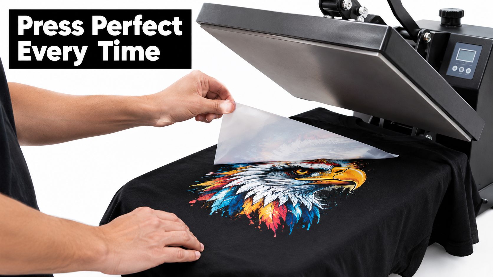
Why Great Heat Transfer Design Makes or Breaks Your Press
A design can look excellent on a bright monitor and still fail on a shirt. Screens display light. Fabric absorbs light, and the transfer has to create its own visible color against that surface. A pale gradient that looks smooth on screen may lose its soft edge on a dark hoodie, while a narrow outline may become fragile once the design is printed, powdered, cured, pressed, and peeled.
That's why DTF artwork needs a production mindset. Screen printing often relies on separations, mesh, and controlled ink deposits. Sublimation depends heavily on compatible polyester substrates and turns ink into gas within the fabric. DTF gives you broad fabric flexibility and strong color potential, but it still needs artwork with clean edges, deliberate transparency, and enough structure to survive application.
The file decides more than the appearance
A semi-transparent pixel at the edge can create a weak, dirty-looking boundary. An unnecessary background can produce a visible box around the design. Excessive ink coverage can make a large graphic feel heavy, while tiny text may look readable in the file and fail to transfer cleanly at actual size.
The press can't correct those choices. Heat and pressure only apply the transfer you supplied. If the art contains weak edges, crowded details, or poor contrast, the machine will reproduce those weaknesses consistently.
Production reality beats screen perfection
I've seen simple logos press beautifully because the designer used strong shapes, controlled spacing, and clear contrast. I've also seen photorealistic artwork fail because it was enlarged from a small, compressed image and filled with noisy edges. The more detailed the design, the more carefully you need to inspect it at its intended print size.
Practical rule: If a detail matters to the design, make sure it still reads at the size you'll actually press, not only when the canvas is enlarged on your monitor.
Good heat transfer design reduces surprises. It helps the printer generate a usable white underbase, gives the adhesive a stable area to bond, and makes color corrections possible before production. The result is fewer rejected transfers and a more repeatable workflow.
Design Best Practices That Look Great and Press Clean
Start with the garment color, not with the artwork alone. A design built for a white shirt can look weak on black because pale colors lose separation without a strong underbase or sufficient contrast. On dark garments, bright fills, confident outlines, and purposeful negative space usually outperform subtle tonal differences.
Build details that can survive transfer
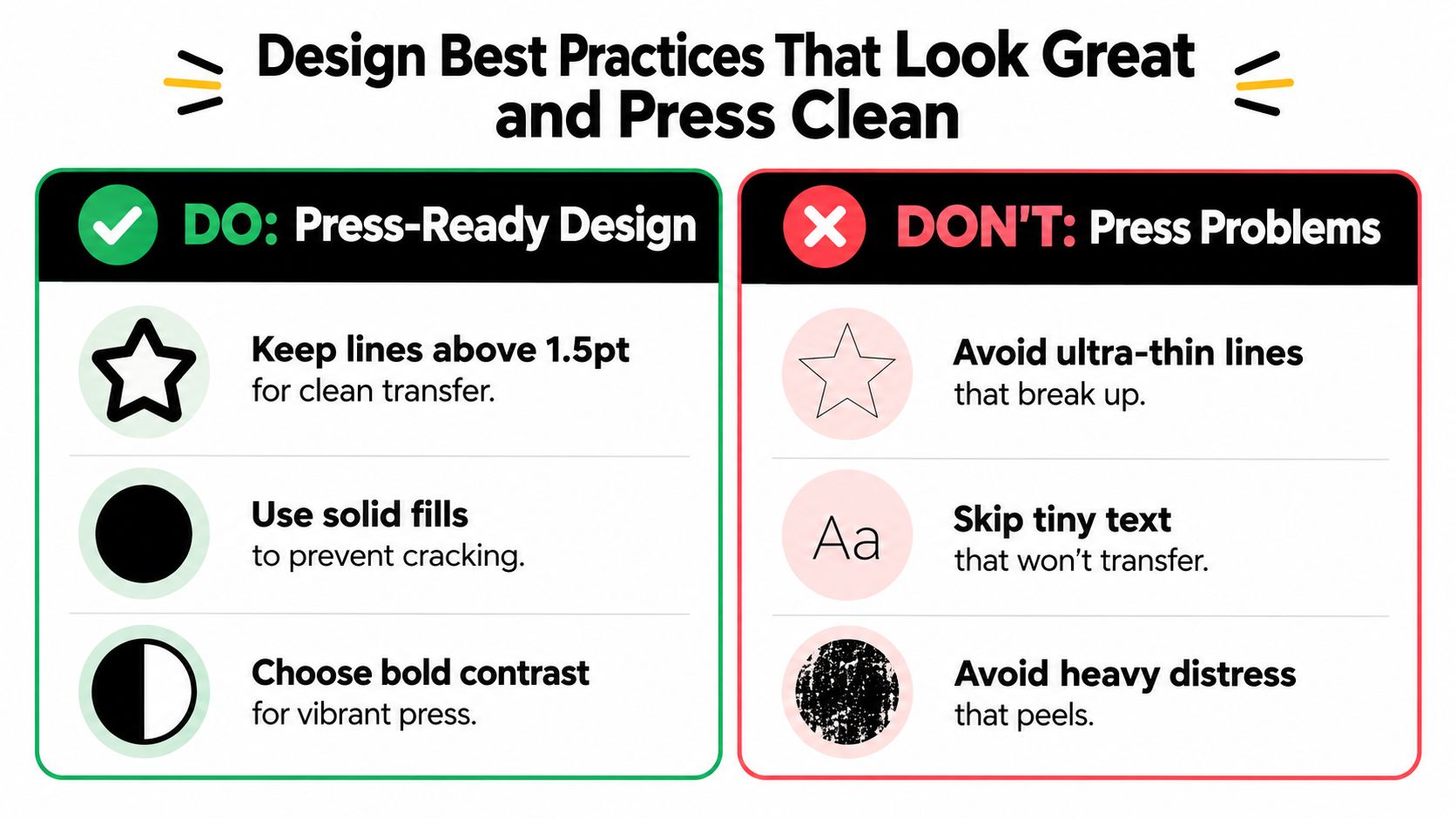
Keep thin strokes from becoming the visual foundation of the design. The supplied production infographic recommends keeping lines above 1.5 pt for a cleaner transfer, but the practical result also depends on final size, artwork complexity, and the printer's workflow. Hairline rules and delicate decorative marks are the first elements I inspect before approving a file.
Small text deserves the same scrutiny. Condensed typefaces, tight counters, and narrow punctuation can fill in or disappear when reduced. Use fewer words, increase spacing where possible, and check the design at 100% rather than trusting an enlarged view.
Control coverage, texture, and transparency
Solid shapes are usually easier to press than layers of unnecessary texture. That doesn't mean every design needs to be flat. A vintage distressed logo can work well when the distress is intentional and moderate, but heavy cracking, scattered microdots, and random edge noise create weak points that may lift or break.
Photorealistic portraits need a different treatment. Don't apply the same distressing or trapping logic used for a bold logo. Correct the image's contrast and color first, remove unwanted background pixels, and preserve important facial or garment details without sharpening every pore and fabric fiber.
Gradients should transition smoothly. Banding, abrupt alpha changes, and low-quality transparency often produce visible steps around the artwork. For dark garments, check whether the lighter parts of the gradient have enough contrast against the shirt once the white underbase is generated.
Use contrast as a production tool
Contrast isn't only a branding decision. It helps the design remain legible after the shirt changes color, stretches, or picks up texture. A dark red element may look rich on white and disappear on charcoal. A narrow black outline may vanish on a black garment unless you introduce a light border or redesign the edge.
For more examples of artwork approaches and layout ideas, review DTF transfer design guidance. Before exporting, check three things: no accidental white box, no fragile microdetail, and no color that depends on the screen's glow to remain visible.
File Formats Resolution and Color Setup for DTF
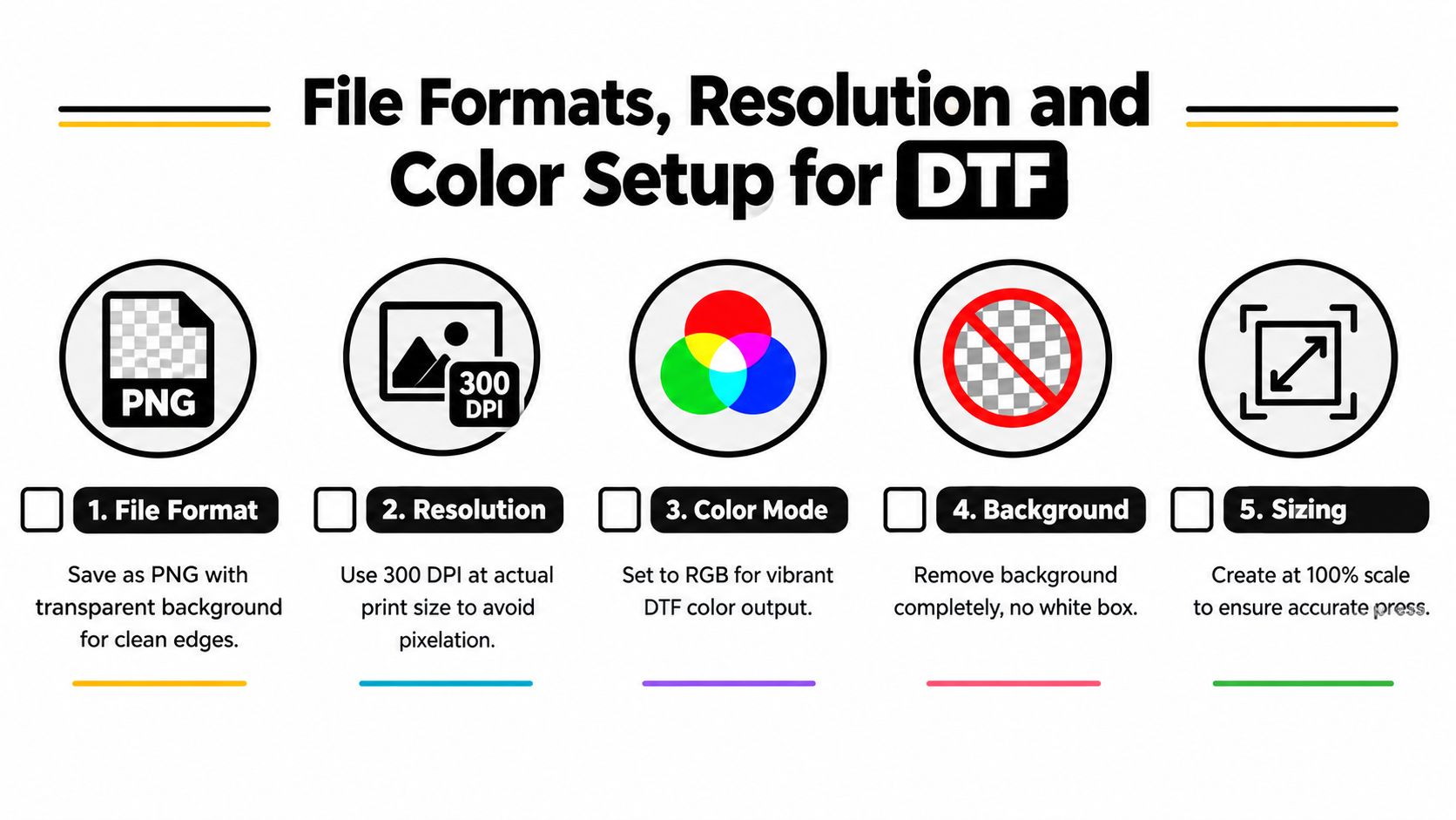
A printer should receive artwork that needs interpretation, not repair. The safest workflow begins with a canvas created at the final print size and a resolution of 300 DPI at actual size. That resolution is included in the required preparation guide because enlarging a low-resolution file later won't restore clean edges or missing detail.
Choose a format that preserves the design
PNG with a transparent background is a practical choice for most raster DTF artwork. Transparency lets the printer place only the intended graphic on the film, rather than printing a rectangular background. Keep the alpha edge clean, especially around hair, smoke, glow effects, and distressed marks.
PDF can work well when the workflow preserves vector elements and transparency correctly. Don't assume every PDF is production-ready. Flattening, color conversion, embedded effects, and missing fonts can change the result between applications.
Avoid JPEG for final artwork when possible. Compression can create blocky halos and colored artifacts around text and high-contrast edges. Those artifacts may be subtle on screen but become obvious when the printer lays down a white underbase beneath them.
Set color for the way DTF is printed
Use an RGB workflow when your printer or RIP expects RGB input and vibrant DTF output. Don't convert back and forth casually between RGB and CMYK. Each conversion can alter bright greens, oranges, blues, and saturated purples, which makes color matching harder.
The white underbase also deserves attention. Many DTF workflows generate it automatically, but transparent regions, knockouts, and semitransparent pixels can influence where white is placed. A design that contains a hidden background or an unintended white object may produce a halo or a visibly different edge.
Key takeaway: Create at 300 DPI, at 100% print scale, in the required RGB workflow, then export with transparency intact.
Keep vector artwork available when you're working with logos, lettering, and geometric shapes. Raster artwork is appropriate for photographs, painted textures, and effects. This raster versus vector guide can help you decide which construction method suits the design before you commit to an export.
If you're also preparing images for a storefront or product catalog, use a separate workflow to improve site speed with image optimization. Web optimization is useful for online previews, but don't let a web-compressed asset replace the full-resolution production file.
Sizing Placement and Substrate Considerations for Every Garment
Sizing errors create awkward shirts even when the transfer itself is flawless. A graphic can be technically centered and still look too low, too wide, or too dominant because the garment, wearer, and placement weren't considered together.
A pocket logo needs a different proportion from a full front print. Youth garments need reduced artwork, while oversized blanks may need a larger visual footprint to avoid looking lost in the fabric. Use a consistent measuring method, mark the garment's center, and check the design against the actual shirt rather than estimating from a product photo.
DTF sizing and substrate quick reference
| Garment and Placement | Recommended Size Range | Substrate Tip |
|---|---|---|
| Adult full front | 10 to 12 inches wide | Check the shirt's usable chest area before scaling |
| Adult left chest | 3.5 to 4.5 inches wide | Keep fine details limited at smaller scale |
| Adult full back | 11 to 13 inches wide | Account for seams, collars, and hood overlap |
| Youth full front | 7 to 9 inches wide | Scale for the garment, not the adult template |
| Infant or toddler front | 4 to 6 inches wide | Use simple shapes and comfortable coverage |
| Sleeve placement | 2.5 to 4 inches wide | Follow the sleeve's narrow, curved surface |
| Oversized front | 12 to 15 inches wide | Confirm the blank can accept the full design |
The ranges above are working starting points, not universal rules. A broad illustration may need more breathing room than a compact wordmark, and a tall design should be measured by height as well as width.
Match the artwork to the fabric
Cotton, polyester, and blends can react differently to heat, pressure, texture, and stretch. Polyester may need more care around scorching or dye migration, while a stretchy performance garment can expose weak edges if the design has rigid, dense coverage. Ribbed fabric, fleece, and heavily textured surfaces also reduce the contact consistency between transfer and garment.
Don't solve every substrate problem by changing the design. Confirm the transfer supplier's fabric-specific application guidance, then test on the actual blank. A sample press can reveal whether the artwork needs a simpler edge, a different placement, or a reduced coverage area.
For gang sheets, arrange designs with clear spacing and consistent orientation. Leave enough room to trim without cutting into the art or its edge effects. Planning the sheet around finished placement sizes prevents a common production mistake, printing a sheet efficiently but discovering that several graphics don't fit the garments they were intended for.
For additional placement examples, use this DTF transfer sizing guide. Measure twice before approving the sheet. A correct file at the wrong size is still a failed production decision.
Exporting Production Ready Artwork Without Costly Mistakes
Exporting should be a controlled handoff, not the last hurried click before sending a file. I use a preflight pass that separates visual inspection from technical inspection. That makes it easier to catch a beautiful design with a broken alpha edge or a correctly sized file with the wrong background.
Follow a repeatable export pass
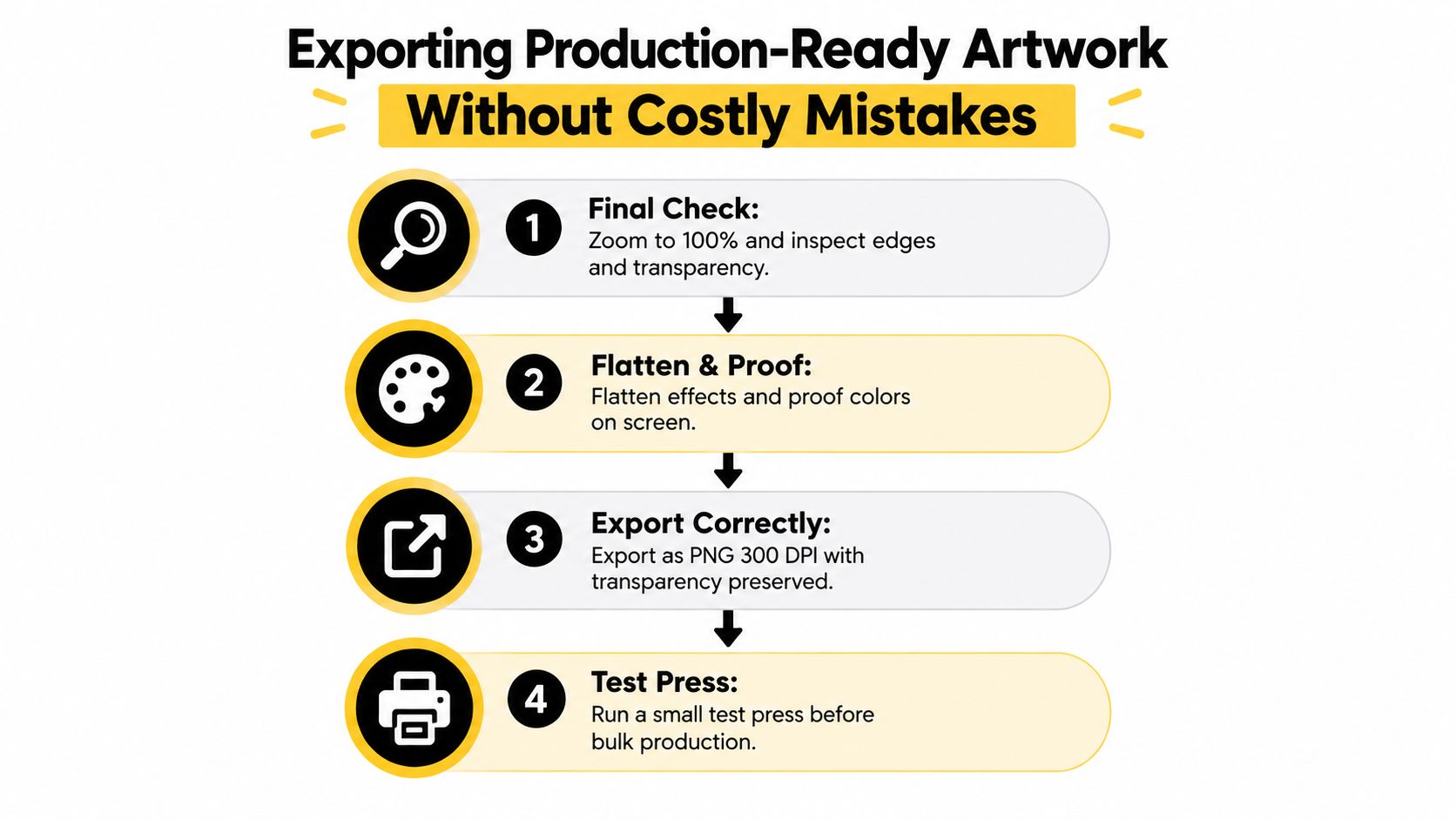
- Inspect at actual size. Zoom to 100% and look for stray pixels, fuzzy edges, broken counters, and unexpected transparency. Then zoom out to confirm the design still reads as a whole.
- Clean the canvas. Remove hidden layers, unused objects, guides, and background rectangles. A white layer turned off on screen may still affect an export if the file is flattened incorrectly.
- Preserve intentional transparency. Keep transparent areas transparent, but don't leave accidental semitransparent fringes around the subject. This matters most around hair, shadows, glows, and distressed logos.
Proof the file before it reaches the RIP
Flatten effects only after you've confirmed that flattening won't remove transparency or change the appearance. If the artwork contains live text, outline it or embed the required fonts according to the printer's instructions. Check the canvas dimensions, resolution, color mode, and file name before uploading.
A useful file name includes the design name, placement, garment audience, and final size. That prevents confusion when multiple versions enter a gang sheet or when a customer orders several colorways.
Production check: Open the exported PNG in a separate viewer. If you see a background box, missing effect, or unexpected edge, fix the source file instead of hoping the RIP will interpret it correctly.
Don't upscale a small logo and call it print-ready. Rebuild vector elements when possible, request a better source image for portraits, and create a small test press when the artwork includes unusual transparency or heavy effects. A short test can expose a problem before bulk production multiplies it.
Press With Confidence and Get Consistent Results Every Time
Reliable DTF production comes from a loop. Build artwork with transfer limits in mind, export it without hidden defects, size it for the garment, and verify the result on the actual substrate. Skipping one part forces the press operator to compensate for a problem that began upstream.
The three checks I'd never skip are edge quality, final-size readability, and garment-specific placement. Together, they catch many of the failures that otherwise appear as peeling corners, muddy color, unreadable text, or an unbalanced shirt.
Keep a sample garment nearby for unfamiliar blanks. Record the transfer size, garment type, press setup, peel result, and second-press result in your production notes. If a design performs well, you'll have a repeatable reference instead of relying on memory.
For outsourced transfers, Cobra DTF offers DTF transfers with USA-made production, vibrant fade-resistant colors, and quick turnaround options, including same-day shipping for qualifying orders placed by 1 PM CST. That can fit a workflow where the artwork is carefully preflighted before ordering and the finished transfer is tested on the intended garment.
Audit one existing design today. Open the source file, check its transparency and edges at actual size, confirm the final placement measurement, and export a clean production copy before you send it to press.
Choose Cobra DTF when you need production-ready DTF transfers to match carefully prepared artwork. Visit the site, review your transfer dimensions and garment requirements, and send your next design through a test-first workflow that prevents avoidable pressing failures.