

Mastering DTF Transfer Designs for Pro-Quality Apparel
The designs you create for DTF transfers are the very foundation of your final product. They're more than just digital graphics; they're the blueprint for what gets printed on the film and eventually heat-pressed onto a garment. The entire process lives or dies by the quality of that digital file, so getting details like resolution, transparency, and file type right from the start is crucial for a professional finish.
The Foundation of Flawless DTF Transfer Designs
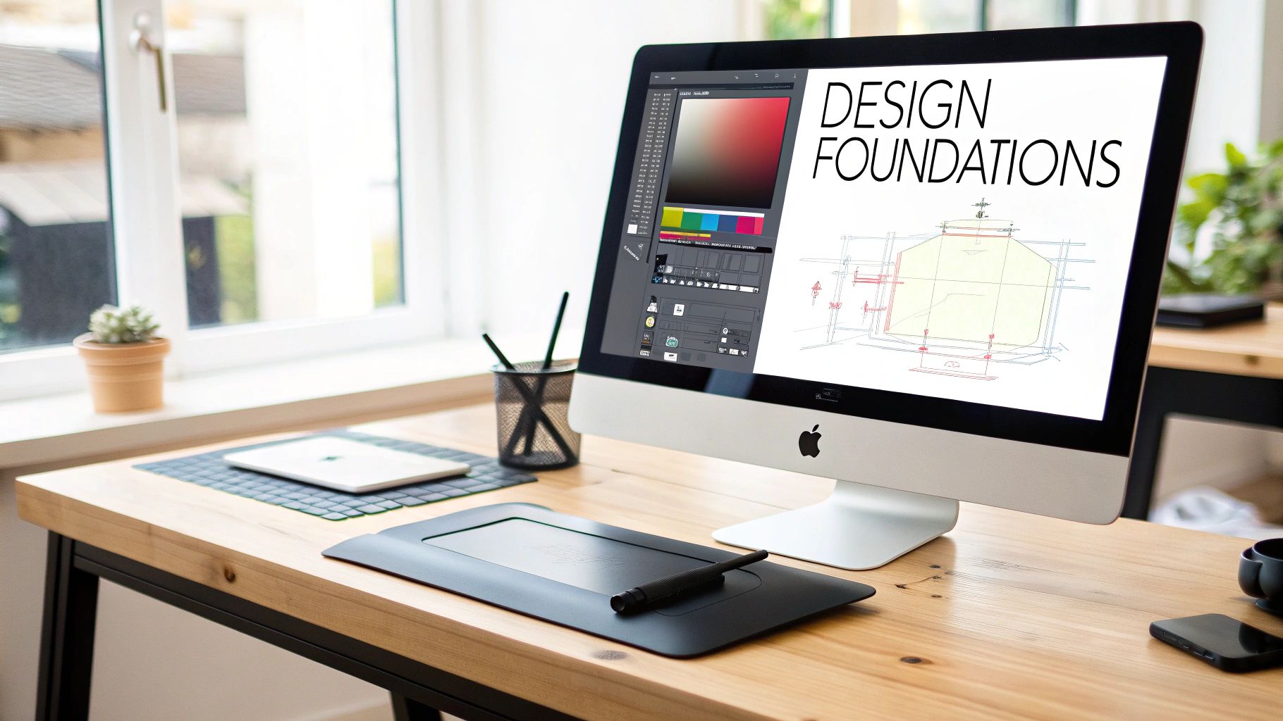
Long before you even power on your printer, the fate of your project is sealed right there on your computer screen. Crafting top-tier dtf transfer designs is as much a technical skill as it is a creative one. A poorly prepped file is a surefire recipe for a subpar transfer, leading to wasted time, ink, and costly film.
This is the stage where you sidestep common headaches like pixelated images, weird color shifts, or those frustrating white halos around your art. By mastering these core principles, you pave the way for a seamless production run and a final product that looks sharp, vibrant, and ready to sell.
Vector vs. Raster: The Eternal Debate
One of the first forks in the road you'll encounter is whether to use vector or raster graphics. They both have their uses, and knowing the difference is key to getting the results you want.
- Vector Graphics (AI, EPS, SVG): Built on mathematical paths, not pixels. This is their superpower. You can scale a vector design from a tiny tag print to a full-back design with zero loss in quality. For any designs heavy on text, logos, or solid shapes, vector is king.
- Raster Graphics (PNG, TIFF, JPG): These are pixel-based, just like a digital photo. They’re fantastic for photorealistic images, intricate textures, and smooth gradients. The catch? They have a fixed resolution. If you stretch a low-resolution raster image, it’s going to look blurry and pixelated. No way around it.
For the majority of DTF projects, I strongly recommend designing in a vector-based program like Adobe Illustrator or CorelDRAW. It just gives you the most flexibility and guarantees crisp lines every time. If you absolutely have to use a raster image (like a client's photo), make sure it’s high-resolution from the get-go.
Pro Tip: Always create your design at the final print size or even a little larger, especially if you're working with raster files. You can always scale a high-quality image down without issue, but you can't scale up without wrecking the quality. A graphic made for a left-chest logo will look like a mess if you blow it up for a hoodie back.
The Critical Role of Clean Transparency
Nothing screams "amateur print" faster than a fuzzy white halo or a faint box around a design. This happens when the artwork has soft, semi-transparent edges or a background that wasn't perfectly knocked out. A DTF printer lays down a white underbase beneath any pixel that isn't 100% transparent.
This means that soft glows, drop shadows, and feathered edges are a no-go. They will trigger the white underbase and leave you with a messy, unprofessional outline on the shirt. The solution is to work with clean, hard edges. Every single part of your design must be either fully opaque or completely transparent—there’s no in-between. You can dive deeper into the mechanics of this in our guide explaining what is Direct-to-Film printing.
Getting this right is more important than ever. The Direct-to-Film (DTF) printing market is booming, valued at an incredible USD 2.72 billion. This isn't just a niche hobby; it's a massive industry driven by the demand for custom apparel. In fact, over 7.2 billion DTF prints were produced globally in a single year, marking a 30% jump from the year before. Mastering your design prep puts you in a position to claim a piece of that growing market.
Getting Your Digital File Ready to Print
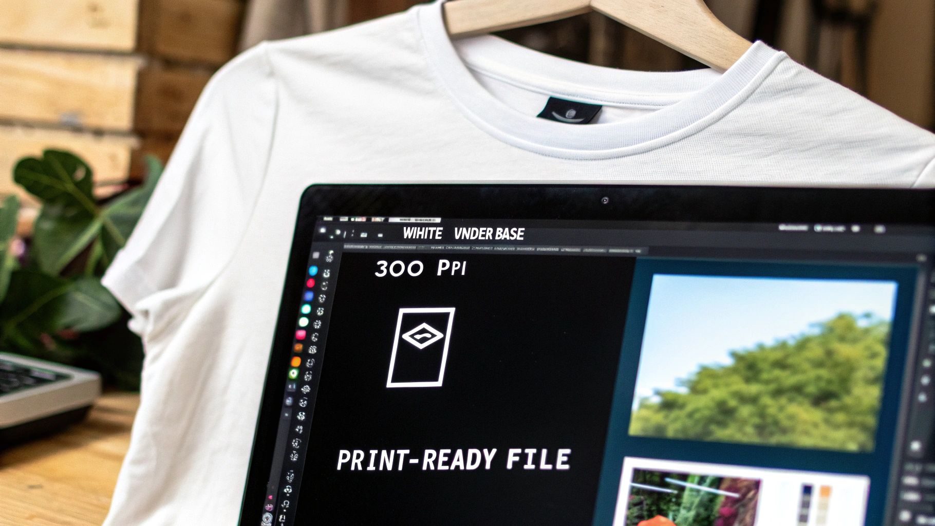
Alright, your design looks incredible on screen. Now comes the critical part: turning that digital artwork into a flawless file that your printer can understand. This is where the real technical work begins, and getting these steps right will save you a world of frustration and wasted materials down the line.
Think of this process as creating a precise blueprint for your printer. Every single setting, from the resolution to the color space, has a direct impact on the final transfer. Nail these details, and your dtf transfer designs will print with the sharpness and color you envisioned.
The Golden Rule: 300 DPI or Bust
Let's start with the absolute non-negotiable of print prep: resolution. For DTF, you need to be working at 300 DPI (Dots Per Inch). Period. This number determines how much detail gets packed into every inch of your print, and it's the key to getting those crisp, professional-looking results.
If you've ever seen a blurry, pixelated shirt, it was probably designed at a low resolution like 72 DPI, which is fine for screens but disastrous for print. You can't magically add detail that was never there to begin with. So, always start your project at the correct size and resolution. If you’re making a 10-inch wide graphic for a t-shirt, your canvas should be set to 10 inches wide at 300 DPI from the very beginning.
Color Profiles and The Best File Format
Here’s a common pitfall: the colors on your screen (RGB) don't match the colors your printer uses (CMYK). This disconnect can lead to some seriously disappointing color shifts when you see the final product.
To avoid surprises, it’s best practice to design your files in a CMYK color profile. This gives you a much more realistic preview of how the colors will actually print. When it's time to save, a high-quality PNG with a transparent background is your best bet. It perfectly preserves all the transparent areas in your design, which is essential for DTF.
Your Pre-Flight Checklist:
- Resolution: 300 DPI
- Color Profile: CMYK (like U.S. Web Coated SWOP v2)
- File Format: PNG-24
- Background: Must be 100% Transparent
The Magic of the White Underbase
The white underbase is the secret sauce for getting vibrant prints on dark or colored shirts. It's a layer of white ink that gets printed underneath your colors, acting like a bright primer. Without it, your design would look faded and muddy on anything but a plain white tee.
Most RIP (Raster Image Processor) software will generate this white layer for you automatically. It just looks for any colored pixel in your design and puts white ink behind it. However, if you want total control, you can create it manually. This usually means duplicating your design, turning it into a solid black shape, and placing that shape on a layer behind your artwork. The RIP software then reads that black area as the map for where to lay down the white ink. You can find out more about how different programs do this in our full guide to DTF printing software.
The Pro Trick: Choking Your White Layer
Ever see a DTF print with a little white halo poking out from the edges? That’s a rookie mistake. It happens when the white underbase is the exact same size as the color layer on top. Even a tiny misalignment during printing can expose that white edge.
The fix is simple but powerful: "choke" the underbase.
This just means making the white layer a few pixels smaller than the color layer, pulling its edges inward. For instance, if your design has a 2-pixel outline, you might choke the white base by 3-4 pixels. This creates a small buffer, guaranteeing the color layer fully covers the white ink underneath. It’s a small tweak that makes a huge difference in producing clean, high-quality dtf transfer designs.
Getting the Most Out of Your Gang Sheets
In this business, profitability is all about efficiency. If you're still printing single designs, it's time for a change. Shifting your focus to building smart gang sheets is how you go from thinking like a hobbyist to running a true production shop. Every square inch of that film should be making you money.
This isn't just about squeezing a few extra logos onto a sheet. It's a deliberate strategy. When you master the art of the gang sheet, you’ll see a massive drop in material waste and print time, which directly boosts your profit margins on every single job. Honestly, it's one of the most valuable skills you can develop.
Start with Simple Sizing Templates
Consistency is everything in the apparel world. A chest logo that looks great on a small t-shirt can look tiny and out of place on a 3XL hoodie. To stop the guesswork and guarantee professional results every time, creating a set of sizing templates is your first move.
You don't need anything fancy. Just build a few basic artboards in your design software for the most common items you print.
- Standard T-Shirt: Have artboards ready for a full front (maybe 11" x 14"), a left chest logo (4" x 4"), and a sleeve hit (3.5" x 3.5").
- Hoodies: Make templates for big back graphics (12" x 15") and smaller front logos, making sure to account for zippers or pockets.
- Youth & Toddler: Create scaled-down versions of your adult templates. This ensures your designs always look proportional, no matter the size.
With these files on hand, you can just drop new designs in, knowing they're sized correctly for production before you even start building the gang sheet.
The Art of Building the Gang Sheet
So, what is a gang sheet? It's just a single, large sheet of DTF film packed with multiple different designs, all arranged to maximize every bit of space. Instead of printing one 10" x 10" design on a 22-inch wide roll and throwing away the rest, you fill that space with other orders, pocket logos, custom tags—anything and everything.
The goal is to fit designs together like puzzle pieces. A big, boxy design might leave some awkward empty areas, but you can tuck smaller, circular logos or text-based graphics right into those gaps. Wasted film is literally wasted money. Every blank spot on your sheet is a missed opportunity.
For a deeper dive, check out our complete guide on how to build DTF gang sheets.
The smartest shops I know are masters of the gang sheet. They never print a single design if they can help it. Instead, they collect smaller orders throughout the day and combine them onto one massive print run at night, turning what would have been dozens of small, inefficient jobs into one highly profitable one.
Nesting Strategies for Maximum Yield
How you nest your dtf transfer designs has a direct impact on your material costs. The mission is simple: leave as little blank film as you possibly can.
Think of it like playing Tetris. Spin your designs around to see how they fit best. A long, skinny design might slide in perfectly next to a wide, rectangular one. Pop circular graphics into the empty spaces created by more angular art.
Many RIP software programs, like the ones that come with Cobra DTF systems, have auto-nesting features that do the heavy lifting for you. They can arrange your imported designs for the best possible layout, saving you a ton of time. This isn't just about saving a few pennies; a 15-20% reduction in material waste adds up to huge savings over hundreds of jobs.
From Screen to Transfer: The Printing & Curing Process
You’ve done the digital heavy lifting—your design is prepped and your gang sheet is ready to go. Now, it's time for the magic to happen. This is where we take those pixels and turn them into a tangible, ready-to-press transfer.
Don't mistake this for a simple "click and print" job. It's a hands-on process that requires a good feel for your equipment and an eye for detail. Getting this part right is what gives you those vibrant colors and the soft-hand feel that everyone loves about DTF.
Dialing in Your RIP Software
Before any ink touches the film, your RIP (Raster Image Processor) software is your mission control. This program is the crucial link between your design file and the printer, translating your art into a language the machine understands. There are two settings here you absolutely have to master: ink density and the white channel configuration.
Ink density is just a fancy term for color saturation—it controls how much CMYK ink your printer lays down. If you go too light, your colors will look washed out. Too heavy, and you risk the ink bleeding and blurring the sharp lines of your design. For most printers, a 60-70% color density is a great starting point, but I always recommend running a small test print to see what looks best on your specific machine.
Then there's the white channel, which might be the most important setting of all. This controls the white underbase that gets printed behind your colors. For bold designs going on dark fabrics, you’ll almost always want a solid 100% white channel. But what if you're aiming for a softer, vintage look on a light-colored tee? You can dial that white back a bit to achieve a more subtle effect.
The Print and Powder Workflow
With your settings locked in, it’s time to get your hands dirty. This is a pretty straightforward sequence, but consistency is everything.
- Printing: First, load your DTF film into the printer. It’s usually matte side up, but double-check your film manufacturer’s guide just in case. When you send the job from your RIP software, the printer will lay down the CMYK color layer first, then immediately print the white ink layer right on top of it.
- Powdering: As soon as the print is finished and while the ink is still wet, it's time for the adhesive powder. You need to be generous here. Cover the entire printed area completely, making sure every last bit of wet ink gets coated. It’s always better to use too much powder than not enough.
- Shaking it Off: Next, you need to remove all the excess powder. A gentle shake of the film will knock most of it off. You can give the back a few good flicks with your finger or, for a more professional setup, use a low-pressure air compressor to blow away any stubborn specks. The goal is simple: powder should only be sticking to the wet ink, nowhere else.
A Pro Tip from Experience: Humidity is your enemy during the powdering stage. If the air is too moist, the adhesive powder can get clumpy or stick to unprinted parts of the film. This leaves you with tiny, unwanted glue specks on your final shirt. A small dehumidifier running in your print room can be an absolute game-changer.
Curing: The Final Step Before the Press
The last thing to do before you can press the transfer onto a garment is to cure it. This step melts the adhesive powder, fusing it permanently to the ink layer to create the final, durable transfer sheet. You can do this with a dedicated curing oven or just your heat press.
The sweet spot for curing is typically between 300-350°F (150-177°C). You aren’t actually pressing the transfer; instead, you hover the heat platen about a half-inch above the film for around 2-3 minutes. You'll know it's perfectly cured when the grainy, powdered surface melts into a smooth, slightly rubbery finish that looks a bit like an orange peel.
If you under-cure it, the transfer won’t stick properly to the shirt. Over-cure, and you can scorch the film or damage the ink. Nailing this balance is what makes professional dtf transfer designs so durable. In fact, this durability, combined with cost-effectiveness, is why so many shops are making the switch. For small runs, it can be up to 40% cheaper than DTG, and it works on over 100 different fabric types. Plus, with the industry moving toward eco-friendly inks that can handle 50+ washes, it’s a smart choice for e-commerce and Shopify sellers who need to build a reputation for quality. If you want to dive deeper into the market data, you can explore the full direct-to-film printing market research on grandviewresearch.com.
Perfecting the Final Heat Press Application
You've done all the hard work. The design is printed, powdered, and cured, and the transfer looks fantastic. But none of that matters if the final application goes wrong. This is the moment of truth, where your digital design becomes a permanent, wearable piece of art. Getting it right boils down to mastering the three pillars of heat pressing: temperature, pressure, and time.
These variables aren't just suggestions; they're a precise formula. Too much heat can scorch a delicate fabric, while too little means the transfer will peel off after the first wash. The same goes for pressure and time. Each element has to be perfectly dialed in for the specific garment you're working with to get that professional, long-lasting print everyone wants.
Calibrating Your Heat Press Settings
Every fabric reacts differently to heat. A 100% cotton tee can take a lot of heat, but that same setting would melt a polyester performance shirt in a heartbeat. That's why having the right starting point for your settings is non-negotiable for a flawless application. It’s not just about making the transfer stick; it’s about making it last.
Here's a handy reference guide to get you started with the most common fabrics we see in the shop.
Heat Press Settings by Fabric Type
This table provides a solid starting point for various materials. Remember, every heat press has its own personality, so a quick test on a scrap piece of fabric is always a smart move before starting a big run.
| Fabric Type | Temperature Range (°F/°C) | Press Time (Seconds) | Pressure Level | Peel Method |
|---|---|---|---|---|
| 100% Cotton | 300-320°F / 149-160°C | 10-15 seconds | Medium-Firm | Cold Peel |
| Polyester | 265-285°F / 129-140°C | 8-10 seconds | Medium | Cold Peel |
| 50/50 Blends | 280-300°F / 138-149°C | 10-12 seconds | Medium | Cold Peel |
| Tri-Blends | 260-275°F / 127-135°C | 8-10 seconds | Light-Medium | Cold Peel |
Think of these as your baseline. Your specific transfer film, the humidity in your workspace, and even the garment's dye can influence the outcome, so don't be afraid to tweak things slightly to get that perfect result.
The Complete Pressing Sequence
A perfect press is more like a carefully choreographed dance than a single slam of the machine. Following this sequence eliminates variables that can ruin your final product, from hidden moisture in the shirt to ensuring the design feels soft and retail-ready.
-
The Pre-Press: This is the one step beginners always want to skip, but it’s absolutely critical. Before placing the transfer, press the blank garment for 5-7 seconds. This simple action removes wrinkles and steams out any moisture, giving the adhesive a perfectly flat, dry surface to bond with.
-
Position and First Press: Carefully lay your DTF transfer on the garment. I highly recommend using a t-shirt ruler or alignment tool to ensure consistent placement, especially on larger orders. Once it's positioned perfectly, cover it with a Teflon sheet or parchment paper and do the first press using the settings for your fabric.
-
The Cold Peel: This is what separates DTF from many other transfer methods. Once the press is finished, do not peel the film while it's hot. You need to let the transfer cool down completely until it feels cool to the touch. Rushing this step is the number one cause of failed transfers. When it's ready, peel the film back in a slow, smooth, rolling motion.
-
The Finishing Press: After the film is off, the design is on the shirt, but we're not quite done. Place your parchment paper or Teflon sheet back over the now-exposed design and press it one last time for 5-7 seconds. This final touch pushes the ink down into the fabric fibers, which dramatically improves durability and gives the print a much softer, matte finish.
The journey from a digital file to a physical transfer—printing, powdering, and curing—all leads up to this final, critical moment.
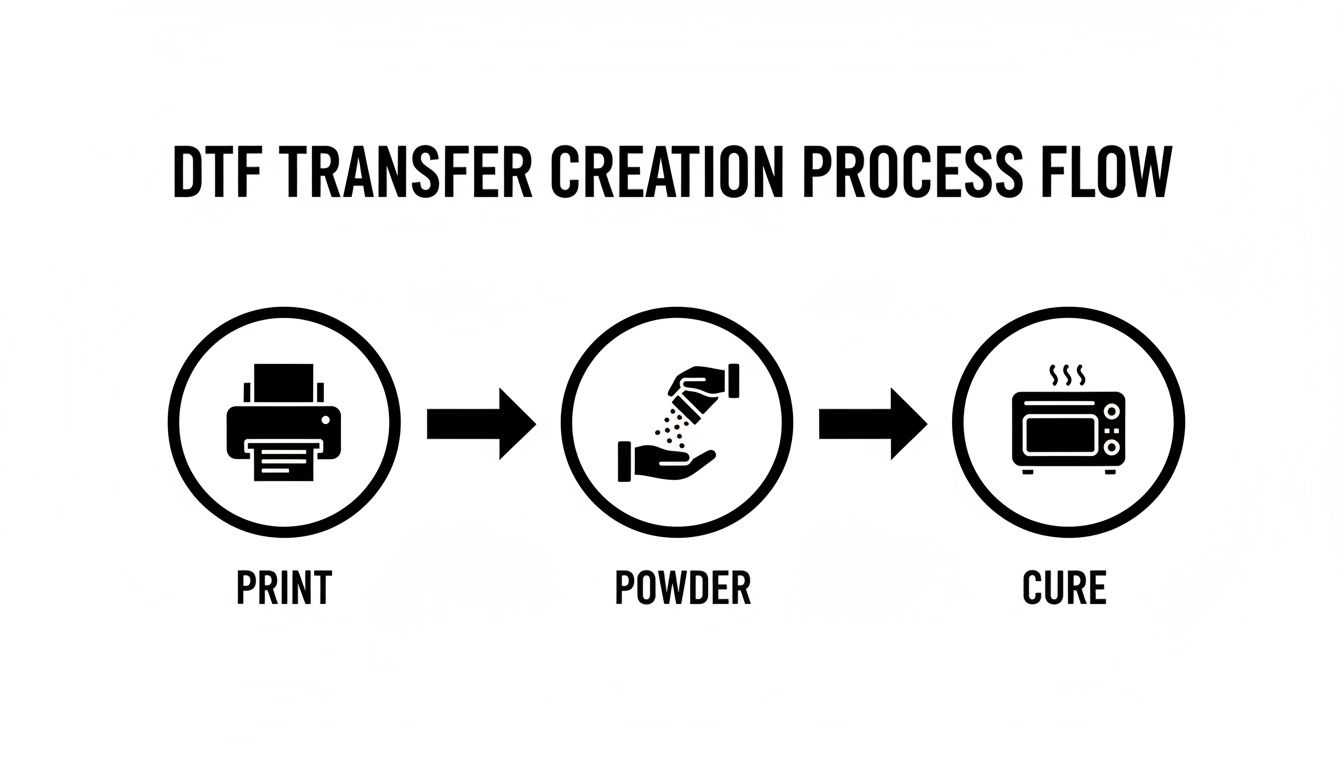
This workflow shows how each part of the process methodically builds on the last, preparing a transfer that's ready for a perfect application every time.
Sidestepping Common Pressing Pitfalls
Even when you do everything right, problems can pop up. Knowing how to spot and fix them on the fly will save you from wasting expensive garments and a lot of frustration.
-
Scorching or "Press Box": You lift the press and see a shiny, discolored box on the shirt where the platen was. This happens all the time with polyester and blends. To fix it, try lowering your temperature and using a flexible finishing sheet or a Teflon pillow to better distribute the pressure and heat.
-
Adhesive Residue: After peeling, you notice a faint, sticky outline around your design. This is almost always caused by loose powder that wasn't properly shaken off before the curing stage. Unfortunately, this is nearly impossible to fix after pressing, which just goes to show how important a clean powdering process is.
-
Incomplete Transfer: You peel the film and parts of the design are still stuck to it instead of the shirt. This is almost always due to one of two things: peeling the film while it was still warm or having uneven pressure. Double-check that your heat press is calibrated correctly and always, always wait for a true cold peel.
A little trick I've picked up over the years is to use the back of my hand to test the temperature of the transfer area. If it feels even slightly warm, I walk away for another minute. Patience at the cold peel stage is the single most important habit for perfecting your DTF transfer designs.
Troubleshooting Common DTF Design Flaws
Even with a perfect file and a dialed-in process, things can still go sideways. When a print looks off, it’s easy to point the finger at the printer, but more often than not, the real culprit is hiding in the design file, the software settings, or how it was pressed.
Don't worry—most of these issues are easy fixes once you know what to look for. Think of this as your field guide for diagnosing and solving the most common headaches with dtf transfer designs. Learning to spot the symptoms helps you get back on track fast without wasting film and ink.
Diagnosing Inaccurate or Muted Colors
It's one of the most jarring moments in DTF: the vibrant design on your monitor comes out looking dull and flat on the final shirt. This kind of color shift is almost always a software or file issue, not a problem with your printer's hardware.
The number one cause? A color profile mismatch. If you're designing in RGB (which is made for screens) but your RIP software is set up for a CMYK printer, you’re going to see some major color shifts. To avoid this, always design your files in a CMYK profile. This gives you a much more realistic preview of how the colors will actually print.
Also, check your ink density settings in your RIP software. If the saturation is turned down too low, your colors will naturally look washed out, no matter how bright they were in your design file.
Dealing with Print Banding and Streaks
You pull a fresh transfer off the printer, hold it up to the light, and there they are—faint horizontal lines running through your beautiful design. This is called banding, and it's a dead giveaway that you've got a printhead problem. It means the ink just isn't being laid down smoothly and evenly.
A few things could be happening here:
- Clogged Nozzles: The tiny nozzles in the printhead get blocked by dried ink. White ink is especially notorious for this since it's thicker. When a nozzle is clogged, it creates a tiny gap in the print.
- Printhead Misalignment: If the head isn't perfectly aligned, you'll see gaps or overlaps between each pass, which show up as lines.
- Low Ink Levels: Sometimes it's simple. If you're running low on a color, the printer will struggle to put down a consistent layer, causing streaks.
Printhead maintenance is probably one of the most critical skills in this business. Learning how to clean a printer printhead properly is non-negotiable for fixing streaks and clogs. Running regular maintenance cycles and doing manual cleanings is your best defense.
I once had a huge order almost ruined by faint banding. It was nearly invisible on the film, but after pressing, it stuck out like a sore thumb. It turned out to be a single, partially clogged white ink nozzle. A deep cleaning cycle fixed it instantly, but it was a costly reminder to never skip daily maintenance.
Why Is My Transfer Peeling After Washing?
There’s nothing worse than getting a message from a customer with a photo of their design cracking or peeling off after just one wash. This isn't a design flaw—it's a failure in the application or curing process. A perfectly applied transfer should easily last for 50+ washes.
So, what went wrong? It's almost always one of these three things:
- Under-Curing: The adhesive powder wasn't fully melted and bonded to the ink. The transfer looks fine right after pressing, but it has no real staying power. Revisit your curing time and temperature until you see that glossy, slightly orange-peel texture on the powder.
- Incorrect Pressing Settings: Not enough time, too low of a temperature, or not enough pressure will create a weak bond. You have to match your settings to the specific fabric you're working with.
- Skipping the Pre-Press: Garments hold moisture, even if they feel dry. Pressing a damp shirt creates a layer of steam that blocks the adhesive from gripping the fabric fibers. Always, always do a quick pre-press to get that moisture out.
By methodically working through these key areas—your file setup, your printer's health, and your pressing technique—you can solve just about any problem that comes your way with dtf transfer designs.
At Cobra DTF, we provide premium, USA-made transfers that give you a reliable foundation for flawless results. Eliminate variables and produce professional-quality apparel with transfers you can trust. Explore our products at https://cobradtf.com.