

Mastering DTF Transfers Gang Sheet Creation for Profit
A DTF transfers gang sheet is your secret weapon for making custom apparel more profitable. In simple terms, it's a large sheet of film where you print a bunch of different designs all at once, which drastically cuts your cost for each individual print.
This approach lets you use every last square inch of the film. Instead of running a bunch of small, costly print jobs, you combine them into one efficient, money-making run. For anyone in the custom apparel game, getting this right is how you scale up.
Understanding the Power of a Gang Sheet
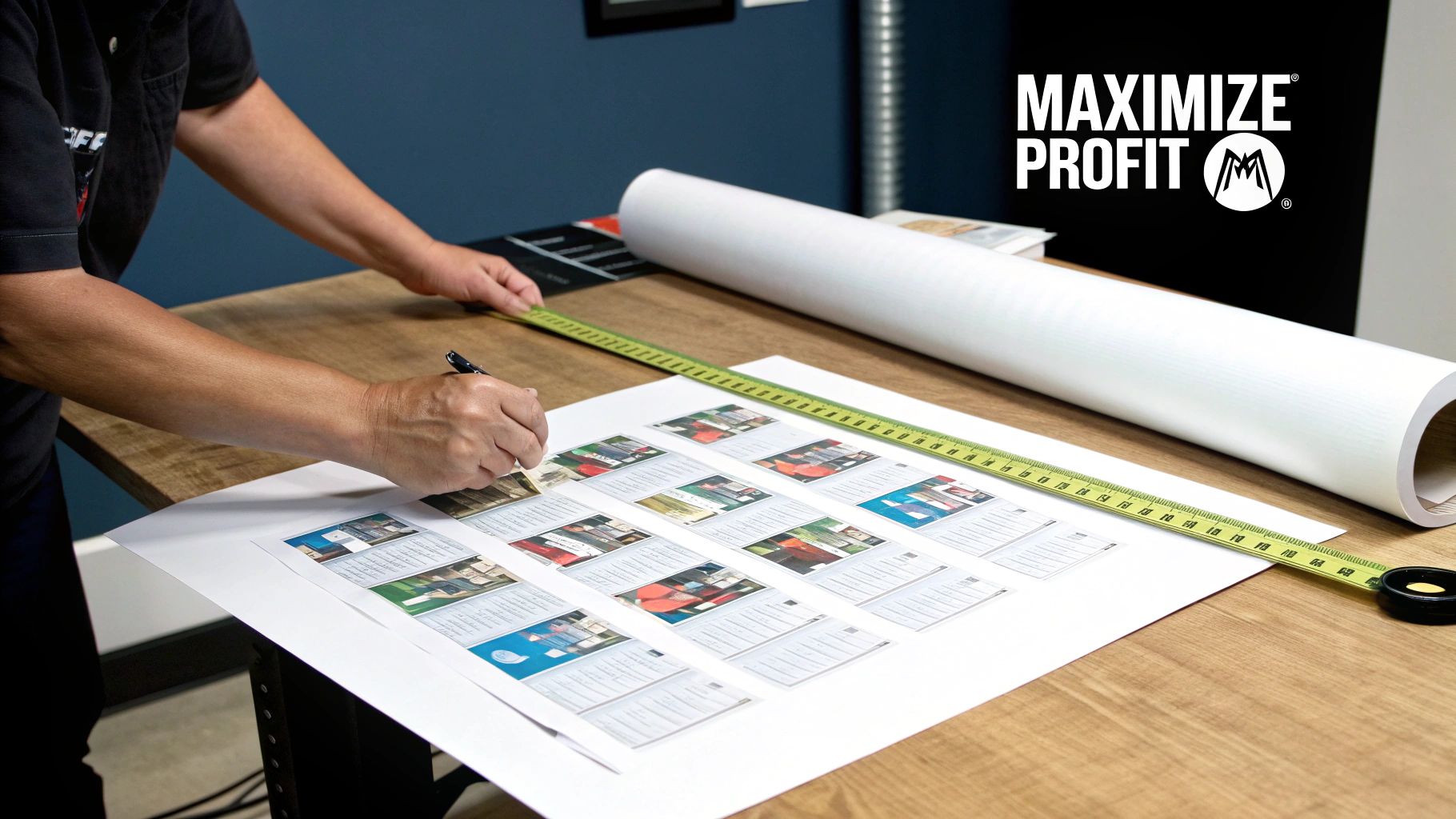
I like to think of a gang sheet as the carpool lane for your graphics. Why print one logo at a time when you can intelligently pack various designs onto a single sheet of DTF film? This isn't just a minor process tweak; it's a complete shift in how you think about production and profitability. The efficiency you gain gives you a serious leg up, especially if you're a small shop or a growing brand.
This simple idea has a huge impact on your bank account. By filling up a 22x60 inch sheet, you can knock out jobs for multiple clients, build complete apparel kits with front, back, and sleeve designs, or just print a massive batch of your top-selling graphics in one go. The cost of the film and ink gets spread across dozens of transfers, which makes each one so much cheaper to produce. You stop paying for empty space and start turning it into profit.
Why This Method Is a Game-Changer
The timing for mastering gang sheets couldn't be better. The Direct-to-Film printing market is exploding, hitting USD 2.72 billion in 2024 and on track to reach USD 3.92 billion by 2030. This boom is all about the demand for custom gear, and gang sheets are a big reason why—they let printers cut production time by as much as 70% compared to older methods.
So, what does that look like in practice?
- Serious Cost Savings: You're paying for the sheet, not for how many designs you cram onto it. Squeezing in 10 small logos next to two big back graphics costs the exact same as printing only those two large designs.
- A Simpler Workflow: Managing one print job is a whole lot easier than managing ten separate ones. This consolidation frees you up from endless file prep so you can spend more time pressing shirts and getting orders out the door.
- Unmatched Versatility: One sheet can hold everything for a complex order—neck tags, pocket logos, sleeve art, and full-front designs. This keeps everything consistent across an entire product line.
Key Takeaway: The real magic of a DTF transfers gang sheet is its economic efficiency. It empowers you to produce more transfers for less money by cutting out wasted material and combining print jobs.
At the end of the day, using gang sheets is about working smarter, not harder. It’s a strategic move that directly boosts your profit margins and your ability to grow. Finding a reliable, US-based supplier like Cobra DTF, which provides top-notch materials and same-day shipping, is crucial. It means you can take full advantage of this method without waiting around, keeping your shop lean and quick to respond.
For a deeper dive into the technology, check out our guide on what DTF transfers are and how they work.
The quality of your final DTF transfer is decided long before the printer ever warms up. It all starts with the digital file.
Think of it like this: your artwork preparation is the foundation of a house. If it’s weak, everything you build on top of it will have problems. Getting this part right from the get-go is the secret to prints that are sharp, vibrant, and exactly what you and your customers imagined.
The Golden Rule: 300 DPI or Bust
Let's cut right to the chase with the most critical rule in DTF printing: your artwork must be 300 DPI (dots per inch) at the exact size you want it printed. This isn't a friendly suggestion; it’s a hard requirement for getting those crisp, clean lines and avoiding that dreaded pixelated look.
Ever tried to blow up a small photo to fit a big frame? It gets blurry and jagged because you're stretching a small amount of information over a huge area. The same thing happens here. A low-resolution file, like a 72 DPI image you snagged from a website, just doesn't have enough data for a high-quality physical print.
When you send a file under 300 DPI, our software has to essentially guess how to fill in the missing pixel information. That guesswork leads to soft edges, fuzzy text, and an overall look that just doesn’t feel professional. Always start your design in a 300 DPI canvas, or make sure your final export hits that magic number.
Artwork File Requirements Checklist
Before you even think about uploading, run your file through this quick checklist. It’s a simple way to catch common issues and ensure your artwork is 100% print-ready.
| Requirement | Specification | Why It Matters |
|---|---|---|
| Resolution | 300 DPI at final print size | Guarantees sharp, crisp lines and prevents pixelation. Non-negotiable for professional quality. |
| Background | 100% Transparent | Prevents a white box or "halo" from being printed around your design. Ensures only your graphic transfers. |
| File Format | .PNG, .AI, .EPS, .SVG | These formats properly support transparent backgrounds and high resolution. |
| Text | Convert to Outlines/Curves | Locks the font into a shape, preventing font substitution errors if the printer doesn't have your specific font. |
| Edges | Clean & Hard Edges | Avoids soft, semi-transparent glows or blurs that will pick up white ink and adhesive, creating a fuzzy border. |
Making these checks a habit will save you a ton of time, money, and frustration down the road.
Mastering Transparency for Clean Edges
For a DTF transfer to look like it’s part of the shirt, it needs a truly transparent background. I’m not talking about mostly transparent—it has to be perfect.
Any stray pixels, faint glows, or semi-transparent "halos" around your design will get picked up by the white ink underbase and adhesive powder. The result? You press a faint, white box or a fuzzy outline onto the garment, completely ruining the clean look. Get in there with your design software’s eraser or selection tools and meticulously clean up anything that isn't your graphic.
Pro Tip: Here’s a trick I use all the time. After you think you’ve removed the background, create a new layer underneath your design and fill it with a loud, obnoxious color like hot pink or lime green. This contrast makes it incredibly easy to spot any leftover white or gray pixels you would have totally missed on the standard checkerboard background.
Vector vs. Raster: What You Actually Need to Know
Your art will usually be one of two types: vector or raster. Knowing the difference is a game-changer when you're setting up a DTF transfers gang sheet.
- Vector Files (.AI, .EPS, .SVG): These are built with math, not pixels. That means you can scale a vector design from the size of a postage stamp to the size of a billboard with absolutely zero loss in quality. For logos, text, and graphics with solid colors, vector is always the best choice because it gives you perfectly sharp edges every single time.
- Raster Files (.PNG, .JPG, .TIFF): These are your classic pixel-based images, like a photograph. Their quality is directly tied to their resolution (DPI). A high-resolution PNG is perfect for DTF, but you can’t enlarge it beyond its original size without it starting to look blurry.
Want to go a little deeper on file types and design best practices? We've put together a full guide on creating excellent DTF transfer designs that covers all the bases.
One last critical step before you export: convert all text to outlines or curves. This simple action locks your font into a fixed shape. It means you never have to worry about our system not having the same cool font you used. This prevents the dreaded "font substitution" error, where your unique typeface gets swapped for something boring like Arial. It’s a five-second click that can save you from a major headache.
Arranging Designs for Maximum Profit and Minimal Waste
Once your artwork is prepped and ready, the next move is laying it out on the film. How you arrange your dtf transfers gang sheet is what separates a decent print run from a truly profitable one. This part is a bit of an art form, but it’s all about a single goal: turning every square inch of that film into money in your pocket.
Think of your gang sheet as prime real estate. Any blank spot is wasted potential, and in this business, that means wasted money. The trick is to pack your designs as tightly and smartly as possible, often combining different jobs and sizes into one efficient run. This is the kind of strategic thinking that really sets successful print shops apart.
Before you even start placing designs, a few technical checks are non-negotiable. This quick breakdown covers the essentials.
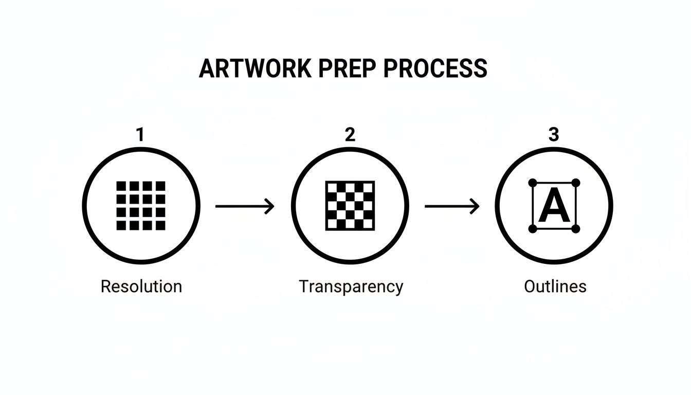
Getting the resolution, transparency, and text outlines right from the start lays the foundation for a perfect print. Don't skip these steps.
The Art of Nesting Your Designs
The best way to maximize your sheet is a technique called nesting. It's a simple concept but incredibly powerful: you fit smaller designs into the empty spaces left by larger ones. It’s basically a game of Tetris, and every piece you fit in saves you cash.
Let's say you've got an order for 20 hoodies with a big 11-inch design on the back. That large graphic is going to leave all sorts of awkward blank areas around it. Instead of letting that space go to waste, you can fill it with other high-value items.
- Pocket Logos: Those 3.5-inch chest logos can be tucked perfectly into the corners around a big design.
- Sleeve Art: Got some small, vertical designs? They can slide right in alongside the main graphic.
- Neck Tag Labels: These little guys are almost pure profit when nested, taking up virtually no extra real estate.
- Designs for Other Jobs: If another client needs a handful of small logos, throw them on this sheet instead of starting a whole new, less profitable job for them.
By strategically nesting just four small pocket logos around a single large back design, you've essentially gotten those smaller transfers for free. You're paying for the film area anyway, so every nested design is 100% profit.
This is how you can bundle several small orders together, transforming a few potentially unprofitable runs into one highly efficient job. If you're looking for more ways to squeeze more value out of your materials, we have a whole guide on how to reduce production costs that dives even deeper.
Optimal Spacing for Easy Cutting
Packing designs tightly is key, but you have to leave yourself enough room to actually cut them apart later. Jamming them too close together might save a fraction of an inch of film, but it creates a huge headache during production. One slip with the scissors, and you could easily ruin two transfers.
From all our time in the shop, we've found the sweet spot for spacing is between 0.25 and 0.5 inches between each separate design. This buffer gives you plenty of room to work with a rotary cutter or scissors without needing the steady hands of a surgeon. It makes the whole post-print workflow faster and dramatically cuts down on cutting errors.
That extra half-inch of film you "waste" on proper spacing isn't a waste at all—it's an investment in a stress-free cutting process. Trust me, it pays for itself the first time you avoid destroying a perfect transfer.
Real-World Gang Sheet Scenarios
Let’s look at how this plays out in the real world. You have a standard 22x60 inch DTF transfers gang sheet from Cobra DTF. Here’s how you could pack it to get the best return.
Scenario 1: The Local Business Bundle
- Main Job: 15 full-back designs (11"x14") for a local landscaping company.
-
Nested Items:
- 20 left-chest logos (3.5"x3.5") for their polo shirts.
- 20 sleeve logos with their phone number (1.5"x4").
- 10 hat patches (2.5"x2.5").
Scenario 2: The Multi-Client Money Maker
- Client A: 8 large front graphics (10"x12") for a band's merch.
- Client B: 30 small logos (3"x3") for a coffee shop's aprons.
- Client C: 12 long, text-based designs (2"x11") for a charity 5k.
- Your Stock: Use any leftover gaps to print some of your own best-selling stock designs or branded neck tags.
In both of these examples, you're combining different jobs with different needs onto a single, highly profitable sheet. The cost of that 22x60 inch film is fixed, but by filling it intelligently, you’ve massively increased its value and your profit margin on every single transfer. This is how you make the gang sheet method really work for you.
So, you’ve uploaded your perfectly built dtf transfers gang sheet. What happens next? It’s not as simple as hitting a "print" button. A pretty sophisticated process takes over, turning your digital art into a physical transfer that’s vibrant, tough, and ready for the heat press. Let's walk through that journey from pixels to product, because this is where professional gear and know-how really shine.
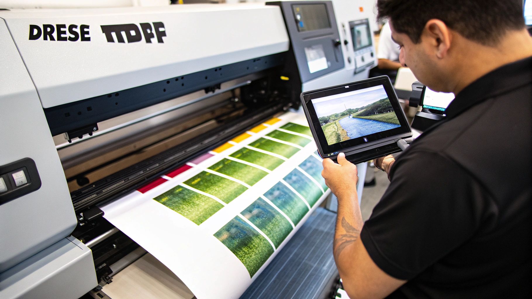
The second we get your file, it’s fed into a specialized piece of software called a Raster Image Processor, or RIP. Think of the RIP as the brains of the whole operation. It takes your PNG file and translates it into a language the printer can execute, calculating the exact recipe of cyan, magenta, yellow, and black ink for every single pixel.
But its most important job is creating the white underbase. This is a solid layer of white ink that gets printed behind your colors. It acts like a primer on the film, and it's the secret to making your designs look bright and bold on dark fabrics instead of muddy and transparent.
Printing, Powdering, and Curing
Once the RIP software has done its job, our industrial DTF printers kick into gear. These are serious machines, built for consistency and high-volume work. The first thing they do is print the color layer of your design onto a sheet of special PET film. While that ink is still wet, the printer perfectly lays down the white underbase right on top of it.
From there, the freshly printed sheet moves directly into an automated machine that handles the powdering and curing. This unit showers the film with a fine thermoplastic adhesive powder, which sticks only to the wet ink. All the blank space on the film stays clean.
This automated system is the key to a good transfer. It guarantees an even coating of adhesive, which is what makes the final product stick properly and hold up wash after wash. You just can't get that kind of precision with a manual, DIY setup.
The Final Steps: Curing and Quality Control
The last stop is the curing tunnel. The powdered film travels through a chamber heated to a very specific temperature. The heat melts the adhesive powder, bonding it directly to the ink. Once it cools, you’re left with a smooth, flexible transfer that’s incredibly durable.
Getting the cure right is everything. Too cool, and the transfer will peel off the shirt after a wash. Too hot, and you can burn the film or distort the colors. Our professional equipment ensures every single part of the gang sheet is cured to perfection.
This whole process has a huge impact on efficiency and cost. For apparel businesses, gang sheets have been a game-changer. The global DTF market was valued at USD 2.89 billion in 2025 and is expected to hit USD 4.56 billion by 2032. For a small shop, printing in batches on a gang sheet can increase output by as much as 5x and cut operating costs by 25-40% by avoiding tons of separate print jobs. You can find more data about the growing DTF printing market on sphericalinsights.com.
Before we roll it up and ship it out, every sheet gets a final quality check. We look for color accuracy, print clarity, and any other little flaw. We do this to make sure the dtf transfers gang sheet that lands on your doorstep is absolutely perfect and ready to press.
Common Gang Sheet Mistakes That Cost You Money
Experience is a great teacher, but it's an expensive one. It's far better to learn from the missteps of others. When it comes to building a DTF transfers gang sheet, a few all-too-common errors can turn a profitable job into a pile of wasted film and cash. Trust me, we see these issues roll through our shop every single day, and nearly all of them are preventable.
This isn't just theory; think of this as your field guide to the most frequent and costly pitfalls. From blurry prints that can damage your brand's reputation to cutting nightmares that bring your whole workflow to a halt, let's walk through what goes wrong and how to get it right before you ever hit that upload button.
The Blurry, Low-Resolution Nightmare
This is, without a doubt, the most common—and most heartbreaking—mistake we see. You can have an amazing design, but if the file isn't set to 300 DPI at its final print size, it’s going to come out looking fuzzy, pixelated, and completely unprofessional. Once it's printed, there's no going back. The damage is done.
Imagine you're trying to enlarge a tiny, blurry photo. All you get is a bigger blurry photo. That's exactly what happens here. The edges of your art won't be sharp, small text will be illegible, and the whole thing just screams "amateur hour."
How to Sidestep This: Always, and I mean always, start your design file on a 300 DPI canvas scaled to the exact physical dimensions you plan to print. If a client sends you a tiny logo they grabbed from their website, you have to be the expert. Politely explain why it won't work for professional printing and ask for a high-quality source file. That one conversation can save everyone a massive headache.
Forgetting to Check the Mirroring Rules
Ah, the classic facepalm moment. DTF transfers are printed in reverse so they appear correctly when pressed onto a shirt. Now, here’s the trap: if you manually mirror your artwork before uploading it, and our system also mirrors it as part of its standard process, you’ll get a full sheet of useless, backward-reading transfers.
Crucial Tip: Every print provider is different, so always check their guidelines. Here at Cobra DTF, our RIP software automatically mirrors your artwork for you. Just upload your designs exactly as you want them to look on the finished shirt—readable and facing the right way. We'll handle the flip.
This five-second check can save you from trashing an entire print run.
Designing with the Wrong Color Mode
Your computer monitor uses RGB (Red, Green, Blue) light to display colors, which is why they look so brilliant and saturated on screen. Professional printers, however, use CMYK (Cyan, Magenta, Yellow, Black) ink to physically create colors. The problem is that the range of colors CMYK ink can produce—its "gamut"—is smaller than what an RGB screen can show.
If you design in RGB using super-vibrant colors that are "out of gamut" for CMYK, our printing software has to make a guess at the closest possible match. This often leads to colors looking duller or just plain different from what you expected. That electric blue you loved on screen might print as a muted navy, or a hot pink could come out as a flat magenta.
How to Fix It: Start your project right. Set your design software’s color mode to CMYK from the very beginning. Doing this gives you a much more accurate preview of how your colors will actually look on film, eliminating those nasty surprises.
Spacing Designs So Tight You Can't Cut Them
We get it. You want to maximize every square inch of your DTF transfers gang sheet to save money. But cramming your designs together with no breathing room creates a huge bottleneck later. Trying to cut apart graphics that are practically touching is a recipe for disaster. One little slip of the scissors, and you've just ruined two transfers.
You quickly find that you waste more in botched transfers and reprints than you ever saved by squeezing things together.
A Better Way to Space:
- Always leave a buffer of at least 0.25 inches around every single design.
- If you have larger graphics or you're just getting started, giving yourself a 0.5-inch gap is even smarter. It’s well worth the tiny bit of extra film.
Think of that little gap as your insurance policy. It makes separating your transfers fast, easy, and stress-free—which is exactly what you need when you've got a stack of orders to get out the door.
Common Questions (and Expert Answers) for Nailing Your Gang Sheet
Even the best-laid plans can hit a snag. When you're dialing in your gang sheet process, a few common questions always seem to pop up. Let's walk through the ones we hear all the time from designers and print shops.
Getting these details right is what separates an okay print run from a great one. Think of this as your go-to troubleshooting guide for building that perfect sheet with confidence.
What’s the Ideal Spacing Between Designs?
I've found that leaving a gap of 0.25 to 0.5 inches between each design is the sweet spot. This little buffer is your best friend when it comes time to cut everything apart.
That extra space means you can confidently use a pair of scissors or a rotary cutter without the constant stress of nicking an adjacent transfer. You can work quickly and efficiently. Sure, you could cram them a little tighter, but trying to save a few pennies on film often costs you dollars in ruined transfers and a whole lot of frustration. It’s just not worth the risk.
Can I Mix Different Client Orders on One Sheet?
Absolutely! In fact, you should. This is one of the biggest money-making strategies when it comes to DTF.
Go ahead and place a dozen large back logos for one client right next to 50 small sleeve designs for another. This is how you make smaller, one-off jobs profitable and ensure you're using every single square inch of film you paid for. It’s all about maximizing your real estate.
A pro tip? Try to keep all the designs for a single order grouped together in one section of the sheet. It makes sorting and packing a breeze after you've cut them all out.
Key Insight: Combining multiple jobs onto a single DTF transfers gang sheet is the fastest way to boost your profit margins. You're shifting from a "one order, one print" mindset to a "maximum value per sheet" workflow.
Do I Need to Mirror My Artwork?
This is a big one, and getting it wrong is a costly mistake. The answer completely depends on your print provider's setup.
Many professional DTF printers, including us here at Cobra DTF, use software that automatically mirrors the artwork during processing. This means you should upload your file looking exactly as you want it to appear on the final shirt—readable and facing the right way. If you mirror it beforehand and our system mirrors it again, you’ll get a double-flipped, backward, and totally unusable print.
Always, always check your supplier's guidelines before you upload. It takes two seconds and can save you from ruining an entire sheet. Don't assume, just confirm.
What Happens If My File Resolution Is Too Low?
Submitting a file under the industry-standard 300 DPI will, unfortunately, result in a subpar print. There’s simply no magic printer setting or software trick that can create image detail that isn't there in the first place.
When you print a low-resolution file, the problems are obvious and look unprofessional:
- Pixelation: Instead of clean lines, the edges of your design will look jagged and blocky.
- Blurriness: The whole image will seem soft and out of focus, lacking that sharp "pop."
- Lost Details: Tiny text, fine lines, and delicate textures will just turn into a fuzzy mess.
Once it's printed, the damage is done. The only fix is to go back to the source and rebuild the artwork correctly. This is exactly why getting your art prep right from the start is the most critical step in the entire process.
Ready to create a flawless gang sheet with vibrant, durable transfers? At Cobra DTF, we provide premium, USA-made DTF transfers with same-day shipping to keep your business moving. Get started on your next profitable print run today at https://cobradtf.com.