

Design shirt comfort colors: A Complete Guide to Vintage Tee Art
If you're going to design for Comfort Colors shirts, you have to get one thing straight from the start: these aren't your average tees. Their whole vibe—that soft, garment-dyed, lived-in feel—is precisely what makes them so popular, but it also means your standard DTF printing playbook needs a few adjustments. Getting this right is the difference between a print that looks amazing and one that just feels... off.
Why Comfort Colors Shirts Need a Different Approach
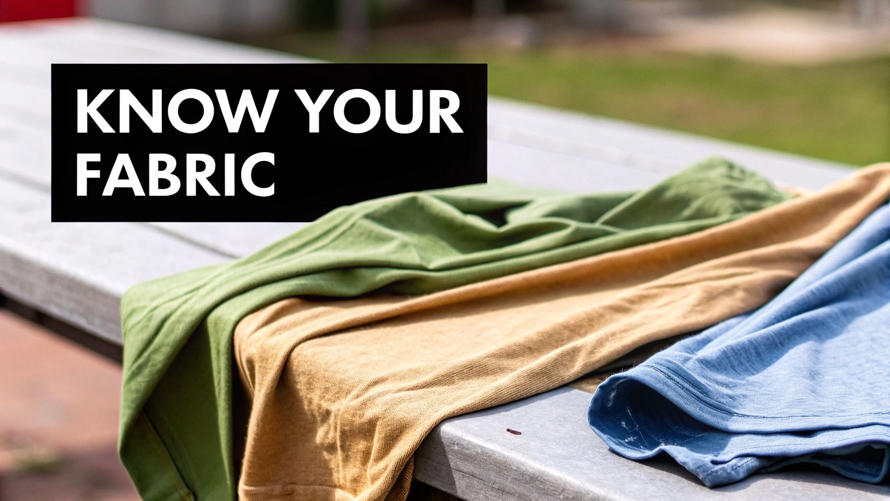
Before you even think about creating your artwork or warming up the heat press, you need to respect the canvas. Comfort Colors' signature look comes from a unique garment-dyeing process. Unlike other brands that cut and sew from pre-dyed rolls of fabric, Comfort Colors builds the shirt first and then dyes it.
This technique is what gives every shirt that slightly weathered, super-soft feel and those rich, complex colors. But it also changes the fabric's properties, which has a real impact on how your DTF transfer will look and feel once it's pressed.
The Impact of Fabric and Dyes
The brand primarily uses two types of dyes—pigment and reactive—and they don't behave the same way under heat. How each one interacts with your DTF inks will directly affect the final print.
- Reactive Dyes: You'll find these on colors like Graphite or Midnight. During pressing, these dyes tend to release more color, allowing the DTF inks to really pop. This "discharge" effect makes prints on these shirts look brighter, bolder, and more color-accurate.
- Pigment Dyes: This is the most common dye type for the Comfort Colors line, creating that classic soft, vintage look. These dyes hold their color more tightly. The result is a DTF transfer that looks a bit more muted and weathered, which honestly, is often exactly the look you're going for with these shirts. It's a feature, not a bug.
Knowing which dye was used for a specific shirt color is key. A design on a pigment-dyed "Pepper" tee will naturally look softer than the exact same print on a reactive-dyed "Graphite" shirt.
Key Takeaway: Don't treat all Comfort Colors shirts the same. The specific color and its dyeing process will dictate the final look of your design. Always consider this when color-matching your artwork.
Fabric Texture and DTF Application
It's not just about the dye; the fabric itself plays a huge role. Comfort Colors shirts are typically 100% ring-spun cotton, which gives them that soft but substantial feel. This thicker, heavier weave is a fantastic surface for DTF transfers to grab onto.
However, that thick cotton also holds more moisture than lighter fabrics. This makes pre-pressing a non-negotiable step. Seriously. If you skip it, you're trapping moisture under the transfer, which leads to weak adhesion and a print that starts peeling after a few washes.
The table below breaks down these characteristics and what they mean for your DTF workflow.
Comfort Colors Characteristics and Design Implications
A quick look at key garment features and how they influence the DTF design and application process.
| Garment Characteristic | Design Implication | Actionable Pro Tip |
|---|---|---|
| Garment-Dyed Fabric | Colors can be less uniform and may interact with ink differently than piece-dyed fabrics. | Test press on a sample or scrap piece of the exact color you're using to check for color interaction or dye migration. |
| 100% Ring-Spun Cotton | Excellent surface for adhesion but holds significant moisture. | Always pre-press for 5-7 seconds to remove moisture and create a flat, dry surface for the transfer. |
| Heavier Weight (6.1 oz) | Requires slightly more pressure and dwell time to ensure the adhesive melts fully into the fibers. | Increase your pressure slightly from what you'd use on a lighter tee. A firm, even pressure is crucial. |
| Soft, Vintage Aesthetic | Harsh, overly vibrant designs can look out of place. | Design with a slightly distressed or faded look in mind. Softer color palettes often complement the shirt's natural feel. |
Ultimately, the fabric's premium texture is a perfect match for designs with a soft hand-feel, making DTF a much better choice than stiffer methods like traditional vinyl. This push for high-quality, comfortable apparel is a massive trend. The global T-shirt market was valued at $169.1 billion in 2021, with comfort-focused brands like this one grabbing a huge slice of the pie. For a deeper dive, check out our guide to understanding t-shirt fabric types.
Getting Your Artwork Ready for Garment-Dyed Fabric
When you're printing on Comfort Colors, your artwork is everything. It's not just about creating a cool graphic; you have to prep a file that can handle the unique texture and rich, garment-dyed color of these shirts. A pixelated or poorly prepared design will stick out like a sore thumb on this kind of premium fabric.
Every great print begins with a high-resolution file. For DTF, this is an absolute must. Your artwork needs to be at least 300 DPI (dots per inch) at the final size you plan to print it. It doesn't matter if you're working in Adobe Photoshop or another program, this is the magic number that ensures every line comes out crisp and your final transfer doesn't look like a blurry mess.
Low-resolution artwork is like starting with a bad foundation—no matter how great your printer and press are, the final product will look cheap.
It's this focus on quality that's really pushing the industry forward. The market for blank apparel, which is dominated by brands like Comfort Colors, was valued at $15.23 billion and is on track to hit $24.04 billion by 2033. People want soft, premium fabrics they can customize. You can dig into the trends shaping the blank apparel market on grandviewresearch.com if you want to see the numbers for yourself.
The All-Important White Underbase
Your secret weapon for printing on colored shirts—especially the deep, muted tones you find with Comfort Colors—is a solid white underbase. This is simply a layer of white ink that gets printed onto the DTF film before any of the colors. It acts as a primer, making sure the shirt color doesn't seep through and mess with your design's vibrancy.
Without that underbase, a bright yellow design on a "Denim" blue shirt will come out looking muddy and greenish. The underbase guarantees your yellow stays yellow. Most RIP software, including what comes with Cobra DTF systems, handles this automatically, but you still need to double-check that the setting is on and the opacity is right.
Pro Tip: If you're going for a more faded, vintage vibe, try dialing back the white underbase opacity in your RIP software. Dropping it to 80-90% can create a softer, more integrated look that feels right at home on a Comfort Colors tee.
Nailing the Colors and Vintage Feel
Comfort Colors has a very specific, nature-inspired palette. You can't just pick a standard CMYK value and expect it to match their "Bay" green or "Watermelon" pink perfectly. To get as close as possible, you should be using an ICC profile that's been calibrated for your specific printer and ink setup.
An ICC profile basically translates the colors on your screen to what your printer will actually produce, giving you much more accurate results.
But getting the colors right is only half the battle. A stiff, plastic-feeling graphic just looks wrong on a soft, broken-in shirt. This is where distressing techniques can save the day.
- Use Knockouts: This is a technique where you create tiny transparent gaps inside your design. Instead of one big solid block of ink, you let the shirt fabric peek through. It makes the print feel so much softer and way more breathable.
- Add Distressing Textures: Find a subtle grunge or cracked texture overlay in Photoshop and apply it to your design. It instantly gives a brand-new graphic that authentic, well-loved vintage look that people want from a Comfort Colors shirt.
If you want a full walkthrough of the whole process, we've got you covered in our complete guide to DTF printing for shirts.
Quick Pre-Flight Checklist
Before you hit "print," run through this quick mental checklist. It’s a simple habit that can save you a ton of time, money, and frustration from bad prints.
- Check the Resolution: Is my file 300 DPI at the final print size?
- Verify Transparency: Is the background completely transparent? If it's white, it will print as a solid white box.
- Confirm File Format: Is it saved as a PNG with transparency? This is the best format for DTF.
- Set the Color Mode: Is the artwork set to CMYK? This is what most DTF printers need to read the colors correctly.
Taking a minute to tick these boxes ensures your design goes from the screen to the shirt looking exactly how you planned. That’s how you get a professional-quality product that keeps customers coming back.
Nailing the DTF Printing and Curing Process
Alright, your artwork is prepped and looking sharp. Now comes the fun part: turning that digital file into a physical transfer that’s ready for the shirt. This is where the technical details really matter. Getting your printer settings and curing process dialed in is the key to a durable, vibrant print with that soft feel everyone loves.
Your journey from file to film begins at the printer. If you're running a Cobra DTF setup or something similar, the game is all about balancing ink coverage without turning your film into a saturated mess. Too much ink, and your colors will bleed; too little, and the final print will look faded and weak right out of the box.
Optimizing Your Printer and Ink Settings
The unique, slightly textured feel of Comfort Colors' 100% cotton fabric demands a specific touch with your ink layers. The goal is simple: lay down enough color and white underbase for a bold, vibrant look, but not so much that the transfer feels like a thick, plastic patch on the final shirt.
This is where your RIP software earns its keep. It's your command center.
Start by looking at your color ink density. For most designs going onto Comfort Colors, a great starting point is around 60-70% CMYK density. This gives you rich color without letting the ink pool up, which helps keep all those fine details crisp.
The white layer is even more important, especially since you're often printing on those classic muted or dark Comfort Colors shades. You need a solid white underbase for the colors to pop, but cranking it up to a 100% white layer will almost always create a heavy, stiff transfer. I've found that setting the white ink percentage somewhere between 85-95% is the sweet spot. It gives you fantastic opacity without killing the soft hand-feel that makes these shirts a bestseller.
Pro Tip: Got a design with super fine lines or tiny text? Try reducing your white ink 'choke' setting in the RIP. A smaller choke, maybe 1-2 pixels, pulls that white underbase in just slightly from the edges of the color. It’s a small tweak that prevents any white from peeking out and gives you incredibly clean, sharp edges on the finished product.
Choosing the Right Film and Powder
Heads up: not all DTF films and powders are created equal. The soft, slightly stretchy nature of ring-spun cotton needs consumables that can move with it. I always recommend a premium hot-peel or warm-peel film; they tend to release much more cleanly and leave a smoother finish on the garment.
When it's time to powder, a medium-grain TPU (Thermoplastic Polyurethane) powder is your best friend here. It creates a killer bond with the cotton fibers but stays flexible enough to stretch with the fabric. I've seen shops try to use fine-grain powders on heavier fabrics, and the bond just doesn't hold up. On the flip side, coarse grains can leave the transfer feeling rough and gritty. Medium is the way to go.
Here's a quick look at how the artwork prep flows before you even get to this stage.
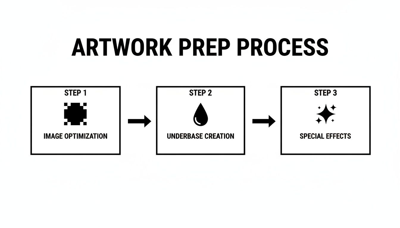
This workflow just reinforces how getting the image right, building a solid underbase, and adding any final effects are all critical steps that have to happen before you can even think about hitting "print."
Mastering the Curing Stage
Once your design is printed and powdered, curing is the final, crucial step before that transfer is ready for the heat press. This is what melts the adhesive powder and bonds it to the ink. Honestly, improper curing is probably the #1 reason I see prints fail.
You'll need a dedicated curing oven or a heat press you can hover just above the film without touching it. The goal is to hit a specific temperature and achieve a very particular texture.
- Temperature: Aim for 240-265°F (115-130°C). If you go too hot, you risk scorching the film or the ink. Too cool, and the powder won't cure fully, leading to a failed press.
- Time: This usually takes about 2-4 minutes. Your exact time will depend on your specific equipment and the size of the design.
How do you know it's done? Look at the texture. A perfectly cured transfer is when the powder melts from a grainy, sugary look into a glossy, slightly bumpy surface. The classic description is that it should look like the texture of an orange peel.
If you pull it out and still see powdery spots, it's under-cured. It won't stick. If it looks super shiny and flat, you might have over-cured it, which can weaken the adhesive's bond.
By taking the time to manage your ink settings, use the right film and powder, and nail your curing technique, you're creating a truly professional-grade DTF transfer. This attention to detail is what ensures your Comfort Colors projects don't just look amazing off the press, but also hold up to whatever your customers throw at them.
Perfecting Your Heat Press Application
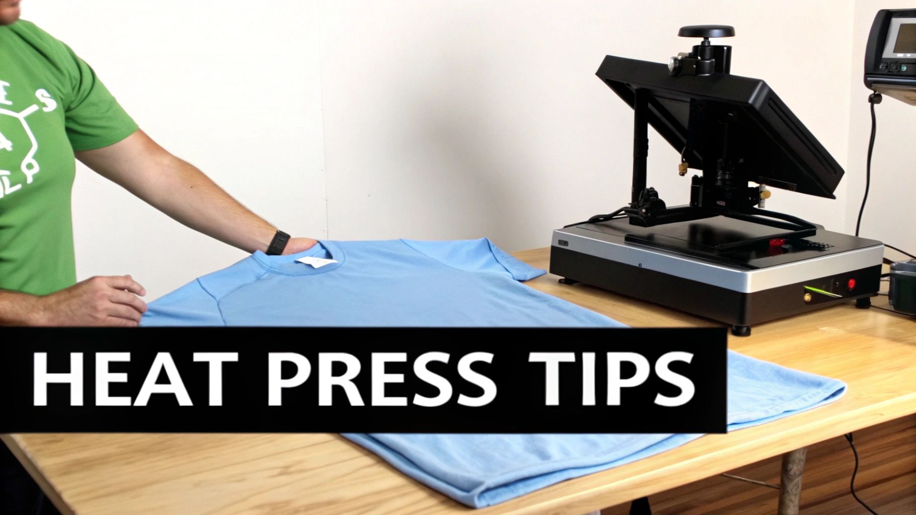
This is the moment of truth. All your hard work in design and printing comes down to how well you apply the transfer. The heat press is where the magic happens, fusing your art to the fabric to create that soft, durable, professional look we're all after. Honestly, nailing this final step is what separates an amateur print from a retail-quality shirt people will want to wear again and again.
The entire process really boils down to three things: temperature, time, and pressure. Get these right, and you’ll be churning out amazing results every single time. Get them wrong, and you're in for a world of frustration—think poor adhesion, a stiff hand-feel, or even a damaged shirt.
The Critical Pre-Pressing Step
Before you even think about laying down that DTF transfer, you must pre-press the shirt. This is probably the most overlooked yet vital step, especially with beefy, 100% cotton garments like Comfort Colors. These shirts are like sponges; they hold a surprising amount of moisture from the air, and that moisture is the enemy of a good DTF application.
If you place a transfer onto a damp shirt, you’re essentially trapping steam underneath it. That steam prevents the adhesive from properly melting and grabbing onto the fabric fibers. The result? A print that starts peeling after just a couple of washes.
A quick 5-7 second pre-press at your application temperature solves two problems at once:
- It zaps any lingering moisture right out of the fabric.
- It gives you a perfectly smooth, wrinkle-free canvas for your transfer.
Seriously, don't skip this. It’s such a simple action that dramatically improves the durability and longevity of your final product. This kind of attention to detail and quality is why the T-shirt market is projected to hit $46.99 billion in revenue by 2025. It's all part of a bigger shift toward high-quality casualwear, with over 2 billion T-shirts sold every year.
Ideal Settings for Comfort Colors Shirts
While every heat press has its own personality, there’s a solid starting point for Comfort Colors shirts that almost always works. The key is to remember you're working with a heavier 6.1 oz fabric, so you need just enough heat and pressure to melt the adhesive without scorching that unique garment-dyed cotton.
Here’s a go-to cheat sheet for that first press:
- Temperature: 290-310°F (143-154°C). I always recommend starting on the lower end of this range to protect the fabric's rich, custom dyes.
- Time: 10-15 seconds. Any longer and you risk over-curing the transfer, which can make it feel brittle and crack prematurely.
- Pressure: Medium to firm. You need enough force to really embed the adhesive into the cotton weave. If your press has a 1-10 scale, aim for a solid 7-8.
After the first press, always—and I mean always—go for a cold peel. Let the garment and transfer cool down completely to room temperature before you even think about pulling off the film. A cold peel is the secret to a smooth, matte finish that perfectly complements the vintage vibe of a Comfort Colors tee. If you peel it while it’s still warm, you risk lifting parts of the design or leaving a weird, glossy texture behind.
Key Insight: Patience is your best friend here. Rushing a warm peel might feel like you're saving time, but a true cold peel is how you get that professional, integrated look that feels like it’s part of the shirt, not just sitting on top of it.
The Finishing Press for Ultimate Softness
Want to take your print from great to absolutely exceptional? The final touch is a second, finishing press. This quick step can completely transform the feel and durability of the design, and it only takes a few seconds.
Once you’ve peeled the film, place a finishing sheet over the design and press it again for 5-10 seconds using the same temperature and pressure settings. This second press accomplishes two things: it pushes the ink deeper into the fabric fibers for incredible washability, and it knocks out any remaining shine for a true matte finish. For a deeper dive into heat press techniques, our essential guide to DTF heat pressing covers more advanced tips.
The type of finishing sheet you use will directly affect the final texture of the print. While DTF is a fantastic method, it's also helpful to understand other heat-applied techniques, like iron-on print transfer paper, to appreciate the nuances of different finishes.
Knowing which sheet to grab can help you dial in the exact feel you're going for.
Finishing Sheet Comparison for Your Final Press
| Finishing Sheet Type | Resulting Finish and Texture | Best Used For |
|---|---|---|
| Teflon Sheet | Smooth, semi-matte finish. Slightly plasticky feel. | General-purpose pressing; provides a clean, consistent surface. |
| Kraft Paper | True matte finish. Softens the hand-feel significantly. | Achieving a vintage, screen-printed look that blends into the fabric. |
| Parchment Paper | Very matte, slightly textured finish. | When you want absolutely zero shine and a super-soft feel. |
Choosing the right sheet for this last step is what truly elevates your work from a custom t-shirt to a premium garment. It's a small detail that makes a massive difference in the final product.
What to Do When Prints Go Wrong
Even with the best prep in the world, things can still go sideways. Let's be real, a perfect design and a flawless transfer don't mean much if the final press doesn't stick the landing. When you're working with a unique garment like Comfort Colors, a few specific issues can pop up. The good news? They’re almost always fixable with a few tweaks to your process.
Don't sweat it if your first few prints aren't perfect. Every seasoned pro has a "bloopers" box full of misprints they learned from. Let’s walk through some of the most common headaches and how to solve them for good.
The Dreaded Dye Migration
You pull a gorgeous, bright white print off a "Crimson" red shirt, only to come back a few hours later and find it has a faint pinkish tint. That's dye migration, a classic problem where the garment dye turns into a gas under heat and stains your DTF ink from the inside out.
Comfort Colors shirts, especially those with deep, saturated reactive dyes, can be particularly susceptible to this. The fix is almost always about managing your heat.
- Drop the Temperature: This is your first and best move. Try lowering your heat press to the cooler end of the spectrum, somewhere around 290-300°F (143-149°C).
- Shorten the Dwell Time: Less time under heat means less time for dye to activate. Bring your press time down to just 10-12 seconds.
- Bring in a Blocker (If Needed): For the most stubborn colors (I'm looking at you, deep reds and maroons), you can source special DTF film that has a built-in carbon or black blocker layer. It acts as a final shield between the shirt dye and your ink.
Tweaking these settings usually stops dye migration in its tracks without hurting the transfer's adhesion. It’s a bit of a balancing act, but it's one you have to master for crisp, true-to-color prints.
Why Is My Print Peeling After One Wash?
There's nothing worse than a customer sending you a picture of a design flaking off after a single wash. This is an adhesion failure, plain and simple, and it almost always points back to one of three culprits during the pressing stage.
First, check your pressure. This is the most common mistake I see. If your heat press isn't clamped down hard enough, the melted adhesive never gets a chance to really work its way into the cotton fibers. You need that solid medium-to-firm pressure to create a bond that lasts.
Second, take a hard look at your curing process. An under-cured transfer—one that didn't get hot enough for long enough in your oven or dryer—means the adhesive powder never fully melted. If it still looked a bit powdery instead of having that "orange peel" texture, it was doomed from the start.
Finally, don't forget the pre-press. As we covered earlier, skipping the pre-press on a beefy cotton tee like Comfort Colors leaves moisture trapped in the fabric. That moisture turns to steam under the press and completely sabotages the adhesive's ability to bond.
My Go-To Diagnostic Test: Before you run a whole batch, press a single test shirt. Let it cool completely, then give it a good, firm stretch. A well-adhered transfer will stretch right along with the fabric. If you see any cracking or the edges start to lift even slightly, you know you have an adhesion problem to solve before you waste any more garments.
How to Fix That Stiff, Plastic-y Feel
The whole reason we love Comfort Colors is for that soft, lived-in feel. If your final print feels like a stiff, plastic shield sitting on top of the fabric, you've completely defeated the purpose. This "heavy hand-feel" is a classic sign of laying down too much ink—specifically, too much white underbase.
When you're aiming for a soft-hand feel, less is truly more.
Here’s how you can dial it back in your RIP software:
- Lower the White Ink Percentage: Instead of running your white layer at 100%, try pulling it back to 85-95%. This one simple change makes a massive difference in the final feel without a noticeable loss in vibrancy.
- Embrace 'Knockouts' and Negative Space: Design with the shirt color in mind. By creating small transparent areas within your graphic, you let the fabric show through. This not only looks cool but also breaks up that solid block of ink, which dramatically improves both softness and breathability.
Properly storing your finished transfers is also crucial for consistency. Keep your printed DTF transfers in a cool, dry place, tucked away from direct sunlight and humidity. I recommend storing them flat in a sealed plastic bin or bag. This prevents the adhesive from degrading over time, ensuring they press perfectly whether you use them tomorrow or next month.
Got Questions? We've Got Answers
Even with the best guide, you're bound to run into a few head-scratchers when working with a unique canvas like a Comfort Colors tee. Let's tackle some of the most common questions we hear from shop owners. Getting these details right can save you a lot of headaches and wasted shirts.
Can I Just Use Regular HTV on These Shirts?
Look, you can, but you probably shouldn't. Standard heat transfer vinyl tends to feel thick and plasticky, which completely kills the soft, lived-in vibe that makes Comfort Colors so popular in the first place. It just feels wrong on a premium shirt.
If you're in a pinch and vinyl is your only option, seek out the super-thin or "stretch" HTV varieties. They offer a much softer hand. But honestly, DTF is the way to go here. A good DTF transfer bonds with the fabric fibers, so the final print is flexible, breathable, and perfectly matches the quality feel of the shirt itself.
Why Do My Colors Look So Muted on the Finished Shirt?
This is a classic issue, and it usually comes down to one of two things. First, never forget that you're not printing on a stark white background. These garment-dyed shirts have a rich, slightly muted base color that will naturally influence how your inks appear. That's part of their vintage appeal.
More often than not, though, dull colors are the result of a weak white underbase on your DTF transfer. That underbase is your primer—it's what makes the CMYK colors pop against the fabric. If it's too thin or inconsistent, your design will look faded right off the press. Check your RIP software settings and make sure you’re laying down a solid foundation of white ink. You might also be scorching the ink with too much heat, so double-check your press temperature.
Help! How Do I Get Rid of That Awful Heat Press Box Outline?
Ah, the dreaded press box. We've all been there. That ugly outline happens when the edges of your heat platen smash down the fabric fibers around your design. It’s especially common on thicker, soft-spun cotton like this.
The best fix is a simple one: use a heat press pillow. You can also use a dense foam pad. Just slide it inside the shirt before you press. This raises the actual print area so the platen only applies firm pressure where it needs to—right on top of the transfer. The edges of the platen never get a chance to clamp down on the surrounding fabric, and poof, no more box. Sticking to the lowest possible temperature and pressure that gets the job done helps, too.
Once you've perfected your printing process on Comfort Colors, it's time to get those amazing shirts out to your customers. If you need a solid game plan, this guide on how to sell clothes online is a fantastic resource covering everything from finding your audience to marketing.
Nailing these little details is what separates an amateur-looking tee from a premium, retail-ready garment. When you tackle these common problems head-on, you save time and money, and every shirt you pull off the press will be something you're proud to sell.
Ready to create stunning, soft-feel designs that last? Cobra DTF provides the high-quality, American-made DTF transfers you need to produce professional results on Comfort Colors and other premium garments. Get vibrant, durable prints with fast, reliable shipping.