

Deep Heather Teal: Color Guide, Values, and DTF Tips
A brand approves a deep heather teal logo on a screen, then the sample arrives looking gray-green. The first DTF run shifts greener still, and the reorder from another blank supplier has a noticeably different cast. Everyone is working from the same artwork, but the garments, white underbase, ink, film, and press conditions are producing different colors.
That's the central production problem with deep heather teal. It isn't only a digital value or a swatch. It's a dark blue-green target interacting with a mottled textile surface. Reliable matching requires four specifications to agree: the color target, garment construction, print method, and press settings. The sections below focus on what changes between those variables, what tends to fail, and how to make reorders less dependent on guesswork.
Why Deep Heather Teal Is Harder to Match Than It Looks
A designer may begin with a Pantone chip labeled deep heather teal, build a mountain logo around it, and export the artwork in RGB. On screen, the logo looks rich and controlled. A screen-print sample can look dull because the ink sinks into the garment or because the heather ground breaks up the flat color. The DTF version may look greener because the white underbase, cyan-to-yellow balance, and film profile create a different visual mixture.
The problem isn't that one operator necessarily made a mistake. A flat color reference describes light from a surface that's assumed to be uniform. A heather garment contains visible tonal variation before any decoration is applied. The final appearance depends on how much of that ground remains visible, how the fibers scatter light, and how the ink layer sits above the fabric.
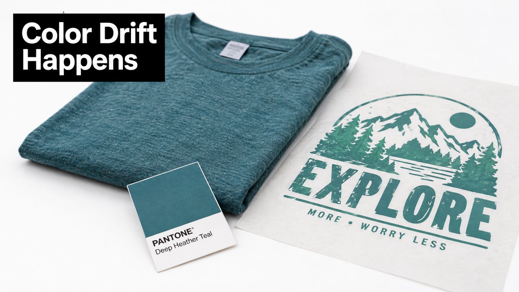
The four specifications that must agree
Color specification comes first. A hex value, a printed swatch, and a garment color name are useful references, but they aren't interchangeable. The artwork file should identify the intended digital value, while the production record should retain a physical approved sample.
Garment specification matters just as much. A cotton-rich heather, a polyester-rich heather, and a supplier's visually similar substitute can expose or absorb the transfer differently. Even when the product description uses the same color name, the fiber blend and yarn construction can change the apparent undertone.
Print method determines whether the color is deposited as an opaque layer, absorbed into cotton, or transferred through a process that interacts selectively with polyester. DTF gives the operator direct control over the printed layer, but it still needs an appropriate underbase and a profile suited to the film and ink system.
Press settings finish the conversion from transfer to garment. Moisture, pressure, dwell time, peel behavior, and film finish can alter edges, surface texture, and perceived depth. A successful first sample proves only that one combination worked. It doesn't automatically define the correct settings for every blank.
Practical rule: Approve the garment and the decoration together. A color chip by itself isn't a production standard.
The useful target isn't perfect visual identity under every condition. It's a documented combination that produces a controlled result on the specified blank, then gives the shop a repeatable reference for later runs.
Defining Deep Heather Teal in Hex, RGB, and Pantone Terms
Deep heather teal combines a dark blue-green color with a heathered surface effect. The digital value describes the artwork. The garment's mixed fibers alter how that value is seen after printing. Two blanks can share a similar teal base yet produce different results because one has a tighter surface while the other exposes more contrasting yarn.
Standard web teal gives the design team a fixed reference. Adobe identifies CSS and HTML teal as #008080, with RGB values of 0, 128, 128, and places it halfway between blue and green on the hue axis. In HSL, that reference is 180° hue and 25% lightness. It can reach a 4.77:1 contrast ratio on white, above the WCAG AA threshold for normal text, according to Adobe's teal color guide.
A production file can start with a darker, muted blue-green value, but the screen preview is only a starting point. On a heathered polyester-cotton blend, the transfer's opacity, the white underbase, and the exposed fabric can shift the result toward a cleaner teal, a grayer teal, or a darker blue-green. Approve the color on the actual blank before releasing a full order.
A useful starting reference
| Format | Value | Notes |
|---|---|---|
| Hex | #008080 | Standard teal anchor, not a finished deep heather teal match |
| RGB | 0, 128, 128 | Digital reference for the standard web color |
| HSL | 180° hue, 25% lightness | Describes the standard reference, not the textile effect |
| Darkened hex direction | #003F3F or a similar muted shade | Useful direction for a deeper, richer blue-green |
| CMYK | Use a press-specific separation | The correct conversion depends on the printer, ink, film, and substrate |
| Pantone | Select the nearest physical coated or uncoated reference | No Pantone chip is an exact substitute for a heathered garment |
Color-reference examples for heather-style teal include #475750, #3F4D48, and #435654. Those examples sit around 154° to 174° hue, 10% to 12% saturation, and 27% to 31% lightness, according to Sabian's explanation of heather color. Their lower saturation and darker value explain the softened, earthy character commonly associated with “deep heather.”
Pantone helps communicate the intended direction, especially when a designer and print shop need a shared physical reference. It does not reproduce the gray, white, or contrasting fibers within the garment. A coated chip may appear cleaner than the same target on uncoated stock, and neither predicts how a heathered knit scatters light. A related textile example, such as teal graduation cord pricing, can help a team compare the general teal family, but it is not an apparel color standard.
For DTF, record the artwork value, underbase approach, ink and film system, garment style, and approved strike-off. Reuse that record for reorders instead of relying on a monitor screenshot. If the underbase is reduced to let more heather texture show through, the print may look more integrated but less opaque. A stronger underbase gives the teal more separation from the garment, while potentially reducing the visible heather effect.
Before production, compare the screen design and physical transfer under consistent lighting. A DTF Transfers Gangsheet Builder can arrange print-ready artwork and show the layout, but it does not replace a color proof. Teams moving between monitors and output devices should also document ICC color profiles, since profile differences can change the displayed and printed color.
What Makes Heather Different from a Standard Teal
A standard teal shirt gives a print a relatively uniform visual ground. A heather shirt already contains contrast before any artwork is pressed, so the same teal graphic can look quieter, grayer, or more textured even when the artwork file has not changed.
Heather describes a textile construction and surface effect rather than one fixed dye. The traditional approach used differently dyed wool fibers to create multi-tonal cloth, with roots in 19th-century Scotland and Ireland. Modern apparel recreates that effect by combining yarns or fibers with different appearances. A teal fiber may sit beside white, gray, or another contrasting fiber, producing the familiar salt-and-pepper surface.
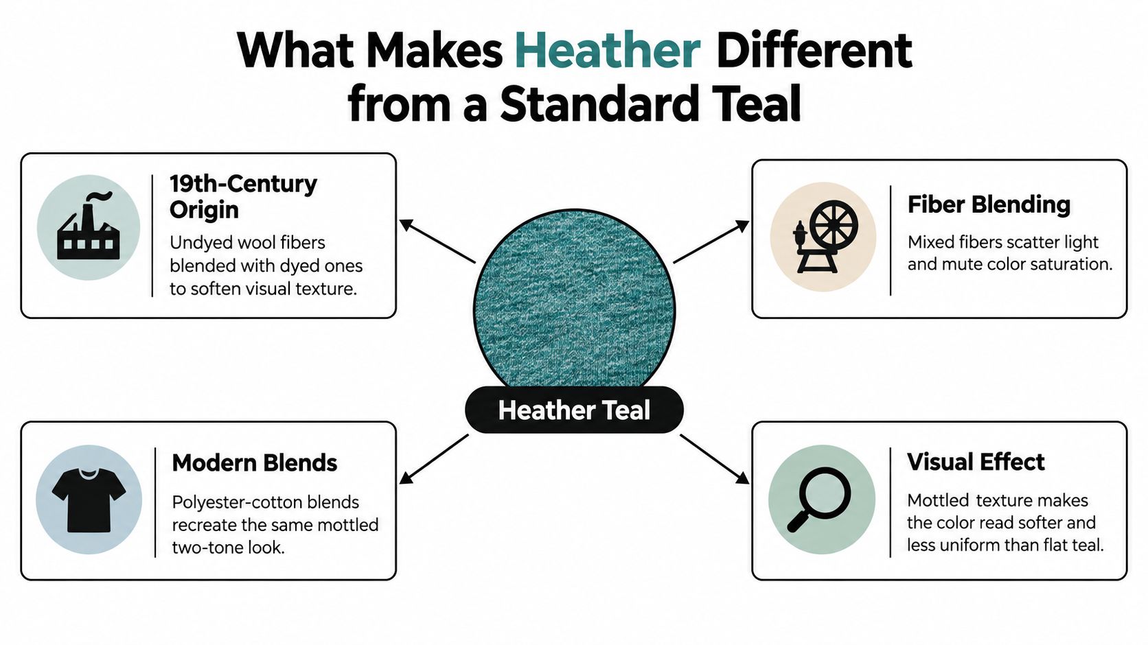
Why the color looks softer
Standard CSS teal is defined at 180° hue and 25% lightness, while heather-style examples sit around 154° to 174° hue, 10% to 12% saturation, and 27% to 31% lightness. These values do not describe every garment, but they show the direction: less saturation, lower contrast, and more surface variation than a clean digital teal.
Viewing conditions add another variable. Light catches raised or differently colored fibers unevenly, and the eye blends those areas at normal viewing distance. A garment may look bluer under one light, greener under another, and grayer in a low-contrast photograph.
What that means on the production floor
The blank can change the perceived color before the transfer is applied. Fine gradients, low-opacity shadows, and small midtone areas are especially sensitive because the garment texture remains visible through less-opaque artwork. A large, solid logo will usually hold its intended teal more clearly than a delicate tonal illustration.
Use the guide to heathered fabric to distinguish the surface effect from the base color, then request the garment's actual fiber and color specification. The product name alone does not tell you how strongly the yarn mix will influence the finished print.
For repeat orders, approve a physical strike-off on the exact blank and record the garment style, artwork version, lighting conditions, and print settings. Reusing that reference gives the design team and DTF operator a practical target instead of relying on a monitor preview.
How Heather Blends Change DTF Ink Behavior
DTF behaves differently on a heather blend because the transfer lands over a surface with more than one visual ground. Lighter cotton fibers and dyed polyester fibers reflect light differently, and the printed layer has to cover that variation. The transfer doesn't need to absorb into the fabric in the same way as water-based screen ink, but the ground still affects edge definition, apparent opacity, and color depth.
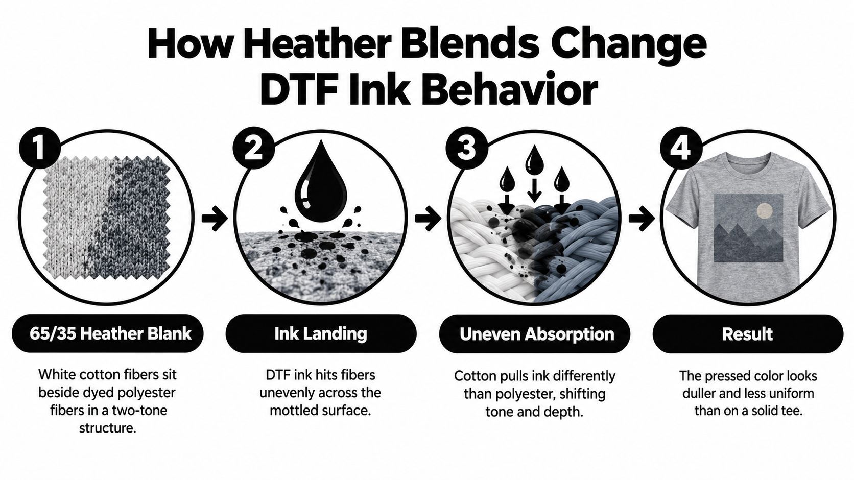
Start with the underbase
A single white underbase is often the sensible starting point for a dark logo or a design with strong solid areas. It gives the teal color a more controlled platform and prevents the darkest garment fibers from dominating the print. The operator should still inspect the thinnest areas of the artwork, because a setting that works for a bold badge may leave a delicate gradient visibly mottled.
A heavier underbase can improve coverage, but it also changes hand feel and may make the transfer look more like a separate patch. A second pass or a tinted underbase should be considered only after a physical test shows that the heather pattern is breaking through important midtones. Adding layers to solve every color issue is inefficient and can create a stiffer result without fixing the underlying profile.
The artwork's ink limit also needs a controlled test. A high ink load can make a solid tee look dense, yet the same design may still look less saturated on heather because the surface texture and film finish change how the eye reads the color. Matte film tends to soften apparent chroma, while glossy film can make the same transfer look more vivid under direct light. Neither finish is automatically more accurate.
Control the production variables
Use one printer profile, one film type, and one ink configuration for the approved sample and the production run. Record the RIP settings rather than relying on a file name or a verbal instruction. If the shop changes film rolls, blanks, or white ink behavior, it should treat the result as a new test condition.
A practical DTF process reference is T-Shirt Envy's DTF printing guide, especially for teams documenting the basic transfer sequence. The remaining color work is substrate-specific. A colorimeter can drift between film rolls, and the blank garment can drift between supplier lots, so instrument readings should support a retained visual standard rather than replace it.
Production reality: The underbase controls more than opacity. It changes the color sitting above it, the surface feel, and the amount of heather texture the customer sees.
Deep teal is especially sensitive to the balance between blue and yellow. Small formulation shifts can change whether the final result reads as a blue-green, a green-teal, or a muted gray-green, which is why textile color-matching guidance treats dark teal production as a control problem rather than a simple hex conversion.
Comparing DTF, Sublimation, and Screen Print for Deep Heather Teal
The right method depends on what the garment and order need to accomplish. A deep heather teal logo on a heathered polyester-cotton shirt isn't the same job as a single-color mark on a smooth, solid blank.
| Method | Color match to target | Hand feel | Wash durability | Best run size |
|---|---|---|---|---|
| DTF | Strong control when the underbase and profile are matched to the blank | Can range from soft to more noticeable depending on coverage and layers | Suitable when fully cured and pressed according to the transfer specification | Small to medium runs and varied artwork |
| Sublimation | Inconsistent on mixed-fiber heather garments because the polyester and cotton portions respond differently | Very soft where dye enters the polyester | Depends on the garment and dye process | Polyester-focused products |
| Water-based screen print | Soft, but can lose depth as ink penetrates the cotton ground | Soft and breathable | Depends on ink, cure, and garment | Repeated artwork with suitable blanks |
| Plastisol screen print | Bright, opaque surface with strong control on compatible garments | More noticeable, particularly across large areas | Strong when properly cured | Larger runs with repeatable artwork |
DTF offers the most practical middle path
DTF places a controlled printed layer above the garment, so it can preserve a dark teal logo better than a process that depends on the garment accepting dye evenly. It also handles artwork changes without the screen setup associated with a traditional multi-step print job. The trade-off is that a large, heavily covered design can feel more present on the shirt, especially if the operator adds a dense underbase to suppress the heather effect.
Sublimation is the weakest choice when the goal is an even deep heather teal on a mixed-fiber blank. The dye affects the polyester portion while the cotton portion remains visually different, so the garment's mottling can become patchy rather than controlled. It works better when the product is designed around polyester behavior instead of treated as a universal solution.
Water-based screen print can produce an attractive soft result, but the cotton component absorbs ink and can reduce the depth of a dark blue-green. Plastisol stays on the surface and can look brighter, yet that opacity may feel heavy on a soft heather garment. For a large repeat order with a stable blank and a simple logo, screen print may be the efficient choice. For smaller runs, variable graphics, or a shop that needs to manage several designs, DTF is usually easier to tune.
For teams comparing physical teal references in apparel and ceremonial products, buying a teal honor cord can provide another example of how textile surface and lighting influence a related color family. It still shouldn't be used as a substitute for the exact blank being decorated.
Press Settings and Troubleshooting for a Consistent Press
Press settings should come from the transfer manufacturer's validated instructions and a sample on the actual blank. That matters more than copying a parameter from another film brand. Different films and adhesive systems can require different peel timing, and a heather garment adds moisture, texture, and dye-migration variables that a smooth solid tee may not reveal.
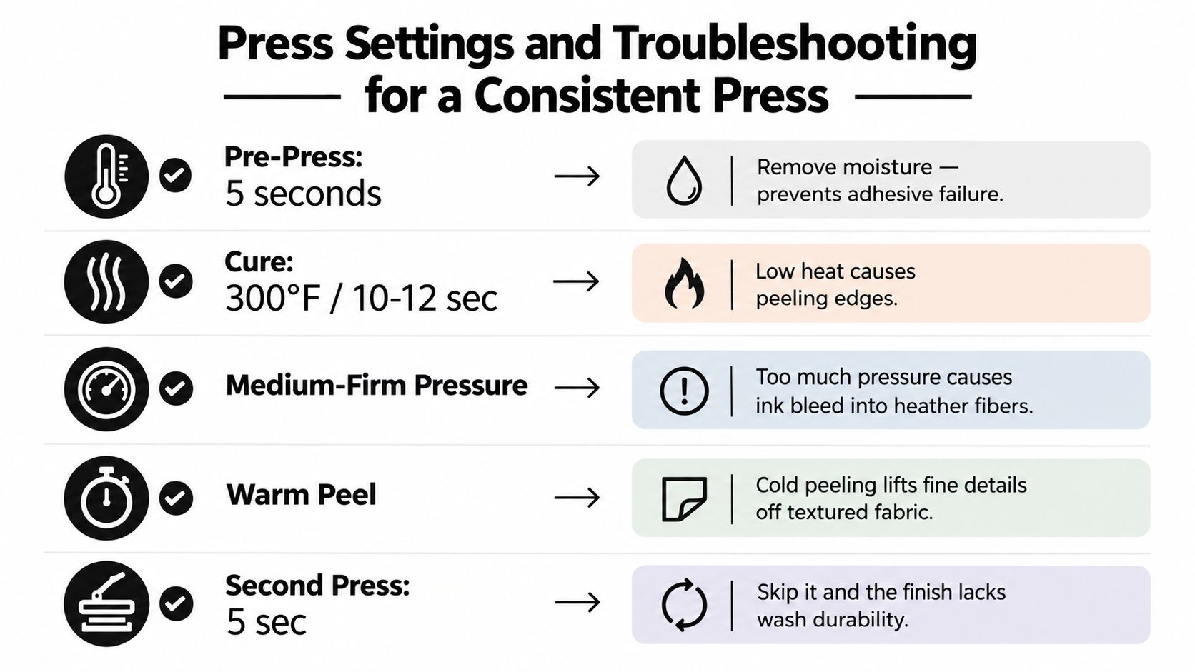
Build a controlled press sequence
Begin with a short pre-press to remove surface moisture, using the blank supplier and transfer supplier's recommended conditions. Moisture trapped in cotton-rich yarn can interfere with adhesive contact and show up as pinholes, lifted edges, or an uneven finish. Keep the garment flat and avoid stretching the knit before placement.
The main press should use the transfer supplier's specified temperature, dwell, and pressure. Choose hot peel or warm peel only when the film instructions call for it. Cold peeling is risky on textured fabric because fine details can remain attached to the film or lift from the garment when the adhesive has not been released correctly.
For a second press, use a protective sheet and the supplier's recommended finishing procedure. A short finishing press can improve surface contact, but excessive heat or dwell can flatten texture, soften edges, or encourage dye migration. The DTF press settings guide is a useful internal reference when documenting a shop's standard workflow, but the approved transfer instructions remain the controlling source.
Diagnose the defect, then change one variable
- Mottled color: Check whether the underbase is too light for the garment and whether pressure is reaching the full design area. Don't immediately increase every ink layer.
- Dye migration: If the garment's teal dye is moving into the white underbase, reduce unnecessary heat exposure and validate the transfer system against the blank.
- Adhesive at the edges: Excess pressure, excessive dwell, or an unsuitable film can push adhesive beyond the design boundary. Test one adjustment at a time.
- Uneven hand feel: Compare the film finish and RIP preset with the approved sample. A profile mismatch can change ink volume and surface texture even when the artwork is identical.
- Peeling details: Review peel timing and confirm that the garment was flat and dry before pressing.
Shop-floor advice: Keep a retained pressed sample beside the machine. Color memory is unreliable, especially when the next blank looks similar but has a different heather structure.
Consistency comes from controlling the sequence, not from chasing a color by eye after every shirt. If the defect appears across the whole run, investigate the profile, film, blank, and press calibration. If it appears only in one area, inspect pressure distribution and garment placement first.
A Pre-Production Checklist for Deep Heather Teal Orders
Before production starts, the operator should be able to answer one question: What exact combination produced the approved color? A useful checklist makes that answer visible instead of leaving it in a designer's memory or an old chat thread.
- Confirm the target. Compare the hex artwork value with a physical swatch under consistent D65 lighting. Keep the approved garment sample, not only a monitor screenshot.
- Verify the blank. Record the supplier, garment color name, fiber composition, and heather appearance. If a substitute blank is proposed, test it before approving the reorder.
- Choose the underbase intentionally. Use the artwork's coverage and the fabric's openness to decide whether a standard underbase is adequate. Test the thinnest and most transparent areas, not just the solid center of the logo.
- Profile the printer and film. Keep the RIP preset, ink configuration, film type, and white-ink behavior tied to the approved sample. A different film finish can change perceived chroma and hand feel.
- Condition the garment. Pre-press according to the validated transfer workflow so moisture and wrinkles don't create defects under the adhesive.
- Retain the production record. Store the approved photo, physical swatch, RIP profile, ink lot, film batch, blank supplier information, and press settings. These records give the next operator a reference when the order returns.
- Sign off visually. Compare the first pressed garment with the retained sample before continuing. Check the logo's blue-green balance, coverage, edges, texture, and hand feel under the same lighting used for approval.
Deep heather teal becomes manageable when the shop stops treating it as a name and starts treating it as a controlled system. That system includes the garment, not just the transfer.
Cobra DTF offers DTF transfers and a gang sheet builder for arranging print-ready artwork with live layout preview, resizing, duplication, and auto-build tools. For a deep heather teal order, use Cobra DTF to organize the artwork, then approve the transfer on the exact heather blank before committing to the full run.