

How to Create Vintage DTF Transfers
A customer brings you a faded-looking reference tee and asks for the same character on a new run. You print the artwork, add a few random cracks, press it onto a dark shirt, and the result looks less like a favorite old garment and more like a transfer that never bonded properly. After washing, pale patches, lifted edges, and broken details make the problem obvious.
Vintage DTF transfers work best when the aged appearance comes from controlled artwork and ink decisions, not from weakening the adhesive layer. The faded color, open negative space, soft hand, and distressed texture should be planned alongside the garment, film, powder, curing method, and press settings. A vintage look can be intentional. Poor adhesion can't.
Direct-to-film printing is a modern production method applied to an older visual language. Commercial DTF development became practical in the late 2010s after earlier inkjet advances, while screen printing had already become widely used on T-shirts by the 1960s. This DTF history overview explains why retro graphics can now be produced in short runs with less setup than traditional screen-print workflows.
Planning the Vintage Look
A small shop owner sees a competitor's “authentic” 1970s tee at a market. The print has uneven gaps, softened color, and a convincing worn surface. Two washes later, the distressed areas have become bare fabric, and the remaining ink is lifting around the edges. The design looked vintage because the production team treated distressing as missing adhesion rather than as controlled artwork.
Start by deciding what kind of age you want the garment to suggest. A faded print needs reduced color intensity and selective transparency. A worn screen print needs irregular coverage, softened edges, and restrained texture. A sun-bleached graphic usually calls for low-contrast color relationships and more visible garment color through the design. These are different visual targets, so they shouldn't share the same distress file.
Define the garment before the artwork
Identify the garment substrate before choosing opacity or underbase treatment. Cotton, polyester, blends, fleece, and performance fabrics can respond differently to heat, pressure, and dwell time. A graphic that looks balanced on a light cotton tee may become muddy on a dark polyester shirt or appear too opaque on a brushed fleece.
Choose the target hand feel at the same time. If the design should resemble an old screen print, keep the ink coverage visually light and avoid building a thick, solid block beneath every distressed region. If the garment needs a stronger, more opaque graphic, preserve the bond and create age through palette, negative space, and texture placement instead of reducing the entire print indiscriminately.
Practical rule: Vintage character belongs in the artwork. Adhesive failure belongs in the reject bin.
Before a full run, press a sample on the actual garment or a closely matched scrap. Record the fabric color, transfer size, film, powder, profile, curing conditions, press temperature, pressure, dwell time, and peel method. Keep the approved sample where operators can compare later units against something real, not against memory.
Lock the visual reference
Save a reference image or physical garment that defines the approved age. Note which areas are faded, which edges remain strong, and where the shirt color shows through. Lock the palette before production, because repeated changes to saturation or transparency can make reorders look like different products.
Vintage apparel has substantial commercial relevance. One market estimate places the global vintage clothes and accessories market at $96.96 billion in 2024, with a projection of $111.54 billion by 2029. The vintage clothing market overview presents those figures alongside other estimates, supporting the practical case for treating retro transfers as a repeatable merchandise category rather than a one-off novelty.
Designing Authentic Aging Effects
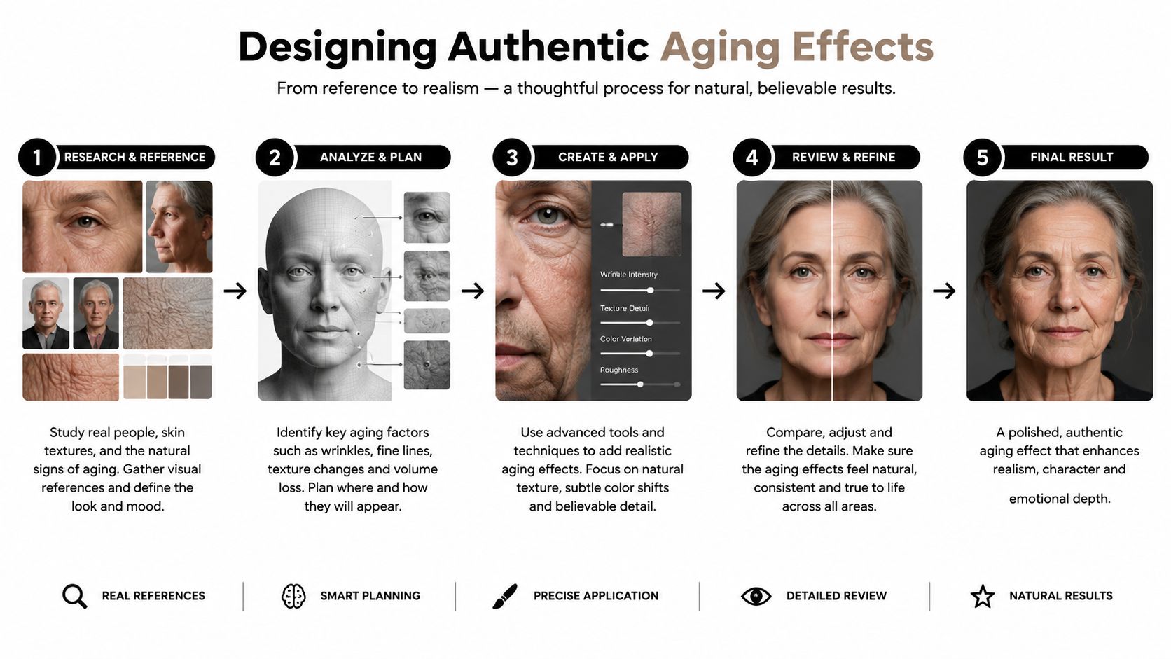
The most reliable vintage designs use several small, deliberate decisions instead of one aggressive distress filter. Build the effect so each layer has a production purpose. Transparent color can simulate faded ink, negative space can reveal the shirt, and selective texture can soften the image without cutting through areas that need dependable adhesion.
Build the palette first
Begin with muted colors rather than applying distress to an overly vivid design. Slightly desaturated reds, ochres, blues, greens, and cream tones often read as older than fully saturated equivalents, but the exact palette must be judged against the garment color and the printer's color profile.
Use transparency selectively. Semi-transparent ink lets the shirt color influence the printed color, creating a worn-in appearance without removing the adhesive from the transfer. A technical guide for retro DTF transfer construction and application specifically describes transparent or semi-transparent ink layers as a way to let the garment show through, and recommends test printing because appearance varies across fabric colors and types.
Don't lower opacity across every layer equally. Preserve enough solid detail in lettering, outlines, and key shapes to keep the graphic readable. Apply lighter transparency to broad fill areas, then use negative space to remove selected portions where wear would naturally appear.
Make the underbase a design decision
On a light garment, skipping a white underbase can help create a washed-out effect because the shirt contributes directly to the final color. That approach can reduce contrast, so it works best when the garment color is part of the intended palette.
Dark garments are less forgiving. A thin white underbase may preserve color separation and support a soft print without turning the design into a heavy opaque slab. Test the underbase beneath the exact distressed artwork. If white fills every opening in the texture, the result may look artificially bright even though the top color is transparent.
Convert texture into controlled print information
Create distress with halftone dots, irregular cracks, hand-drawn grit, and purposeful missing areas. Keep the texture varied in scale and distribution. Repeating one cloned crack across the entire image makes the effect look digital, while placing identical distress over every color creates a sticker-like pattern.
For a Photoshop workflow, use this halftone guide as a reference, then convert the finished texture into clearly named spot or mask layers. Avoid leaving critical aging effects as untracked raster filters that another operator can't reproduce.
Save separate layers for artwork, color, underbase, transparency, distress mask, and background removal. Export in the correct color order for your RIP and keep a production file with the film and powder combination used for proofing. Print the proof on the actual film, cure it with the intended powder, and press it onto the target garment. A design isn't approved because it looks right on a monitor.
Choosing Inks Film and Powder
Ink, film, and powder influence both appearance and handling. There isn't one universal combination for vintage work because a thin distressed graphic can behave differently from a dense logo, and a light cotton tee creates different visual conditions from dark polyester.
Pigment-loaded ink sets generally support strong color coverage, while ink systems that reproduce soft transparency more cleanly may be easier to control for muted retro artwork. The goal isn't to weaken the print. It's to produce the intended color density while leaving selected areas open.
Film choice affects peel behavior. A hot-peel film can shorten handling time, but thin distressed details may be more vulnerable if the artwork hasn't bonded evenly. A cold-peel film gives the transfer time to stabilize before removal, although it adds a cooling step. Follow the film supplier's validated instructions instead of choosing a peel method based only on habit.
Powder also changes the result. Fine powder can suit light adhesive coverage and small details, while coarser powder may provide a more pronounced surface tooth. Too much powder can create a heavy hand and visible buildup. Too little, or uneven coverage, can produce missing areas that operators may mistake for intentional distress.
| Material Option | Effect on Vintage Look | Production Consideration |
|---|---|---|
| High-coverage pigment ink | Keeps muted colors defined and preserves readable details | May feel heavier if density and underbase are excessive |
| Transparency-friendly ink profile | Helps garment color influence faded areas | Requires proofing on each important garment color |
| Hot-peel film | Can preserve clean, immediate handling | Thin distressed details need uniform bonding before peel |
| Cold-peel film | Gives the transfer time to stabilize | Adds cooling and handling time to the workflow |
| Fine adhesive powder | Supports lighter coverage and delicate texture | Coverage must remain even across transparent regions |
| Coarser adhesive powder | Can add surface tooth to a distressed graphic | Excess can increase thickness and reduce a soft hand |
Profile selection deserves the same attention as texture. An ICC profile tuned for the chosen ink, film, and fabric can reduce the temptation to force a faded appearance through excessive post-production transparency. For practical background on how ink behavior affects DTF output, consult this guide to DTF printer ink.
The visual specification should include more than “vintage.” Record the approved garment color, palette, underbase treatment, transparency range, texture file, film, powder, and profile. That specification gives the operator a way to reproduce the look without guessing.
Curing and Pressing Transfers
A vintage graphic can look intentionally pale on the proof and still fail during application. Control the appearance through transparent ink and planned negative space, then protect that look with a cured adhesive and tested press cycle. Treat curing and pressing as one documented production system, not as a temperature copied from another printer or garment.
Begin with the validated settings for the ink, film, powder, and printer. Test those settings on the actual fabric, because heat-sensitive garments and uneven press pressure can change the result. Record dryer temperature, belt speed, powder-melt behavior, and whether the temperature reading describes the film surface or the garment path. The adhesive must melt across the printed image without scorching the ink or deforming the film. Before pressing, inspect for stray powder, fingerprints, edge damage, and uneven density.
Press by fabric and supplier guidance
One supplier specifies 350°F for 10 to 12 seconds on non-heat-sensitive fabrics and 310°F for 18 to 20 seconds on heat-sensitive fabrics, with firm pressure and hot peel. Use those figures as that supplier's reference settings, not as universal rules. Keep the platen flat and clear, and position the garment so zippers, seams, and buttons do not sit beneath the transfer.
Wholesale benchmarks list 300 to 325°F for 10 to 15 seconds, followed by a repress of 5 to 15 seconds. Another listing specifies 315°F for 8 to 10 seconds with heavy pressure and hot peel. These retro DTF transfer pressing benchmarks show why a shop should test its supplier's instructions instead of combining separate recipes.
Before loading the garment, check the press surface, verify pressure across the platen, and align the transfer with a rigid method. For a full walkthrough of time, temperature, and pressure combinations, see this guide to heat press settings for DTF. Cover the transfer only as the film supplier recommends. An iron cannot replace a calibrated heat press, and skipping the specified cycle can leave the adhesive incomplete or damage the garment.
Inspect before approving the batch
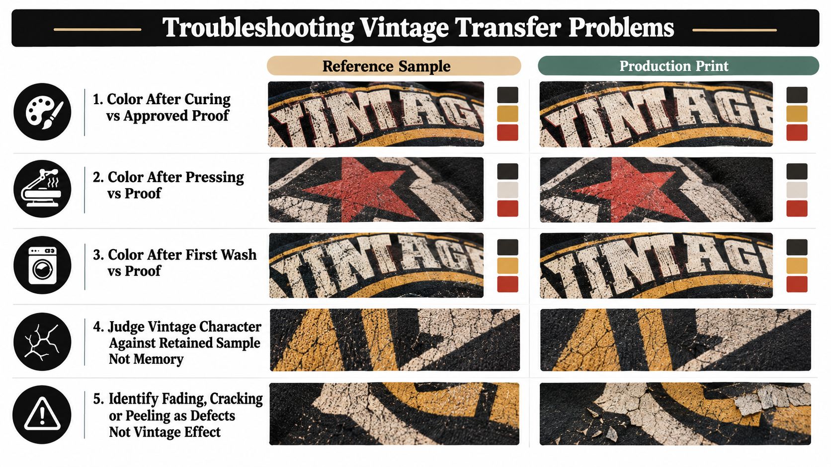
Peel once at the specified temperature, then inspect the result under consistent light. Check color retention, fine detail, edge adhesion, powder lines, and hand feel after cooling. A brief repress may improve adhesion and hand feel when the supplier and fabric allow it. It should not compensate for a poorly cured transfer.
Polyester and sublimated garments require a separate test because heat can alter the fabric or trigger color migration. Cotton, blends, fleece, and performance fabrics can each require different pressure and dwell decisions. Put the exact settings on the job ticket and retain a washed test sample as the production standard.
Pressing checkpoint: If the transfer looks faded while the edges remain secure and the texture matches the approved proof, inspect the artwork. If edges lift or distressed gaps expand after washing, investigate curing and adhesion first.
Compare the production unit with the retained proof after curing, pressing, the first wash, and later washing. This sequence shows whether the vintage character came from controlled transparency and negative space or appeared because the process lost bond strength.
Troubleshooting Vintage Transfer Problems
A pale print isn't automatically a successful vintage print. Judge it against the retained reference sample, not against an imagined memory of how an old shirt should look. A proper vintage effect preserves intentional texture, readable structure, and a stable adhesive bond.
Separate visual age from process failure
Pale or uneven color can come from low ink density, inconsistent white ink, an unsuitable profile, or excessive transparency. Correct the profile, print density, and underbase settings before adding more random distress. Brown or yellow shifts can indicate excessive heat, over-curing, inaccurate dryer control, or an unsuitable fabric.
Peeling, edge lift, cracked details, and missing print areas point to process problems. Incomplete powder melt, insufficient curing, unsuitable adhesive, low pressure, or untested dwell and peel conditions can all create defects that resemble wear. A soft image immediately after pressing may settle during the specified cool-down, but it shouldn't become unstable once cooled.
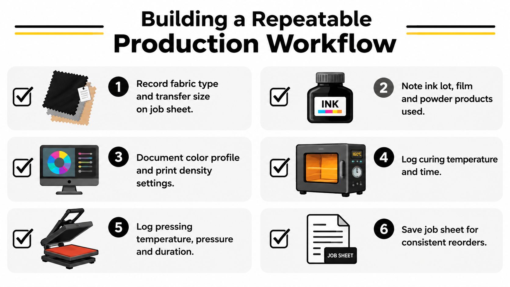
If distress lines become true breaks in the adhesive layer, reduce the texture depth and inspect the source artwork. A soft hand combined with cracking can indicate excessive ink or powder thickness. Bleeding around distressed marks can indicate too much heat, pressure, or dwell time.
Use one controlled correction at a time. Change the profile without changing the press, or change the press setting without changing the artwork. Approve the next sample only when color, edge definition, wash durability, and fabric appearance match the reference.
Vintage is a controlled visual result. Fading, cracking, and peeling that exceed the approved sample are defects, not added authenticity.
Building a Repeatable Production Workflow
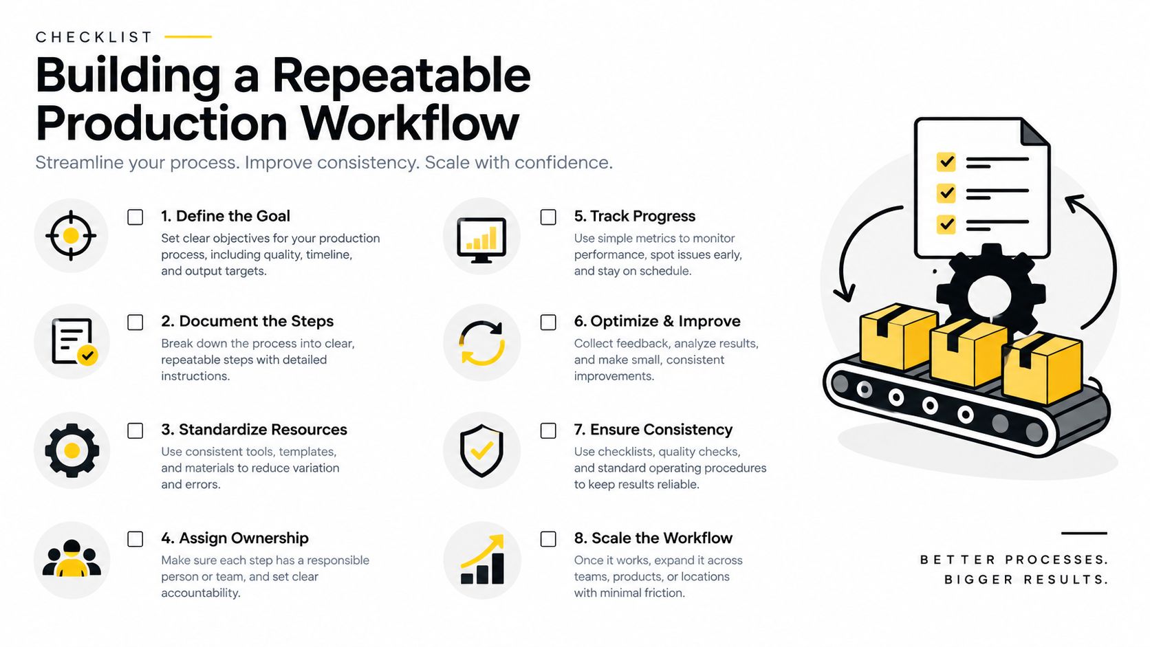
A reliable vintage program starts with a job sheet. Record the fabric type, garment color, transfer size, ink lot, film, powder, color profile, print density, curing conditions, press temperature, pressure, dwell time, peel method, and approved proof.
Keep three references for each important run: one unpressed transfer, one pressed sample, and one washed sample. Print a small test whenever you change the fabric, garment color, image size, film, powder, or profile. A distressed design that works on one substrate may need a different underbase or transparency treatment on another.
Inspect incoming supplies for moisture, clumping, contamination, and storage damage. Track failures by category, including color, registration, curing, adhesion, fabric damage, and artwork defects. That record helps the operator correct the responsible variable instead of compensating with more heat.
For small-batch apparel, group compatible fabrics and artwork by press behavior, then schedule heat-sensitive fabrics separately. A concise daily checklist should confirm the profile, dryer temperature, print path cleanliness, powder coverage, alignment, press settings, and first-unit approval. If you offer ready-to-press options, size-specific DTF transfers can help match each artwork to the garment while keeping the approved file and settings attached to the order.
Cobra DTF offers size-specific DTF transfers for garments, which can fit a workflow built around approved artwork, defined transfer dimensions, and repeatable application testing. Visit Cobra DTF to review transfer options for your next vintage apparel run and order with the garment and production requirements in mind.