
How to Design a Rainbow Cat Sticker: Guide for Printers
“Make it colorful” is the most common advice for designing a rainbow cat sticker, and it's also where many production problems begin. A saturated design can look excellent on a backlit monitor, then print with a dull orange, a weak yellow, or a muddy rainbow. Fine whiskers can vanish, small eye highlights can close up, and a sticker that looks perfect on a clean sample surface can lift from the customer's textured tumbler or laptop.
A sellable sticker needs more than attractive artwork. You need a controlled file, a color-managed workflow, a substrate-specific adhesion test, and a demand test that proves people want your version of the design. The production choices below are what separate a decorative mockup from a repeatable product.
The Cultural Roots of Rainbow Cat Imagery
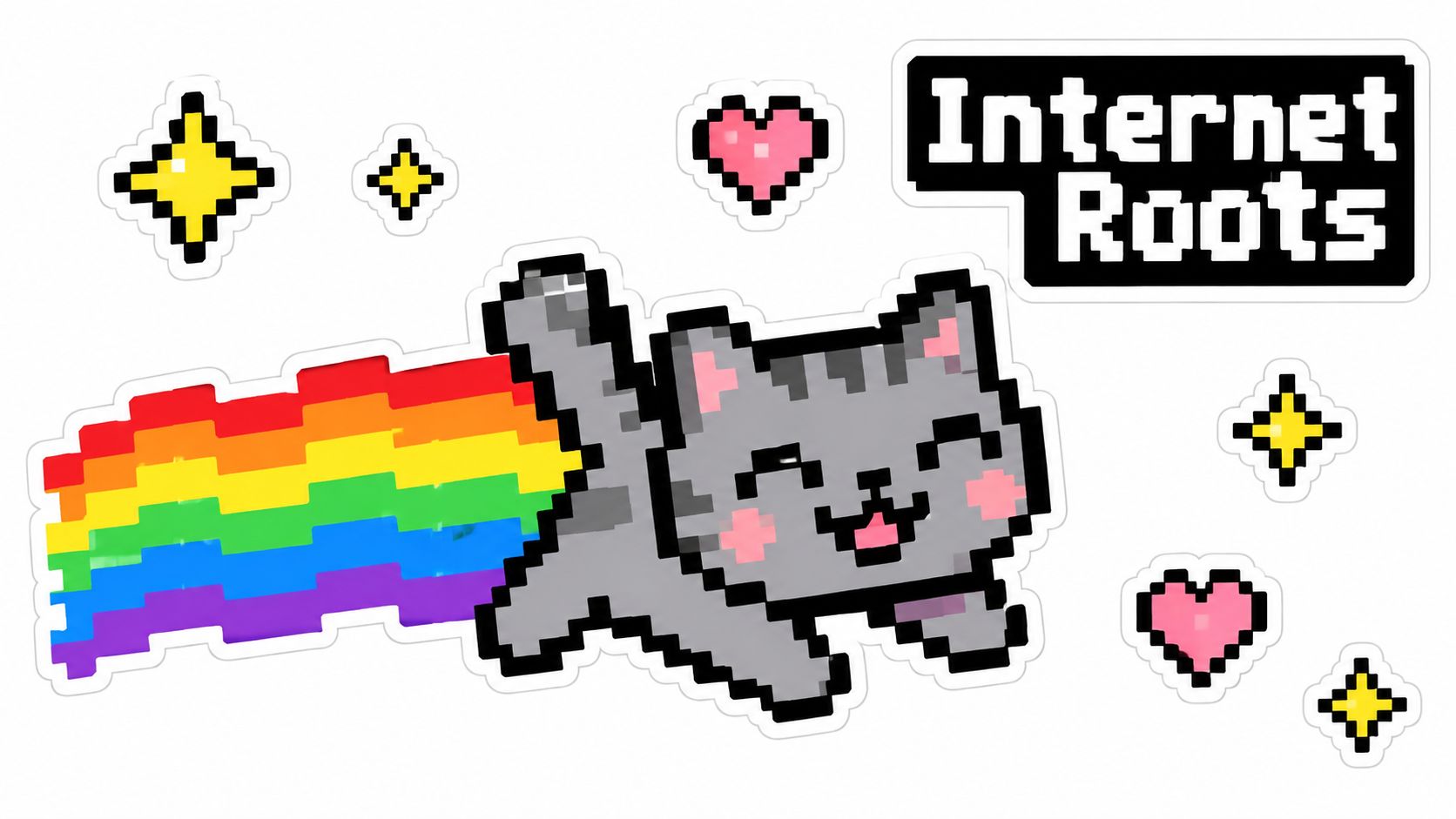
The modern rainbow cat sticker traces back to Nyan Cat, an animated internet character created by artist Christopher Torres on April 2, 2011. The original combined an 8-bit cat with a Pop-Tart-style body and a rainbow trail, a compact visual formula that translated naturally into decals, emojis, apparel graphics, and physical merchandise. A music-backed version appeared on YouTube on April 5, 2011, and the video had surpassed 39 million views by October 2011 (historical record of Nyan Cat).
That speed matters to a printer. The design language became recognizable through a few strong components: a feline silhouette, intense color bands, pixel-inspired detail, and a composition that suggests movement. Those elements are easy for a customer to identify, but they're not equally easy to reproduce. A rainbow has several adjacent saturated colors competing for printable gamut, while pixel art depends on sharp boundaries and deliberate small details.
Why the visual formula still works
The appeal isn't limited to nostalgia. A rainbow cat can support different buyer interpretations without changing its basic silhouette. One customer may want a playful laptop decal, another may want an identity-led design, and a small apparel brand may want a character for packaging or promotional material. That flexibility makes the motif commercially useful, but it also creates a trap: a design that tries to serve every audience often loses the simple visual hierarchy that made the motif memorable.
The original Nyan Cat concept also gained measurable cultural and commercial visibility beyond ordinary merchandise. In February 2021, a special anniversary version of the rainbow-cat GIF sold for $560,000, a digital-art transaction rather than a physical sticker sale (University of Iowa discussion of the sale). That figure shouldn't be used to estimate sticker prices or physical demand. It does show that rainbow-cat imagery became an independently recognizable intellectual-property asset.
Production rule: Treat the historical reference as a design language, not as permission to copy a protected character. Build an original cat, original proportions, and original supporting details.
For production, the practical lesson is simple. Preserve the high-contrast silhouette and motion-oriented composition, but make the artwork your own. Once the concept is original, the next challenge is ensuring that the file survives the transition from screen to print.
Designing Your Rainbow Cat Artwork for Print
Start with the artwork structure, not the sticker shape. Build the cat, rainbow bands, outline, highlights, and text as separate layers. That lets you reduce a troublesome orange band, thicken a whisker, or adjust the cat's eye without rebuilding the entire illustration.
Vector artwork is the safest starting point for clean outlines and hard-edged rainbow bands. If you're working from raster artwork, size it at the final output dimensions and keep critical detail high resolution. Don't rely on tiny anti-aliased pixels for whiskers, eye highlights, or narrow color separations. Those details can soften during rasterization, disappear against a dark outline, or fill in when the design is printed with a white underbase.
Build the file around production decisions
Use a consistent sequence:
- Separate the visual elements. Keep the cat, rainbow, background accents, and lettering editable. A flattened file makes troubleshooting slower because every correction affects neighboring pixels.
- Protect fine features. Convert whiskers, eye highlights, and thin rainbow bands to vector paths or retain them as high-resolution elements. If a line is essential to recognition, give it enough visual weight to survive the actual print process.
- Plan the contour. Create the cutline after the artwork is stable. Avoid placing the cut path so close to a delicate ear, tail, or star that minor registration variation exposes an unwanted edge.
- Embed the source profile. An untagged RGB file can be interpreted differently by design software, RIP software, and the printer. The file should carry its intended color information from creation through output.
- Check the physical application. A design for a flat paper label can use different detail and contour decisions than a UV DTF decal intended for curved glass or textured plastic.
Don't design only against the brightest monitor you have. Screen colors can exceed what printed pigments reproduce, and gradients that look smooth onscreen may show visible stepping or muted transitions in output. A practical guide to vector images for T-shirt design is useful when you're deciding which parts of the cat should remain scalable paths rather than fragile raster details.
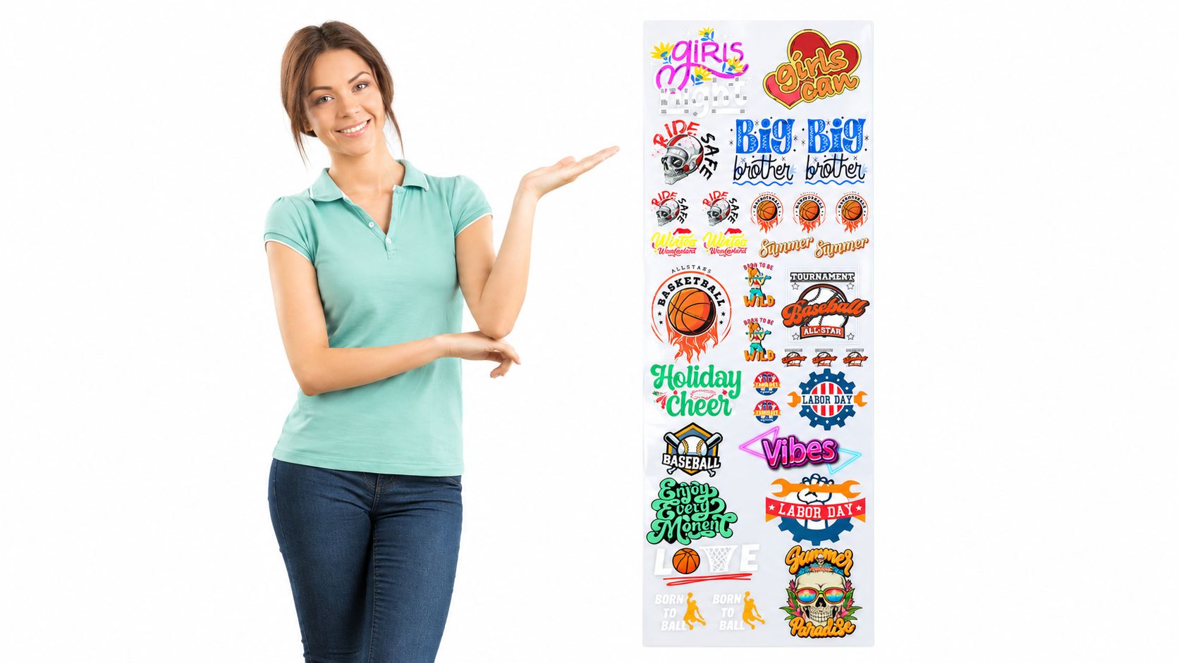
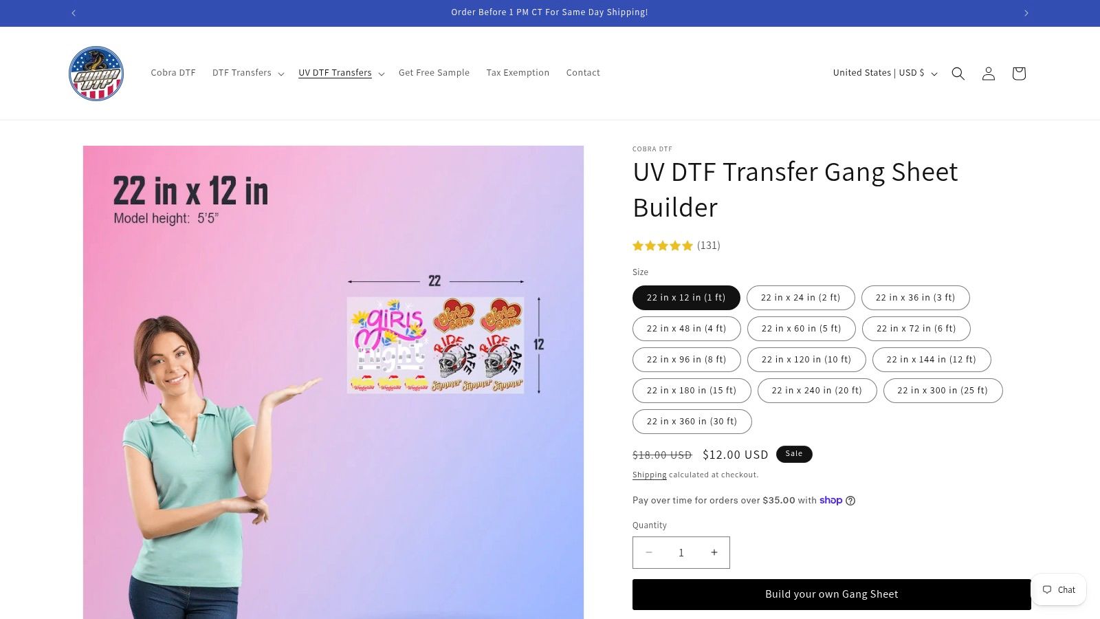
If you're preparing multiple original variations for hard-surface decals, the UV DTF Transfer Gang Sheet Builder provides upload, scaling, duplication, drag-and-drop arrangement, live layout preview, and automatic building for custom gang sheets. Use that kind of layout tool after the individual files are already print-ready. It can arrange artwork efficiently, but it can't repair a weak cutline, missing profile, or disappearing highlight.
Mastering Color Management for Saturated Rainbows
A rainbow cat sticker fails visually when the designer judges color only on a backlit display. The screen emits light, while the printed sticker reflects it. Printed pigments don't reproduce the full screen gamut, so saturated areas can become dull or shift in hue. Orange and yellow deserve special attention because they can appear washed out under ordinary lighting (technical discussion of rainbow printing).
Use a defined color path
The color workflow should be intentional:
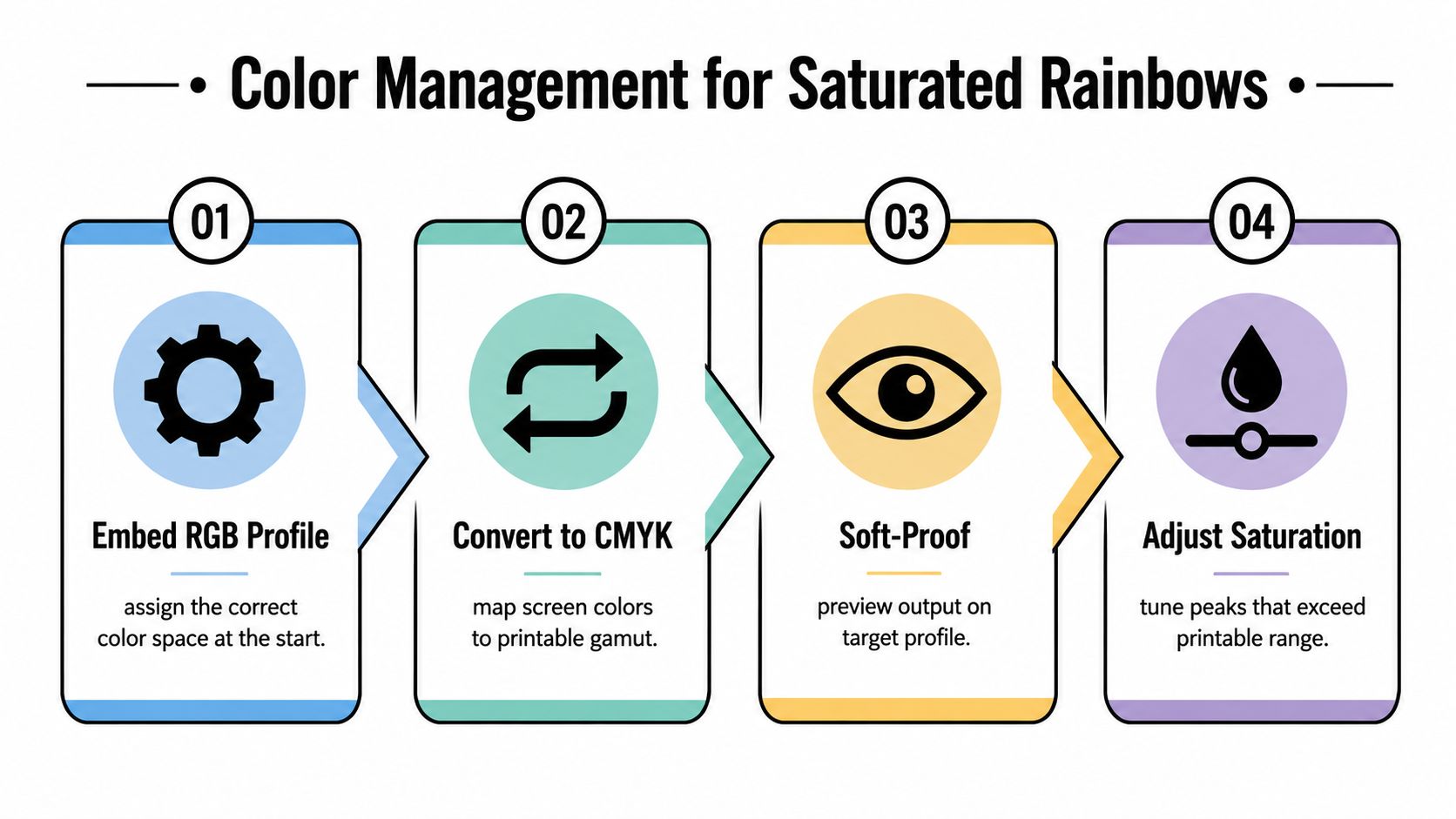
- Embed the RGB profile at the source. This tells downstream software how the original values were intended to appear.
- Convert through the printer, ink, and media ICC profile. A generic conversion can't account for the behavior of a particular combination of equipment and substrate. The practical role of ICC profiles in printing is to map source color into a known output condition.
- Soft-proof before production. Preview the artwork against the target output profile and inspect the rainbow bands, cat eyes, neutral shadows, and any text.
- Adjust clipped colors selectively. Don't reduce saturation across the entire design just because one orange band exceeds the printable range. Correct the problem areas while preserving contrast elsewhere.
A common mistake is to boost saturation until the monitor looks exciting. That can clip channel detail and leave the printed gradient with fewer usable transitions. If you need a broader explanation of how saturation adjustments affect an image, adjusting saturation in RevelRaw offers useful visual context, although sticker production still requires validation on the actual printer and media.
Measure a sample instead of trusting appearance
Print a standardized color chart beside the rainbow cat artwork. Measure representative cyan, magenta, yellow, orange, violet, and neutral-gray patches with a spectrophotometer, then compare the results using CIE L*a*b* values or Delta E metrics. The goal isn't to make every color identical under every lighting condition. It's to identify repeatable shifts and decide whether the artwork needs correction before the production run.
Archive the final ICC workflow, substrate, lighting condition, and measured tolerances with the artwork version. This record matters when a repeat order uses a different film, ink set, laminate, or printer setting. Without it, operators often “fix” a color by eye and create a new mismatch on the next batch.
Press-side observation: Orange and yellow usually need more scrutiny than the blue and violet bands. A rainbow can remain recognizable after a modest shift, but a weak warm section often makes the entire design feel flat.
Validating Adhesion and Durability
A rainbow cat sticker that lifts at the ears or tail is a failed product, regardless of how accurately the colors printed. Adhesion should be validated with a controlled peel-test workflow, not by pressing one sample onto a clean desk and checking it a few minutes later.
Condition the sticker and substrate at approximately 23 ± 1°C and 50 ± 5% relative humidity. Clean a standardized stainless-steel surface, or use a representative end-use surface such as the glassware described in this guide to stickers for glassware. Apply the sticker with a consistent roller, allow a defined dwell period, and peel at a fixed 90° or 180° angle at 300 mm/min.
Record the failure, not just the force
ASTM D6252 measures 90° peel adhesion for pressure-sensitive label stocks and supports comparisons across substrates (ASTM D6252 reference). Repeat specimens matter because one successful sample can hide edge lift, contamination, or inconsistent coating.
For each artwork batch, record:
- Mean peel force: The average result across repeat specimens.
- Minimum result: The weakest specimen, which often reveals the production risk.
- Substrate: Stainless steel, glass, plastic, powder-coated metal, or the actual customer surface.
- Dwell time: The time between application and testing.
- Failure mode: Adhesive failure, substrate failure, or face-stock tear.
The failure mode tells you what to change. Adhesive failure may point to surface contamination or an unsuitable adhesive. Face-stock tearing can indicate that the bond is stronger than the sticker material. Edge lift on textured plastic doesn't mean the same design will fail on clean glass, but it does mean stainless-steel data can't be applied broadly.
Use a practical acceptance gate
A Library of Congress label specification benchmark can serve as an additional reference: the label should support a 200 g weight for 10 minutes and show no more than 10 mm of edge separation after environmental conditioning. That's a benchmark, not a universal requirement for every sticker application.
Avoid the shortcuts that produce misleading results:
- Immediate testing: Adhesives may need dwell time to develop a representative bond.
- Unclean surfaces: Oils and dust can make a good adhesive appear defective.
- Changing peel conditions: Angle and speed changes make batch comparisons unreliable.
- One-surface validation: Smooth steel doesn't represent powder-coated metal, textured plastic, or fabric.
Choosing Between DTF and UV DTF Production
The right production method depends on where the rainbow cat design will live. DTF transfers suit textile applications, including shirts, tote bags, and other fabric goods. UV DTF transfers suit rigid surfaces such as glass, metal, plastic, wood, ceramic, and acrylic.
That distinction changes both the design and the test plan. A textile transfer must tolerate bending, stretching, and repeated handling. A hard-surface decal must conform to the target object and maintain clean edges against scratches, curvature, and surface contamination.
Compare the application first
| Production route | Best fit | Main production concern |
|---|---|---|
| DTF | Fabric goods and apparel decoration | Preserve detail through transfer application and fabric movement |
| UV DTF | Hard surfaces, decals, and labels | Validate adhesion and edge behavior on the actual rigid substrate |
DTF is the natural choice when the rainbow cat is part of an apparel product. The design can retain bright character details, but the artwork should avoid relying on hairline features that may become less distinct on textured fabric. Keep the cat silhouette readable from a normal viewing distance and check the transfer on the specific garment color.
UV DTF is more appropriate for a laptop decal, tumbler graphic, product label, or other rigid application. Its appeal is the ability to move a detailed design onto a hard surface without treating it like a textile. The surface still controls the result. Glass, acrylic, molded plastic, and powder-coated metal can behave differently, so the adhesion workflow should match the intended product.
Choose based on the sales format
If you're selling decorated garments, standard DTF keeps the production path aligned with the product. If you're selling loose decals or branded hard goods, UV DTF gives you a more suitable transfer format. Neither method rescues a poorly prepared file. Color management, clean separations, and surface testing still determine whether the finished rainbow cat looks intentional.
A printer that's adding stickers to an existing catalog may also need a fulfillment model rather than a new in-house workflow. Resources on how to launch DTC print products can help frame the product around its sales channel, while the physical decision remains application-specific.
Decision rule: Pick the substrate before picking the transfer. A beautiful textile graphic is not automatically a reliable hard-surface decal, and a rigid-surface workflow doesn't replace fabric testing.
Testing Demand Before Full Production
General sticker interest can justify a test, but it can't justify a large run by itself. Recent industry reporting says searches for “custom stickers” increased 40% year over year during much of 2025, while searches for stickers and related accessories reached an all-time high within the previous 12 months (industry reporting on personalized accessories). The same reporting says 60% of consumers prefer customized products and 48% of small businesses use custom stickers for promotion. Those figures describe broad behavior, not proven demand for your specific rainbow cat artwork.
Test the concept as a set of distinct products. A minimal cat silhouette may appeal to buyers who want a subtle decal. A kawaii illustration can serve stationery shoppers. A pride-specific version may use a different color arrangement and message. A name-customizable version tests whether personalization matters more than the base character.
Keep the test commercially clean
Separate personal-use buyers from business customers. A person buying one sticker for a laptop is making a different decision from a small business ordering promotional labels. Combining them can make a design look successful because it attracts clicks while failing to produce the order type your operation can profitably fulfill.
Track each variation separately:
- Click-through rate: Does the design earn attention in the listing or ad?
- Saves: Do shoppers want to return to it?
- Add-to-cart behavior: Does interest survive contact with the product details?
- Conversion: Does the buyer complete the purchase?
- Repeat purchase: Does the design support additional orders or related products?
Keep the first production commitment small enough that a weak variant doesn't trap cash in inventory. Test the actual listing image, physical finish, size options, and application language. A digital mockup can validate the concept, but it can't reveal whether the orange looks muddy or whether the tail lifts from the customer's surface.
For a broader framework on structured indie hacker product testing, focus on the same discipline used in a good print test: isolate variables, collect behavior rather than compliments, and change one meaningful element at a time. Rising customization demand supports experimentation, not automatic mass production.
Cobra DTF offers DTF and UV DTF gang sheet builders that let you upload print-ready artwork, resize and duplicate designs, arrange them with drag-and-drop tools, and preview the layout before ordering. For a rainbow cat sticker, use that workflow after color and adhesion checks are complete, then visit Cobra DTF to prepare a production-ready sheet for your chosen application.