

Pique Material Definition: A Printer's Guide to the Fabric
Piqué material is a knit structure, not a fiber type, and its signature look comes from raised, geometric texture. For a shop owner, that means you're not choosing a single raw material, you're choosing a surface that changes how a garment feels, drapes, and prints.
You've probably held a polo that looked cleaner and sturdier than a plain tee, then wondered why. The answer is usually the fabric construction, not a special finish, and that distinction matters when you're deciding what to buy, decorate, and resell.
What Every Apparel Shop Needs to Know About Pique
A new polo lands on your bench, and the first thing you notice is the surface. It does not feel flat like jersey, and it does not behave like a simple cotton tee. That texture is what makes pique worth understanding before you accept a decorating job, because the fabric surface affects print quality, hand feel, and profit from the start. This cotton pique knit guide is a useful companion if you want a broader product-view of the category.
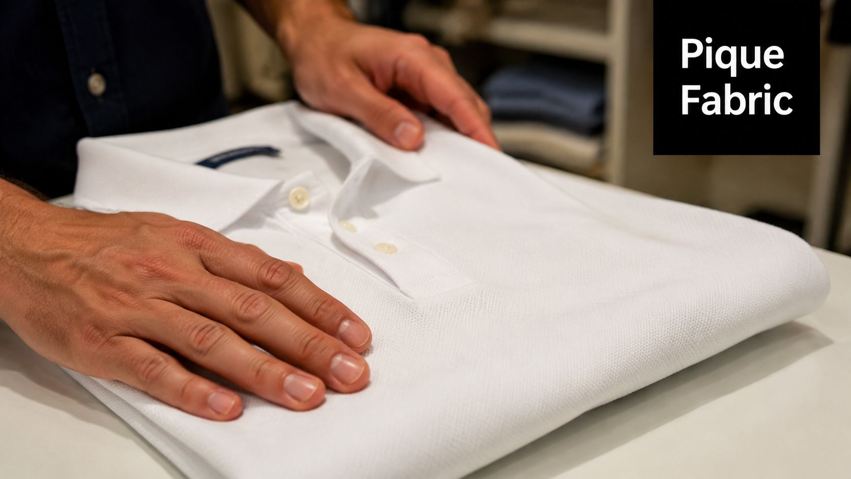
The practical definition is simple. Piqué material is a woven or knitted structure with raised cords, ribs, or geometric texture, and it is commonly used in polos, uniforms, and similar garments because the surface gives the fabric a cleaner look and more airflow than a flat knit like jersey as described in textile references).
Why the definition matters for your shop
If you source the wrong fabric by assuming “pique” means one fiber or one feel, you will make avoidable buying mistakes. Pique can be cotton, rayon, silk, polyester, or blends, so the hand feel and print behavior can change even when the surface still looks like pique. A cotton pique knit reference helps separate the fabric family from the fiber content, which is the distinction that matters during ordering and quoting.
That is why decorators care. The raised surface signals a garment class that customers already associate with professionalism, durability, and classic sportswear styling, but it also means print placement needs more thought than on a smooth tee. For a shop owner, that is the trade-off, the garment can look more premium, yet the texture can make DTF transfers and other prints require better prep, tighter placement, and a clearer plan before you promise an easy run.
The Structure Behind the Texture
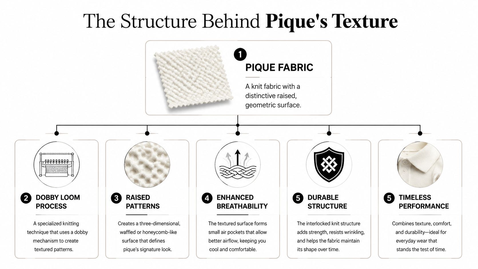
Pique gets its identity from how it's built, not from a single fiber content. Textile references describe it as a weaving or knitting style with raised parallel cords, ribs, or geometric textures, and the name comes from the French verb piquer, meaning to prick or stitch, which fits the quilted look.
How the surface is formed
Pique uses a raised surface that creates small highs and lows across the face of the fabric. That is why it can read as honeycomb, birdseye, ribbed, or waffle texture depending on how it is made as textile histories describe the variants. The same broad category can appear in different weights and compositions, but the structure stays recognizable.
Practical rule: when a supplier says pique, ask about the structure and the fiber blend separately. Those aren't the same question.
That question matters because the same surface can be created with different yarns and different machines. One technical guide explains that pique uses knit or dobby-weave structures with tuck or stuffer yarns, so the fabric architecture itself creates the raised effect and the more rigid hand as detailed in a construction guide.
What that construction means in sourcing
For sourcing, the main takeaway is that structure drives performance. You're not just choosing whether the fabric is cotton or poly, you're choosing how the garment holds air, how it keeps shape, and how it accepts decoration. Pique's architecture is why it gets used as a stable, professional-looking textile across apparel categories, not just as a polo-only novelty.
That also explains why buyers sometimes mix up terms. The fabric can look upscale and technical even when the fiber content is basic, because the visual texture does the heavy lifting. Once you understand that, supplier spec sheets get much easier to read.
Performance Properties and Common Applications
A shop owner usually notices pique first in the fitting room and on press. The fabric feels more structured than a basic jersey, and that changes how it wears, how it presents the logo, and how forgiving it is for decoration. It is also a practical reason pique keeps showing up in apparel programs where the garment has to look clean after real use.
The body of the fabric has a raised texture that traps small pockets of air, so it tends to feel cooler and less clingy than a flat knit of similar weight. That is why it shows up so often in polo shirts, uniforms, golf apparel, and tennis wear. Buyers want a garment that stays neat, keeps its shape, and does not collapse into a soft tee-like drape after a few wears.
That same structure also affects the business side. A pique garment usually reads as more polished than a standard jersey tee, so it fits programs where the customer wants a step up in appearance without moving into a dress shirt. In practice, that makes it a strong option for school polos, clubwear, hospitality uniforms, and business casual merch, especially when the order needs a dependable look across a whole team or staff run.
Where pique fits best
- Polos and team uniforms: The structure keeps the garment from looking flimsy and helps the shirt hold a cleaner line through repeated wear.
- Sport-inspired retail programs: The textured face gives the piece a classic feel, which works well for collections meant to look lasting rather than trend-driven.
- Brand pieces with a structured look: The fabric supports a more refined presentation than many soft knits, so the logo and garment work together instead of fighting each other.
Good product rule: if the customer cares about a neat collar, predictable drape, and a durable first impression, pique usually makes more sense than a softer tee fabric.
For buyers comparing a standard polo with a more fashion-forward style, choosing the right golf polo is a useful reference because silhouette and fabric choice shape the final impression together. That same idea applies in your catalog, where the structure of the fabric should match the look you are selling.
Pique vs Jersey A Head-to-Head Comparison
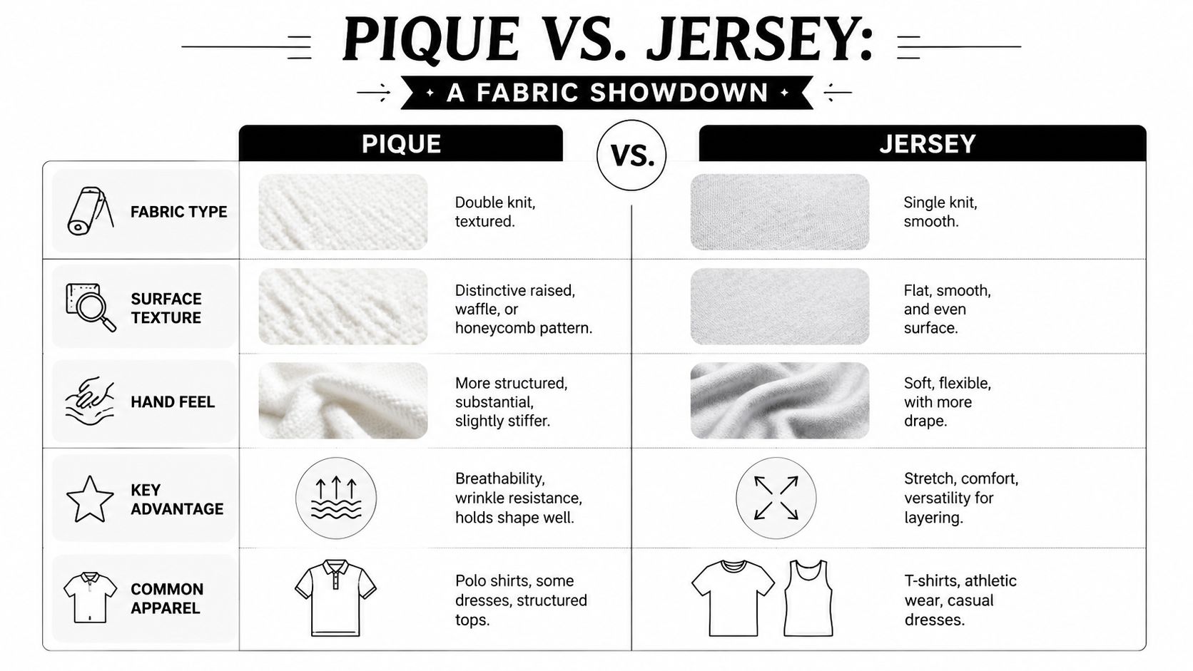
A shop owner comparing pique and jersey is really choosing between two different production outcomes. Jersey gives you a smooth, familiar surface that prints cleanly and feels casual. Pique gives you texture, more body, and a presentation that reads as more structured, which can change how customers judge the garment before they ever try it on.
What changes on press
True piqué uses its textile structure to create air pockets and a firmer hand, which is why it shows up so often in polos and uniforms where buyers want cleaner drape and better airflow than flat jersey. Jersey gives decorators a flatter print field and usually a softer drape, which makes it easier for fine graphics and casual tees.
What changes on press is contact. On jersey, the transfer lands on a more even surface, so you spend less time compensating for the fabric itself. On pique, the raised texture means the film has to bridge highs and lows, and that is where print clarity, edge definition, and wash consistency can start to separate a good setup from a frustrating one. For that reason, DTF heat press temperature guidance matters more than many new shops expect, because the right heat and dwell help the adhesive bond without flattening the garment more than necessary.
How to choose the right fabric for the job
| Factor | Pique | Jersey |
|---|---|---|
| Surface | Raised, textured | Smooth, even |
| Hand | More structured | Softer, more fluid |
| Best use | Polos, uniforms, classic sportswear | T-shirts, layering pieces, casual basics |
| Print feel | Texture can affect laydown | More uniform print surface |
That table is the quick buyer's shortcut, but the sales angle matters too. Pique often supports a higher perceived value because customers connect the texture with better construction and longer wear, while jersey usually wins on comfort-first basics.
If you're selling into golf, club, or uniform programs, pique makes sense when the buyer wants a garment that looks intentional. If the artwork has to be the main focus and the fabric should stay in the background, jersey is often the safer pick. That is the same buying logic behind choosing the right golf polo, where fabric choice and silhouette shape the final impression together.
Mastering DTF Printing on Pique Surfaces
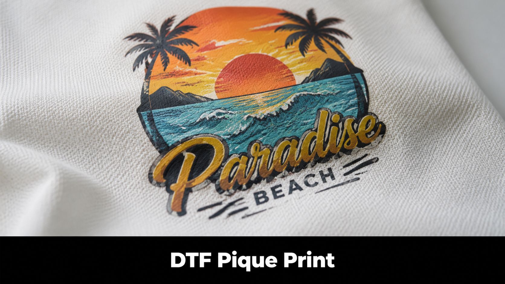
Pique's texture is the whole challenge. The raised surface means your transfer has to work across highs and lows, not just land on a flat field, and that's why many decorators run into inconsistent edges or incomplete contact when they treat it like jersey. Independent apparel guidance says decorators should “respect the texture,” which is the right mindset for avoiding reprints and unhappy customers as explained here.
Why DTF fits textured fabric so well
DTF gives you a flexible printed film with adhesive that can conform better than many direct print methods on uneven surfaces. That matters on pique because the fabric isn't perfectly level, so the decoration has to bridge the geometry instead of assuming a smooth sheet of cloth.
For a printer, that means DTF is less about forcing a rigid solution onto the surface and more about creating contact where the surface dips and rises. The print still sits on top of the texture, but the film's flexibility helps it read more completely than methods that depend on the fabric behaving like jersey.
What to watch during production
- Placement matters: Put the graphic where the weave isn't fighting small details.
- Design complexity matters: Large, bold shapes usually survive texture better than hairline elements.
- Heat control matters: Too much heat can exaggerate problems on textured surfaces, so follow the application guidance for your transfer system. This DTF heat press temperature guide is a useful reference when you're setting your press.
The practical advantage is profitability. When you choose DTF for pique instead of trying to force a method that hates texture, you lower the chance of rework and make the job more predictable. That matters even more on small runs, where one bad press can erase margin quickly.
If you're quoting a polo decoration job, treat pique as a textured substrate first and a garment second. That mindset helps you decide when to simplify art, when to enlarge elements, and when to steer the client toward a more print-friendly silhouette.
Care and Longevity for Printed Pique Garments
Printed pique holds up best when the customer treats both the fabric structure and the DTF print gently. The goal is to preserve the raised texture, keep the garment from stressing the print, and avoid the kind of wash routine that shortens the life of either component.
What to tell your customer
- Wash inside out: That reduces friction on the print and helps the texture stay cleaner longer.
- Use mild detergent: Harsh cleaners can be rough on both the garment and the transfer.
- Skip aggressive heat: Air-drying is the safest choice, and low-heat tumbling is the next best option.
- Keep water temperature moderate: Extreme heat isn't helpful for the print or the fabric hand.
Those are basic instructions, but they protect the part of the garment that customers notice most. If you need a customer-facing handout, the washing instructions guide from Cobra DTF lays out a simple care routine you can adapt for your own orders.
Simple rule: if the garment looks structured on day one, the care routine should protect that structure instead of fighting it.
For shops that want to offer extra guidance, a pro care tips for kits page can also be a useful model for how to explain garment care without sounding technical. The best care advice is always the advice customers will remember and follow.
When you sell printed pique well, you're not just selling a shirt. You're selling a garment that feels intentional, prints reliably when handled correctly, and keeps that classic look after repeated wear. If you want more help choosing the right transfer approach for textured apparel, visit Cobra DTF and compare your next pique polo job against the surface, the art, and the wash expectations before you place the order.