

Blowing Up Photos to Poster Size Without Losing Detail
A customer walks into a print shop with a phone photo and asks for a 24 × 36 inch poster. On the phone, the image looks sharp. At poster size, though, every limitation becomes easier to see: soft eyes, compressed texture, jagged lettering, and noise in the shadows. The question isn't only whether the file can be made bigger. It's whether the source contains enough useful information for the way the poster will be viewed.
Successful blowing up photos to poster size starts with four decisions: the source pixel dimensions, the final physical size, the viewing distance, and the material receiving the image. Once those are clear, you can choose between ordinary interpolation, AI enlargement, or a design change instead of trusting a software preset blindly.
What You Actually Need Before Enlarging
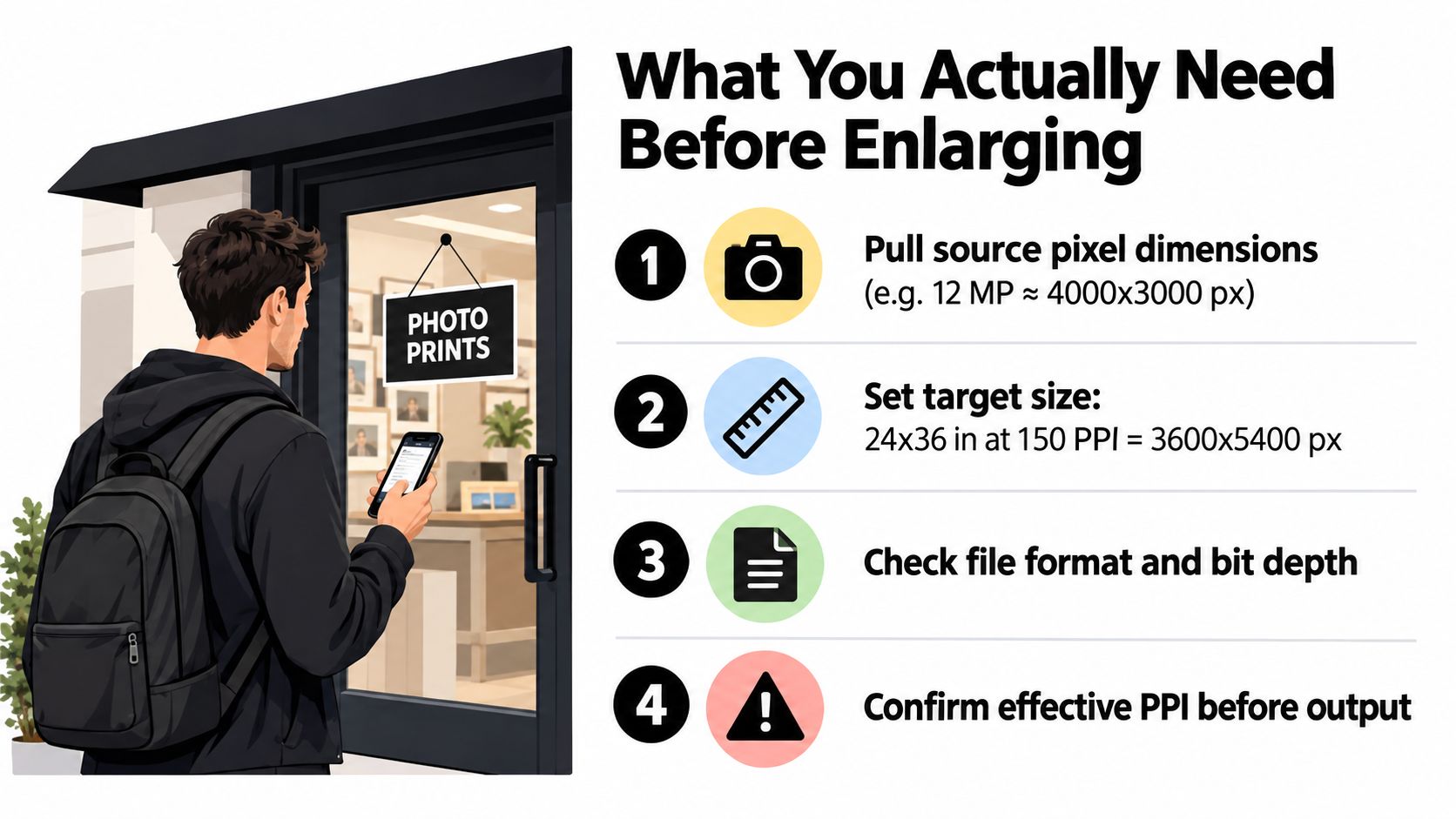
The first thing I ask for is the original file. A customer may describe it as a “12 MP phone image,” but that doesn't tell me whether I'm looking at the camera export or a copy that has passed through WhatsApp, Instagram, email, or a website upload. Social platforms and messaging apps often re-encode images, and that compression removes the fine edge and texture information a large print needs.
Start by locating the pixel dimensions in the file properties. Then divide the width and height in pixels by the intended print dimensions in inches. A file measuring 4000 × 3000 pixels, for example, produces different effective PPI depending on whether it's printed small or stretched across a wall. The calculation is simple:
Source pixels ÷ final print inches = effective PPI
Before opening an upscale tool, check these four items:
- Image dimensions: Record the actual width and height in pixels, not the camera's advertised megapixel category.
- Final size: Write the target width and height in inches, including whether the image needs cropping.
- Viewing distance: Decide whether people will hold the print close, stand beside it, or view it across a room.
- Substrate: Identify whether the job uses glossy photo paper, matte stock, canvas, vinyl, or another surface.
Protect the source before you edit
Save the original camera export in a separate folder and create a working copy. Don't crop, denoise, sharpen, or convert the master before you know the final dimensions. A reversible workflow lets you return to the untouched file if the first enlargement creates halos, plastic-looking skin, or distorted detail.
Aspect ratio deserves attention at this stage. A phone image and a 24 × 36 poster may not share the same proportions, so filling the poster can cut off a face, product, or important background element. Decide whether to crop, add a border, or redesign the composition before enlargement. Upscaling a file that will later be cropped wastes pixels and can push a borderline image into visibly soft territory.
Practical rule: Never judge a poster file only by how it looks on a phone screen. Check the effective PPI at the final physical size and inspect a proof at the distance where viewers will stand.
Calculating Resolution and Viewing Distance
A 300 PPI setting is useful, but it is not a universal minimum. Print guidance lists 300 DPI for an 11 × 17 inch poster, 240 DPI for 18 × 24, and 200 DPI for both 22 × 28 and 24 × 36 inch posters. The larger the print, the more its intended viewing distance matters. VistaPrint's poster preparation guide reflects the practical difference between a close-view print and a large wall display.
Take a 4032 × 3024 phone image placed into a 24 × 36 inch layout. Cropping or rotating it to match the poster orientation changes the available pixels, so calculate resolution after finalizing the composition. Without that crop complication, dividing the image dimensions by the print dimensions produces an effective result near 168 PPI in the limiting direction. That can work well for a wall poster, even below 300 PPI.
Viewing distance explains why. A poster across a living room occupies less of the viewer's visual field than a phone held close to the face. From several feet away, the eye cannot resolve the same fine detail, so lower pixel density may still look clean when the image is focused, the contrast is appropriate, and the material suits the job.
Use distance as the deciding variable
| Viewing Distance | Recommended PPI | Typical Use |
|---|---|---|
| Under 2 feet | 200+ PPI | Handheld prints, tabletop displays, close-view promotional pieces |
| 2 to 6 feet | 150 to 200 PPI | Wall art, retail posters, office displays |
| Beyond 6 feet | 100 to 150 PPI | Event signage, large wall graphics, trade-show displays |
These are working targets, not guarantees. 150 to 200 DPI can remain adequate for posters viewed from a distance, while Adobe Express treats 300 DPI as the standard for print posters. Choose the target from the job's viewing conditions, image quality, and substrate rather than selecting a “best quality” checkbox.
For a 24 × 36 inch poster, 150 PPI requires 3600 × 5400 pixels, while 300 PPI requires 7200 × 10,800 pixels. Use those figures to plan the output file, but remember that metadata cannot restore detail the camera never captured. A low-resolution image set to 300 PPI can carry the right resolution value and still print soft.
Posters containing logos, lines, or type may need separate artwork. Photographs are raster images, while vector artwork scales without the same pixel limitation. See this guide to raster and vector artwork before enlarging a mixed photo-and-graphics file.
Choosing Between Interpolation and AI Upscaling
Traditional interpolation estimates new pixels from neighboring pixels. Bicubic, Lanczos, and Sinc methods are predictable, widely available, and usually the safest choice when the enlargement is moderate. They won't create convincing eyelashes or fabric weave that the camera never recorded, but they also tend not to rewrite a person's face or turn small lettering into something plausible but wrong.
Independent testing cited a practical failure threshold around 2.2× linear enlargement for RAW files captured under favorable conditions, with sharpness degrading measurably beyond that point. Since linear enlargement affects both dimensions, 2.2× corresponds to about 4.84× the image area, which explains why a file can appear acceptable after a modest resize but deteriorate quickly when pushed further. The benchmark and its print-failure observations are discussed in this enlargement testing report.
Where ordinary resizing works
Use Bicubic or Lanczos when the source is already close to the required pixel target, the subject contains text or logos, or the print will use a forgiving surface such as canvas. Lanczos often preserves a crisp edge, but it can introduce ringing around high-contrast boundaries. Bicubic is gentler and can be a better starting point for portraits or images with smooth gradients.
The safest test is to enlarge a working copy, inspect faces, fine lines, and repeated textures at 100%, and then make a small proof. If the source only needs a conservative increase, a deterministic method gives you a result you can explain and reproduce.
Where AI helps, and where it lies
AI upscalers such as Topaz Gigapixel, ON1 Resize AI, Magnific, and Upscayl use trained models to reconstruct likely texture and edge structure. That can rescue a source that needs aggressive enlargement, particularly when the final viewing distance hides small inaccuracies. AI super-resolution guidance notes that doubling linear resolution can turn a 12 MP image into an equivalent 48 MP file, but the output remains a reconstruction rather than a recovery of original sensor data. WhiteWall's image upscaling guide describes that distinction and the practical role of AI enlargement.
AI can also invent. It may change facial features, add false skin texture, warp product labels, or damage small text. Always compare the enlarged file against the original, especially around eyes, teeth, jewelry, logos, signage, and packaging.
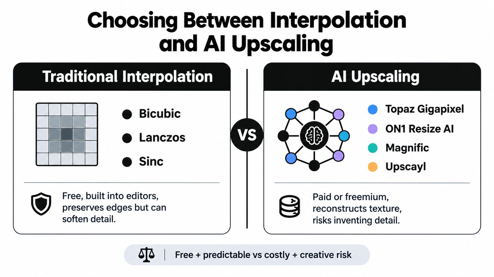
The practical choice is straightforward. Use interpolation when the file is near target and accuracy matters. Use AI when the enlargement is aggressive and the viewing conditions justify it, then audit the result as carefully as you would a retouched photograph.
Step-by-Step Workflow in Photoshop, GIMP, and Online Tools
The software matters less than the sequence. Resize the image before heavy retouching, apply noise reduction after the target size is established, and sharpen only at final output dimensions. Keep every major stage as a separate file so you can compare versions rather than relying on memory.
Photoshop
Open the original working copy, release the background if necessary, and duplicate the layer. Choose Image > Image Size, keep Resample enabled, and select Preserve Details 2.0 when available. Set the final dimensions in inches or pixels, check the resulting resolution, and keep noise reduction low while enlarging. A setting of zero is a sensible starting point because aggressive smoothing can erase texture before you know what the print needs.
Apply the resize, then inspect at 100%. Look at eyelashes, edges, foliage, fabric, and any text. Don't sharpen yet. If you need a more controlled result, compare Preserve Details 2.0 with Bicubic Smoother on duplicate versions.
GIMP
In GIMP, use Image > Scale Image and choose NoHalo or LoHalo interpolation. These options can produce smoother edges than Cubic for enlargement, but the same limit applies: interpolation estimates; it doesn't recover lost detail. Export a separate result and compare it with Photoshop or an AI version at the final dimensions.
Browser-based tools
Services such as Upscayl, Topaz's web tools, and Let's Enhance can be convenient when the computer isn't suited to a large render. Upload the original rather than a preview, choose a model suited to photography or graphics, and download a TIFF when the service provides that option. Review privacy and file-retention terms before uploading a client's commercial image.
| Step | Photoshop | GIMP | Online AI Tool |
|---|---|---|---|
| Prepare | Duplicate the original layer | Save a working copy | Upload the camera export |
| Resize | Preserve Details 2.0 or Bicubic | NoHalo or LoHalo | Select the appropriate model |
| Inspect | Review at 100% | Review edges and texture | Compare faces, text, and labels |
| Finish | Sharpen after final sizing | Use final-size sharpening | Download TIFF when available |
If the artwork will be transferred onto apparel, the image also needs to meet the printer's actual-size requirements, transparency rules, and color expectations. Cobra DTF's guide to preparing images for transfer paper is useful when the final output isn't a conventional paper poster.
Photoshop is usually fastest for a one-off job with layered retouching. GIMP works well when you need a free desktop workflow and can tolerate more manual checking. Online AI tools save local processing time, but they add upload, download, privacy, and model-selection considerations.
Fixing Noise and Sharpening After Enlargement
A large print reveals defects that were easy to ignore at screen size. Enlargement spreads noise across more visible area, while sharpening can turn that noise into coarse grain. The order of operations determines whether the poster looks clean or artificially outlined.
Finish the resize first. Then reduce noise at the final image dimensions, and only afterward apply output sharpening. If you denoise before enlargement, the scaling step can soften the result again. If you sharpen before enlargement, the resampler enlarges the halos along with the image.
A controlled cleanup sequence
For a RAW or TIFF file in Photoshop, open Camera Raw Filter and address luminance noise before color noise. Keep the correction restrained. A high-ISO photograph may need a dedicated AI denoiser such as Topaz DeNoise, but inspect hair, foliage, fabric, and skin afterward because heavy denoising can replace natural texture with a smooth, synthetic surface.
Once the noise work is complete, apply sharpening as a Smart Filter so you can revise it. Unsharp Mask is a practical option for output sharpening. The working ranges below are starting points tied to viewing distance:
- Arm's-length poster: Try a radius of 1.5 to 2 pixels.
- Wall poster viewed across a room: Try a radius of 3 to 5 pixels.
- Amount: Keep it within roughly 40 to 80%.
- Threshold: Start around 2 to prevent uniform areas from becoming noisy.
These settings are not universal presets. Paper, ink spread, subject contrast, and the viewer's distance all change the result. A glossy photographic surface usually exposes a sharpening halo more clearly than a textured material.
Sharpen the file people will print, not the small file you started with.
GIMP offers comparable cleanup through Despeckle and its GIMP-MIT unsharp mask. Use a duplicate layer or a reversible filter where possible. Zooming to 100% is necessary, but it isn't sufficient. Check a scaled preview that approximates the physical print, then request a proof when the image carries an important face, product, or brand mark.
The most common mistake is excessive sharpening. Dark outlines around bright objects, crunchy skin, and noisy skies may look “detailed” on a monitor, but they become distracting on a wall. If the source is fundamentally out of focus, sharpening won't restore focus. It can only make the boundary of the blur more obvious.
Color, Bleed, and File Prep for Your Printer
An enlarged image can still fail at the printer if the color profile, trim area, or export format is wrong. Ask the print provider what it accepts before you build the final file. A photo lab, inkjet operator, offset press, and large-format shop may prefer different profiles and delivery formats.
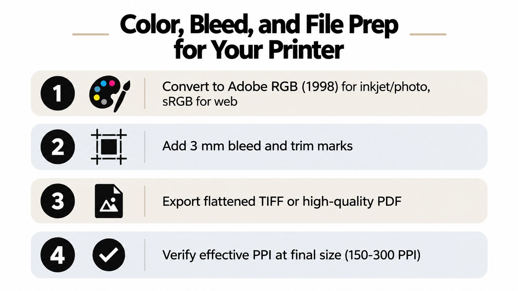
For inkjet and photographic output, Adobe RGB (1998) can be appropriate when the printer's workflow supports it. Offset work may call for a profile such as US SWOP Coated v2 or GRACoL. Don't convert by habit. Use the profile supplied by the printer, then soft-proof through View > Proof Colors with the relevant ICC profile loaded. A practical explanation of why profiles affect conversion and output is available in this guide to ICC color profiles.
Build the trim area correctly
If the poster runs to the edge, extend the background or image beyond the trim line. The supplied workflow calls for 0.125 inch of bleed on each edge for offset and large-format jobs that trim to the edge. Keep faces, logos, and critical text inside the safety area rather than placing them against the cut line.
For a poster that will be trimmed without a complex press layout, the printer may only need a safe internal margin. Confirm that requirement instead of assuming every shop handles bleed in the same way. Guides should show the finished trim and the safety boundary, but they shouldn't become part of the exported artwork.
Poster proportion also affects how the image feels in its frame or display. For useful composition and sizing context, review this framing advice for famous movie posters before committing to a crop.
Export a production copy
A TIFF with LZW compression is a solid choice for many photo workflows. Keep the file at 16-bit when the printer supports it, and preserve layers until the shop confirms whether layered delivery is accepted. Otherwise, flatten a copy and retain the layered master separately.
Commercial design files often work well as PDF/X-4, particularly when the layout contains text, vector elements, or spot colors. For text-bearing artwork, outline fonts when the printer requests it, and verify that the correct profile is embedded. Sending an 8-bit sRGB JPEG to an offset workflow, embedding the wrong profile, or forgetting bleed can create avoidable color shifts and trimming problems.
Make a final checklist before upload:
- Dimensions: Confirm the trim size and orientation.
- Effective PPI: Check the image at the final physical size.
- Color: Verify the requested ICC profile.
- Bleed: Extend edge artwork and protect important content.
- Format: Use the shop's requested TIFF or PDF standard.
- Proof: Inspect a test print when detail or color is commercially important.
Matching the Method to Your Poster Job
The best enlargement method depends on what the audience can see, how close they can stand, and how much the surface hides or reveals. A handheld or tabletop print needs more visible detail than a wall graphic. A glossy photo paper or metal print exposes interpolation flaws, while canvas and textured stock can make slight softness less obvious.
Use this decision path:
- Under 2 feet: Aim for 300 PPI when close inspection matters. If the source already meets the target, don't upscale unnecessarily. If it falls short, use a conservative interpolation method first and compare a proof.
- Around 4 to 8 feet: 150 to 200 PPI can be sufficient for wall art, office displays, and retail posters. Moderate enlargement with Bicubic or Lanczos is often more dependable than an aggressive AI reconstruction.
- 10 feet or more: Larger signage may work at 75 to 100 PPI, depending on subject and conditions. AI enlargement becomes more useful when the source needs substantial resampling, but faces, logos, and text require close auditing.
Large-format guidance also identifies 24 × 36 inches as a common poster size, with 150 to 200 DPI often used for wall displays viewed from about three feet or more. For displays at 36 × 48 inches, 100 to 150 DPI can work when the viewing distance increases. HP's large-format guidance places those figures in the context of actual display conditions, media settings, and production checks.
| Poster Job | Viewing Distance | Target PPI | Upscale Method | Substrate | Export Format |
|---|---|---|---|---|---|
| Wedding portrait, 18 × 24 | Close wall viewing | 200+ | Bicubic or Lanczos if needed | Glossy or matte photo paper | TIFF or printer-approved PDF |
| Trade-show banner, 24 × 36 | Several feet | 150 to 200 | AI for aggressive enlargement, interpolation for moderate work | Vinyl or matte stock | PDF/X-4 or TIFF |
| Gallery piece, 36 × 48 | Room-scale viewing | 100 to 150 | Pixel-honest workflow or carefully audited AI | Canvas or textured paper | Printer-approved TIFF or PDF |
Three practical scenarios
An 18 × 24 wedding portrait deserves conservative treatment because viewers often approach faces closely. Preserve the original skin texture, avoid aggressive face reconstruction, and use a glossy or matte photo proof to evaluate halos.
A 24 × 36 trade-show banner is judged from a distance and often competes with surrounding graphics. Design clarity may matter more than microscopic texture. Keep logos and type vector-based where possible, and choose vinyl or matte stock if reflections are likely.
A 36 × 48 gallery piece needs a composition that works at room scale. Canvas can forgive modest softness, but it won't fix a badly focused subject. If the source is short on pixels, AI may help, though a crop that emphasizes shape and color can be more honest than fabricating fine detail.
For owners building a print-on-demand catalog, Skup's poster business tips provide useful operational context around product selection, artwork preparation, and fulfillment decisions. The same discipline applies to custom orders: standardize your intake checklist, request original files, and identify viewing distance before promising a result.
Cobra DTF also handles size-based DTF transfer orders for printed apparel designs, so the same principle applies beyond paper posters. Prepare artwork at its intended output dimensions, verify the production requirements, and keep the enlarged master separate from the file sent to the printer.
Cobra DTF offers custom-size DTF transfers for apparel businesses that need print-ready artwork prepared for physical output, with production handled in the USA and same-day shipping available for orders placed by 1 PM CST. Review the artwork requirements and place your next transfer order through Cobra DTF.